Creating a Reusable Bulletproof React IconButton Component


Let me share a reusalbe bulletproof React component for displaying a clickable icon - the IconButton.
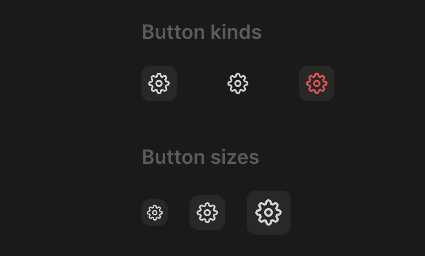
The IconButton component
The Container component is a styled button that will have different styles based on size and kind props. Here we have s, m, l sizes, and regular, secondary, alert kinds. You can have more or less depending on your needs.
import { ComponentProps, Ref, forwardRef } from "react"
import styled from "styled-components"
import { defaultTransitionCSS } from "../animations/transitions"
import { centerContentCSS } from "../utils/centerContentCSS"
import { getCSSUnit } from "../utils/getCSSUnit"
import { getSameDimensionsCSS } from "../utils/getSameDimensionsCSS"
import { matchColor } from "../theme/getters"
import { match } from "lib/shared/utils/match"
import { interactiveCSS } from "../utils/interactiveCSS"

export const iconButtonSizes = ["s", "m", "l"] as const
export type IconButtonSize = (typeof iconButtonSizes)[number]

export const iconButtonKinds = ["regular", "secondary", "alert"] as const
export type IconButtonKind = (typeof iconButtonKinds)[number]

const sizeRecord: Record<IconButtonSize, number> = {
  s: 24,
  m: 32,
  l: 40,
}

interface ContainerProps {
  size: IconButtonSize
  kind: IconButtonKind
}

const Container = styled.button<ContainerProps>`
  all: unset;
  ${interactiveCSS};
  position: relative;
  ${centerContentCSS};
  ${({ size }) => getSameDimensionsCSS(sizeRecord[size])};
  font-size: ${({ size }) => `calc(${getCSSUnit(sizeRecord[size] * 0.6)})`};
  border-radius: 8px;
  ${defaultTransitionCSS};

  color: ${matchColor("kind", {
    regular: "text",
    secondary: "text",
    alert: "alert",
  })};

  background: ${({ kind, theme: { colors } }) =>
    match(kind, {
      regular: () => colors.mist,
      secondary: () => colors.transparent,
      alert: () => colors.alert.getVariant({ a: (a) => a * 0.12 }),
    }).toCssValue()};

  &:hover {
    background: ${({ kind, theme: { colors } }) =>
      match(kind, {
        regular: () => colors.mist,
        secondary: () => colors.mist,
        alert: () => colors.alert.getVariant({ a: (a) => a * 0.24 }),
      }).toCssValue()};

    color: ${matchColor("kind", {
      regular: "contrast",
      secondary: "contrast",
      alert: "alert",
    })};
  }
`

export interface IconButtonProps extends ComponentProps<typeof Container> {
  icon: React.ReactNode
  size?: IconButtonSize
  kind?: IconButtonKind
  title: string
}

export const IconButton = forwardRef(function IconButton(
  { size = "m", kind = "regular", icon, ...rest }: IconButtonProps,
  ref: Ref<HTMLButtonElement> | null,
) {
  return (
    <Container kind={kind} ref={ref} size={size} {...rest}>
      {icon}
    </Container>
  )
})
We remove all the default styles from the button with the all: unset CSS rule. Then we apply the interactiveCSS that will add cursor: pointer. To center icon inside we turn it in a flexbox element with alignItems: center and justifyContent: center using the centerContentCSS. To make it a square we use the getSameDimensionsCSS helper, and to make the icon fit inside we set the font-size to 60% of the size.
I use HSLA color format through my apps, and you can learn more about it in my blog post. Here we use the matchColor helper to get the color based on the kind prop. We do the same for the background, but here we want to maninulate color parameters so we have to write a bit more code. We use the same approach to update color and background on hover.
The IconButton component will receive the same properties as the container, but also icon and title props. The icon prop is a React node that will be rendered inside the button. In my apps I have icons as a regular React component and you can learn more about the setup here. We make the title prop required for accessibility purposes, since there is no text inside the button we need to have some explanation for the action.
There are situations where you want the icon to be aligned with the content and have hover effect go beyond the boundaries of the element, to do that you can use the Hoverable component that positions highlight absolute, and you can learn more about it in my blog post.