How To Make Hover Effect Overflow Its Container with React


Do you see this nice hover effect going beyond the boundaries of a checklist item? Let me show you how to make a reusable component to make any interactive element hoverable with ease.
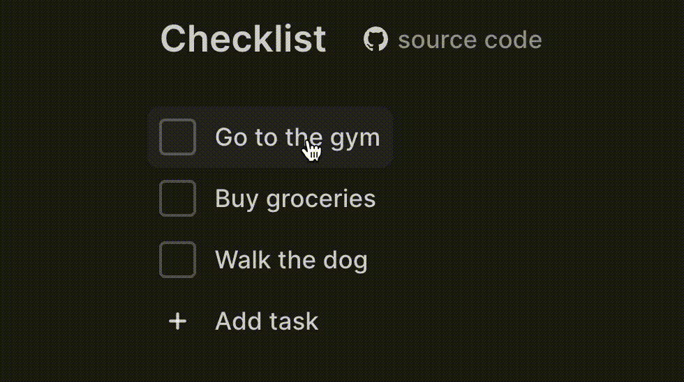
The component receives children, an optional horizontal and vertical offset to let hover go beyond the boundaries of an element, the as property so we can render the element as a div, button, or label, and optional onClick and style properties.
import styled from "styled-components"

import { defaultTransitionCSS } from "./animations/transitions"
import { ComponentWithChildrenProps } from "lib/shared/props"
import { UnstyledButton } from "./buttons/UnstyledButton"
import { getCSSUnit } from "./utils/getCSSUnit"

const Highlight = styled.div`
  position: absolute;
  ${defaultTransitionCSS};
  border-radius: 8px;
`

const Container = styled(UnstyledButton)`
  position: relative;

  &:hover ${Highlight} {
    background: ${({ theme }) => theme.colors.backgroundGlass.toCssValue()};
  }
`

const Content = styled.div`
  z-index: 1;
`

interface HoverableProps extends ComponentWithChildrenProps {
  horizontalOffset?: number
  verticalOffset?: number
  as?: React.ElementType
  onClick?: () => void
  style?: React.CSSProperties
}

export const Hoverable = ({
  children,
  horizontalOffset = 8,
  verticalOffset = 8,
  onClick,
  as,
  style,
}: HoverableProps) => {
  return (
    <Container onClick={onClick} as={as} style={style}>
      <Highlight
        style={{
          left: getCSSUnit(-horizontalOffset),
          top: getCSSUnit(-verticalOffset),
          width: `calc(100% + ${getCSSUnit(horizontalOffset * 2)})`,
          height: `calc(100% + ${getCSSUnit(verticalOffset * 2)})`,
        }}
      />
      <Content>{children}</Content>
    </Container>
  )
}
We base the container on an UnstyledButton component that clears all the default styles of a button element. We want it to be relative so we can position the Highlight element absolutely. The hover effect has a transition to animate appearance, border-radius, and no background, as it will be set on hover of the Container element. To position the Highlight and make it larger than the content inside, we'll make the left and top values negative and make the width and height 100% plus their offset. To make the content appear above the hover effect, we'll apply a z-index.