Exploring HSLA Color Format for React: TypeScript, Styled Components, Color Variants, Colors Generator, Color Picker


HEX and RGB color formats are not intuitive for us humans. We don't know how to make #ff5343 a bit lighter by changing its hex parameters. Hopefully, there is an HSLA format with four easy-to-understand parameters. More than that, we can comfortably create new color variants through code using an HSLA TypeScript implementation I will share with you today. To take a grasp of the format, you can play with a color picker I prepared for you at kit.radzion.com/hsla. We will also see how HSLA fits nicely with styled-components and React. As a bonus, we'll also check how I've made the sliders for this color picker. Let's jump in!
HSLA Color Format
Since we want more control over the color, generate them, and make variants, we better store it in an object rather than a string. HSLA is a simple class with a constructor receiving hue, saturation, lightness, and alpha parameters. It has only two methods:
toCssValue- converts the color to a CSS string.getVariant- creates a new color variant based on the modifiers passed as an argument. Modifier is a function that takes a color parameter and returns a new value for it.
import { degreesInCircle } from "lib/shared/utils/degreesToRadians"
import { enforceRange } from "lib/shared/utils/enforceRange"

export const hslaKeys = ["h", "s", "l", "a"] as const

export type HSLAParameter = (typeof hslaKeys)[number]

export type ColorModifiers = Partial<
  Record<HSLAParameter, (parameter: number) => number>
>

export const hslaParamMaxValue: Record<HSLAParameter, number> = {
  h: degreesInCircle,
  s: 100,
  l: 100,
  a: 1,
}

export class HSLA {
  private _h = 0
  get h(): number {
    return this._h
  }
  set h(newH: number) {
    this._h = enforceRange(newH, 0, hslaParamMaxValue.h)
  }

  private _l = 0
  get l(): number {
    return this._l
  }
  set l(newL: number) {
    this._l = enforceRange(newL, 0, hslaParamMaxValue.l)
  }

  private _s = 0
  get s(): number {
    return this._s
  }
  set s(newS: number) {
    this._s = enforceRange(newS, 0, hslaParamMaxValue.s)
  }

  private _a = 0
  get a(): number {
    return this._a
  }
  set a(newA: number) {
    this._a = enforceRange(newA, 0, hslaParamMaxValue.a)
  }

  constructor(h: number, s: number, l: number, a = 1) {
    this.h = h
    this.s = s
    this.l = l
    this.a = a
  }

  toCssValue() {
    return `hsla(${this.h},${this.s}%,${this.l}%,${this.a})`
  }

  getVariant(modifiers: ColorModifiers) {
    const [h, s, l, a] = hslaKeys.map((key) => {
      const value = this[key]
      const modifier = modifiers[key]

      return modifier ? modifier(value) : value
    })

    return new HSLA(h, s, l, a)
  }
}
To ensure that color won't break because of incorrect parameters we rely on rarely used getter and setters. Actually it might be the only time I've used it in TypeScript. The enforceRange function is a simple utility that ensures that the value is between the min and max values. For every parameter 0 is the minimum value. The maximum value is 360 for hue, 100 for saturation and lightness, and 1 for alpha.
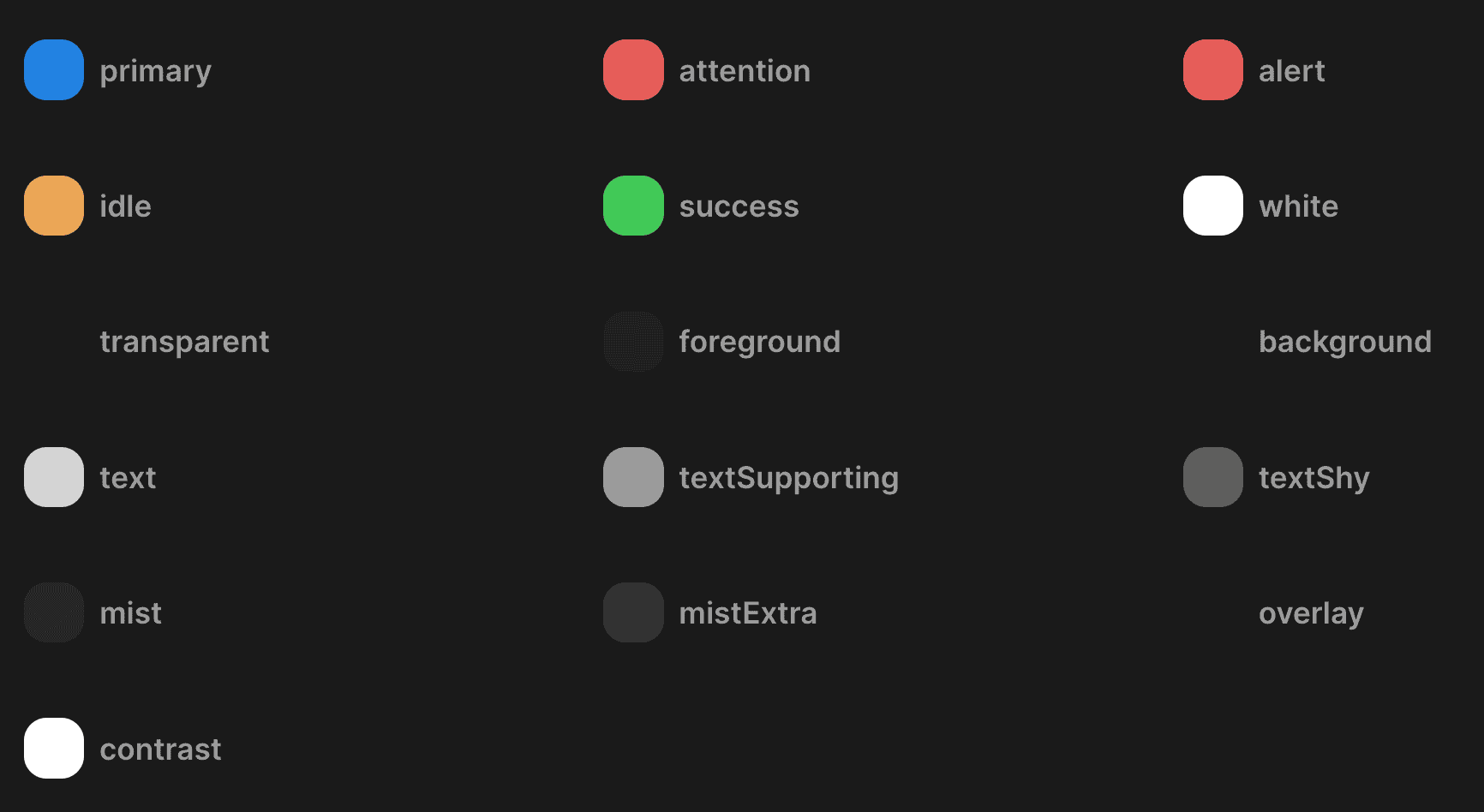
HSLA & Color Theme
Instead of relying on string type to represent a color in our app, we can now use the HSLA type. Here's an example of how I define the ThemeColors interface:
import { HSLA } from "../colors/HSLA"

export type ThemeColors = {
  primary: HSLA

  attention: HSLA

  alert: HSLA
  idle: HSLA
  success: HSLA

  foreground: HSLA
  background: HSLA

  text: HSLA
  textSupporting: HSLA
  textShy: HSLA

  mist: HSLA
  mistExtra: HSLA

  overlay: HSLA

  contrast: HSLA

  white: HSLA
  transparent: HSLA

  getLabelColor: (index: number) => HSLA
}
Then we'll usually have dark and light theme implementations of the ThemeColors interface:
import { DefaultTheme } from "styled-components"
import { HSLA } from "lib/ui/colors/HSLA"
import { sharedColors } from "./shared"
import { generateLabelColorGetter } from "../colors/generateLabelColorGetter"

const backgroundHue = 0
const backgroundSaturation = 0
const backgroundLightness = 10

export const darkTheme: DefaultTheme = {
  name: "dark",
  colors: {
    ...sharedColors,
    foreground: new HSLA(
      backgroundHue,
      backgroundSaturation,
      backgroundLightness + 3,
    ),
    background: new HSLA(
      backgroundHue,
      backgroundSaturation,
      backgroundLightness,
    ),
    text: new HSLA(0, 0, 100, 0.81),
    textSupporting: new HSLA(0, 0, 61),
    textShy: new HSLA(0, 0, 100, 0.28),

    mist: new HSLA(0, 0, 100, 0.06),
    mistExtra: new HSLA(0, 0, 100, 0.13),

    overlay: new HSLA(backgroundHue, backgroundSaturation, 1, 0.8),

    getLabelColor: generateLabelColorGetter({
      saturation: 56,
      lightness: 52,
    }),

    contrast: new HSLA(0, 0, 100),
  },
  shadows: {
    small:
      "rgb(15 15 15 / 20%) 0px 0px 0px 1px, rgb(15 15 15 / 20%) 0px 2px 4px",
    medium:
      "rgb(15 15 15 / 10%) 0px 0px 0px 1px, rgb(15 15 15 / 20%) 0px 3px 6px, rgb(15 15 15 / 40%) 0px 9px 24px;",
  },
}
HSLA & Styled Components
We can get the color from the theme and use it in our styled components. Here's an example of assigning background color:
background: ${({ theme }) => theme.colors.primary.toCssValue()};Yet it's a bit too much code to write every time. In 90% of cases we just want to use CSS color without making any variation. By using the getColor helper we can get color in a concise way:
background: ${getColor("primary")};Here's the implementation of the getColor helper. It's a closure - a function that returns another function.
import { DefaultTheme } from "styled-components"
import { ThemeColors } from "./ThemeColors"

interface ThemeGetterParams {
  theme: DefaultTheme
}

type ColorName = keyof Omit<ThemeColors, "getLabelColor">

export const getColor =
  (color: ColorName) =>
  ({ theme }: ThemeGetterParams) =>
    theme.colors[color].toCssValue()
There are also situations where the styled component takes a parameter and than we should match a color to that value. For example, here we want to make color red if the input is invalid:
color: ${({ theme, isValid }) => (isValid ? theme.colors.textSupporting : theme.colors.alert).toCssValue()};To make it more concise we can use the matchColor helper:
  color: ${matchColor("isValid", {
    true: "textSupporting",
    false: "alert",
  })};
It has a bit more complex types because we want to support booleans and union types. Here's the implementation:
type BooleanMatcher = { true: ColorName; false: ColorName }
type Matcher<T extends string | number | symbol> = { [key in T]: ColorName }
type MatcherType<T> = Extract<T, "string" | "number" | "symbol">

export const matchColor =
  <T extends ThemeGetterParams, K extends keyof T, U = T[K]>(
    variable: K,
    matcher: U extends boolean ? BooleanMatcher : Matcher<MatcherType<U>>,
  ) =>
  (params: T) => {
    if (typeof params[variable] === "boolean") {
      const booleanMatcher = matcher as BooleanMatcher
      const color = params[variable]
        ? booleanMatcher.true
        : booleanMatcher.false

      return getColor(color)
    }

    const color = (matcher as Matcher<MatcherType<U>>)[
      params[variable] as unknown as MatcherType<U>
    ]

    return getColor(color)
  }
Generate HSLA colors
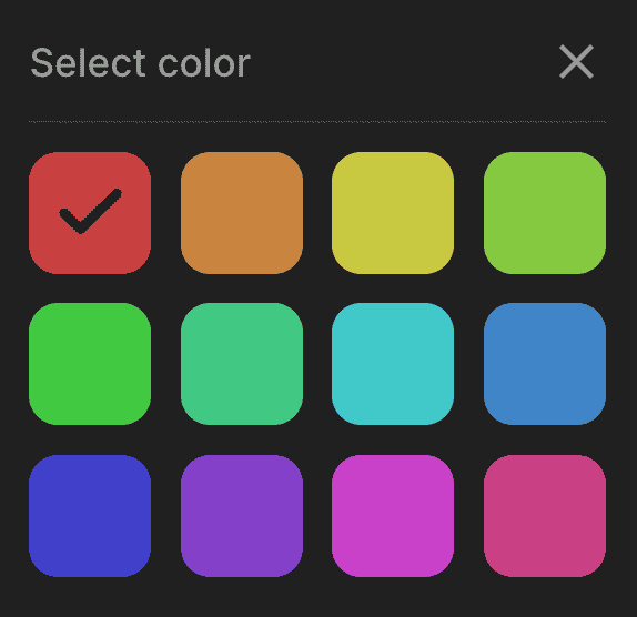
In the ThemeColors interface we've seen the getLabelColor function. It's a common need for apps to have colored labels for projects, or categories, and so on. We can generate a function that will return a color based on the index. Here's the implementation:
import { degreesInCircle } from "lib/shared/utils/degreesToRadians"
import { HSLA } from "./HSLA"

export const labelColorsCount = 12

interface LabelColorGetterParams {
  saturation: number
  lightness: number
}

export const generateLabelColorGetter =
  ({ saturation, lightness }: LabelColorGetterParams) =>
  (labelIndex: number): HSLA => {
    const labelIndexOnInterval =
      (labelIndex % labelColorsCount) / labelColorsCount

    const hue = degreesInCircle * labelIndexOnInterval

    return new HSLA(hue, saturation, lightness)
  }
Here we decide to have 12 color options in our labels palette that are evenly distributed on the color wheel. Instead of saving a color in the database or in the app state we can just save the index and then get the color from the function. If later we change the number of colors in the pallette, the function will still work because we are using the mod operator.
To make the colors look good in both dark and light themes we pass diferent saturation and lightness values. Here's how it looks in the dark theme:
getLabelColor: generateLabelColorGetter({
  saturation: 56,
  lightness: 52,
}),
And here's how it looks in the light theme:
getLabelColor: generateLabelColorGetter({
  saturation: 64,
  lightness: 64,
}),
HSLA variants
Sometimes we want to make a color a bit darker or lighter. We can do it by using the getVariant method on HSLA class. Here's an example where we make button background a bit darker on hover:
const getHoverVariant = (color: HSLA) => color.getVariant({ l: (l) => l * 0.92 })

// ...

background: ${({ theme }) => getHoverVariant(theme.colors.primary).toCssValue()};
Another example is the Tag component we can use to show project labels or categories. Here we adjust saturation for text color and background to make it look good in both dark and light themes.
import styled, { css } from "styled-components"

import { HSLA } from "./colors/HSLA"
import { Text } from "./Text"
import { match } from "lib/shared/utils/match"

export const Tag = styled(Text)<{ $color: HSLA }>`
  border-radius: 8px;
  padding: 4px 8px;
  font-weight: 600;
  font-size: 14px;
  ${({ theme, $color }) =>
    match(theme.name, {
      dark: () => css`
        color: ${$color.getVariant({ s: () => 56, l: () => 60 }).toCssValue()};
        background: ${$color.getVariant({ a: () => 0.06 }).toCssValue()};
      `,
      light: () => css`
        color: ${$color.getVariant({ s: () => 40, l: () => 40 }).toCssValue()};
        background: ${$color.getVariant({ a: () => 0.1 }).toCssValue()};
      `,
    })}
`
How To Make HSLA Color Picker
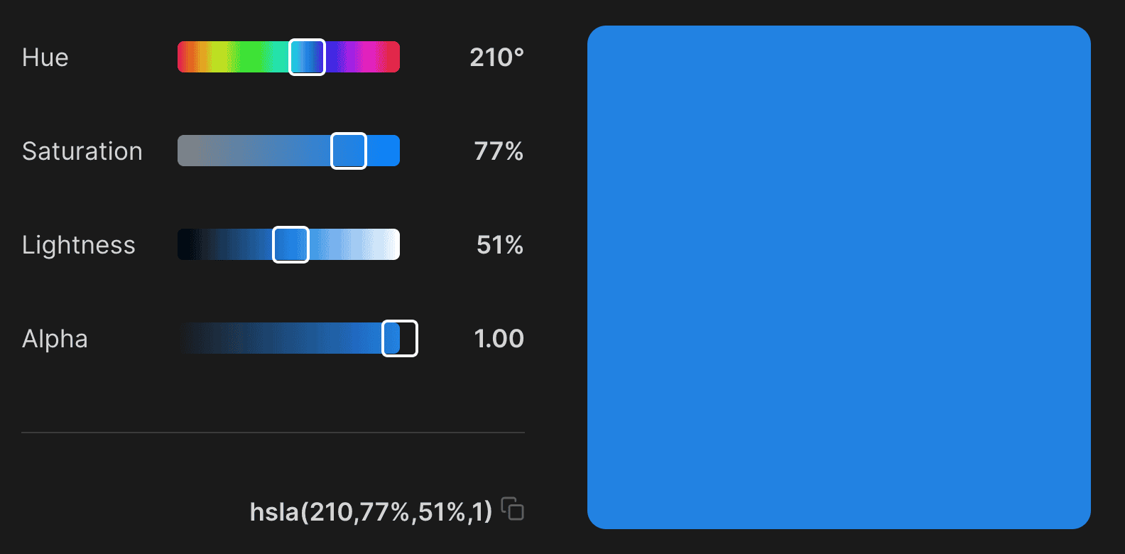
I've promised to show an implementation of the color picker. We store the HSLA value in the useState hook:
const { colors } = useTheme()
const [value, setValue] = useState(colors.primary)
Then we go over each key and render a CSS Grid container with the name of the parameter, input, and the formatted value:
{
  hslaKeys.map((key) => (
    <InputContainer key={key}>
      <Text>{colorParameterName[key]}</Text>
      <ColorParameterInput
        onChange={(parameter) => {
          setValue(value.getVariant({ [key]: () => parameter.toFixed(2) }))
        }}
        value={value[key]}
        getColor={(param) =>
          value.getVariant({ [key]: () => param }).toCssValue()
        }
        max={hslaParamMaxValue[key]}
        step={colorParameterStep[key]}
      />
      <Text weight="bold">{formatColorParameter[key](value[key])}</Text>
    </InputContainer>
  ))
}
The ColorParameterInput component is just a fancy slider:
import { range } from "lib/shared/utils/range"
import { toPercents } from "lib/shared/utils/toPercents"
import { PressTracker } from "lib/ui/PressTracker"
import { defaultTransition } from "lib/ui/animations/transitions"
import {
  InvisibleHTMLSlider,
  InvisibleHTMLSliderProps,
} from "lib/ui/inputs/Slider/InvisibleHtmlSlider"
import { getColor } from "lib/ui/theme/getters"
import { centerContentCSS } from "lib/ui/utils/centerContentCSS"
import { getCSSUnit } from "lib/ui/utils/getCSSUnit"
import { getSameDimensionsCSS } from "lib/ui/utils/getSameDimensionsCSS"
import { interactiveCSS } from "lib/ui/utils/interactiveCSS"
import styled from "styled-components"

export interface ColorParameterInputProps
  extends Omit<InvisibleHTMLSliderProps, "min"> {
  getColor: (param: number) => string
}

const railHeight = 20
const controlBorderWidth = 2
const controlSize = railHeight + controlBorderWidth * 2

const Control = styled.div<{ value: number }>`
  position: absolute;
  left: ${({ value }) =>
    `calc(${toPercents(value)} - ${getCSSUnit(controlSize / 2)})`};
  ${getSameDimensionsCSS(controlSize)};
  transition: outline ${defaultTransition};
  outline: 6px solid transparent;
  border: ${getCSSUnit(controlBorderWidth)} solid ${getColor("contrast")};
  border-radius: 4px;
`

const Container = styled.label`
  width: 100%;
  height: 40px;
  ${interactiveCSS};
  ${centerContentCSS};
  position: relative;

  :focus-within ${Control} {
    outline: 12px solid ${getColor("mistExtra")};
  }

  &:hover ${Control} {
    outline-color: ${getColor("mist")};
  }
`

const Line = styled.div`
  width: 100%;
  height: ${getCSSUnit(railHeight)};

  border-radius: 4px;
`

export const ColorParameterInput = ({
  value,
  onChange,
  max,
  step,
  getColor,
}: ColorParameterInputProps) => {
  const colors = range(Math.round(max / step)).map((index) =>
    getColor(index * step),
  )
  return (
    <PressTracker
      onChange={({ position }) => {
        if (position) {
          onChange(Math.round((position.x * max) / step) * step)
        }
      }}
      render={({ props }) => (
        <Container {...props}>
          <InvisibleHTMLSlider
            step={step}
            value={value}
            onChange={onChange}
            min={0}
            max={max}
          />
          <Line
            style={{
              background: `linear-gradient(to right, ${colors.join(", ")})`,
            }}
          />
          <Control value={value / max} />
        </Container>
      )}
    />
  )
}
To handle user mouse or touch we rely on an abstract component called PressTracker that you can learn more about here. The InvisibleHTMLSlider is a hidden range input that will still do its job allowing us to change the value by using the keyboard. To make this nice gradient we rely on the getColor property that returns a color for a given parameter value.