Designing a Color Palette for Dark and Light Modes for React App

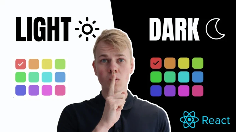
Designing a color palette that achieves both beauty and functionality can be challenging, especially when trying to make it graceful in both dark and light modes while keeping the color system easy to manage in the code. In this post, I will share an approach that has worked well for my front-end project and should help make color systems intuitive for you as well.
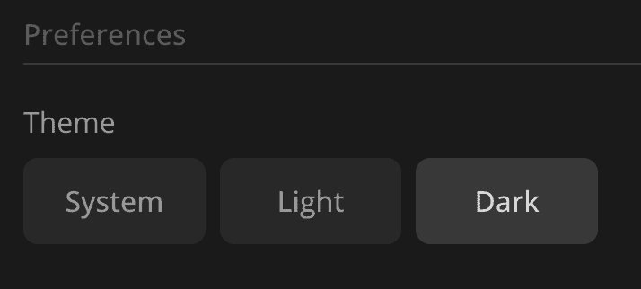
Theme Preference
We store the user's theme preference in the local storage. The available options are "dark," "light," or "system." By default, we set it to "system" unless the user decides to change it. If you are interested in learning about an optimal setup for storing values in the local storage, please refer to this post.
import { PersistentStorageKey } from "state/persistentStorage"
import { usePersistentStorageValue } from "state/usePersistentStorageValue"
import { ThemePreference } from "./ThemePreference"
export const useThemePreference = () => {
return usePersistentStorageValue<ThemePreference>(
PersistentStorageKey.ThemePreference,
"system",
)
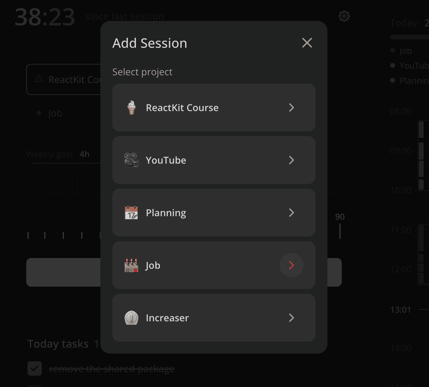
}Here's an example of the theme settings in my productivity app at increaser.org.
To provide the components with colors, we have to wrap the root of the app with the ThemeProvider component. It relies on the useMedia hook from react-use to detect if the user prefers a dark theme. Then, based on that value and the theme preference from local storage, we pick the theme object.
import { useMemo } from "react"
import { useMedia } from "react-use"
import { ComponentWithChildrenProps } from "shared/props"
import { ThemeProvider as StyledComponentsThemeProvider } from "styled-components"
import { darkTheme } from "ui/theme/darkTheme"

import { lightTheme } from "./lightTheme"
import { useThemePreference } from "./useThemePreference"

export const ThemeProvider = ({ children }: ComponentWithChildrenProps) => {
  const [themePreference] = useThemePreference()

  const isSystemThemeDark = useMedia("(prefers-color-scheme: dark)")

  const theme = useMemo(() => {
    if (themePreference === "system") {
      return isSystemThemeDark ? darkTheme : lightTheme
    }

    return themePreference === "dark" ? darkTheme : lightTheme
  }, [isSystemThemeDark, themePreference])

  return (
    <StyledComponentsThemeProvider theme={theme}>
      {children}
    </StyledComponentsThemeProvider>
  )
}
Dark and Light Themes
Both the dark and light themes implement the DefaultTheme interface, which we declare in the styled.d.ts file. It includes a name (either "dark" or "light"), colors, and shadows.
import "styled-components"
import { ThemeColors } from "lib/ui/theme/ThemeColors"
import { ThemeName } from "./ThemeName"
import { ThemeShadows } from "./ThemeShadows"
declare module "styled-components" {
export interface DefaultTheme {
name: ThemeName
colors: ThemeColors
shadows: ThemeShadows
}
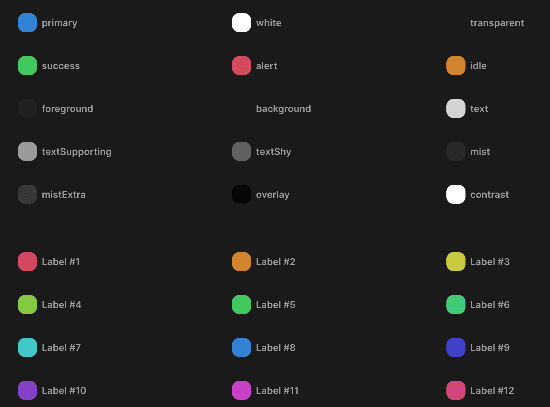
}All the colors we'll use in our app will come from the ThemeColors interface implementation or their variants.
import { HSLA } from "../colors/HSLA"
export type ThemeColors = {
primary: HSLA
alert: HSLA
idle: HSLA
success: HSLA
foreground: HSLA
background: HSLA
text: HSLA
textSupporting: HSLA
textShy: HSLA
contrast: HSLA
mist: HSLA
mistExtra: HSLA
overlay: HSLA
white: HSLA
transparent: HSLA
getLabelColor: (index: number) => HSLA
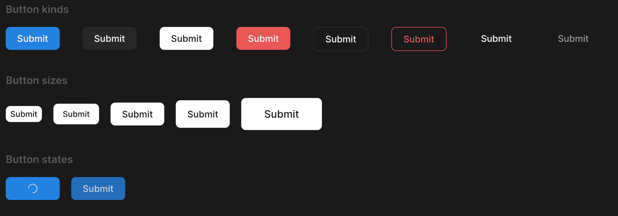
}The "primary" color is like a brand or accent color. It's the only color you have to change in the system to accommodate it for your app. We will usually use the "primary" color for interactive elements such as buttons, checkboxes, or links.
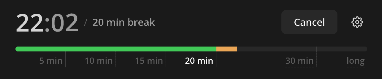
The "alert" color is for error messages or destructive actions. "Idle" is an orange color that could be used for warnings, and I use it in some visualizations, like in this example highlighting an overdue.
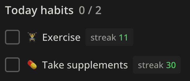
The "success" color is used for positive things, like a check icon when the user completes a task or to highlight an increase in some metric. Here's an example of using it to show a habit streak.
"Foreground" could be used for a sidebar or some panel, while the "background" color provides the most contrast. It's either almost black or white and serves as a page background or text color in reversed elements, like a button with a dark background and white text in a light mode.
We will use "text", "textSupporting", and "textShy" for texts. They have different contrast levels, and their names embody their purpose. There's also a "contrast" color that we will use for things that should stand out. It will be absolute white in the dark mode and black in the light mode.

"Mist" and "mistExtra" are almost transparent colors that we would use a lot because we can put one element with the "mist" background on top of another, and they will still have different colors due to the transparency. We can use them for panels and cards, buttons, borders, etc. For interactive elements with the "mist" background, we would usually use "mistExtra" as a hover color.
The "overlay" color is an almost opaque version of the "mist" color that we would use to blur out the background when showing a modal.
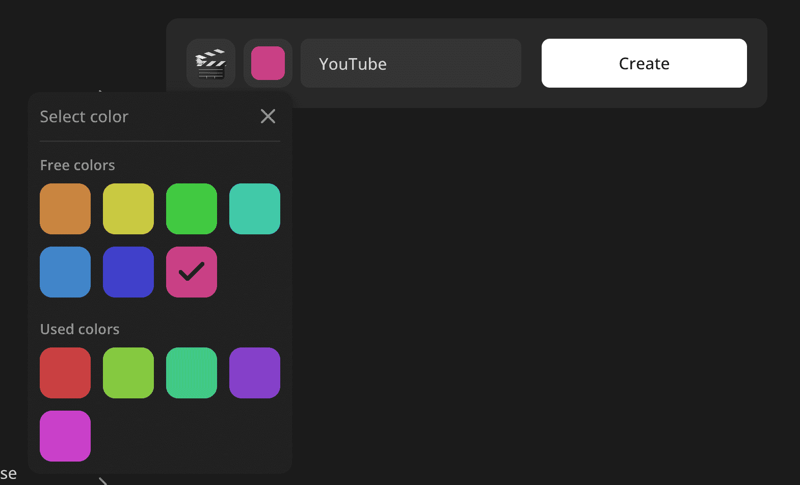
The "white" and "transparent" colors are self-explanatory, and they will be the same in both themes. We will use the getLabelColor function to get a color for a label based on its index. Here's an example of a color input that relies on that function to provide this list of options. To learn more about color generation and the HSLA format, check out this post.
Here's how the darkTheme implements the ThemeColors interface. When using the HSLA format, there's logic for colors: here, foreground is the same as the background, but a bit lighter. The same goes for the mistExtra color, which is a bit more opaque than the mist color.
import { DefaultTheme } from "styled-components"
import { generateLabelColorGetter } from "ui/colors/generateLabelColorGetter"
import { HSLA } from "ui/colors/HSLA"

import { sharedColors } from "./shared"

const backgroundHue = 0
const backgroundSaturation = 0

const backgroundLightness = 10

export const darkTheme: DefaultTheme = {
  name: "dark",
  colors: {
    ...sharedColors,

    success: new HSLA(130, 56, 52),

    foreground: new HSLA(
      backgroundHue,
      backgroundSaturation,
      backgroundLightness + 3,
    ),
    background: new HSLA(
      backgroundHue,
      backgroundSaturation,
      backgroundLightness,
    ),
    text: new HSLA(0, 0, 100, 0.81),
    textSupporting: new HSLA(0, 0, 61),
    textShy: new HSLA(0, 0, 100, 0.28),

    mist: new HSLA(0, 0, 100, 0.06),
    mistExtra: new HSLA(0, 0, 100, 0.13),

    overlay: new HSLA(backgroundHue, backgroundSaturation, 1, 0.8),

    getLabelColor: generateLabelColorGetter({
      saturation: 56,
      lightness: 52,
    }),

    contrast: new HSLA(0, 0, 100),
  },
  shadows: {
    small:
      "rgb(15 15 15 / 20%) 0px 0px 0px 1px, rgb(15 15 15 / 20%) 0px 2px 4px",
    medium:
      "rgb(15 15 15 / 10%) 0px 0px 0px 1px, rgb(15 15 15 / 20%) 0px 3px 6px, rgb(15 15 15 / 40%) 0px 9px 24px;",
  },
}
And here is the lightTheme implementation. You can see the slight difference in saturation and lightness we pass to the generateLabelColorGetter function to make them fit the light theme.
import { DefaultTheme } from "styled-components"
import { generateLabelColorGetter } from "ui/colors/generateLabelColorGetter"
import { HSLA } from "ui/colors/HSLA"

import { sharedColors } from "./shared"

export const lightTheme: DefaultTheme = {
  name: "light",
  colors: {
    ...sharedColors,

    success: new HSLA(137, 66, 36),

    foreground: new HSLA(60, 11, 98),
    background: new HSLA(0, 0, 100),

    text: new HSLA(60, 6, 20),
    textSupporting: new HSLA(45, 19, 8, 0.6),
    textShy: new HSLA(45, 8, 20, 0.65),

    mist: new HSLA(45, 8, 20, 0.06),
    mistExtra: new HSLA(45, 8, 20, 0.16),

    overlay: new HSLA(0, 0, 0, 0.8),

    contrast: new HSLA(0, 0, 0),

    getLabelColor: generateLabelColorGetter({
      saturation: 64,
      lightness: 64,
    }),
  },
  shadows: {
    small:
      "rgb(15 15 15 / 10%) 0px 0px 0px 1px, rgb(15 15 15 / 10%) 0px 2px 4px",
    medium:
      "rgb(15 15 15 / 5%) 0px 0px 0px 1px, rgb(15 15 15 / 10%) 0px 3px 6px, rgb(15 15 15 / 20%) 0px 9px 24px",
  },
}
Using Theme Colors in Styled Components
To access the color in styled components, we would usually rely on the getColor helper.
import { DefaultTheme } from "styled-components"

import { ThemeColors } from "./ThemeColors"

interface ThemeGetterParams {
  theme: DefaultTheme
}

type ColorName = keyof Omit<ThemeColors, "getLabelColor">

export const getColor =
  (color: ColorName) =>
  ({ theme }: ThemeGetterParams) =>
    theme.colors[color].toCssValue()

/*
background: ${getColor('primary')};
*/
However, there may be times when we need to create a color variant. For example, here we make the button background a bit dimmer on hover:
import { HSLA } from "./HSLA"

export const getHoverVariant = (color: HSLA) =>
  color.getVariant({ l: (l) => l * 0.92 })