Building a Goal-Tracking System in a Productivity App with React and TypeScript


Building a Goal Tracking System for a Productivity App
In this article, we'll build an exciting feature for a productivity app: a system for setting and tracking goals to help users get closer to their dream life. We'll work within a TypeScript monorepo and use React for the frontend. Although the source code for Increaser is in a private repository, you can find all the reusable components and utilities in the RadzionKit repository.
Creating a User-Friendly Goals Page
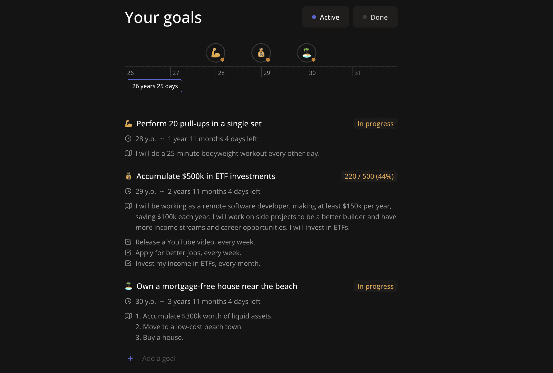
Our plan is to create a beautiful and user-friendly page for managing goals. Users should be able to set a goal deadline either to a specific date or link it to their age. Additionally, they should see their age and goals on a timeline to instill a sense of urgency and track progress. Each goal will have a status: "to do," "in progress," or "done." Completed goals will be moved to a separate section to keep the main view uncluttered. Users can assign an emoji to each goal for easy identification on the timeline. For measurable goals, users can set a numeric target and track the current value. They should also write a high-level plan for achieving the goal and, most importantly, set recurring tasks to be completed daily, weekly, or monthly to reach the goal.
The Goal Entity
First, let's examine the Goal entity. It has the following properties:
id- A unique identifier.emoji- A string representing an emoji.name- A string containing the goal name.status- Which could be "done," "inProgress," or "toDo."deadlineAt- A string or number representing the deadline. If it's a number, it represents the timestamp; if it's a string, it represents the age.plan- A string with a high-level plan for achieving the goal.target- An object for measurable goals with two properties:currentandvalue, both of which are numbers.taskFactories- An array of task factory IDs responsible for creating recurring tasks.
export const goalStatuses = ["done", "inProgress", "toDo"] as const
export type GoalStatus = (typeof goalStatuses)[number]

export const goalStatusNameRecord: Record<GoalStatus, string> = {
  done: "Done",
  inProgress: "In progress",
  toDo: "To do",
}

export type GoalTarget = {
  current: number
  value: number
}

export type Goal = {
  id: string
  emoji: string
  name: string
  status: GoalStatus
  deadlineAt: string | number
  plan?: string | null
  target?: GoalTarget | null
  taskFactories?: string[]
}

export type Goals = Record<string, Goal>

export const goalDeadlineTypes = ["age", "date"] as const
export type GoalDeadlineType = (typeof goalDeadlineTypes)[number]
Storing Goals in DynamoDB
We use DynamoDB as our database, and goals are stored in the user item as records, with the goal ID serving as the key. This setup allows for more efficient updates on specific goals. We won't delve into the backend implementation details, as it's quite straightforward. If you're curious about how to seamlessly implement backends within a TypeScript monorepo, check out this post.
Front-End Implementation
On the front-end, we have two subpages: one for active goals and another for completed goals. Both subpages share the same layout. We place a view selector for switching between pages in the page title and wrap the content in a UserStateOnly component to ensure that the goals component is rendered only when user data is present.
import { ComponentWithChildrenProps } from "@lib/ui/props"
import { AppPageLayout } from "../focus/components/AppPageLayout"
import { FixedWidthContent } from "../components/reusable/fixed-width-content"
import { PageTitle } from "../ui/PageTitle"
import { UserStateOnly } from "../user/state/UserStateOnly"
import { HStack, VStack } from "@lib/ui/layout/Stack"
import { Text } from "@lib/ui/text"
import styled from "styled-components"
import { GoalsViewSelector } from "./GoalsViewSelector"

const title = "Your goals"

const Container = styled(VStack)`
  max-width: 560px;
`

const Content = styled(VStack)`
  gap: 40px;
`

export const GoalsLayout = ({ children }: ComponentWithChildrenProps) => {
  return (
    <AppPageLayout>
      <FixedWidthContent>
        <Container>
          <PageTitle
            documentTitle={`⏳ ${title}`}
            title={
              <HStack
                fullWidth
                justifyContent="space-between"
                gap={20}
                wrap="wrap"
              >
                <Text>{title}</Text>
                <GoalsViewSelector />
              </HStack>
            }
          />
          <Content>
            <UserStateOnly>{children}</UserStateOnly>
          </Content>
        </Container>
      </FixedWidthContent>
    </AppPageLayout>
  )
}
Goals View Selector
The GoalsViewSelector renders the RadioInput component from RadzionKit. When an option is selected, we call push from useRouter to navigate to the selected subpage.
import { RadioInput } from "@lib/ui/inputs/RadioInput"
import { capitalizeFirstLetter } from "@lib/utils/capitalizeFirstLetter"
import { useRouter } from "next/router"
import { useCurrentPageView } from "../navigation/hooks/useCurrentPageView"
import { appPageViews, getAppPath } from "@increaser/ui/navigation/app"

export const GoalsViewSelector = () => {
  const view = useCurrentPageView("goals")
  const { push } = useRouter()

  return (
    <RadioInput
      minOptionHeight={40}
      value={view}
      options={appPageViews.goals}
      onChange={(view) => push(getAppPath("goals", view))}
      renderOption={capitalizeFirstLetter}
    />
  )
}
Current Page View Hook
The useCurrentPageView hook examines the current path and returns the last path segment. If the view is invalid, it throws an error.
import { useRouter } from "next/router"
import { useMemo } from "react"
import {
  AppPageWithView,
  AppPathViewOf,
  appPageViews,
} from "@increaser/ui/navigation/app"

export const useCurrentPageView = <P extends AppPageWithView>(
  page: P
): AppPathViewOf<P> => {
  const router = useRouter()
  const { asPath } = router

  return useMemo(() => {
    const [, view] = asPath.split("/").slice(1)

    if (appPageViews[page].includes(view as never)) {
      return view as AppPathViewOf<P>
    }

    throw new Error(`Invalid view=${view} for page=${page}`)
  }, [asPath, page])
}
Navigation System
Increaser has a specific navigation system that allows only one level of nesting. The getAppPath function receives the "route" path, and if that path has a view, it expects a second argument for the view. The function returns the path to the page with the view, if provided.
export const primaryAppNavigationPages = [
  "plan",
  "focus",
  "timeTracking",
  "workBudget",
  "timePlanning",
  "habits",
  "tasks",
  "schedule",
  "vision",
  "goals",
  "projects",
] as const

export const secondaryAppNavigationPages = [
  "community",
  "membership",
  "account",
] as const

const appNavigationPages = [
  ...primaryAppNavigationPages,
  ...secondaryAppNavigationPages,
] as const
export type AppNavigationPage = (typeof appNavigationPages)[number]

export const appPages = [
  ...appNavigationPages,
  "oauth",
  "signIn",
  "signUp",
  "emailConfirm",
  "onboarding",
] as const

export type AppPage = (typeof appPages)[number]

export const appPagePath: Record<AppPage, string> = {
  focus: "",
  timeTracking: "time-tracking",
  workBudget: "work-budget",
  timePlanning: "time-planning",
  habits: "habits",
  tasks: "tasks",
  schedule: "schedule",
  vision: "vision",
  goals: "goals",
  projects: "projects",
  community: "community",
  membership: "membership",
  account: "account",
  plan: "plan",
  oauth: "oauth",
  signIn: "sign-in",
  signUp: "sign-up",
  emailConfirm: "email-confirm",
  onboarding: "onboarding",
}

export const appPageViews = {
  timeTracking: ["report", "track"],
  vision: ["my", "ideas"],
  goals: ["active", "done"],
  habits: ["my", "ideas"],
} as const

export type AppPageVisionView = (typeof appPageViews)["vision"][number]
export type AppPageHabitsView = (typeof appPageViews)["habits"][number]

type AppPageViews = typeof appPageViews
export type AppPageWithView = keyof AppPageViews

export function getAppPath<P extends AppPageWithView>(
  page: P,
  subpage: AppPageViews[P][number]
): string
export function getAppPath(page: Exclude<AppPage, AppPageWithView>): string
export function getAppPath(page: AppPage, view?: string): string {
  const path = appPagePath[page]
  if (view) {
    return `/${path}/${view}`
  }
  return `/${path}`
}

export type AppPathViewOf<P extends AppPageWithView> = AppPageViews[P][number]

export const getPageDefaultPath = (page: AppPage): string =>
  page in appPageViews
    ? getAppPath(
        page as AppPageWithView,
        appPageViews[page as AppPageWithView][0]
      )
    : getAppPath(page as Exclude<AppPage, AppPageWithView>)
Active View Sections
The active view consists of three sections: a timeline, an educational block that the user can dismiss, and a list of goals with an "Add goal" button.
import { VStack } from "@lib/ui/layout/Stack"
import { ProductEducationBlock } from "@increaser/ui/education/ProductEducationBlock"
import { ActiveItemIdProvider } from "@lib/ui/list/ActiveItemIdProvider"
import { Goals } from "@increaser/ui/goals/Goals"
import { AddGoal } from "@increaser/ui/goals/AddGoal"
import { GoalsTimeline } from "@increaser/ui/goals/timeline/GoalsTimeline"

export const ActiveGoals = () => {
  return (
    <>
      <GoalsTimeline />
      <ProductEducationBlock value="goals" />
      <VStack>
        <ActiveItemIdProvider initialValue={null}>
          <Goals />
          <AddGoal />
        </ActiveItemIdProvider>
      </VStack>
    </>
  )
}
Goals Timeline
Let's start with the goals timeline. Since it makes the most sense to display the timeline in relation to the user's age, we prompt the user to set their date of birth if it hasn't been set yet, instead of displaying the timeline.
import { useAssertUserState } from "../../user/UserStateContext"
import { GoalsTimelineProvider } from "./GoalsTimelineProvider"
import { VStack } from "@lib/ui/layout/Stack"
import { TimeLabels } from "./TimeLabels"
import styled from "styled-components"
import { getColor } from "@lib/ui/theme/getters"
import { SetDobPrompt } from "../dob/SetDobPrompt"
import { goalsTimelineConfig } from "./config"
import { toSizeUnit } from "@lib/ui/css/toSizeUnit"
import { CurrentAge } from "./CurrentAge"
import { GroupedGoals } from "./GroupedGoals"
import { Spacer } from "@lib/ui/layout/Spacer"
const Line = styled.div`
height: 1px;
width: 100%;
background: ${getColor("mistExtra")};
`
const LabelsContainer = styled.div`
width: 100%;
position: relative;
height: ${toSizeUnit(goalsTimelineConfig.labelsHeight)};
`
export const GoalsTimeline = () => {
const { dob } = useAssertUserState()
if (dob) {
return (
<GoalsTimelineProvider>
<VStack>
<GroupedGoals />
<Spacer height={8} />
<Line />
<LabelsContainer>
<TimeLabels />
<CurrentAge />
</LabelsContainer>
</VStack>
</GoalsTimelineProvider>
)
}
return <SetDobPrompt />
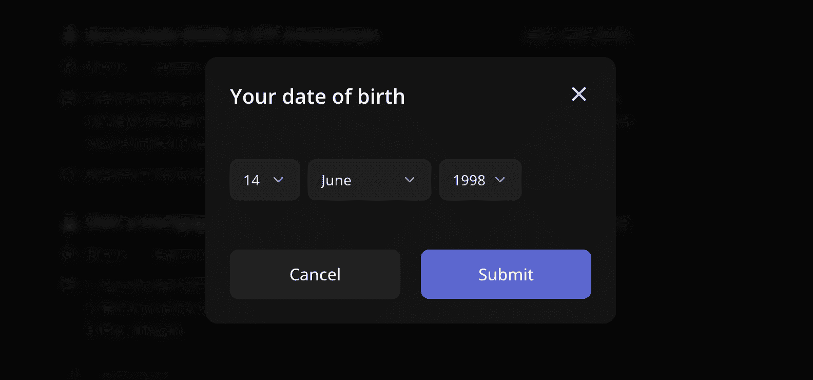
}Date of Birth Prompt
The SetDobPrompt component uses the Opener and PanelPrompt components from RadzionKit to display a prompt that opens a modal with a form for setting the date of birth. Opener is a simple wrapper around the useState hook, providing more declarative control over opener components. PanelPrompt is a component that resembles a panel but has an interactive UI with bold text at the center.
import { PanelPrompt } from "@lib/ui/panel/PanelPrompt"
import { Opener } from "@lib/ui/base/Opener"
import { SetDobForm } from "./SetDobForm"

export const SetDobPrompt = () => {
  return (
    <Opener
      renderOpener={({ onOpen, isOpen }) =>
        isOpen ? null : (
          <PanelPrompt
            onClick={onOpen}
            title="Set your birthdate for age-based goals"
          >
            Customize goals by setting milestones based on your age.
          </PanelPrompt>
        )
      }
      renderContent={({ onClose }) => <SetDobForm onFinish={onClose} />}
    />
  )
}
Managing User's Date of Birth
At Increaser, we represent the user's date of birth as a string created by calling dayToString with the Day entity. The Day entity is an object that includes a year and a day index of that year. While we could have used a regular date format, I prefer having a specific entity for a day that describes that particular point in time, as we don't need other aspects of the "Date" concept.
import { haveEqualFields } from "../record/haveEqualFields"
import { convertDuration } from "./convertDuration"
import { format, startOfYear } from "date-fns"
import { inTimeZone } from "./inTimeZone"

export type Day = {
  year: number
  dayIndex: number
}

export const toDay = (timestamp: number): Day => {
  const date = new Date(timestamp)
  const dateOffset = date.getTimezoneOffset()
  const yearStartedAt = inTimeZone(startOfYear(timestamp).getTime(), dateOffset)
  const diff = timestamp - yearStartedAt

  const day = {
    year: new Date(timestamp).getFullYear(),
    dayIndex: Math.floor(diff / convertDuration(1, "d", "ms")),
  }

  return day
}

export const dayToString = ({ year, dayIndex }: Day): string =>
  [dayIndex, year].join("-")

export const stringToDay = (str: string): Day => {
  const [dayIndex, year] = str.split("-").map(Number)

  return { dayIndex, year }
}

export const fromDay = ({ year, dayIndex }: Day): number => {
  const yearStartedAt = startOfYear(new Date(year, 0, 1)).getTime()
  return yearStartedAt + dayIndex * convertDuration(1, "d", "ms")
}

export const areSameDay = <T extends Day>(a: T, b: T): boolean =>
  haveEqualFields(["year", "dayIndex"], a, b)

export const formatDay = (timestamp: number) => format(timestamp, "EEEE, d MMM")
Setting Date of Birth
The SetDobForm is a straightforward form with a single value managed by useState. On submit, we call the updateUser mutation and close the form.
import { HStack } from "@lib/ui/layout/Stack"
import { Button } from "@lib/ui/buttons/Button"
import styled from "styled-components"
import { InputContainer } from "@lib/ui/inputs/InputContainer"
import { DayInput } from "@lib/ui/time/DayInput"
import { stringToDay, dayToString, Day } from "@lib/utils/time/Day"
import { FinishableComponentProps } from "@lib/ui/props"
import { useState } from "react"
import { LabelText } from "@lib/ui/inputs/LabelText"
import { useUpdateUserMutation } from "../../user/mutations/useUpdateUserMutation"
import { getFormProps } from "@lib/ui/form/utils/getFormProps"
import { useAssertUserState } from "../../user/UserStateContext"
import { Panel } from "@lib/ui/panel/Panel"
import { useDobBoundaries } from "./useDobBoundaries"
import { getDefaultDob } from "./getDefaultDob"

const Container = styled(HStack)`
  width: 100%;
  justify-content: space-between;
  align-items: end;
  gap: 20px;
`

export const SetDobForm = ({ onFinish }: FinishableComponentProps) => {
  const { dob } = useAssertUserState()
  const { mutate: updateUser } = useUpdateUserMutation()
  const [value, setValue] = useState<Day>(() => {
    if (dob) {
      return stringToDay(dob)
    }

    return getDefaultDob()
  })

  const [min, max] = useDobBoundaries()

  return (
    <InputContainer as="div" style={{ gap: 8 }}>
      <LabelText>Your date of birth</LabelText>
      <Panel kind="secondary">
        <Container
          as="form"
          {...getFormProps({
            onClose: onFinish,
            onSubmit: () => {
              updateUser({ dob: dayToString(value) })
              onFinish()
            },
          })}
        >
          <DayInput min={min} max={max} value={value} onChange={setValue} />
          <Button>Submit</Button>
        </Container>
      </Panel>
    </InputContainer>
  )
}
Form Submission
To support Escape and Enter key presses we use the getFormProps function. This function returns the onKeyDown and onSubmit properties for the form element.
import { preventDefault } from "../../utils/preventDefault"
import { FormEvent, KeyboardEvent } from "react"
import { stopPropagation } from "../../utils/stopPropagation"

type GetFormPropsInput = {
  onClose?: () => void
  onSubmit: () => void
  isDisabled?: boolean | string
}

export const getFormProps = ({
  onClose,
  onSubmit,
  isDisabled = false,
}: GetFormPropsInput) => {
  return {
    onKeyDown: onClose
      ? (event: KeyboardEvent<HTMLFormElement>) => {
          if (event.key === "Escape") {
            onClose()
          }
        }
      : undefined,
    onSubmit: stopPropagation<FormEvent>(
      preventDefault(() => {
        if (isDisabled) return

        onSubmit()
      })
    ),
  }
}
Date of Birth Boundaries
The useDobBoundaries hook returns the minimum and maximum date of birth values, which are 6 and 100 years ago, respectively. We use the toDay function to convert a timestamp to a Day entity and subYears from date-fns to subtract years from the current date.
import { toDay } from "@lib/utils/time/Day"
import { useMemo } from "react"
import { subYears } from "date-fns"

export const useDobBoundaries = () => {
  const maxDob = useMemo(() => toDay(subYears(Date.now(), 6).getTime()), [])
  const minDob = useMemo(() => toDay(subYears(Date.now(), 100).getTime()), [])

  return [minDob, maxDob]
}
Submitting User Date of Birth
On submit we call the updateUser mutation, which will do an optimistic update of the user state and call the appropriate API endpoint to update the user's date of birth. If you are curious about learning how the DayInput works, check out this post.
import { User } from "@increaser/entities/User"
import { useApi } from "@increaser/api-ui/state/ApiContext"
import { useMutation } from "@tanstack/react-query"
import { useUserState } from "@increaser/ui/user/UserStateContext"

export const useUpdateUserMutation = () => {
  const api = useApi()
  const { updateState } = useUserState()

  return useMutation({
    mutationFn: async (input: Partial<User>) => {
      updateState(input)

      return api.call("updateUser", input)
    },
  })
}
Goals Timeline Context
Let's move on to the timeline and define the necessary React context for this component. We need to have an interval for the timeline to know where it starts and ends, the date of birth, and an array of time labels.
import { createContextHook } from "@lib/ui/state/createContextHook"
import { Interval } from "@lib/utils/interval/Interval"
import { createContext } from "react"

type GoalsTimelineState = {
  interval: Interval
  dob: string
  timeLabels: number[]
}

export const GoalsTimelinContext = createContext<
  GoalsTimelineState | undefined
>(undefined)

export const useGoalsTimeline = createContextHook(
  GoalsTimelinContext,
  "GoalsTimelinContext"
)
Calculating Timeline Interval
The GoalsTimelineProvider component calculates the timeline interval based on the user's date of birth and active goals. The start of the timeline is either the user's last birthday or the first goal deadline, and the end is either the user's birthday three years from now or the last goal deadline plus one year.
import { ComponentWithChildrenProps } from "@lib/ui/props"
import { GoalsTimelinContext } from "./state/GoalsTimelineContext"
import { useMemo } from "react"
import { useAssertUserState } from "../../user/UserStateContext"
import { fromDay, stringToDay } from "@lib/utils/time/Day"
import { getGoalDeadlineTimestamp } from "@increaser/entities-utils/goal/getGoalDeadlineTimestamp"
import { shouldBePresent } from "@lib/utils/assert/shouldBePresent"
import { getUserAgeAt } from "@increaser/entities-utils/user/getUserAgeAt"
import { addYears } from "date-fns"
import { range } from "@lib/utils/array/range"
import { order } from "@lib/utils/array/order"
import { getLastItem } from "@lib/utils/array/getLastItem"
import { useActiveGoals } from "../hooks/useActiveGoals"
import { isEmpty } from "@lib/utils/array/isEmpty"

const maxLabelsCount = 10

export const GoalsTimelineProvider = ({
  children,
}: ComponentWithChildrenProps) => {
  const goals = useActiveGoals()
  const { dob: potentialDob } = useAssertUserState()
  const dob = shouldBePresent(potentialDob)

  const [start, minEnd] = useMemo(() => {
    const dobDate = fromDay(stringToDay(dob))

    const userAge = getUserAgeAt({
      dob,
      at: Date.now(),
    })
    let start = addYears(dobDate, userAge).getTime()

    let end = addYears(dobDate, userAge + 3).getTime()
    if (!isEmpty(goals)) {
      const orderedDeadlines = order(
        goals.map(({ deadlineAt }) =>
          getGoalDeadlineTimestamp({
            deadlineAt,
            dob,
          })
        ),
        (v) => v,
        "asc"
      )
      start = Math.min(
        start,
        addYears(
          dobDate,
          getUserAgeAt({
            dob,
            at: orderedDeadlines[0],
          }) - 1
        ).getTime()
      )

      end = Math.max(
        end,
        addYears(
          dobDate,
          getUserAgeAt({
            dob,
            at: getLastItem(orderedDeadlines),
          }) + 1
        ).getTime()
      )
    }

    return [start, end]
  }, [dob, goals])

  const [step, count] = useMemo(() => {
    const startAge = getUserAgeAt({ dob, at: start })
    const endAge = getUserAgeAt({ dob, at: minEnd })

    const initialStepCount = endAge - startAge + 1

    const step = Math.ceil(initialStepCount / maxLabelsCount)

    return [step, Math.ceil(initialStepCount / step)]
  }, [dob, minEnd, start])

  const interval = useMemo(
    () => ({
      start,
      end: addYears(start, step * count).getTime(),
    }),
    [count, start, step]
  )

  const timeLabels = useMemo(() => {
    return range(count).map((i) => addYears(start, i * step).getTime())
  }, [count, start, step])

  return (
    <GoalsTimelinContext.Provider
      value={{
        dob,
        interval,
        timeLabels,
      }}
    >
      {children}
    </GoalsTimelinContext.Provider>
  )
}
Asserting Date of Birth
We also assert the date of birth and calculate time labels to ensure that the maximum number of labels is 10, even if the user's goals span more than 10 years. We use the range function to generate an array of numbers from 0 to count and then map over it to calculate the timestamp for each label.
export const range = (length: number) => Array.from({ length }, (_, i) => i)Grouping Goals by Deadline
Since some goals might have the same deadline and we don't want them to overlap on the timeline, we group goals by their deadline and render them within a vertical stack.
import { useMemo } from "react"
import { groupItems } from "@lib/utils/array/groupItems"
import { getGoalDeadlineTimestamp } from "@increaser/entities-utils/goal/getGoalDeadlineTimestamp"
import { useGoalsTimeline } from "./state/GoalsTimelineContext"
import styled from "styled-components"
import { goalsTimelineConfig } from "./config"
import { PositionAbsolutelyCenterVertically } from "@lib/ui/layout/PositionAbsolutelyCenterVertically"
import { getIntervalDuration } from "@lib/utils/interval/getIntervalDuration"
import { toPercents } from "@lib/utils/toPercents"
import { getRecordKeys } from "@lib/utils/record/getRecordKeys"
import { VStack } from "@lib/ui/layout/Stack"
import { useActiveGoals } from "../hooks/useActiveGoals"
import { CurrentGoalProvider } from "../CurrentGoalProvider"
import { TimelineGoalItem } from "./TimelineGoalItem"

const Container = styled(VStack)`
  position: relative;
  width: 100%;
`

export const GroupedGoals = () => {
  const items = useActiveGoals()
  const { dob, interval } = useGoalsTimeline()

  const intervalDuration = getIntervalDuration(interval)

  const groupedGoals = useMemo(() => {
    return groupItems(items, ({ deadlineAt }) =>
      getGoalDeadlineTimestamp({
        deadlineAt,
        dob,
      })
    )
  }, [dob, items])

  const maxGroupSize = Math.max(
    ...Object.values(groupedGoals).map((group) => group.length)
  )

  return (
    <Container
      style={{
        height:
          maxGroupSize * goalsTimelineConfig.goalHeight +
          goalsTimelineConfig.goalsGap * (maxGroupSize - 1),
      }}
    >
      {getRecordKeys(groupedGoals).map((timestamp) => {
        const goals = groupedGoals[timestamp]
        return (
          <PositionAbsolutelyCenterVertically
            key={timestamp}
            fullHeight
            left={toPercents(
              ((timestamp as number) - interval.start) / intervalDuration
            )}
          >
            <VStack
              fullHeight
              justifyContent="end"
              gap={goalsTimelineConfig.goalsGap}
            >
              {goals.map((goal, index) => (
                <CurrentGoalProvider value={goal} key={index}>
                  <TimelineGoalItem />
                </CurrentGoalProvider>
              ))}
            </VStack>
          </PositionAbsolutelyCenterVertically>
        )
      })}
    </Container>
  )
}
Group Items Function
We use the groupItems function to group items into a record, where the key is the deadline timestamp and the value is an array of goals.
export const groupItems = <T, K extends string | number>(
  items: T[],
  getKey: (item: T) => K
): Record<K, T[]> => {
  const result = {} as Record<K, T[]>

  items.forEach((item) => {
    const key = getKey(item)
    if (!result[key]) {
      result[key] = []
    }
    result[key]?.push(item)
  })

  return result
}
Calculating Container Height
Since the size of the goal item is fixed and defined in the goalsTimelineConfig, we calculate the height of the container based on the maximum group size. We then iterate over the grouped goals, calculate the left position based on the timestamp, and render the TimelineGoalItem component.
export const goalsTimelineConfig = {
  timeLabelHeight: 20,
  labelsHeight: 52,
  goalHeight: 40,
  goalsGap: 4,
}
Positioning Goals
To avoid prop-drilling, we leverage the CurrentGoalProvider component, which receives the goal as a value and makes it available to all child components. To easily create such providers, we use the getValueProviderSetup function from RadzionKit.
import { Goal } from "@increaser/entities/Goal"
import { getValueProviderSetup } from "@lib/ui/state/getValueProviderSetup"

export const { useValue: useCurrentGoal, provider: CurrentGoalProvider } =
  getValueProviderSetup<Goal>("Goal")
Rendering Goal Items
The TimelineGoalItem component renders the goal emoji and an indicator that represents the goal status. We use the useTheme hook from styled-components to access the theme and apply the appropriate color to the indicator.
import styled, { useTheme } from "styled-components"
import { goalsTimelineConfig } from "./config"

import { round } from "@lib/ui/css/round"
import { getColor } from "@lib/ui/theme/getters"
import { centerContent } from "@lib/ui/css/centerContent"
import { sameDimensions } from "@lib/ui/css/sameDimensions"
import { getGoalStatusColor } from "../getGoalStatusColor"
import { useCurrentGoal } from "../CurrentGoalProvider"

const Container = styled.div`
  border: 2px solid ${getColor("mistExtra")};
  ${round}
  color: ${getColor("contrast")};
  background: ${getColor("background")};

  ${centerContent};
  ${sameDimensions(goalsTimelineConfig.goalHeight)};
  position: relative;
  font-size: 20px;
`

const Indicator = styled.div`
  position: absolute;
  ${sameDimensions(8)};
  ${round};
  right: 0;
  bottom: 0;
`

export const TimelineGoalItem = () => {
  const { emoji, status } = useCurrentGoal()

  const theme = useTheme()

  return (
    <Container>
      {emoji}
      <Indicator
        style={{
          background: getGoalStatusColor(status, theme).toCssValue(),
        }}
      />
    </Container>
  )
}
Centering Goals Vertically
To make it easier to position the goals on the timeline by their center coordinate, we use the PositionAbsolutelyCenterVertically component from RadzionKit. This component uses a combination of absolute and relative positioning to vertically center the content.
import styled from "styled-components"
import { ComponentWithChildrenProps, UIComponentProps } from "../props"

type PositionAbsolutelyCenterVerticallyProps = ComponentWithChildrenProps &
  UIComponentProps & {
    left: React.CSSProperties["left"]
    fullHeight?: boolean
  }

const Wrapper = styled.div`
  position: absolute;
  top: 0;
`

const Container = styled.div`
  position: relative;
  display: flex;
  justify-content: center;
`

const Content = styled.div`
  position: absolute;
  top: 0;
`

export const PositionAbsolutelyCenterVertically = ({
  left,
  children,
  fullHeight,
  className,
  style = {},
}: PositionAbsolutelyCenterVerticallyProps) => {
  return (
    <Wrapper
      className={className}
      style={{ ...style, left, height: fullHeight ? "100%" : undefined }}
    >
      <Container style={{ height: fullHeight ? "100%" : undefined }}>
        <Content style={{ height: fullHeight ? "100%" : undefined }}>
          {children}
        </Content>
      </Container>
    </Wrapper>
  )
}
Displaying Time Labels
To display labels on the timeline, we use the TimeLabels component. We calculate the left position of each label based on the timestamp and the interval duration. Additionally, we use the getUserAgeAt function to calculate the user's age at a specific timestamp.
import styled from "styled-components"
import { useGoalsTimeline } from "./state/GoalsTimelineContext"
import { toSizeUnit } from "@lib/ui/css/toSizeUnit"
import { goalsTimelineConfig } from "./config"
import { useMemo } from "react"
import { getUserAgeAt } from "@increaser/entities-utils/user/getUserAgeAt"
import { getIntervalDuration } from "@lib/utils/interval/getIntervalDuration"
import { toPercents } from "@lib/utils/toPercents"
import { Text } from "@lib/ui/text"
import { VStack } from "@lib/ui/layout/Stack"
import { getColor } from "@lib/ui/theme/getters"

const Label = styled(VStack)`
  font-size: 12px;
  height: ${toSizeUnit(goalsTimelineConfig.timeLabelHeight)};
  justify-content: end;
  padding-left: 4px;
  color: ${getColor("textSupporting")};
  border-left: 1px solid ${getColor("mistExtra")};
  position: absolute;
  top: 0;
`

export const TimeLabels = () => {
  const { interval, dob, timeLabels } = useGoalsTimeline()

  const intervalDuration = useMemo(
    () => getIntervalDuration(interval),
    [interval]
  )

  return (
    <>
      {timeLabels.map((timestamp) => {
        return (
          <Label
            style={{
              left: toPercents((timestamp - interval.start) / intervalDuration),
            }}
            key={timestamp}
          >
            <Text size={12} nowrap>
              {getUserAgeAt({ dob, at: timestamp })}
            </Text>
          </Label>
        )
      })}
    </>
  )
}
Showing User's Current Age
Since it's important to see goals in relation to the user's current age, we display the user's current age on the timeline as well. If the user made a mistake in setting their date of birth, they can easily correct it by clicking on the age.
import { getIntervalDuration } from "@lib/utils/interval/getIntervalDuration"
import { useGoalsTimeline } from "./state/GoalsTimelineContext"
import { toSizeUnit } from "@lib/ui/css/toSizeUnit"
import { VStack } from "@lib/ui/layout/Stack"
import { getColor } from "@lib/ui/theme/getters"
import styled from "styled-components"
import { goalsTimelineConfig } from "./config"
import { toPercents } from "@lib/utils/toPercents"
import { shouldBePresent } from "@lib/utils/assert/shouldBePresent"
import { fromDay, stringToDay } from "@lib/utils/time/Day"
import { formatDuration, intervalToDuration } from "date-fns"
import { interactive } from "@lib/ui/css/interactive"
import { transition } from "@lib/ui/css/transition"
import { Opener } from "@lib/ui/base/Opener"
import { SetDobOverlay } from "../dob/SetDobOverlay"

const Container = styled(VStack)`
  height: ${toSizeUnit(goalsTimelineConfig.labelsHeight)};
  justify-content: end;
  color: ${getColor("primary")};
  border-left: 1px solid;
  position: absolute;
  top: 0;
  ${interactive};
  ${transition};
`

const Content = styled.div`
  border-radius: 0 4px 4px 0;
  padding: 4px 8px;
  font-weight: 500;
  font-size: 12px;

  border: 1px solid ${getColor("primary")};
  border-left: 0;
  color: ${({ theme }) =>
    theme.colors.primary
      .getHighestContrast(theme.colors.background, theme.colors.contrast)
      .toCssValue()};
  &:hover {
    background: ${getColor("foreground")};
  }
`

export const CurrentAge = () => {
  const { interval, dob } = useGoalsTimeline()

  const now = Date.now()

  const intervalDuration = getIntervalDuration(interval)

  const dobTimestamp = fromDay(stringToDay(shouldBePresent(dob)))
  const duration = intervalToDuration({
    start: dobTimestamp,
    end: Date.now(),
  })

  return (
    <Opener
      renderOpener={({ onOpen }) => (
        <Container
          onClick={onOpen}
          style={{
            left: toPercents((now - interval.start) / intervalDuration),
          }}
        >
          <Content>
            {formatDuration(duration, {
              format: ["years", "months", "days"],
            })}
          </Content>
        </Container>
      )}
      renderContent={({ onClose }) => <SetDobOverlay onFinish={onClose} />}
    />
  )
}
Goals List
With the timeline and grouped goals in place, we can now move on to the goals list. We wrap it with the ActiveItemIdProvider component to make the active goal ID available to all child components. This can be useful in situations where other items need to adjust their appearance if one item is active. For example, in a drag-and-drop list, we might want to disable dragging of items when one item is active. In our case, the active item is the one being edited.
import { getStateProviderSetup } from "../state/getStateProviderSetup"

export const { useState: useActiveItemId, provider: ActiveItemIdProvider } =
  getStateProviderSetup<string | null>("ActiveItemId")
Displaying Goals
To display the goals, we retrieve the active items from the state using the useActiveGoals hook and render the GoalItem component for each item. We wrap each GoalItem with the CurrentGoalProvider component to make the goal available to all child components.
import { VStack } from "@lib/ui/layout/Stack"
import { GoalItem } from "./GoalItem"
import { CurrentGoalProvider } from "./CurrentGoalProvider"
import { useActiveGoals } from "./hooks/useActiveGoals"

export const Goals = () => {
  const items = useActiveGoals()

  return (
    <VStack>
      {items.map((item) => (
        <CurrentGoalProvider key={item.id} value={item}>
          <GoalItem />
        </CurrentGoalProvider>
      ))}
    </VStack>
  )
}
Goal Item Content
If the current goal is active, the GoalItem component will render the EditGoalForm component. Otherwise, it will render the GoalItemContent component wrapped with a Hoverable component from RadzionKit. You can learn more about Hoverable here.
import styled from "styled-components"
import { Hoverable } from "@lib/ui/base/Hoverable"
import { verticalPadding } from "@lib/ui/css/verticalPadding"
import { goalVerticalPadding } from "./config"
import { useActiveItemId } from "@lib/ui/list/ActiveItemIdProvider"
import { useCurrentGoal } from "./CurrentGoalProvider"
import { EditGoalForm } from "./form/EditGoalForm"
import { GoalItemContent } from "./GoalItemContent"

const Container = styled(Hoverable)`
  ${verticalPadding(goalVerticalPadding)};
  text-align: start;
  width: 100%;
`

export const GoalItem = () => {
  const { id } = useCurrentGoal()

  const [activeItemId, setActiveItemId] = useActiveItemId()

  if (activeItemId === id) {
    return <EditGoalForm />
  }

  return (
    <Container
      onClick={() => {
        setActiveItemId(id)
      }}
      verticalOffset={0}
    >
      <GoalItemContent />
    </Container>
  )
}
In the GoalItemContent, we display the goal name prefixed with an emoji and the goal status tag on the right. We then show how much time is left before the deadline. If the goal has a plan, we render the GoalPlan component. If the goal has task factories, we render the GoalTaskFactories component.
import { HStack, VStack } from "@lib/ui/layout/Stack"
import { Text } from "@lib/ui/text"
import styled from "styled-components"
import { toSizeUnit } from "@lib/ui/css/toSizeUnit"
import { useCurrentGoal } from "./CurrentGoalProvider"
import { GoalStatusTag } from "./GoalStatusTag"
import { getColor } from "@lib/ui/theme/getters"
import { GoalDeadline } from "./GoalDeadline"
import { EmojiTextPrefix } from "@lib/ui/text/EmojiTextPrefix"
import { GoalPlan } from "./GoalPlan"
import { GoalTaskFactories } from "./GoalTaskFactories"
import { tightListItemConfig } from "@lib/ui/list/tightListItemConfig"

const Name = styled(Text)`
  text-align: start;
  font-weight: 500;
  color: ${getColor("contrast")};
  font-size: 16px;
  line-height: ${toSizeUnit(tightListItemConfig.lineHeight)};
`

export const GoalItemContent = () => {
  const { name, emoji, plan, taskFactories } = useCurrentGoal()

  const hasTaskFactories = taskFactories && taskFactories.length > 0

  return (
    <VStack gap={8}>
      <HStack alignItems="start" justifyContent="space-between" gap={8}>
        <Name>
          <EmojiTextPrefix emoji={emoji} />
          {name}
        </Name>
        <GoalStatusTag />
      </HStack>
      <GoalDeadline />
      {plan && <GoalPlan />}
      {hasTaskFactories && <GoalTaskFactories />}
    </VStack>
  )
}
Goal Status Tag
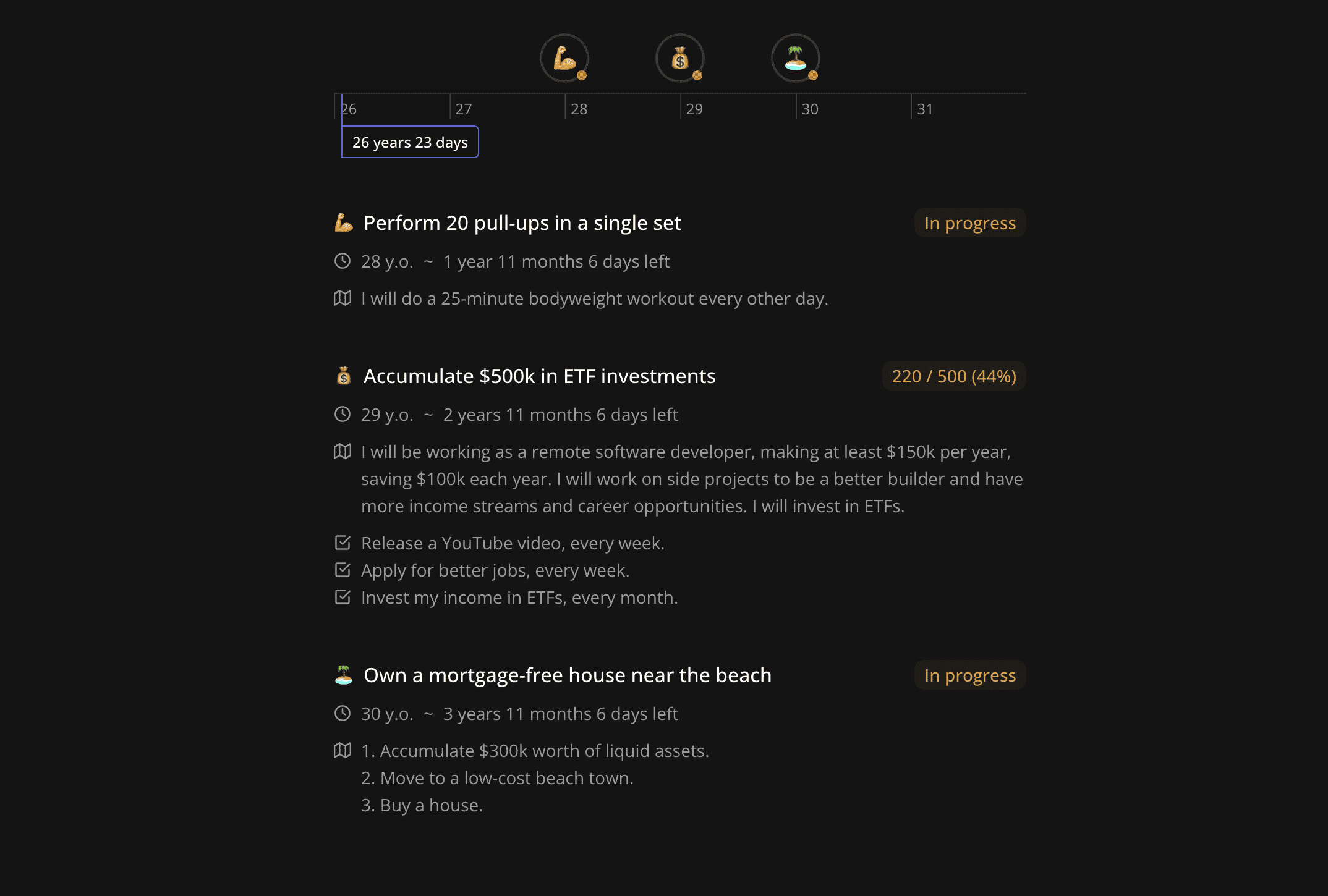
In the GoalStatusTag, we display the goal status as text with a corresponding color. For measurable goals, we also display the current value, the target value, and the percentage of completion.
import { toSizeUnit } from "@lib/ui/css/toSizeUnit"
import styled, { useTheme } from "styled-components"
import { borderRadius } from "@lib/ui/css/borderRadius"
import { coloredTag } from "@lib/ui/css/coloredTag"
import { getGoalStatusColor } from "./getGoalStatusColor"
import { HSLA } from "@lib/ui/colors/HSLA"
import { centerContent } from "@lib/ui/css/centerContent"
import { horizontalPadding } from "@lib/ui/css/horizontalPadding"
import { goalStatusNameRecord } from "@increaser/entities/Goal"
import { useCurrentGoal } from "./CurrentGoalProvider"
import { useMemo } from "react"
import { toPercents } from "@lib/utils/toPercents"
import { tightListItemConfig } from "@lib/ui/list/tightListItemConfig"

const Container = styled.div<{ $color: HSLA }>`
  height: ${toSizeUnit(tightListItemConfig.lineHeight)};
  ${borderRadius.s};
  font-size: 14px;
  flex-shrink: 0;
  font-weight: 500;
  ${centerContent};
  ${horizontalPadding(8)}
  ${({ $color }) => coloredTag($color)}
`

export const GoalStatusTag = () => {
  const theme = useTheme()

  const { status, target } = useCurrentGoal()

  const text = useMemo(() => {
    if (!target || !target.value || !target.current) {
      return goalStatusNameRecord[status]
    }

    return `${target.current} / ${target.value} (${toPercents(
      target.current / target.value,
      "round"
    )})`
  }, [status, target])

  return (
    <Container
      style={{ flexShrink: 0 }}
      $color={getGoalStatusColor(status, theme)}
    >
      {text}
    </Container>
  )
}
Goal Deadline
In the GoalDeadline component, we first display either the user's age or a date using the formatGoalDeadline function. If the goal is not overdue, we also display the time left until the deadline using the formatGoalTimeLeft function.
import { useCurrentGoal } from "./CurrentGoalProvider"
import { ClockIcon } from "@lib/ui/icons/ClockIcon"
import { convertDuration } from "@lib/utils/time/convertDuration"
import { Text } from "@lib/ui/text"
import { useAssertUserState } from "../user/UserStateContext"
import { getGoalDeadlineTimestamp } from "@increaser/entities-utils/goal/getGoalDeadlineTimestamp"
import { formatGoalDeadline } from "@increaser/entities-utils/goal/formatGoalDeadline"
import { HStackSeparatedBy } from "@lib/ui/layout/StackSeparatedBy"
import { formatGoalTimeLeft } from "@increaser/entities-utils/goal/formatGoalTimeLeft"
import { useRhythmicRerender } from "@lib/ui/hooks/useRhythmicRerender"
import { GoalSection } from "./GoalSection"

export const GoalDeadline = () => {
  const { dob } = useAssertUserState()
  const { deadlineAt } = useCurrentGoal()

  const now = useRhythmicRerender(convertDuration(1, "min", "ms"))
  const deadlineTimestamp = getGoalDeadlineTimestamp({
    deadlineAt,
    dob,
  })

  return (
    <GoalSection icon={<ClockIcon />}>
      <HStackSeparatedBy gap={8} separator={"~"}>
        <Text>{formatGoalDeadline(deadlineAt)}</Text>
        {deadlineTimestamp > now && (
          <Text>{formatGoalTimeLeft(deadlineTimestamp)}</Text>
        )}
      </HStackSeparatedBy>
    </GoalSection>
  )
}
Both the GoalPlan and GoalTaskFactories components use the GoalSection component to display the corresponding icon on the left and have a text content on the right.
import { HStack } from "@lib/ui/layout/Stack"
import styled from "styled-components"
import { getColor } from "@lib/ui/theme/getters"
import { ComponentWithChildrenProps } from "@lib/ui/props"
import { ReactNode } from "react"
import { toSizeUnit } from "@lib/ui/css/toSizeUnit"
import { IconWrapper } from "@lib/ui/icons/IconWrapper"

const lineHeight = 22

const Container = styled(HStack)`
  font-size: 14px;
  align-items: start;
  gap: 8px;
  color: ${getColor("textSupporting")};
  white-space: pre-line;
  line-height: ${toSizeUnit(lineHeight)};
`

const IconContainer = styled(IconWrapper)`
  height: ${toSizeUnit(lineHeight)};
`

type GoalSectionProps = ComponentWithChildrenProps & {
  icon: ReactNode
}

export const GoalSection = ({ children, icon }: GoalSectionProps) => {
  return (
    <Container>
      <IconContainer>{icon}</IconContainer>
      {children}
    </Container>
  )
}
Goal Plan and Task Factories
The GoalPlan is simply plain text, while the GoalTaskFactories component iterates over the taskFactories array, displaying the task name and cadence within a GoalSection prefixed with a checkmark icon.
import { useCurrentGoal } from "./CurrentGoalProvider"
import { useAssertUserState } from "../user/UserStateContext"
import { taskCadenceName } from "@increaser/entities/TaskFactory"
import { shouldBePresent } from "@lib/utils/assert/shouldBePresent"
import { Text } from "@lib/ui/text"
import { GoalSection } from "./GoalSection"
import { CheckSquareIcon } from "@lib/ui/icons/CheckSquareIcon"
import { VStack } from "@lib/ui/layout/Stack"

export const GoalTaskFactories = () => {
  const { taskFactories } = useCurrentGoal()
  const { taskFactories: taskFactoriesRecord } = useAssertUserState()

  return (
    <VStack>
      {shouldBePresent(taskFactories).map((id) => {
        if (!taskFactoriesRecord[id]) {
          return null
        }
        const { task, cadence } = taskFactoriesRecord[id]

        const text = `${task.name}, ${taskCadenceName[cadence].toLowerCase()}.`
        return (
          <GoalSection icon={<CheckSquareIcon />}>
            <Text>{text}</Text>
          </GoalSection>
        )
      })}
    </VStack>
  )
}
Editing and Creating Goals
When the user clicks on the goal item, we show the EditGoalForm component, which allows the user to edit or delete the goal. We display the form within a Panel component from RadzionKit.
import { useCallback, useState } from "react"
import { Panel } from "@lib/ui/panel/Panel"
import { VStack } from "@lib/ui/layout/Stack"
import { useCurrentGoal } from "../CurrentGoalProvider"
import { Goal } from "@increaser/entities/Goal"
import { useUpdateGoalMutation } from "../api/useUpdateGoalMutation"
import { useDeleteGoalMutation } from "../api/useDeleteGoalMutation"
import { GoalNameInput } from "./GoalNameInput"
import { GoalStatusSelector } from "./GoalStatusSelector"
import { useActiveItemId } from "@lib/ui/list/ActiveItemIdProvider"
import { GoalDeadlineInput } from "./GoalDeadlineInput"
import { shouldBePresent } from "@lib/utils/assert/shouldBePresent"
import { GoalFormShape } from "./GoalFormShape"
import { useIsGoalFormDisabled } from "./useIsGoalFormDisabled"
import { getFormProps } from "@lib/ui/form/utils/getFormProps"
import { EmojiInput } from "@increaser/app/ui/EmojiInput"
import { GoalFormHeader } from "./GoalFormHeader"
import { GoalPlanInput } from "./GoalPlanInput"
import { GoalTargetInput } from "./GoalTargetInput"
import { GoalTaskFactoriesInput } from "./GoalTaskFactoriesInput"
import { pick } from "@lib/utils/record/pick"
import { EditDeleteFormFooter } from "@lib/ui/form/components/EditDeleteFormFooter"
import { getUpdatedValues } from "@lib/utils/record/recordDiff"
import { omit } from "@lib/utils/record/omit"

export const EditGoalForm = () => {
  const goalAttribute = useCurrentGoal()
  const [value, setValue] = useState<GoalFormShape>({
    ...pick(goalAttribute, ["name", "status", "emoji", "deadlineAt"]),
    plan: goalAttribute.plan ?? "",
    target: goalAttribute.target ?? null,
    taskFactories: goalAttribute.taskFactories ?? [],
  })

  const { mutate: updateGoal } = useUpdateGoalMutation()
  const { mutate: deleteGoal } = useDeleteGoalMutation()

  const [, setActiveItemId] = useActiveItemId()

  const onFinish = useCallback(() => {
    setActiveItemId(null)
  }, [setActiveItemId])

  const isDisabled = useIsGoalFormDisabled(value)

  const onSubmit = useCallback(() => {
    if (isDisabled) {
      return
    }

    const fields: Partial<Omit<Goal, "id">> = getUpdatedValues(
      omit(goalAttribute, "id"),
      {
        ...value,
        deadlineAt: shouldBePresent(value.deadlineAt),
      }
    )

    updateGoal({
      id: goalAttribute.id,
      fields,
    })
    onFinish()
  }, [goalAttribute, isDisabled, onFinish, updateGoal, value])

  return (
    <Panel
      withSections
      kind="secondary"
      as="form"
      {...getFormProps({
        onClose: onFinish,
        isDisabled,
        onSubmit,
      })}
      style={{ width: "100%" }}
    >
      <GoalFormHeader>
        <div>
          <EmojiInput
            value={value.emoji}
            onChange={(emoji) => setValue((prev) => ({ ...prev, emoji }))}
          />
        </div>
        <GoalNameInput
          autoFocus
          onChange={(name) => setValue((prev) => ({ ...prev, name }))}
          value={value.name}
          onSubmit={onSubmit}
        />
      </GoalFormHeader>
      <VStack alignItems="start">
        <GoalStatusSelector
          value={value.status}
          onChange={(status) => setValue((prev) => ({ ...prev, status }))}
        />
      </VStack>
      <GoalDeadlineInput
        value={value.deadlineAt}
        onChange={(deadlineAt) => setValue((prev) => ({ ...prev, deadlineAt }))}
      />
      <GoalTargetInput
        value={value.target}
        onChange={(target) => setValue((prev) => ({ ...prev, target }))}
      />
      <GoalPlanInput
        onChange={(plan) => setValue((prev) => ({ ...prev, plan }))}
        value={value.plan}
      />
      <GoalTaskFactoriesInput
        onChange={(taskFactories) =>
          setValue((prev) => ({ ...prev, taskFactories }))
        }
        value={value.taskFactories}
      />
      <EditDeleteFormFooter
        onDelete={() => {
          deleteGoal({ id: goalAttribute.id })
          onFinish()
        }}
        onCancel={onFinish}
        isDisabled={isDisabled}
      />
    </Panel>
  )
}
Editing Goals
On finish or cancel, we call the setActiveItemId with null to close the form. When submitting the form, we call the updateGoal mutation with the updated goal fields which are being diffed using the getUpdatedValues function.
export const getUpdatedValues = <T extends Record<string, any>>(
  original: T,
  updated: T
): Partial<T> => {
  const result: Partial<T> = {}

  for (const key in original) {
    if (original[key] !== updated[key]) {
      result[key] = updated[key]
    }
  }

  return result
}
Form Footer
There are quite a few inputs that go into the EditGoalForm component, and we won't go into detail about each one. Since these types of forms are quite common in Increaser, we use the EditDeleteFormFooter component to hold the Delete, Cancel, and Save buttons.
import { Button } from "../../buttons/Button"
import { HStack } from "../../layout/Stack"

type EditDeleteFormFooterProps = {
  onDelete: () => void
  onCancel: () => void
  isDisabled?: string | boolean
}

export const EditDeleteFormFooter = ({
  onCancel,
  onDelete,
  isDisabled,
}: EditDeleteFormFooterProps) => {
  return (
    <HStack
      wrap="wrap"
      justifyContent="space-between"
      fullWidth
      alignItems="center"
      gap={20}
    >
      <Button kind="alert" type="button" onClick={onDelete}>
        Delete
      </Button>
      <HStack alignItems="center" gap={8}>
        <Button
          type="button"
          isDisabled={isDisabled}
          onClick={onCancel}
          kind="secondary"
        >
          Cancel
        </Button>
        <Button>Save</Button>
      </HStack>
    </HStack>
  )
}
Adding a New Goal
To prompt the user to add a new goal, we use a combination of the Opener and ListAddButton components from RadzionKit.
import { Opener } from "@lib/ui/base/Opener"
import { CreateGoalForm } from "./form/CreateGoalForm"
import { ListAddButton } from "@lib/ui/list/ListAddButton"

export const AddGoal = () => {
  return (
    <Opener
      renderOpener={({ onOpen, isOpen }) =>
        isOpen ? null : <ListAddButton onClick={onOpen} text="Add a goal" />
      }
      renderContent={({ onClose }) => <CreateGoalForm onFinish={onClose} />}
    />
  )
}
Creating a Goal
To create a new goal, we use the CreateGoalForm component, which is very similar to the EditGoalForm component.
import { useCallback, useState } from "react"
import { FinishableComponentProps } from "@lib/ui/props"
import { getId } from "@increaser/entities-utils/shared/getId"
import { Panel } from "@lib/ui/panel/Panel"
import { HStack } from "@lib/ui/layout/Stack"
import { Button } from "@lib/ui/buttons/Button"
import { useCreateGoalMutation } from "../api/useCreateGoalMutation"
import { getFormProps } from "@lib/ui/form/utils/getFormProps"
import { GoalNameInput } from "./GoalNameInput"
import { GoalStatusSelector } from "./GoalStatusSelector"
import { GoalDeadlineInput } from "./GoalDeadlineInput"
import { shouldBePresent } from "@lib/utils/assert/shouldBePresent"
import { GoalFormShape } from "./GoalFormShape"
import { randomlyPick } from "@lib/utils/array/randomlyPick"
import { useIsGoalFormDisabled } from "./useIsGoalFormDisabled"
import { EmojiInput } from "@increaser/app/ui/EmojiInput"
import { GoalFormHeader } from "./GoalFormHeader"
import { GoalPlanInput } from "./GoalPlanInput"
import { GoalTargetInput } from "./GoalTargetInput"
import { defaultEmojis } from "@lib/utils/entities/EntityWithEmoji"
import { GoalTaskFactoriesInput } from "./GoalTaskFactoriesInput"

export const CreateGoalForm = ({ onFinish }: FinishableComponentProps) => {
  const [value, setValue] = useState<GoalFormShape>({
    name: "",
    status: "inProgress",
    deadlineAt: null,
    emoji: randomlyPick(defaultEmojis),
    target: null,
    plan: "",
    taskFactories: [],
  })
  const { mutate } = useCreateGoalMutation()

  const isDisabled = useIsGoalFormDisabled(value)

  const onSubmit = useCallback(() => {
    if (isDisabled) return

    mutate({
      id: getId(),
      ...value,
      deadlineAt: shouldBePresent(value.deadlineAt),
    })
    onFinish()
  }, [isDisabled, mutate, onFinish, value])

  return (
    <Panel
      withSections
      kind="secondary"
      as="form"
      {...getFormProps({
        onClose: onFinish,
        isDisabled,
        onSubmit,
      })}
    >
      <GoalFormHeader>
        <div>
          <EmojiInput
            value={value.emoji}
            onChange={(emoji) => setValue((prev) => ({ ...prev, emoji }))}
          />
        </div>
        <GoalNameInput
          autoFocus
          onChange={(name) => setValue((prev) => ({ ...prev, name }))}
          value={value.name}
          onSubmit={onSubmit}
        />
      </GoalFormHeader>
      <GoalDeadlineInput
        onChange={(deadlineAt) => setValue((prev) => ({ ...prev, deadlineAt }))}
        value={value.deadlineAt}
      />
      <GoalTargetInput
        onChange={(target) => setValue((prev) => ({ ...prev, target }))}
        value={value.target}
      />
      <GoalPlanInput
        onChange={(plan) => setValue((prev) => ({ ...prev, plan }))}
        value={value.plan}
      />
      <GoalTaskFactoriesInput
        onChange={(taskFactories) =>
          setValue((prev) => ({ ...prev, taskFactories }))
        }
        value={value.taskFactories}
      />
      <HStack justifyContent="space-between" fullWidth alignItems="center">
        <GoalStatusSelector
          onChange={(status) => setValue((prev) => ({ ...prev, status }))}
          value={value.status}
        />
        <HStack alignItems="center" gap={8}>
          <Button onClick={onFinish} kind="secondary">
            Cancel
          </Button>
          <Button isDisabled={isDisabled}>Submit</Button>
        </HStack>
      </HStack>
    </Panel>
  )
}
Reusing Inputs
We reuse the same inputs and leverage the same useIsGoalFormDisabled hook to ensure that both the name and deadline are present.
import { useMemo } from "react"
import { GoalFormShape } from "./GoalFormShape"

export const useIsGoalFormDisabled = ({ name, deadlineAt }: GoalFormShape) => {
  return useMemo(() => {
    if (!name.trim()) {
      return "Name is required"
    }

    if (!deadlineAt) {
      return "Deadline is required"
    }
  }, [deadlineAt, name])
}