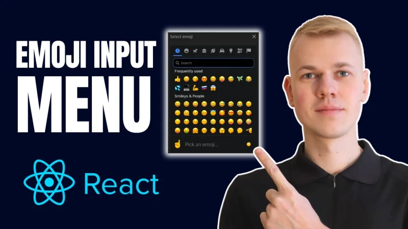
How To Make Emoji Input Menu React Component with Emoji Mart

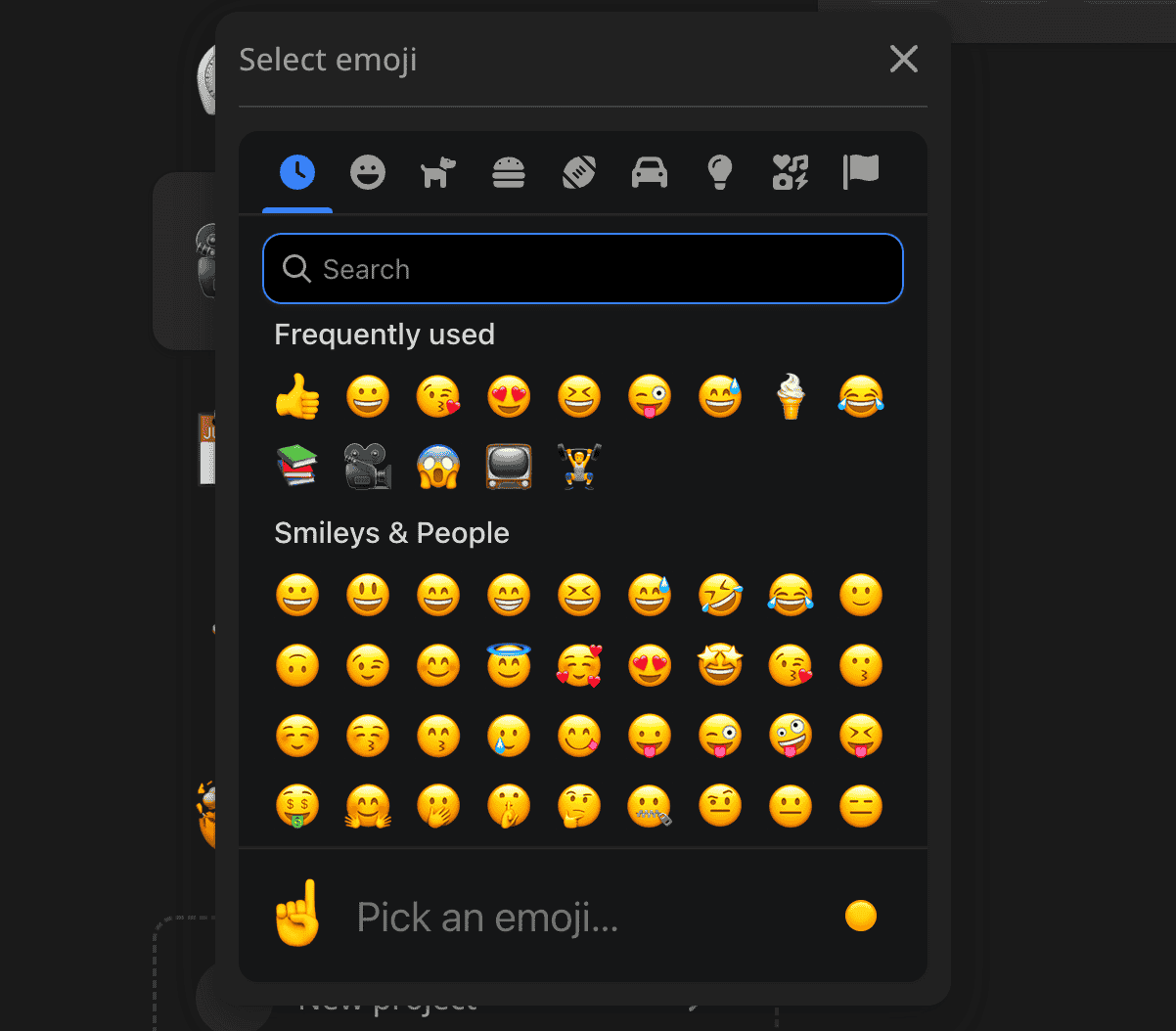
Let me share a reusable React component for choosing an emoji. That's how I use it in my app at increaser.org to assign an emoji to a project.
The EmojiInput component receives only two properties:
value- selected emojionChange- a function that is called when the value changes
import { Spinner } from "lib/ui/Spinner"
import { HStack } from "lib/ui/Stack"
import { centerContentCSS } from "lib/ui/utils/centerContentCSS"
import { Suspense, lazy } from "react"
import styled from "styled-components"
import { ExpandableInputOpener } from "../ExpandableInputOpener"
import { Menu } from "lib/ui/Menu"
import { Text } from "lib/ui/Text"
import { InputProps } from "lib/shared/props"

const EmojiPicker = lazy(() => import("./EmojiPicker"))

interface EmojiInputProps extends InputProps<string> {}

const EmojiMartFallback = styled.div`
  width: 352px;
  height: 435px;
  ${centerContentCSS};
`

export const EmojiInput = ({ value, onChange }: EmojiInputProps) => {
  return (
    <Menu
      title="Select an emoji"
      renderOpener={(props) => (
        <ExpandableInputOpener type="button" {...props}>
          <Text color="contrast" size={32}>
            {value}
          </Text>
        </ExpandableInputOpener>
      )}
      renderContent={({ onClose }) => (
        <Suspense
          fallback={
            <EmojiMartFallback>
              <HStack gap={4} alignItems="center">
                <Spinner />
                <Text>Loading emoji picker</Text>
              </HStack>
            </EmojiMartFallback>
          }
        >
          <EmojiPicker
            onSelect={(value) => {
              onChange(value)
              onClose()
            }}
          />
        </Suspense>
      )}
    />
  )
}
To show a responsive menu that becomes a slideover on mobile we rely on the Menu component, you can learn more about it in this article. For a button that opens the menu, we use the ExpandableInputOpener component.
import styled from "styled-components"
import { defaultTransitionCSS } from "ui/animations/transitions"
import { defaultBorderRadiusCSS } from "ui/borderRadius"
import { inputDefaultHeight } from "ui/Input/helpers/getInputShapeCSS"
import { getColor } from "ui/theme/getters"
import { centerContentCSS } from "ui/utils/centerContentCSS"
import { getSameDimensionsCSS } from "ui/utils/getSameDimensionsCSS"

import { UnstyledButton } from "./UnstyledButton"

export const ExpandableInputOpener = styled(UnstyledButton)`
  ${centerContentCSS}
  ${defaultBorderRadiusCSS}
  ${defaultTransitionCSS}

  ${getSameDimensionsCSS(inputDefaultHeight)};

  background: ${getColor("backgroundGlass")};

  &:hover {
    background: ${getColor("backgroundGlass2")};
  }
`
The EmojiPicker component is a wrapper around the emoji-mart library, and we don't want to include this library in the bundle, and rather lazy load it when needed. That's why we use the lazy function and the Suspense component from React.
import data from "@emoji-mart/data"
import Picker from "@emoji-mart/react"
import { SelectableComponentProps } from "lib/shared/props"
import { useTheme } from "styled-components"

const EmojiPicker = ({ onSelect }: SelectableComponentProps<string>) => {
  const { name } = useTheme()

  return (
    <Picker
      autoFocus
      data={data}
      theme={name}
      showPreview={false}
      showSkinTones={false}
      onEmojiSelect={(emoji: any) => {
        if (!emoji?.native) return

        onSelect(emoji.native)
      }}
    />
  )
}

export default EmojiPicker