How To Make Popover Menu React Component With Floating UI

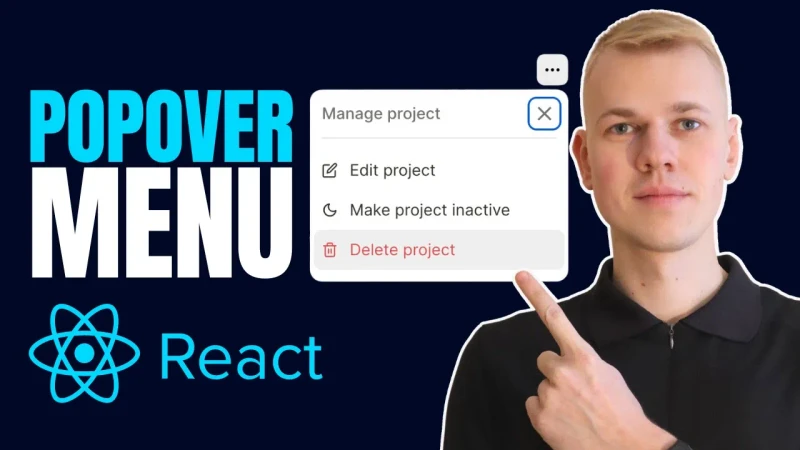
Let me share a reusable React component for displaying a menu that often saves me time, and I believe you will find it helpful too. Here's an example from my app at increaser.org
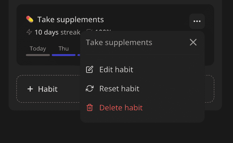
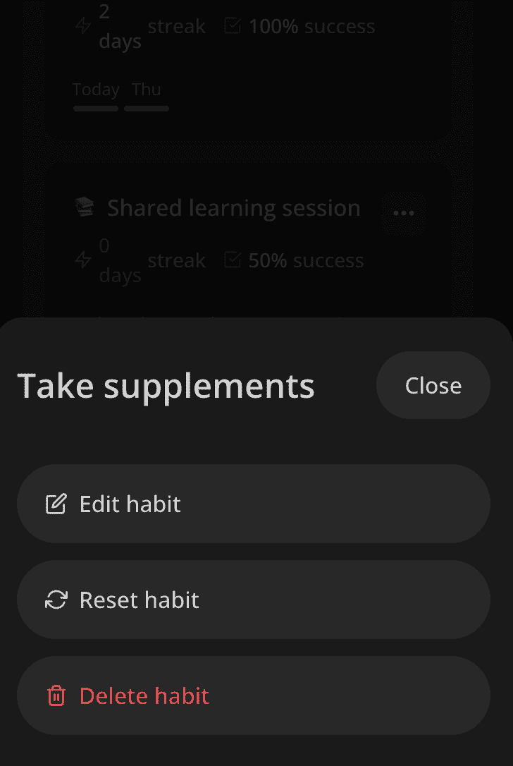
I use this component in various situations, and here we have a button that opens options for a habit. On mobile, it will display the content in a bottom slide-over.
The Menu component receives three properties:
title- the title of the menurenderOpener- a function that returns a component that opens the menurenderContent- a function that returns the content of the menu
import { ReactNode } from "react"

import { PopoverMenu, PopoverMenuProps } from "./PopoverMenu"
import { ResponsiveView } from "../ResponsiveView"
import { Opener } from "../Opener"
import { BottomSlideOver } from "../BottomSlideOver"

export type MenuView = "popover" | "slideover"

interface RenderContentParams {
  view: MenuView
  onClose: () => void
}

interface MenuProps extends Pick<PopoverMenuProps, "title" | "renderOpener"> {
  renderContent: (params: RenderContentParams) => ReactNode
}

export const Menu = ({ renderOpener, title, renderContent }: MenuProps) => {
  return (
    <ResponsiveView
      small={() => (
        <Opener
          renderOpener={({ onOpen }) =>
            renderOpener({
              onClick: onOpen,
              ref: () => {},
            })
          }
          renderContent={({ onClose }) => (
            <BottomSlideOver onClose={onClose} title={title}>
              {renderContent({ onClose, view: "slideover" })}
            </BottomSlideOver>
          )}
        />
      )}
      normal={() => (
        <PopoverMenu
          title={title}
          renderOpener={renderOpener}
          renderContent={({ onClose }) =>
            renderContent({ view: "popover", onClose })
          }
        />
      )}
    />
  )
}
To determine when to use slide-over and when to use popover, we have a simple ResponsiveView component that renders different content depending on the screen size.
import { ReactNode } from "react"

import { useIsScreenWidthLessThan } from "./hooks/useIsScreenWidthLessThan"

interface ResponsiveViewProps {
  small: () => ReactNode
  normal: () => ReactNode
}

const smallScreenWidth = 600

export const ResponsiveView = ({ small, normal }: ResponsiveViewProps) => {
  const isSmallScreen = useIsScreenWidthLessThan(smallScreenWidth)

  return <>{(isSmallScreen ? small : normal)()}</>
}
We pass the view to the renderContent function so that the parent component can adjust the experience for different screen sizes. In the previes example we showed big buttons on the mobile slide-over and small options on the desktop popover.
<Menu
  title="Manage project"
  renderOpener={({ ref, ...props }) => (
    <OpenMenuButton ref={ref} {...props} />
  )}
  renderContent={({ view, onClose }) => {
    const options: MenuOptionProps[] = [
      {
        text: 'Edit project',
        onSelect: () => {
          console.log('Edit project')
          onClose()
        },
        icon: <EditIcon />,
      },
      {
        text: 'Make project inactive',
        onSelect: () => {
          console.log('Make project inactive')
          onClose()
        },
        icon: <MoonIcon />,
      },
      {
        icon: <TrashBinIcon />,
        text: 'Delete project',
        kind: 'alert',
        onSelect: () => {
          console.log('Delete project')
          onClose()I
        },
      },
    ]

    return options.map((props, index) => <MenuOption view={view} key={index} {...props} />)
  }}
/>
To implement the popover, we rely on the floating ui library. It provides a useFloating hook that returns the styles and references for the floating element, and it's opener. We also use the useDismiss hook to close the menu when the user clicks outside or presses the escape key. To keep the menu visible we use middleware as shift and flip. For accessibility purposes we use the FocusTrap component to keep the focus inside the menu when it is open.
import { flip, offset, shift } from "@floating-ui/dom"
import {
  ReferenceType,
  useClick,
  useDismiss,
  useFloating,
  useInteractions,
} from "@floating-ui/react"
import { ReactNode, useState } from "react"
import styled from "styled-components"

import { Panel } from "../Panel/Panel"
import { HStack, VStack } from "../Stack"
import { Text } from "../Text"
import { SeparatedByLine } from "../SeparatedByLine"
import { CloseIconButton } from "../buttons/square/CloseIconButton"
import FocusTrap from "focus-trap-react"

export interface RenderOpenerProps extends Record<string, unknown> {
  ref: (node: ReferenceType | null) => void
}

interface RenderContentParams {
  onClose: () => void
}

export interface PopoverMenuProps {
  title: ReactNode

  renderContent: (params: RenderContentParams) => ReactNode
  renderOpener: (props: RenderOpenerProps) => ReactNode
}

const Container = styled(Panel)`
  box-shadow: ${({ theme }) => theme.shadows.medium};
  background: ${({ theme: { colors, name } }) =>
    (name === "dark" ? colors.foreground : colors.background).toCssValue()};
  overflow: hidden;
  min-width: 260px;
`

const Header = styled(HStack)`
  align-items: center;
  gap: 12px;
  justify-content: space-between;
`

export const PopoverMenu = ({
  renderContent,
  renderOpener,
  title,
}: PopoverMenuProps) => {
  const [isOpen, setIsOpen] = useState(false)

  const {
    floatingStyles,
    refs: { setReference, setFloating },
    context,
  } = useFloating({
    open: isOpen,
    placement: "bottom-end",
    strategy: "fixed",
    onOpenChange: setIsOpen,
    middleware: [offset(4), shift(), flip()],
  })

  useDismiss(context)

  const click = useClick(context)

  const { getReferenceProps, getFloatingProps } = useInteractions([click])

  return (
    <>
      {renderOpener({ ref: setReference, ...getReferenceProps() })}
      {isOpen && (
        <div
          ref={setFloating}
          style={{ ...floatingStyles, zIndex: 1 }}
          {...getFloatingProps()}
        >
          <FocusTrap
            focusTrapOptions={{
              clickOutsideDeactivates: true,
            }}
          >
            <Container padding={12}>
              <SeparatedByLine gap={12}>
                <Header>
                  <Text weight="semibold" color="supporting" cropped>
                    {title}
                  </Text>
                  <CloseIconButton onClick={() => setIsOpen(false)} />
                </Header>
                <VStack>
                  {renderContent({ onClose: () => setIsOpen(false) })}
                </VStack>
              </SeparatedByLine>
            </Container>
          </FocusTrap>
        </div>
      )}
    </>
  )
}
We render the slide-over using the BodyPortal component. This component renders its children in the body element, so that it can be positioned on top of everything else. We use the ScreenCover component to render a semi-transparent background that covers the entire screen.
import { ReactNode } from "react"
import { handleWithStopPropagation } from "lib/shared/events"
import {
  ClosableComponentProps,
  ComponentWithChildrenProps,
} from "lib/shared/props"
import styled from "styled-components"
import { BodyPortal } from "lib/ui/BodyPortal"
import { ScreenCover } from "lib/ui/ScreenCover"
import { HStack, VStack } from "lib/ui/Stack"
import { Text } from "lib/ui/Text"
import { getHorizontalPaddingCSS } from "lib/ui/utils/getHorizontalPaddingCSS"
import { getVerticalPaddingCSS } from "lib/ui/utils/getVerticalPaddingCSS"
import { PrimaryButton } from "./buttons/rect/PrimaryButton"

export type BottomSlideOverProps = ComponentWithChildrenProps &
  ClosableComponentProps & {
    title: ReactNode
  }

const Cover = styled(ScreenCover)`
  align-items: flex-end;
  justify-content: flex-end;
`

const Container = styled(VStack)`
  width: 100%;
  border-radius: 20px 20px 0 0;
  ${getVerticalPaddingCSS(24)}

  background: ${({ theme }) => theme.colors.background.toCssValue()};
  max-height: 80%;

  gap: 32px;

  > * {
    ${getHorizontalPaddingCSS(16)}
  }
`

const Content = styled(VStack)`
  flex: 1;
  overflow-y: auto;
`

export const BottomSlideOver = ({
  children,
  onClose,
  title,
}: BottomSlideOverProps) => {
  return (
    <BodyPortal>
      <Cover onClick={onClose}>
        <Container onClick={handleWithStopPropagation()}>
          <HStack gap={8} alignItems="center" justifyContent="space-between">
            <Text cropped as="div" weight="bold" size={24}>
              {title}
            </Text>
            <PrimaryButton
              kind="secondary"
              size="l"
              onClick={onClose}
              isRounded
            >
              Close
            </PrimaryButton>
          </HStack>
          <Content gap={12}>{children}</Content>
        </Container>
      </Cover>
    </BodyPortal>
  )
}