

Including a confirmation prompt when users engage in potentially destructive actions is a widely accepted practice. For example, Increaser effectively employs a modal to present a confirmation prompt when users wish to permanently delete a project. As such scenarios can arise in various projects, I'd like to share an abstraction I use to seamlessly incorporate such prompts.
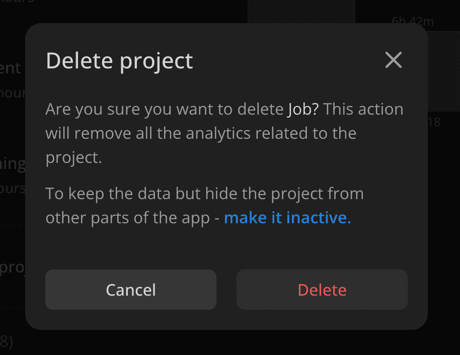
Here's the code from Increaser for delete project functionality that leverages two abstract components - Opener and ConfirmationModal.
<Opener
  renderOpener={({ onOpen }) => (
    <IconButton kind="alert" icon={<TrashBinIcon />} onClick={onOpen} />
  )}
  renderContent={({ onClose }) => (
    <ConfirmationModal
      title="Delete project"
      onClose={onClose}
      confirmActionText="Delete"
      onConfirm={() => {
        console.log("Delete project")
      }}
      renderContent={() => (
        <VStack gap={12}>
          <Text color="supporting">
            Are you sure you want to delete{" "}
            <Text as="span" color="regular">
              Job?
            </Text>{" "}
            This action will remove all the analytics related to the project.
          </Text>
          <Text color="supporting">
            To keep the data but hide the project from other parts of the app -{" "}
            <ShyTextButton
              onClick={() => {
                console.log("Make project inactive")
                onClose()
              }}
              text="make it inactive."'
            />
          </Text>
        </VStack>
      )}
    />
  )}
/>
The first component is a simple wrapper for a boolean state for an open/closed state, so it doesn't do much and is more of a personal preference.
import { ReactNode } from "react"
import { useBoolean } from "lib/shared/hooks/useBoolean"
import { ClosableComponentProps } from "lib/shared/props"

interface RenderOpenerParams {
  onOpen: () => void
}

interface Props {
  renderOpener: (params: RenderOpenerParams) => ReactNode
  renderContent: (params: ClosableComponentProps) => ReactNode
}

export const Opener = ({ renderOpener, renderContent }: Props) => {
  const [isOpen, { set: onOpen, unset: onClose }] = useBoolean(false)

  return (
    <>
      {isOpen && renderContent({ onClose })}
      {renderOpener({ onOpen })}
    </>
  )
}
The second component utilizes the Modal component, which I've explained in a separate post. We base ConfirmationModalProps of ModalProps while making onClose a required prop and removing the footer, as we want to use it for two choices, cancel or confirm. To make both buttons equal in size, I leverage the SameWidthChildrenRow, which you can learn more about here.
import { Modal, ModalProps } from "."
import { SameWidthChildrenRow } from "../Layout/SameWidthChildrenRow"
import { PrimaryButton, PrimaryButtonKind } from "../buttons/rect/PrimaryButton"

interface ConfirmationModalProps
  extends Omit<ModalProps, "footer" | "onClose"> {
  onClose: () => void
  onConfirm: () => void
  confirmActionText: string
  confirmActionKind?: PrimaryButtonKind
}

export const ConfirmationModal = ({
  onClose,
  onConfirm,
  confirmActionText,
  confirmActionKind = "alert",
  ...props
}: ConfirmationModalProps) => {
  return (
    <Modal
      {...props}
      onClose={onClose}
      footer={
        <SameWidthChildrenRow gap={20}>
          <PrimaryButton size="l" onClick={onClose} kind="secondary">
            Cancel
          </PrimaryButton>
          <PrimaryButton
            size="l"
            onClick={() => {
              onConfirm()
              onClose()
            }}
            kind={confirmActionKind}
          >
            {confirmActionText}
          </PrimaryButton>
        </SameWidthChildrenRow>
      }
    />
  )
}