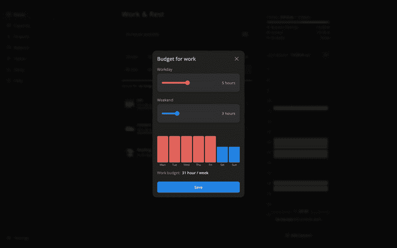
Let's make a bulletproof modal component with React, TypeScript, and styled components. Here's how it looks in the production at increaser.org.
The components receive quite a few properties to make modal versatile for different situations. The first one is the renderContent. We use it instead of children to know if the modal is in a full-screen mode. It could be helpful when we want to adjust UI for mobile screens.
import FocusTrap from "focus-trap-react"
import React, { ReactNode, useEffect } from "react"
import { useKey } from "react-use"
import { handleWithStopPropagation } from "lib/shared/events"
import styled, { css } from "styled-components"
import { BodyPortal } from "lib/ui/BodyPortal"
import { CloseIconButton } from "lib/ui/buttons/square/CloseIconButton"
import { useIsScreenWidthLessThan } from "lib/ui/hooks/useIsScreenWidthLessThan"
import { ScreenCover } from "lib/ui/ScreenCover"
import { Spacer } from "lib/ui/Spacer"
import { HStack } from "lib/ui/Stack"
import { getCSSUnit } from "lib/ui/utils/getCSSUnit"
import { getSameDimensionsCSS } from "lib/ui/utils/getSameDimensionsCSS"

import { ModalTitleText } from "./ModalTitleText"

interface RenderContentParams {
  isFullScreen: boolean
}

type ModalTitlePlacement = "left" | "center"

type ModalPlacement = "top" | "center"

export interface Props {
  renderContent: (params: RenderContentParams) => React.ReactNode
  width?: number | string
  onClose?: () => void
  placement?: ModalPlacement

  hasImplicitClose?: boolean
  title?: ReactNode
  titlePlacement?: ModalTitlePlacement
  className?: string
  padding?: string | number
}

const MIN_HORIZONTAL_FREE_SPACE_IN_PX = 120

interface ContainerProps {
  isFullScreen: boolean
  width: number | string
  placement?: ModalPlacement
}

export const Container = styled.div<ContainerProps>`
  display: flex;
  flex-direction: column;
  overflow: hidden;

  max-height: 100%;

  background: ${({ theme: { name, colors } }) =>
    (name === "light" ? colors.background : colors.foreground).toCssValue()};

  ${({ isFullScreen, width, placement }) =>
    isFullScreen
      ? getSameDimensionsCSS("100%")
      : css`
          width: ${getCSSUnit(width)};
          border-radius: 16px;
          max-height: 92%;
          ${placement === "top" &&
          `
            align-self: start;
            margin-top: 4%;
          `}
        `}
`

const Content = styled.div`
  ${getSameDimensionsCSS("100%")};
  overflow-y: auto;
`

export const Modal = ({
  renderContent,
  onClose,
  title = null,
  width = 400,
  hasImplicitClose = true,
  titlePlacement = "left",
  placement = "center",
  padding = 20,
  className,
}: Props) => {
  const isFullScreen = useIsScreenWidthLessThan(
    `calc(${getCSSUnit(width)} + ${MIN_HORIZONTAL_FREE_SPACE_IN_PX}px)`,
  )

  useKey("Escape", () => {
    onClose?.()
  })

  useEffect(() => {
    window.history.pushState(null, "modal")
    window.onpopstate = () => {
      if (onClose) {
        onClose()
      } else {
        window.history.pushState(null, "modal")
      }
    }

    return () => {
      window.onpopstate = null
    }
  })

  const hasCloseButton = (hasImplicitClose || isFullScreen) && onClose

  const headerPadding = [padding, padding, 0, padding].map(getCSSUnit).join(" ")
  const contentPadding = [0, padding, padding, padding]
    .map(getCSSUnit)
    .join(" ")

  return (
    <BodyPortal>
      <ScreenCover onClick={onClose ? () => onClose() : undefined}>
        <FocusTrap
          focusTrapOptions={{
            clickOutsideDeactivates: true,
            fallbackFocus: "#container",
          }}
        >
          <Container
            placement={placement}
            className={className}
            id="container"
            isFullScreen={isFullScreen}
            width={width}
            onClick={handleWithStopPropagation()}
          >
            <HStack
              style={{ padding: headerPadding }}
              alignItems="center"
              justifyContent="space-between"
            >
              {(titlePlacement === "center" || !title) &&
                (hasCloseButton ? <Spacer width={32} /> : <div />)}
              {title && <ModalTitleText>{title}</ModalTitleText>}
              {hasCloseButton && (
                <CloseIconButton size="l" onClick={() => onClose?.()} />
              )}
            </HStack>
            {(title || hasCloseButton) && <Spacer height={20} />}
            <Content style={{ padding: contentPadding }}>
              {renderContent({ isFullScreen })}
            </Content>
          </Container>
        </FocusTrap>
      </ScreenCover>
    </BodyPortal>
  )
}
Usually, we place the modal at the center, but there are situations when we don't want the popup to jump on content size change, for example, on the onboarding flow. Then we have props for the title and its placement. Sometimes we show it in the center.
Then we have properties for width and padding. For example, in this sign-up modal, we set the padding to zero to make the image fill the whole right side. To allow changing styles of the modal container, we accept the className prop.
Finally, we have a callback for closing the modal and a boolean value to hide the close button. It's handy for a situation where user action is required to continue using the app.
We render modal as the last children in the body to prevent inheritance of parent styles by using the BodyPortal component that, in turn, leverages the useBody hook.
To bring user attention to the modal, we blur the background with the ScreenCover component. It accepts the onClick callback, so we can close the modal by clicking outside. Besides the close button, we can also exit the modal by pressing the Escape button on the keyboard.
We don't want to let the focus outside of the modal when it's open. To achieve that, we use the FocuTrap library to disable focus outside its content.
Modal's container takes width, placement, and isFullWidth flag. Here we set up the background, size, and position. We want to show the scroll only for the conent and keep the title with the close button fixed on top. To achieve that, we set overflow-y auto on content and set padding separately to have enough space between content and scroll.
When there is not enough free space between modal and screen edges we make it full screen.

