
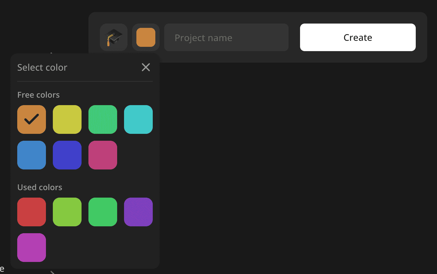
Let me share a color input component that is especially handy for users to label different kinds of items with color. At increaser.org, I provide this input when creating a project or a habit so it's easier to distinguish one from another.
The component receives common input properties value and onChange together with an optional usedValues prop. There are 12 colors to choose from, and I use an index to store the color in the database and identify it. If the number of colors has changed, it's ok since we can use the mod operator when taking an actual color from the list by index. To learn more about how to generate those colors and more about HSLA format and how I store it as an object, check out this post.
import { InputProps, StyledComponentWithColorProps } from "lib/shared/props"
import { range } from "lib/shared/utils/range"
import { splitBy } from "lib/shared/utils/splitBy"
import styled, { useTheme } from "styled-components"
import { Menu } from "../Menu"
import { VStack } from "../Stack"
import { defaultTransitionCSS } from "../animations/transitions"
import { defaultBorderRadiusCSS } from "../borderRadius"
import { paletteColorsCount } from "../colors/palette"
import { CheckIcon } from "../icons/CheckIcon"
import { getColor } from "../theme/getters"
import { centerContentCSS } from "../utils/centerContentCSS"
import { getSameDimensionsCSS } from "../utils/getSameDimensionsCSS"
import { InvisibleHTMLRadio } from "./InvisibleHTMLRadio"
import { ExpandableInputOpener } from "./ExpandableInputOpener"
import { ShySection } from "../ShySection"

interface ColorLabelInputProps extends InputProps<number> {
  usedValues?: Set<number>
}

const CurrentColor = styled.div<StyledComponentWithColorProps>`
  background: ${({ $color }) => $color.toCssValue()};
  border-radius: 8px;
  ${getSameDimensionsCSS("68%")}
`

const ColorOption = styled.label<StyledComponentWithColorProps>`
  position: relative;
  cursor: pointer;
  ${centerContentCSS};
  background: ${({ $color }) => $color.toCssValue()};

  aspect-ratio: 1/1;

  ${defaultBorderRadiusCSS};

  font-size: 32px;
  color: ${getColor("foreground")};

  ${defaultTransitionCSS};

  &:hover {
    background: ${({ $color }) =>
      $color.getVariant({ l: (l) => l * 0.8 }).toCssValue()};
  }
`

const ColorsContainer = styled.div`
  display: grid;
  gap: 12px;
  grid-template-columns: repeat(4, 1fr);
`

export const ColorLabelInput = ({
  value,
  onChange,
  usedValues = new Set<number>(),
}: ColorLabelInputProps) => {
  const {
    colors: { getPaletteColor },
  } = useTheme()

  const colors = range(paletteColorsCount)

  const [free, used] = splitBy(colors, (value) =>
    usedValues.has(value) ? 1 : 0,
  )

  return (
    <Menu
      title="Select color"
      renderOpener={(props) => (
        <ExpandableInputOpener type="button" {...props}>
          <CurrentColor $color={getPaletteColor(value)} />
        </ExpandableInputOpener>
      )}
      renderContent={({ onClose }) => {
        const renderColors = (colors: number[]) => {
          return (
            <ColorsContainer>
              {colors.map((index) => {
                const isSelected = index === value

                const inputValue = `Color #${index}`

                return (
                  <ColorOption key={index} $color={getPaletteColor(index)}>
                    <InvisibleHTMLRadio
                      groupName="color-label-input"
                      value={inputValue}
                      isSelected={isSelected}
                      onSelect={() => {
                        onChange(index)
                        onClose()
                      }}
                    />
                    {isSelected && <CheckIcon />}
                  </ColorOption>
                )
              })}
            </ColorsContainer>
          )
        }

        if (free.length === 0 || used.length === 0) {
          return renderColors(colors)
        }

        return (
          <VStack gap={20}>
            <ShySection title="Free colors">{renderColors(free)}</ShySection>
            <ShySection title="Used colors">{renderColors(used)}</ShySection>
          </VStack>
        )
      }}
    />
  )
}
As a user, I may want color be unique between projects, so if there are any free colors, we separate them from the used ones and display them in the first section. If there are no free colors, we display all of them together.
We use the ExpandableInputOpener component as a menu opener. It's a simple button that has the same dimensions as the input and displays the current color.
import styled from "styled-components"
import { defaultTransitionCSS } from "../animations/transitions"
import { defaultBorderRadiusCSS } from "../borderRadius"
import { UnstyledButton } from "../buttons/UnstyledButton"
import { getColor } from "../theme/getters"
import { centerContentCSS } from "../utils/centerContentCSS"
import { getSameDimensionsCSS } from "../utils/getSameDimensionsCSS"
import { defaultInputHeight, inputBackgroundCSS } from "./config"

export const ExpandableInputOpener = styled(UnstyledButton)`
  ${centerContentCSS}
  ${defaultBorderRadiusCSS}
  ${defaultTransitionCSS}

  ${getSameDimensionsCSS(defaultInputHeight)};

  ${inputBackgroundCSS};

  &:hover {
    background: ${getColor("backgroundGlass2")};
  }
`
To display the color picker we use an abstract Menu component that will work as a slideover on mobile and popover on desktop, to learn more about it, check out this post. We render color options inside of a helper component ShySection.
import {
  TitledComponentProps,
  ComponentWithChildrenProps,
} from "lib/shared/props"
import { VStack } from "./Stack"
import { Text } from "./Text"

type ShySectionProps = TitledComponentProps & ComponentWithChildrenProps

export const ShySection = ({ title, children }: ShySectionProps) => {
  return (
    <VStack gap={8}>
      <Text size={14} weight="bold" color="supporting">
        {title}
      </Text>
      {children}
    </VStack>
  )
}
The container for colors is a CSS grid, with every option displayed as a label with an invisible HTML radio input inside for accessibility purposes. We make the color a little bit darker on hover by using getVariant method on HSLA color, and display a check icon if the color is selected.