

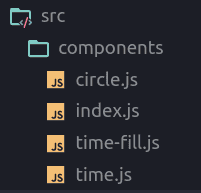
In this post, we are going to make a React component that will be available as an NPM module so that we could use it in different projects. This component shows a timeline of the day and represents activities with a different color. Let’s dive in!
create-react-library
Create-react-app is the best tool for bootstrapping the front-end project, and I always use it for new apps. However, since we want to make an NPM module, we need a different starter. After some research, I found a tool named create-react-library that using create-react-app to run demo and rollup to build the library.
To start a new project, we will type these commands:
npm install -g create-react-library
create-react-library increaser-Timer
cd increaser-Timer
After initializing the project, we will install the only extra library we will need.
npm install --save styled-componentsAnd add additional fields in the rollup.config.js file.
    ...
    external: ['styled-components'],
    globals: { 'styled-components': 'styled' }
}
First, we will run rollup to watch our src module and automatically recompile it into dist whenever we make changes.
npm startThe second part will be running the example create-react-app that’s linked to the local version of our module. In another tab:
cd example
npm start
Timer Component
Let’s start from the top of our components hierarchy. A lot of libraries requires width and height to specify size, but we will make it another way. We will require Wrapper component to be passed by props. And via refs, we will figure out the size of Timer. To handle changes in our user finger or mouse position we will add event handlers to Container component. Father in the updatePosition() function we will determine the new value that the user selected by computing the mouse angle relative to the center of Timer. Also worth to mention that users of the library pass theme props where he can specify some colors of the time picker. And since we are using styled-components we can set this theme in the root component and every child will be able to access it.
import React from "react"
import styled, { ThemeProvider } from "styled-components"

import Circle from "./circle"
import Time from "./time"
import TimeFill from "./time-fill"

import { defaultTheme } from "../constants"

const Container = styled.div`
  margin: auto;
  position: relative;
  display: flex;
  align-items: center;
  justify-content: center;
`

export default class Timer extends React.Component {
  constructor(props) {
    super(props)
    this.state = {
      width: 0,
      height: 0,
    }
  }

  render() {
    const {
      wrapper: Wrapper,
      theme,
      startTime,
      timeNow,
      duration,
      showTimeInTitle,
    } = this.props
    const { diameter } = this.state

    const renderContent = () => {
      const secondsPass = Math.min((timeNow - startTime) / 1000, duration * 60)
      const percent = secondsPass / (duration * 60)
      const secondsLeft = duration * 60 - secondsPass
      return (
        <React.Fragment>
          <Circle>
            <TimeFill percent={percent} />
            <Time
              showInTitle={showTimeInTitle}
              secondsLeft={secondsLeft}
              diameter={diameter}
            />
          </Circle>
        </React.Fragment>
      )
    }

    return (
      <ThemeProvider theme={{ ...defaultTheme, ...theme }}>
        <Wrapper ref={(el) => (this.wrapper = el)}>
          <Container
            ref={(el) => (this.view = el)}
            style={{ width: diameter, height: diameter }}
          >
            {this.view && renderContent()}
          </Container>
        </Wrapper>
      </ThemeProvider>
    )
  }

  componentDidMount() {
    this.onResize()
    window.addEventListener("resize", this.onResize)
    if (this.props.handleBeforeUnload) {
      window.addEventListener("beforeunload", this.exitPage)
    }
  }

  exitPage = (e) => {
    const message = "Better stop timer first"
    e.returnValue = message
    return message
  }

  componentWillUnmount() {
    window.removeEventListener("resize", this.onResize)
    if (this.props.handleBeforeUnload) {
      window.removeEventListener("beforeunload", this.exitPage)
    }
  }

  onResize = () => {
    const { width, height } = this.wrapper.getBoundingClientRect()
    const diameter = Math.min(width, height)
    this.setState({ width, height, diameter })
  }
}
Timer Circle
The Circle component is a styled div tag. Here we can see how background color specified by accessing a theme.
import styled from "styled-components"

const Circle = styled.div`
  position: relative;
  width: 100%;
  height: 100%;
  border-radius: 50%;
  background-color: ${(props) => props.theme.circleColor};
  display: flex;
  align-items: center;
  justify-content: center;
  box-shadow: rgba(0, 0, 0, 0.12) 0px 1px 6px, rgba(0, 0, 0, 0.12) 0px 1px 4px;
`

export default Circle
Timer Filling
The TimeFill component is this yellow moving part of the timer. The only parameter passed to this component is the percent. It defines how much of the circle we need to fill with color.
import React from "react"
import styled from "styled-components"

const Container = styled.svg`
  height: 100%;
  position: absolute;
`

const Path = styled.path`
  fill: ${(props) => props.theme.timeFillColor};
`

const Circle = styled.circle`
  r: 1;
  fill: ${(props) => props.theme.timeFillColor};
`

const getCoordinatesForPercent = (percent) => ({
  x: Math.cos(2 * Math.PI * percent),
  y: Math.sin(2 * Math.PI * percent),
})

export default ({ percent }) => {
  const renderPath = () => {
    const startPoint = 0.75
    const start = getCoordinatesForPercent(startPoint)
    const end = getCoordinatesForPercent(startPoint + percent)
    const largeArcFlag = startPoint + percent < 1.25 ? 0 : 1
    const pathData = [
      `M ${start.x} ${start.y}`,
      `A 1 1 0 ${largeArcFlag} 1 ${end.x} ${end.y}`,
      `L 0 0`,
    ].join(" ")

    return <Path d={pathData} />
  }

  return (
    <Container viewBox="-1 -1 2 2">
      {percent < 1 ? renderPath() : <Circle />}
    </Container>
  )
}
Timer Time Text
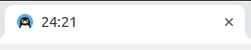
The last component is the Time. It shows how many minutes and seconds left. In this component, we are using the react-document-title library to present the information in the browser tab — this feature makes user experience a little bit better.
import React from "react"
import styled from "styled-components"
import DocumentTitle from "react-document-title"

const Text = styled.h1`
  z-index: 1;
  position: absolute;
  top: 42%;
  text-align: center;
  vertical-align: middle;
  color: ${(props) => props.theme.textColor};
`
const numberForTimer = (number) =>
  number < 0 ? "00" : number < 10 ? `0${number}` : number

export default ({ secondsLeft, diameter, showInTitle }) => {
  const minutes = Math.floor(secondsLeft / 60) || 0
  const seconds = Math.floor(secondsLeft - minutes * 60) || 0
  const timeStr = `${numberForTimer(minutes)}:${numberForTimer(seconds)}`
  const TitleWrapper = ({ children }) =>
    showInTitle ? (
      <DocumentTitle title={timeStr}>{children}</DocumentTitle>
    ) : (
      children
    )

  const size = diameter * 0.125
  return (
    <TitleWrapper>
      <Text style={{ fontSize: size, lineHeight: `${size}px` }}>{timeStr}</Text>
    </TitleWrapper>
  )
}
Update Demo Project
Don’t forget we also have an example project where we will import the Timer component.
import React from "react"
import styled from "styled-components"

import Timer from "increaser-timer"

const TestingPage = styled.div`
  height: 100vh;
  background-color: #fafafa;
  display: flex;
  flex-direction: column;
  justify-content: center;
  align-items: center;
`
const Container = styled.div`
  position: relative;
  height: 60%;
  width: 80%;
  padding: 20px;
  background-color: #7fdbff;
  box-shadow: 0 19px 38px rgba(0, 0, 0, 0.3), 0 15px 12px rgba(0, 0, 0, 0.22);
  border-radius: 5px;
  transition: background-color 800ms linear;
`

const Increaser = styled.a`
  top: 20px;
  left: 20px;
  position: absolute;
  font-family: "Dancing Script", cursive;
  color: white;
  font-size: 34px;
  cursor: pointer;
  text-decoration: none;
`

const TimeWaitsForNoOne = styled.a`
  margin: 40px;
  color: black;
  font-family: "Dancing Script", cursive;
  font-size: 24px;
  cursor: pointer;
  text-decoration: none;
`

const ContainerWrapper = styled.div`
  height: 100%;
  width: 100%;
  display: flex;
  justify-content: center;
  align-items: center;
`

export default class App extends React.Component {
  constructor(props) {
    super(props)
    const startTime = Date.now()
    this.state = {
      startTime,
      duration: 1,
      timeNow: startTime,
    }
    setInterval(() => {
      const timeNow = Date.now()
      const { startTime, duration } = this.state
      this.setState({ timeNow })
      if (timeNow - startTime > duration * 60 * 1000) {
        this.setState({ startTime: timeNow })
      }
    }, 500)
  }

  render() {
    const { startTime, duration, timeNow } = this.state
    return (
      <TestingPage>
        <Container>
          <Timer
            wrapper={ContainerWrapper}
            startTime={startTime}
            duration={duration}
            timeNow={timeNow}
            showTimeInTitle={true}
            handleBeforeUnload={true}
          />
          <Increaser target="_blank" href="https://increaser.org">
            Increaser
          </Increaser>
        </Container>
        <TimeWaitsForNoOne
          target="_blank"
          href="https://increaser.org/blog/mindset"
        >
          {"Time Waits For No One, and It Won't Wait For Me"}
        </TimeWaitsForNoOne>
      </TestingPage>
    )
  }
}