

In this post, we are going to make a React component that will be available as an NPM module so that we could use it in different projects. You will find this article useful if you are planning to build a custom time picker. Let’s dive in!
create-react-library
Create-react-app is the best tool for bootstrapping the front-end project, and I always use it for new apps. However, since we want to make an NPM module, we need a different starter. After some research, I found a tool named create-react-library that using create-react-app to run demo and rollup to build the library.
To start a new project, we will type these commands:
npm install -g create-react-library
create-react-library increaser-timepicker
cd increaser-timepicker
After initializing the project, we will install the only extra library we will need.
npm install --save styled-componentsAnd add additional fields in the rollup.config.js file.
    ...
    external: ['styled-components'],
    globals: { 'styled-components': 'styled' }
}
First, we will run rollup to watch our src module and automatically recompile it into dist whenever we make changes.
npm startThe second part will be running the example create-react-app that’s linked to the local version of our module. In another tab:
cd example
npm start
Timepicker Component
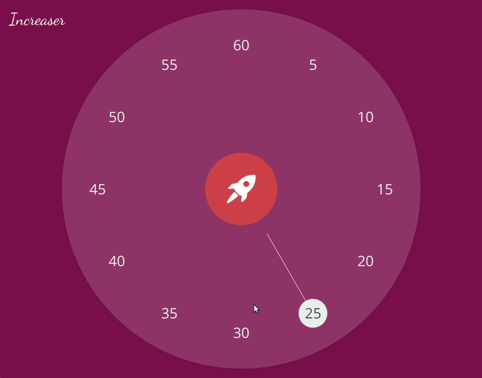
Let’s start from the top of our components hierarchy. A lot of libraries requires width and height to specify size, but we will make it another way. We will require Wrapper component to be passed by props. And via refs, we will figure out the size of TimePicker. To handle changes in our user finger or mouse position we will add event handlers to Container component. Father in the updatePosition() function we will determine the new value that the user selected by computing the mouse angle relative to the center of TimePicker. Also worth to mention that users of the library pass theme props where he can specify some colors of the time picker. And since we are using styled-components we can set this theme in the root component and every child will be able to access it.
import React from 'react'
import styled, { ThemeProvider } from 'styled-components'

import Minutes from './minutes'
import Line from './line'
import Start from './start'
import Circle from './circle'
import { getMouseAngle } from '../utils'
import { defaultTheme } from '../constants'

const Container = styled.div`
  margin: auto;
  position: relative;
  display: flex;
  align-items: center;
  justify-content: center;
`

export default class TimePicker extends React.Component {
  constructor(props) {
    super(props)
    this.state = {
      width: 0,
      height: 0,
      touching: false
    }
  }

  render() {
    const { wrapper: Wrapper, theme } = this.props
    const { width, height, diameter } = this.state
    const renderContent = () => {
      const startDiameter = diameter * (width > height ? 0.2 : 0.25)
      const startPadding = startDiameter * 0.3
      const { duration, onStart } = this.props

      return (
        <React.Fragment>
          <Circle>
            <Line diameter={diameter} duration={duration}/>
            <Minutes diameter={diameter} duration={duration} />
          </Circle>
          <Start
            onClick={onStart}
            diameter={startDiameter}
            padding={startPadding}
          />
        </React.Fragment>
      )
    }

    return (
      <ThemeProvider theme={{ ...defaultTheme, ...theme }}>
        <Wrapper ref={el => (this.wrapper = el)}>
          <Container
            ref={el => (this.view = el)}
            style={{ width: diameter, height: diameter }}
            onMouseDown={this.onMouseDown}
            onTouchStart={this.onMouseDown}
            onMouseMove={this.onMouseMove}
            onTouchMove={this.onMouseMove}
            onMouseUp={this.onMouseUp}
            onTouchEnd={this.onMouseUp}
          >
            {this.view && renderContent()}
          </Container>
        </Wrapper>
      </ThemeProvider>
    )
  }

  componentDidMount() {
    this.onResize()
    window.addEventListener('resize', this.onResize)
  }

  componentWillUnmount() {
    window.removeEventListener('resize', this.onResize)
  }

  onMouseDown = e => {
    this.updatePosition(e)
    this.setState({ touching: true })
  }

  onMouseMove = e => {
    if (this.state.touching) {
      this.updatePosition(e)
    }
  }

  onMouseUp = () => {
    this.setState({ touching: false })
  }

  updatePosition = e => {
    if (!e.pageX && !e.changedTouches) return

    const rect = this.view.getBoundingClientRect()
    const { pageX, pageY } = e.pageX ? e : e.changedTouches[0]
    const x = pageX - rect.x
    const y = pageY - rect.y

    const { diameter } = this.state
    const center = diameter / 2
    const mouseAngle = getMouseAngle(center, center, x, y)
    const onTop = mouseAngle < 15 || mouseAngle > 345
    const minutes = onTop ? 60 : Math.round(mouseAngle / 30) * 5
    const { duration, onDurationChange } = this.props
    if (minutes !== duration) {
      onDurationChange(minutes)
    }
  }

  onResize = () => {
    const { width, height } = this.wrapper.getBoundingClientRect()
    const diameter = Math.min(width, height)
    this.setState({ width, height, diameter })
  }
}
Timepicker Circle
The Circle component is a styled div tag. Here we can see how background color specified by accessing a theme.
import styled from 'styled-components'

const Circle = styled.div`
  position: relative;
  width: 100%;
  height: 100%;
  border-radius: 50%;
  background-color: ${props => props.theme.circleColor};
  display: flex;
  align-items: center;
  justify-content: center;
  box-shadow: rgba(0, 0, 0, 0.12) 0px 1px 6px, rgba(0, 0, 0, 0.12) 0px 1px 4px;
`

export default Circle
Timepicker Minutes
In Minutes components we lay text evenly inside the circle by using some trigonometry. You may find getMinutes() little bit confusing, yet it simply returns an array of minutes [5, 10, 15, 20, 25, 30, 35, 40, 45, 50, 55, 60]. Just always trying to keep immutability:)
import React from 'react'
import styled from 'styled-components'
import { toRadians } from '../utils'

const MINUTE_PERSENTAGE_SIZE = 0.08

const getMinutes = (start, step, limit) => {
  const inner = minutes => {
    const last = minutes[minutes.length - 1]
    const next = last + step
    if (next > limit) return minutes

    return inner([...minutes, next])
  }
  return inner([start])
}

const Minutes = styled.p`
  position: absolute;
  color: ${props =>
    props.selected ? props.theme.selectTextColor : props.theme.selectColor};
  border-radius: 50%;
  text-align: center;
  vertical-align: middle;
  background-color: ${props =>
    props.selected ? props.theme.selectColor : 'transparent'};
  cursor: pointer;
  user-select: none;
`

export default ({ diameter, duration }) => {
  const center = diameter / 2
  const radius = center * 0.8
  const minutesNumbers = getMinutes(5, 5, 60)
  const size = diameter * MINUTE_PERSENTAGE_SIZE
  const moveDistance = size / 2
  const minutes = minutesNumbers.map(minute => {
    const angle = toRadians(minute * 6)
    const left = center + radius * Math.sin(angle) - moveDistance
    const top = center - radius * Math.cos(angle) - moveDistance
    const style = {
      top,
      left,
      fontSize: size / 2,
      width: size,
      height: size,
      lineHeight: `${size}px`
    }
    return (
      <Minutes style={style} key={minute} selected={minute === duration}>
        {minute}
      </Minutes>
    )
  })

  return minutes
}
Timepicker SVG Line
Line component is an SVG line element. Here we also use sinuses and cosines:)
import React from "react"
import styled from "styled-components"

import { toRadians } from "../utils"

const Line = styled.line`
  position: absolute;
  stroke-width: 1;
  stroke: ${(props) => props.theme.selectColor};
`

export default ({ duration, diameter }) => {
  const angle = toRadians(duration * 6)
  const radius = diameter / 2
  const lineProps = {
    x1: radius + radius * 0.8 * Math.sin(angle) * 0.36,
    y1: radius - radius * 0.8 * Math.cos(angle) * 0.36,
    x2: radius + radius * 0.8 * Math.sin(angle) * 0.9,
    y2: radius - radius * 0.8 * Math.cos(angle) * 0.9,
  }

  return (
    <svg height={diameter} width={diameter} style={{ position: "absolute" }}>
      <Line {...lineProps} />
    </svg>
  )
}
Timepicker Start Button
Start component is the button with the rocket. It placed absolutely in the center of the container. Also worth to mention that we need to handle onMouseDown() event here and call stopPropagation()p because we don’t want this problem:)
import React from "react"
import styled from "styled-components"

import StartIcon from "./start-icon"

const StartButton = styled.button`
  position: absolute;
  border-radius: 50%;
  background-color: ${(props) => props.theme.actionColor};
  border-width: 0;
  cursor: pointer;
  transition: all 0.4s cubic-bezier(0.42, 0, 0.58, 1);
  &:hover {
    transform: scale(1.2);
    cursor: pointer;
    fill: #ffffff;
    color: #ffffff;
  }
`

const noPropagation =
  (func = () => null) =>
  (e) => {
    e.stopPropagation()
    func()
  }

export default ({ onClick, diameter, padding }) => (
  <StartButton
    onClick={noPropagation(onClick)}
    onMouseDown={noPropagation()}
    style={{ width: diameter, height: diameter, padding: padding }}
  >
    <StartIcon />
  </StartButton>
)
Update Demo Project
Don’t forget we also have an example project where we will import the TimePicker component.
import React from 'react'
import styled from 'styled-components'

import TimePicker from 'increaser-timepicker'

const TestingPage = styled.div`
  height: 100vh;
  background-color: #fafafa;
  display: flex;
  flex-direction: column;
  justify-content: center;
  align-items: center;
`
const Container = styled.div`
  position: relative;
  height: 60%;
  width: 80%;
  padding: 20px;
  background-color: ${props => props.color};
  box-shadow: 0 19px 38px rgba(0, 0, 0, 0.3), 0 15px 12px rgba(0, 0, 0, 0.22);
  border-radius: 5px;
  transition: background-color 800ms linear;
`

const Increaser = styled.a`
  top: 20px;
  left: 20px;
  position: absolute;
  font-family: 'Dancing Script', cursive;
  color: white;
  font-size: 34px;
  cursor: pointer;
  text-decoration: none;
`

const TimeWaitsForNoOne = styled.a`
  margin: 40px;
  color: black;
  font-family: 'Dancing Script', cursive;
  font-size: 24px;
  cursor: pointer;
  text-decoration: none;
`

const ContainerWrapper = styled.div`
  height: 100%;
  width: 100%;
  display: flex;
  justify-content: center;
  align-items: center;
`

const COLORS = [
  '#2ECC40',
  '#7FDBFF',
  '#001f3f',
  '#0074D9',
  '#3D9970',
  '#FF851B',
  '#FF4136',
  '#85144b',
  '#B10DC9',
  '#AAAAAA'
]

const getRandomColor = colors =>
  colors[Math.floor(Math.random() * colors.length)]

export default class App extends React.Component {
  constructor(props) {
    super(props)
    this.state = {
      color: getRandomColor(COLORS),
      duration: 25
    }
  }

  render() {
    const { color, duration } = this.state
    return (
      <TestingPage>
        <Container color={color}>
          <TimePicker
            duration={duration}
            wrapper={ContainerWrapper}
            onStart={this.updateColor}
            onDurationChange={duration => this.setState({ duration })}
          />
          <Increaser target="_blank" href="https://increaser.org">
            Increaser
          </Increaser>
        </Container>
        <TimeWaitsForNoOne
          target="_blank"
          href="https://increaser.org/blog/mindset"
        >
            {"Time Waits For No One, and It Won't Wait For Me"}
        </TimeWaitsForNoOne>
      </TestingPage>
    )
  }

  updateColor = () => {
    const chooseFrom = COLORS.filter(c => c !== this.state.color)
    const color = getRandomColor(chooseFrom)
    this.setState({ color })
  }
}
view raw