React Masterclass: Building an Interactive Calendar View


In this post, we'll conduct a React masterclass, during which I'll share how I've created this attractive timeline, alternatively known as a calendar view, to display work sessions overview. While the code for Increaser sits in a private repository, you can locate all the reusable components, hooks, and utilities featured in this article at the RadzionKit repository. I trust you'll find lots of useful content in this masterclass, particularly when it comes to absolute positioning and time management.
DayOverviewProvider
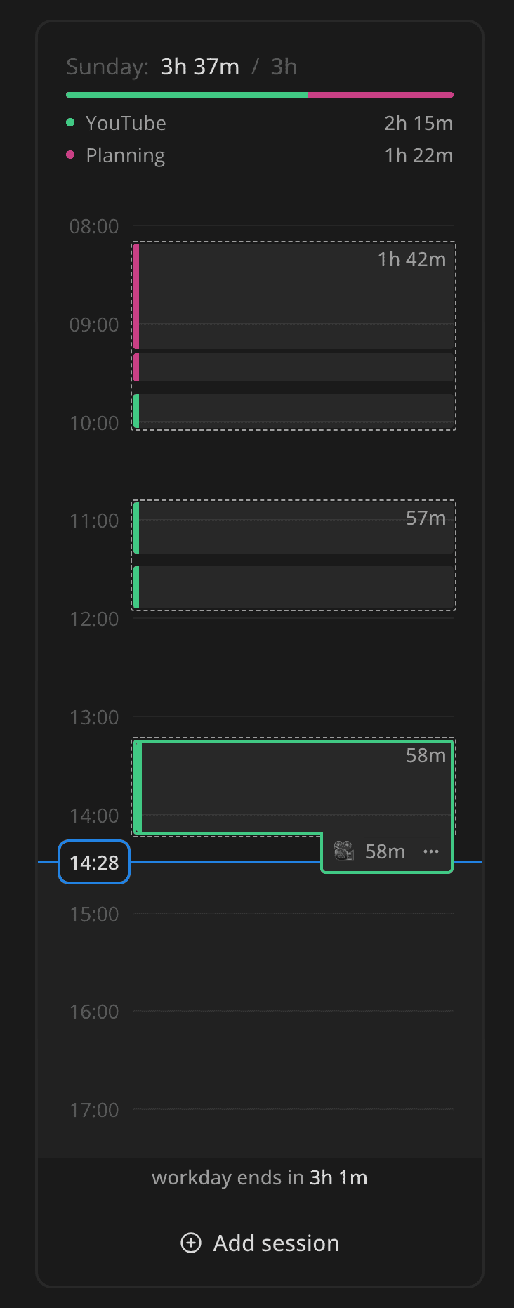
Our component is constructed from four principal sections:
- Navigation between days of the week
- Summary of work sessions with a projects breakdown
- A timeline featuring blocks of work, which also presents the current time, and shows the amount of a workday that remains
- Lastly, a flow to add a work session, but we won't be covering this feature in this video.
import styled from "styled-components"
import { Panel } from "@increaser/ui/ui/Panel/Panel"
import { AmountOverview } from "./AmountOverview"
import { DayTimeline } from "./DayTimeline"
import { AddSession } from "./AddSession"
import { horizontalPaddingInPx } from "./config"
import { WeekNavigation } from "./WeekNavigation"
import { DayOverviewProvider } from "./DayOverviewProvider"

const Container = styled(Panel)`
  height: 100%;
`

export const DayOverview = () => {
  return (
    <DayOverviewProvider>
      <Container padding={horizontalPaddingInPx} withSections kind="secondary">
        <WeekNavigation />
        <AmountOverview />
        <DayTimeline />
        <AddSession />
      </Container>
    </DayOverviewProvider>
  )
}
We'll need to reuse some state in multiple components within DayOverview, so let's create a provider using React Context.
DayOverviewProvider will effectively deliver:
- Sets for the current day
- Current time
- Start and end times of the timeline
- Start of the current day
- End of the workday
- A function to change the current day
import { Set } from "@increaser/entities/User"
import { ComponentWithChildrenProps } from "@increaser/ui/props"
import { createContextHook } from "@increaser/ui/state/createContextHook"
import { useRhythmicRerender } from "@increaser/ui/hooks/useRhythmicRerender"
import { getLastItem } from "@increaser/utils/array/getLastItem"
import { MS_IN_MIN } from "@increaser/utils/time"
import { startOfHour, endOfHour, isToday } from "date-fns"
import { useFocus } from "focus/hooks/useFocus"
import { createContext, useEffect, useMemo, useState } from "react"
import { startOfDay } from "date-fns"
import { useAssertUserState } from "user/state/UserStateContext"
import { getDaySets } from "sets/helpers/getDaySets"
import { useStartOfDay } from "@increaser/ui/hooks/useStartOfDay"

interface DayOverviewContextState {
  sets: Set[]
  currentTime: number

  timelineStartsAt: number
  timelineEndsAt: number

  dayStartedAt: number
  workdayEndsAt: number
  setCurrentDay: (timestamp: number) => void
}

const DayOverviewContext = createContext<DayOverviewContextState | undefined>(
  undefined
)

export const useDayOverview = createContextHook(
  DayOverviewContext,
  "DayOverview"
)

export const DayOverviewProvider = ({
  children,
}: ComponentWithChildrenProps) => {
  const currentTime = useRhythmicRerender()
  const todayStartedAt = useStartOfDay()
  const [currentDay, setCurrentDay] = useState(todayStartedAt)

  const dayStartedAt = startOfDay(currentDay).getTime()

  const { currentSet } = useFocus()
  useEffect(() => {
    if (currentSet && dayStartedAt !== todayStartedAt) {
      setCurrentDay(todayStartedAt)
    }
  }, [currentSet, dayStartedAt, todayStartedAt])

  const { sets: allSets } = useAssertUserState()

  const sets = useMemo(() => {
    const result = getDaySets(allSets, dayStartedAt)
    if (currentSet && isToday(dayStartedAt)) {
      result.push({
        start: currentSet.startedAt,
        end: currentTime,
        projectId: currentSet.projectId,
      })
    }

    return result
  }, [allSets, currentSet, currentTime, dayStartedAt])

  const { goalToStartWorkAt, goalToFinishWorkBy } = useAssertUserState()

  const workdayEndsAt = dayStartedAt + goalToFinishWorkBy * MS_IN_MIN

  const timelineStartsAt = useMemo(() => {
    if (sets.length) {
      return startOfHour(sets[0].start).getTime()
    }

    const workdayStartsAt = dayStartedAt + goalToStartWorkAt * MS_IN_MIN

    if (currentTime < workdayStartsAt) {
      return startOfHour(currentTime).getTime()
    }

    return workdayStartsAt
  }, [currentTime, dayStartedAt, goalToStartWorkAt, sets])

  const timelineEndsAt = useMemo(() => {
    if (!sets.length) {
      return workdayEndsAt
    }
    const lastSetEnd = getLastItem(sets).end
    if (workdayEndsAt > lastSetEnd) {
      return workdayEndsAt
    }

    return endOfHour(lastSetEnd).getTime()
  }, [sets, workdayEndsAt])

  return (
    <DayOverviewContext.Provider
      value={{
        sets,
        currentTime,
        timelineStartsAt,
        timelineEndsAt,
        workdayEndsAt,
        dayStartedAt,
        setCurrentDay,
      }}
    >
      {children}
    </DayOverviewContext.Provider>
  )
}
We will interact with the context using the useDayOverview hook, which will generate an error if we attempt to utilize it outside of the provider.
import { Context as ReactContext, useContext } from "react"

export function createContextHook<T>(
  Context: ReactContext<T | undefined>,
  contextName: string
) {
  return () => {
    const context = useContext(Context)

    if (!context) {
      throw new Error(`${contextName} is not provided`)
    }

    return context
  }
}
To obtain the current time and rerender the component, we will employ the useRhythmicRerender hook.
import { useEffect, useState } from "react"

export const useRhythmicRerender = (durationInMs = 1000) => {
  const [time, setTime] = useState<number>(Date.now())

  useEffect(() => {
    const interval = setInterval(() => setTime(Date.now()), durationInMs)
    return () => clearInterval(interval)
  }, [setTime, durationInMs])

  return time
}
We will record the current day as a timestamp in the currentDay state and distribute the setCurrentDay function to provider consumer to modify it.
We will filter the sets to include only those within the current day, and if the user is in focus mode, we will add a current set to the list.
Based on the current time, sets, and the user's preferred start and end of the workday, we will compute the start and end of the timeline.
Panel Container
We encapsulate our component in a Panel container, which spaces out the content inside and outlines the component with a border.
import styled, { css } from "styled-components"

import { defaultBorderRadiusCSS } from "../borderRadius"
import { getCSSUnit } from "../utils/getCSSUnit"
import { getColor } from "../theme/getters"
import { match } from "@increaser/utils/match"

type PanelKind = "regular" | "secondary"

export interface PanelProps {
  width?: React.CSSProperties["width"]
  padding?: React.CSSProperties["padding"]
  direction?: React.CSSProperties["flexDirection"]

  kind?: PanelKind

  withSections?: boolean
}

const panelPaddingCSS = css<{ padding?: React.CSSProperties["padding"] }>`
  padding: ${({ padding }) => getCSSUnit(padding || 20)};
`

export const Panel = styled.div<PanelProps>`
  ${defaultBorderRadiusCSS};
  width: ${({ width }) => (width ? getCSSUnit(width) : undefined)};
  overflow: hidden;

  ${({ withSections, direction = "column", kind = "regular", theme }) => {
    const contentBackground = match(kind, {
      secondary: () => theme.colors.background.toCssValue(),
      regular: () => theme.colors.mist.toCssValue(),
    })

    const contentCSS = css`
      ${panelPaddingCSS}
      background: ${contentBackground};
    `

    return withSections
      ? css`
          display: flex;
          flex-direction: ${direction};
          gap: 1px;

          > * {
            ${contentCSS}
          }
        `
      : contentCSS
  }}

  ${({ kind }) =>
    kind === "secondary" &&
    css`
      border: 2px solid ${getColor("mist")};
    `}
`
We will continue to maintain all the hardcoded sizes and distances in the config.ts file.
export const horizontalPaddingInPx = 20
export const timeLabelWidthInPx = 40
export const timeLabelGapInPx = 8
export const botomPlaceholderHeightInPx = 28
export const topPlaceholderHeightInPx = horizontalPaddingInPx
export const minimumHourHeightInPx = 40
WeekNavigation
The WeekNavigation component presents the specific day of the week and enables the user to navigate between days.
import { WEEKDAYS } from "@increaser/utils/time"
import styled from "styled-components"

import { useDayOverview } from "../DayOverviewProvider"
import { useStartOfDay } from "@increaser/ui/hooks/useStartOfDay"
import { useStartOfWeek } from "@increaser/ui/hooks/useStartOfWeek"
import { convertDuration } from "@increaser/utils/time/convertDuration"
import { useFocus } from "focus/hooks/useFocus"
import { verticalPadding } from "@increaser/ui/css/verticalPadding"
import { horizontalPadding } from "@increaser/ui/css/horizontalPadding"
import { SameWidthChildrenRow } from "@increaser/ui/ui/Layout/SameWidthChildrenRow"
import { horizontalPaddingInPx } from "../config"
import { WeekdayOption } from "./WeekdayOption"
import { InvisibleHTMLRadio } from "@increaser/ui/ui/inputs/InvisibleHTMLRadio"

const Container = styled(SameWidthChildrenRow)`
  ${verticalPadding(2)}
  ${horizontalPadding(horizontalPaddingInPx * 0.6)}
`

export const WeekNavigation = () => {
  const todayStartedAt = useStartOfDay()
  const weekStartedAt = useStartOfWeek()
  const { setCurrentDay, dayStartedAt } = useDayOverview()
  const { currentSet } = useFocus()

  if (currentSet) {
    return null
  }

  return (
    <Container rowHeight={horizontalPaddingInPx * 1.6} gap={1} fullWidth>
      {WEEKDAYS.map((weekday, index) => {
        const weekdayStartsAt =
          weekStartedAt + convertDuration(index, "d", "ms")
        const isActive = dayStartedAt === weekdayStartsAt
        const isEnabled = weekdayStartsAt <= todayStartedAt
        return (
          <WeekdayOption key={index} isActive={isActive} isEnabled={isEnabled}>
            {isEnabled && (
              <InvisibleHTMLRadio
                isSelected={isActive}
                groupName="week-navigation"
                value={weekdayStartsAt}
                onSelect={() => setCurrentDay(weekdayStartsAt)}
              />
            )}
            {weekday.slice(0, 3)}
          </WeekdayOption>
        )
      })}
    </Container>
  )
}
We will position the weekdays inside a CSS Grid container abstracted behind the SameWidthChildrenRow component.
import styled, { css } from "styled-components"
import { getCSSUnit } from "../utils/getCSSUnit"

interface Props {
  gap: number
  minChildrenWidth?: number
  childrenWidth?: number
  rowHeight?: number
  fullWidth?: boolean
  maxColumns?: number
}

const getColumnMax = (maxColumns: number | undefined, gap: number) => {
  if (!maxColumns) return `0px`

  const gapCount = maxColumns - 1
  const totalGapWidth = `calc(${gapCount} * ${getCSSUnit(gap)})`

  return `calc((100% - ${totalGapWidth}) / ${maxColumns})`
}

const getColumnWidth = ({
  minChildrenWidth,
  maxColumns,
  gap,
  childrenWidth,
}: Props) => {
  if (childrenWidth !== undefined) {
    return getCSSUnit(childrenWidth)
  }

  return `
    minmax(
      max(
        ${getCSSUnit(minChildrenWidth || 0)},
        ${getColumnMax(maxColumns, gap)}
      ),
      1fr
  )`
}

export const SameWidthChildrenRow = styled.div<Props>`
  display: grid;
  grid-template-columns: repeat(auto-fit, ${getColumnWidth});
  gap: ${({ gap }) => getCSSUnit(gap)};
  ${({ rowHeight }) =>
    rowHeight &&
    css`
      grid-auto-rows: ${getCSSUnit(rowHeight)};
    `}
  ${({ fullWidth }) =>
    fullWidth &&
    css`
      width: 100%;
    `}
`
To cycle over weekdays, we will utilize the WEEKDAYS array that contains the names of the days of the week. To procure the commencement of a weekday, we do simple math by adding days converted to milliseconds to the start of the week timestamp.
The active day will be the one that corresponds with the dayStartedAt timestamp, and we will disable all the days that fall in the future.
For a better accessibility experience and keyword support, we will render an invisible radio input inside every option.
import { centerContent } from "@increaser/ui/css/centerContent"
import { interactive } from "@increaser/ui/css/interactive"
import { transition } from "@increaser/ui/css/transition"
import { getColor } from "@increaser/ui/ui/theme/getters"
import styled, { css } from "styled-components"

interface WeekdayOptionProps {
  isActive: boolean
  isEnabled: boolean
}

export const WeekdayOption = styled.label<WeekdayOptionProps>`
  ${centerContent}
  ${transition}
  font-size: 12px;
  font-weight: 500;
  border-radius: 4px;
  border: 2px solid transparent;

  ${({ isEnabled }) =>
    isEnabled
      ? css`
          ${interactive}
          color: ${getColor("textSupporting")};
        `
      : css`
          pointer-events: none;
          color: ${getColor("textShy")};
        `}

  ${({ isActive }) =>
    isActive
      ? css`
          color: ${getColor("contrast")};
          background: ${getColor("mist")};
        `
      : css`
          &:hover {
            color: ${getColor("text")};
            border-color: ${getColor("mist")};
          }
        `}
`
The WeekdayOption component will style the label component, changing the text border and background color based on the isActive and isEnabled props.
AmountOverview
The AmountOverview component provides an overview of the current day's work sessions and projects breakdown.
import { HStack, VStack } from "@increaser/ui/ui/Stack"
import {
  HStackSeparatedBy,
  slashSeparator,
} from "@increaser/ui/ui/StackSeparatedBy"
import { WEEKDAYS } from "@increaser/utils/time"
import { ProjectTotal } from "projects/components/ProjectTotal"
import { ProjectsAllocationLine } from "projects/components/ProjectsAllocationLine"
import { getProjectColor } from "projects/utils/getProjectColor"
import { getProjectName } from "projects/utils/getProjectName"
import { useDayOverview } from "./DayOverviewProvider"
import { Text } from "@increaser/ui/ui/Text"
import { formatDuration } from "@increaser/utils/time/formatDuration"
import { getSetsSum } from "sets/helpers/getSetsSum"
import { useWeekTimeAllocation } from "weekTimeAllocation/hooks/useWeekTimeAllocation"
import { useProjects } from "projects/hooks/useProjects"
import { getProjectsTotalRecord } from "projects/helpers/getProjectsTotalRecord"
import { useTheme } from "styled-components"
import { getWeekday } from "@increaser/utils/time/getWeekday"

export const AmountOverview = () => {
  const theme = useTheme()
  const { sets, dayStartedAt } = useDayOverview()
  const setsTotal = getSetsSum(sets)
  const { allocation } = useWeekTimeAllocation()
  const weekday = getWeekday(new Date(dayStartedAt))
  const { projectsRecord } = useProjects()

  const allocatedMinutes = allocation ? allocation[weekday] : 0
  const projectsTotal = getProjectsTotalRecord(sets)

  return (
    <VStack fullWidth gap={8}>
      <VStack gap={4}>
        <HStack alignItems="center" justifyContent="space-between">
          <Text weight="semibold" color="supporting" size={14}>
            {WEEKDAYS[weekday]}
          </Text>
          <HStackSeparatedBy
            separator={<Text color="shy">{slashSeparator}</Text>}
          >
            <Text size={14} weight="semibold">
              {formatDuration(setsTotal, "ms")}
            </Text>
            <Text size={14} weight="semibold" color="shy">
              {formatDuration(allocatedMinutes, "min")}
            </Text>
          </HStackSeparatedBy>
        </HStack>
        <ProjectsAllocationLine
          projectsRecord={projectsRecord}
          sets={sets}
          allocatedMinutes={allocatedMinutes}
        />
      </VStack>

      <VStack gap={4} fullWidth>
        {Object.entries(projectsTotal)
          .sort((a, b) => b[1] - a[1])
          .map(([projectId]) => (
            <ProjectTotal
              key={projectId}
              name={getProjectName(projectsRecord, projectId)}
              color={getProjectColor(projectsRecord, theme, projectId)}
              value={projectsTotal[projectId]}
            />
          ))}
      </VStack>
    </VStack>
  )
}
First, we display the name of the current day along with the total time spent on work sessions compared to the designated time for the day. Normally, you would opt to work less over the weekends, so the allocated time will be different for Saturday and Sunday.
To visualize the breakdown of projects, we will employ the ProjectsAllocationLine component.
To estimate the total time spent on each project, we will exploit the getProjectsTotalRecord helper.
import { getSetDuration } from "sets/helpers/getSetDuration"
import { Set } from "sets/Set"

export const getProjectsTotalRecord = (sets: Set[]) =>
  sets.reduce(
    (acc, set) => ({
      ...acc,
      [set.projectId]: (acc[set.projectId] || 0) + getSetDuration(set),
    }),
    {} as Record<string, number>
  )
DayTimeline
The DayTimeline component forms the most complex part of our display, heavily stocking up on the absolutely positioned elements. The major segments of the component are:
- A block highlighting the time left before the end of the workday
- A timeline marker showing the hours of the day
- A current time indicator
- A workday end status showing how much time left before the end of the workday
- Work blocks displaying the work sessions
- A floating button permitting edits to the last work session
import styled from "styled-components"

import { TimelineMarks } from "./TimelineMarks"
import { WorkdayEndStatus } from "./WorkdayEndStatus"
import { CurrentTime } from "./CurrentTime"
import { WorkdayLeftBlock } from "./WorkdayLeftBlock"
import { WorkBlocks } from "./WorkBlocks"
import { ManageLastSession } from "./ManageLastSession"
import {
  botomPlaceholderHeightInPx,
  minimumHourHeightInPx,
  topPlaceholderHeightInPx,
} from "./config"
import { useDayOverview } from "./DayOverviewProvider"
import { convertDuration } from "@increaser/utils/time/convertDuration"
import { takeWholeSpaceAbsolutely } from "@increaser/ui/css/takeWholeSpaceAbsolutely"
import { takeWholeSpace } from "@increaser/ui/css/takeWholeSpace"

const Wrapper = styled.div`
  flex: 1;
  padding: 0;
  position: relative;
  min-height: 320px;
`

const Container = styled.div`
  ${takeWholeSpaceAbsolutely}
  overflow: auto;
  padding-bottom: ${botomPlaceholderHeightInPx}px;
  padding-top: ${topPlaceholderHeightInPx}px;
`

const Content = styled.div`
  ${takeWholeSpace};
  position: relative;
`

export const DayTimeline = () => {
  const { timelineStartsAt, timelineEndsAt } = useDayOverview()
  const timespan = timelineEndsAt - timelineStartsAt
  const minHeight = convertDuration(timespan, "ms", "h") * minimumHourHeightInPx

  return (
    <Wrapper>
      <Container>
        <Content style={{ minHeight }}>
          <WorkdayLeftBlock />
          <TimelineMarks />
          <CurrentTime />
          <WorkdayEndStatus />
          <WorkBlocks />
          <ManageLastSession />
        </Content>
      </Container>
    </Wrapper>
  )
}
The Wrapper uses flex: 1 to accommodate all the available space, and we use min-height to guarantee the component is at least 320px tall.
The Container will be an absolutely positioned element with overflow: auto to permit scrolling when space is inadequate.
The Content will be a relatively positioned element occupying all available space within the Container.
Since a lengthy timeline may not fit into the screen, we set a min-height for the Content element based on the timeline duration so that one hour is at least 40px tall.
WorkdayLeftBlock
The WorkdayLeftBlock component will visualize the remaining time until the end of the workday. It only makes sense for today, so it will hide if the user is looking at a past weekday.
import styled from "styled-components"
import { useDayOverview } from "./DayOverviewProvider"
import { getColor } from "@increaser/ui/ui/theme/getters"
import { toPercents } from "@increaser/utils/toPercents"

const Container = styled.div`
  width: 100%;
  background: ${getColor("foreground")};
  position: absolute;
  left: 0;
`

export const WorkdayLeftBlock = () => {
  const { workdayEndsAt, timelineEndsAt, timelineStartsAt, currentTime } =
    useDayOverview()
  const workEndsIn = workdayEndsAt - currentTime
  const timespan = timelineEndsAt - timelineStartsAt

  if (currentTime > workdayEndsAt) {
    return null
  }

  return (
    <Container
      style={{
        top: toPercents((currentTime - timelineStartsAt) / timespan),
        height: toPercents(workEndsIn / timespan),
      }}
    />
  )
}
To convert ratios for the top and height attributes to percentages, we employ the toPercents helper.
type Format = "round"

export const toPercents = (value: number, format?: Format) => {
  const number = value * 100

  return `${format === "round" ? Math.round(number) : number}%`
}
TimelineMarks
The TimelineMarks component will portray the hours of the day.
import { useMemo } from "react"
import { useDayOverview } from "./DayOverviewProvider"
import { PositionAbsolutelyCenterHorizontally } from "@increaser/ui/ui/PositionAbsolutelyCenterHorizontally"
import { toPercents } from "@increaser/utils/toPercents"
import styled from "styled-components"
import {
  horizontalPaddingInPx,
  timeLabelGapInPx,
  timeLabelWidthInPx,
} from "./config"
import { Text } from "@increaser/ui/ui/Text"
import { formatTime } from "@increaser/utils/time/formatTime"
import { getColor } from "@increaser/ui/ui/theme/getters"
import { getHoursInRange } from "@increaser/utils/time/getHoursInRange"
import { takeWholeSpace } from "@increaser/ui/css/takeWholeSpace"
import { horizontalPadding } from "@increaser/ui/css/horizontalPadding"
import { centerContent } from "@increaser/ui/css/centerContent"
import { transition } from "@increaser/ui/css/transition"

const Container = styled.div`
  display: grid;
  grid-template-columns: ${timeLabelWidthInPx}px 1fr;
  align-items: center;
  ${horizontalPadding(horizontalPaddingInPx)};
  gap: ${timeLabelGapInPx}px;
`

const Time = styled.div`
  ${centerContent};
  ${takeWholeSpace};
`

const Line = styled.div`
  width: 100%;
  height: 1px;
  background: ${getColor("mist")};
  ${transition};
`

export const TimelineMarks = () => {
  const { timelineStartsAt, timelineEndsAt } = useDayOverview()
  const marks = useMemo(() => {
    return getHoursInRange(timelineStartsAt, timelineEndsAt)
  }, [timelineEndsAt, timelineStartsAt])

  const timespan = timelineEndsAt - timelineStartsAt

  return (
    <>
      {marks.map((mark) => {
        return (
          <PositionAbsolutelyCenterHorizontally
            fullWidth
            top={toPercents((mark - timelineStartsAt) / timespan)}
            key={mark}
          >
            <Container>
              <Time>
                <Text color="shy" size={14}>
                  {formatTime(mark)}
                </Text>
              </Time>
              <Line />
            </Container>
          </PositionAbsolutelyCenterHorizontally>
        )
      })}
    </>
  )
}
We rely on a recursive function getHoursInRange to acquire the hours of the day between two timestamps.
import { startOfHour } from "date-fns"
import { MS_IN_HOUR } from "."

export const getHoursInRange = (start: number, end: number) => {
  const recursive = (time: number): number[] => {
    if (time > end) {
      return []
    }

    const nextHour = time + MS_IN_HOUR
    if (time < start) {
      return recursive(nextHour)
    }

    return [time, ...recursive(nextHour)]
  }

  return recursive(startOfHour(start).getTime())
}
To center the text with the time and line, we use the PositionAbsolutelyCenterHorizontally abstract component.
import styled from "styled-components"
import { ComponentWithChildrenProps } from "../props"

interface PositionAbsolutelyCenterHorizontallyProps
  extends ComponentWithChildrenProps {
  top: React.CSSProperties["top"]
  fullWidth?: boolean
}

const Wrapper = styled.div`
  position: absolute;
  left: 0;
`

const Container = styled.div`
  position: relative;
  display: flex;
  align-items: center;
`

const Content = styled.div`
  position: absolute;
  left: 0;
`

export const PositionAbsolutelyCenterHorizontally = ({
  top,
  children,
  fullWidth,
}: PositionAbsolutelyCenterHorizontallyProps) => {
  const width = fullWidth ? "100%" : undefined
  return (
    <Wrapper style={{ top, width }}>
      <Container style={{ width }}>
        <Content style={{ width }}>{children}</Content>
      </Container>
    </Wrapper>
  )
}
It combines a Wrapper with 0 height, Container with horizontally aligned content, and Content with absolute positioning. Briefly, it involves a lot of wrapping, but as a user of the component, you access a pleasing API for absolute positioning.
CurrentTime
The CurrentTime component strongly resembles one of the markers in the TimelineMarks component.
import { PositionAbsolutelyCenterHorizontally } from "@increaser/ui/ui/PositionAbsolutelyCenterHorizontally"
import { toPercents } from "@increaser/utils/toPercents"
import { useDayOverview } from "./DayOverviewProvider"
import styled from "styled-components"
import { getColor } from "@increaser/ui/ui/theme/getters"
import { horizontalPaddingInPx, timeLabelWidthInPx } from "./config"
import { formatTime } from "@increaser/utils/time/formatTime"
import { Text } from "@increaser/ui/ui/Text"
import { useStartOfDay } from "@increaser/ui/hooks/useStartOfDay"
import { centerContent } from "@increaser/ui/css/centerContent"
import { absoluteOutline } from "@increaser/ui/css/absoluteOutline"

const Line = styled.div`
  width: 100%;
  height: 2px;
  background: ${getColor("primary")};
`

const Wrapper = styled.div`
  width: ${timeLabelWidthInPx}px;
  margin-left: ${horizontalPaddingInPx}px;
  position: relative;
  ${centerContent}
  height: 20px;
`

const Time = styled(Text)`
  position: absolute;
`

const Outline = styled.div`
  ${absoluteOutline(6, 6)};
  background: ${getColor("background")};
  border-radius: 8px;
  border: 2px solid ${getColor("primary")};
`

export const CurrentTime = () => {
  const {
    currentTime,
    timelineStartsAt,
    timelineEndsAt,
    workdayEndsAt,
    dayStartedAt,
  } = useDayOverview()

  const todayStartedAt = useStartOfDay()
  if (dayStartedAt !== todayStartedAt) {
    return null
  }

  if (currentTime > workdayEndsAt && timelineEndsAt === workdayEndsAt) {
    return null
  }

  const timespan = timelineEndsAt - timelineStartsAt

  const top = toPercents((currentTime - timelineStartsAt) / timespan)

  return (
    <>
      <PositionAbsolutelyCenterHorizontally fullWidth top={top}>
        <Line />
      </PositionAbsolutelyCenterHorizontally>
      <PositionAbsolutelyCenterHorizontally fullWidth top={top}>
        <Wrapper>
          <Outline />
          <Time size={14} weight="bold">
            {formatTime(currentTime)}
          </Time>
        </Wrapper>
      </PositionAbsolutelyCenterHorizontally>
    </>
  )
}
An interesting CSS trick here involves the absoluteOutline helper to create a border around the current time.
import { css } from "styled-components"
import { toSizeUnit } from "./toSizeUnit"

export const absoluteOutline = (
  horizontalOffset: number | string,
  verticalOffset: number | string
) => {
  return css`
    pointer-events: none;
    position: absolute;
    left: -${toSizeUnit(horizontalOffset)};
    top: -${toSizeUnit(verticalOffset)};
    width: calc(100% + ${toSizeUnit(horizontalOffset)} * 2);
    height: calc(100% + ${toSizeUnit(verticalOffset)} * 2);
  `
}
As the Outline is an absolutely positioned element, we have to turn the Time component into an absolute as well.
WorkdayEndStatus
When the user observes the current day and it's not yet the end of the workday, we present the WorkdayEndStatus component to display how much time remains before work concludes.
import { Text } from "@increaser/ui/ui/Text"
import { formatDuration } from "@increaser/utils/time/formatDuration"
import styled from "styled-components"
import { useDayOverview } from "./DayOverviewProvider"
import { useStartOfDay } from "@increaser/ui/hooks/useStartOfDay"

const Container = styled.div`
  position: absolute;
  bottom: -20px;
  width: 100%;
  display: flex;
  justify-content: center;
  font-size: 14px;
  line-height: 1;
`

export const WorkdayEndStatus = () => {
  const { workdayEndsAt, timelineEndsAt, currentTime, dayStartedAt } =
    useDayOverview()
  const workEndsIn = workdayEndsAt - currentTime

  const todayStartedAt = useStartOfDay()
  if (dayStartedAt !== todayStartedAt) {
    return null
  }

  if (timelineEndsAt > workdayEndsAt) {
    return null
  }

  return (
    <Container>
      {currentTime < workdayEndsAt && (
        <Text color="contrast" weight="semibold" size={14}>
          <Text as="span" color="supporting">
            workday ends in
          </Text>{" "}
          {formatDuration(workEndsIn, "ms")}
        </Text>
      )}
    </Container>
  )
}
To format, we use the proficient formatDuration helper.
import { padWithZero } from "../padWithZero"
import { H_IN_DAY, MIN_IN_HOUR, S_IN_HOUR, S_IN_MIN } from "."
import { DurationUnit, convertDuration } from "./convertDuration"

export const formatDuration = (duration: number, unit: DurationUnit) => {
  const minutes = Math.round(convertDuration(duration, unit, "min"))

  if (minutes < MIN_IN_HOUR) return `${minutes}m`

  const hours = Math.floor(minutes / S_IN_MIN)

  if (hours < H_IN_DAY) {
    const minutesPart = Math.round(minutes % S_IN_MIN)
    if (!minutesPart) {
      return `${hours}h`
    }
    return `${hours}h ${minutesPart}m`
  }

  const days = Math.floor(hours / H_IN_DAY)
  const hoursPart = Math.round(hours % H_IN_DAY)
  if (!hoursPart) {
    return `${days}d`
  }

  return `${days}d ${hoursPart}h`
}
WorkBlocks
A work block is an assembly of sets that are close together. As per Andrew Huberman, one of the productivity secrets involves organizing work into 90-minute blocks. That's why we desire to categorize sessions into blocks and highlight their duration to the user.
import { useDayOverview } from "./DayOverviewProvider"
import { getBlocks } from "@increaser/entities-utils/block"
import { WorkBlock } from "./WorkBlock"

export const WorkBlocks = () => {
  const { sets } = useDayOverview()
  const blocks = getBlocks(sets)

  return (
    <>
      {blocks.map((block, index) => (
        <WorkBlock key={index} block={block} />
      ))}
    </>
  )
}
Since I also incorporate blocks on the server-side to create a scoreboard of the most productive users, the getBlocks function is contained in the entities-utils package.
export const getBlocks = (sets: Set[]): Block[] => {
  const blocks: Block[] = []

  sets.forEach((set, index) => {
    const prevSet = sets[index - 1]

    if (!prevSet) {
      blocks.push({ sets: [set] })
      return
    }

    const distance = getDistanceBetweenSets(prevSet, set)
    if (distance > blockDistanceInMinutes * MS_IN_MIN) {
      blocks.push({ sets: [set] })
      return
    }

    getLastItem(blocks).sets.push(set)
  })

  return blocks
}
WorkBlock
To show a dashed line around the block, we'll once again use the absoluteOutline helper.
import { Block } from "@increaser/entities/Block"
import styled from "styled-components"
import { useDayOverview } from "../DayOverviewProvider"
import {
  getBlockBoundaries,
  getBlockWorkDuration,
} from "@increaser/entities-utils/block"
import { toPercents } from "@increaser/utils/toPercents"
import { takeWholeSpace } from "@increaser/ui/css/takeWholeSpace"
import { getColor } from "@increaser/ui/ui/theme/getters"
import {
  horizontalPaddingInPx,
  timeLabelWidthInPx,
  timeLabelGapInPx,
} from "../config"
import { convertDuration } from "@increaser/utils/time/convertDuration"
import { Text } from "@increaser/ui/ui/Text"
import { formatDuration } from "@increaser/utils/time/formatDuration"
import { WorkSession } from "./WorkSession"
import { getSetDuration } from "@increaser/entities-utils/set/getSetDuration"
import { transition } from "@increaser/ui/css/transition"
import { absoluteOutline } from "@increaser/ui/css/absoluteOutline"

interface WorkBlockProps {
  block: Block
}

const leftOffset =
  horizontalPaddingInPx + timeLabelWidthInPx + timeLabelGapInPx * 2

const Container = styled.div`
  width: calc(100% - ${leftOffset}px - ${horizontalPaddingInPx}px);
  left: ${leftOffset}px;
  position: absolute;
  ${transition};
`

const Content = styled.div`
  position: relative;
  ${takeWholeSpace}
`

const Outline = styled.div`
  ${absoluteOutline(2, 2)};
  border-radius: 4px;
  border: 1px dashed ${getColor("textSupporting")};
`

const Duration = styled(Text)`
  position: absolute;
  top: 1px;
  right: 4px;
`

export const WorkBlock = ({ block }: WorkBlockProps) => {
  const { timelineStartsAt, timelineEndsAt } = useDayOverview()
  const timespan = timelineEndsAt - timelineStartsAt
  const { start, end } = getBlockBoundaries(block)
  const blockDuration = end - start
  const showDuration = blockDuration > convertDuration(25, "min", "ms")

  return (
    <Container
      style={{
        top: toPercents((start - timelineStartsAt) / timespan),
        height: toPercents(blockDuration / timespan),
      }}
    >
      <Content>
        <Outline />
        {block.sets.map((set) => (
          <WorkSession
            set={set}
            style={{
              top: toPercents((set.start - start) / blockDuration),
              height: toPercents(getSetDuration(set) / blockDuration),
            }}
          />
        ))}
        {showDuration && (
          <Duration color="supporting" size={14} weight="semibold">
            {formatDuration(getBlockWorkDuration(block), "ms")}
          </Duration>
        )}
      </Content>
    </Container>
  )
}
If the session is too short, we won't display the duration. To alternate between different time units, we use the convertDuration helper.
import { MS_IN_DAY, MS_IN_HOUR, MS_IN_MIN, MS_IN_SEC, MS_IN_WEEK } from "."

export type DurationUnit = "ms" | "s" | "min" | "h" | "d" | "w"

const msInUnit: Record<DurationUnit, number> = {
  ms: 1,
  s: MS_IN_SEC,
  min: MS_IN_MIN,
  h: MS_IN_HOUR,
  d: MS_IN_DAY,
  w: MS_IN_WEEK,
}

export const convertDuration = (
  value: number,
  from: DurationUnit,
  to: DurationUnit
) => {
  const result = value * (msInUnit[from] / msInUnit[to])

  return result
}
To illustrate a work session, we have a designated component.
import { Set } from "@increaser/entities/User"
import { transition } from "@increaser/ui/css/transition"
import { UIComponentProps } from "@increaser/ui/props"
import { getColor } from "@increaser/ui/ui/theme/getters"
import { useFocus } from "focus/hooks/useFocus"
import { useProjects } from "projects/hooks/useProjects"
import { getProjectColor } from "projects/utils/getProjectColor"
import styled, { useTheme } from "styled-components"

interface WorkSessionProps extends UIComponentProps {
  set: Set
}

const Container = styled.div`
  border-radius: 2px;
  background: ${getColor("mist")};
  overflow: hidden;
  position: absolute;
  width: 100%;
  ${transition};
`

const Identifier = styled.div`
  width: 4px;
  height: 100%;
  ${transition};
`

export const WorkSession = ({ set, ...rest }: WorkSessionProps) => {
  const { projectsRecord } = useProjects()
  const { currentSet } = useFocus()

  const theme = useTheme()

  const color = getProjectColor(projectsRecord, theme, set.projectId)

  return (
    <Container {...rest}>
      {!currentSet && <Identifier style={{ background: color.toCssValue() }} />}
    </Container>
  )
}
We assign a session a mist background using the getColor helper, which simplifies interaction with styled components themes.
import { DefaultTheme } from "styled-components"
import { ThemeColors } from "./ThemeColors"

interface ThemeGetterParams {
  theme: DefaultTheme
}

type ColorName = keyof Omit<ThemeColors, "getLabelColor">

export const getColor =
  (color: ColorName) =>
  ({ theme }: ThemeGetterParams) => {
    return theme.colors[color].toCssValue()
  }
To link a session with a project, we'll display a small identifier in the form of a vertical line. Here we utilize the getProjectColor helper to retrieve the project's color.
import { EnhancedProject } from "projects/Project"
import { DefaultTheme } from "styled-components"

export const getProjectColor = (
  projectsRecord: Record<string, EnhancedProject>,
  theme: DefaultTheme,
  projectId = ""
) => {
  const project = projectsRecord[projectId]

  if (!project) return theme.colors.mist

  return theme.colors.getLabelColor(project.color)
}
ManageLastSession
Lastly, we'll introduce a floating button to modify the last work session. The ManageLastSession component will generate a menu component with options to either edit or remove the last session.
import { useStartOfDay } from "@increaser/ui/hooks/useStartOfDay"
import { useFocus } from "focus/hooks/useFocus"
import { useDayOverview } from "../DayOverviewProvider"
import { getLastItem } from "@increaser/utils/array/getLastItem"
import { Menu } from "@increaser/ui/ui/Menu"
import { MenuOptionProps, MenuOption } from "@increaser/ui/ui/Menu/MenuOption"
import { EditIcon } from "@increaser/ui/ui/icons/EditIcon"
import { MoveIcon } from "@increaser/ui/ui/icons/MoveIcon"
import { TrashBinIcon } from "@increaser/ui/ui/icons/TrashBinIcon"
import { useState } from "react"
import { Match } from "@increaser/ui/ui/Match"
import { ChangeLastSetIntervalOverlay } from "focus/components/ChangeLastSetInvervalOverlay"
import { ChangeLastSetProjectOverlay } from "focus/components/ChangeLastSetProjectOverlay"
import { useDeleteLastSetMutation } from "sets/hooks/useDeleteLastSetMutation"
import { ManageSetOpener } from "./ManageSetOpener"

type MenuOptionType = "editInterval" | "changeProject"

export const ManageLastSession = () => {
  const [selectedOption, setSelectedOption] = useState<MenuOptionType | null>(
    null
  )

  const { currentSet } = useFocus()
  const todayStartedAt = useStartOfDay()
  const { dayStartedAt, sets } = useDayOverview()

  const { mutate: deleteLastSet } = useDeleteLastSetMutation()

  if (currentSet || dayStartedAt !== todayStartedAt || !sets.length) {
    return null
  }

  return (
    <>
      <Menu
        title="Manage last session"
        renderContent={({ view, onClose }) => {
          const options: MenuOptionProps[] = [
            {
              icon: <EditIcon />,
              text: "Change project",
              onSelect: () => {
                setSelectedOption("changeProject")
              },
            },
            {
              icon: <MoveIcon />,
              text: "Edit interval",
              onSelect: () => {
                setSelectedOption("editInterval")
              },
            },
            {
              icon: <TrashBinIcon />,
              text: "Delete session",
              kind: "alert",
              onSelect: () => {
                deleteLastSet()
              },
            },
          ]

          return options.map(({ text, icon, onSelect, kind }) => (
            <MenuOption
              text={text}
              key={text}
              icon={icon}
              view={view}
              kind={kind}
              onSelect={() => {
                onClose()
                onSelect()
              }}
            />
          ))
        }}
        renderOpener={(openerProps) => (
          <ManageSetOpener set={getLastItem(sets)} openerProps={openerProps} />
        )}
      />
      {selectedOption && (
        <Match
          value={selectedOption}
          editInterval={() => (
            <ChangeLastSetIntervalOverlay
              onClose={() => setSelectedOption(null)}
            />
          )}
          changeProject={() => (
            <ChangeLastSetProjectOverlay
              onClose={() => setSelectedOption(null)}
            />
          )}
        />
      )}
    </>
  )
}
To display the opener, we use the ManageSetOpener component which retrieves a set and essential props for the Menu component, to activate and position the menu. Here we position the opener absolutely with a 4px offset from the end of the session.
import { interactive } from "@increaser/ui/css/interactive"
import { HStack } from "@increaser/ui/ui/Stack"
import { defaultTransitionCSS } from "@increaser/ui/ui/animations/transitions"
import { MoreHorizontalIcon } from "@increaser/ui/ui/icons/MoreHorizontalIcon"
import { getColor } from "@increaser/ui/ui/theme/getters"
import { centerContentCSS } from "@increaser/ui/ui/utils/centerContentCSS"
import { toPercents } from "@increaser/utils/toPercents"
import { getProjectEmoji } from "projects/utils/getProjectEmoji"
import styled, { useTheme } from "styled-components"
import { horizontalPaddingInPx } from "../config"
import { Text } from "@increaser/ui/ui/Text"
import { useProjects } from "projects/hooks/useProjects"
import { RenderOpenerProps } from "@increaser/ui/ui/Menu/PopoverMenu"
import { Set } from "@increaser/entities/User"
import { useDayOverview } from "../DayOverviewProvider"
import { formatDuration } from "@increaser/utils/time/formatDuration"
import { getProjectColor } from "projects/utils/getProjectColor"

const offsetInPx = 4

const Container = styled.div`
  ${interactive}
  position: absolute;
  right: ${horizontalPaddingInPx}px;
  border-radius: 8px;
  padding: 4px 8px;
  ${centerContentCSS};
  font-size: 14px;
  border: 2px solid;
  background: ${getColor("background")};
  color: ${getColor("text")};
  ${defaultTransitionCSS};
  &:hover {
    color: ${getColor("contrast")};
  }
`

interface ManageSetOpener {
  set: Set
  openerProps: RenderOpenerProps
}

export const ManageSetOpener = ({ set, openerProps }: ManageSetOpener) => {
  const { projectsRecord } = useProjects()
  const { start, end, projectId } = set
  const { timelineEndsAt, timelineStartsAt } = useDayOverview()
  const timespan = timelineEndsAt - timelineStartsAt

  const theme = useTheme()
  const color = getProjectColor(projectsRecord, theme, projectId)

  return (
    <Container
      {...openerProps}
      style={{
        top: `calc(${toPercents(
          (end - timelineStartsAt) / timespan
        )} + ${offsetInPx}px)`,
        borderColor: color.toCssValue(),
      }}
    >
      <HStack alignItems="center" gap={8}>
        <Text>{getProjectEmoji(projectsRecord, projectId)}</Text>
        <Text weight="semibold">{formatDuration(end - start, "ms")}</Text>
        <MoreHorizontalIcon />
      </HStack>
    </Container>
  )
}