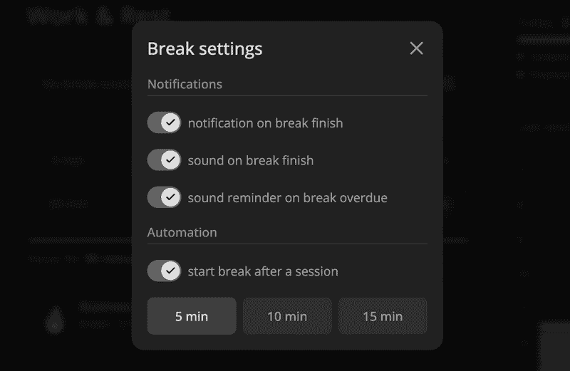
Let's make a nice switch or toggle component with React.
In props, we have value and onChange handler together with an optional label that we'll show next to the switch.
import styled, { useTheme } from "styled-components"
import { defaultTransitionCSS } from "../animations/transitions"
import { CheckIcon } from "../icons/CheckIcon"
import { CloseIcon } from "../icons/CloseIcon"
import { HStack } from "../Stack"
import { Text } from "../Text"
import { centerContentCSS } from "../utils/centerContentCSS"
import { getCSSUnit } from "../utils/getCSSUnit"
import { getSameDimensionsCSS } from "../utils/getSameDimensionsCSS"
import { roundedCSS } from "../utils/roundedCSS"

interface SwitchProps {
  value: boolean
  onChange: (value: boolean) => void
  label?: string
}

const height = 28
const width = height * 1.58
const spacing = 2
const controlSize = height - spacing * 2

const Control = styled.div`
  ${getSameDimensionsCSS(controlSize)};

  ${roundedCSS};
  ${defaultTransitionCSS};

  ${centerContentCSS};
  color: ${({ theme }) => theme.colors.background.toCssValue()};
  font-size: 14px;
`

const Wrapper = styled(HStack)`
  cursor: pointer;

  color: ${({ theme }) => theme.colors.textSupporting.toCssValue()};

  &:hover {
    color: ${({ theme }) => theme.colors.text.toCssValue()};
  }

  &:hover ${Control} {
    transform: scale(1.08);
  }
`

const Container = styled.div`
  width: ${getCSSUnit(width)};
  height: ${getCSSUnit(height)};

  display: flex;
  align-items: center;

  ${roundedCSS};
  ${defaultTransitionCSS};
`

export const Switch = ({ value, onChange, label }: SwitchProps) => {
  const { colors } = useTheme()
  return (
    <Wrapper
      onClick={() => onChange(!value)}
      as="label"
      alignItems="center"
      gap={8}
      id={label}
    >
      <Container
        style={{
          background: (value
            ? colors.textSupporting3
            : colors.backgroundGlass2
          ).toCssValue(),
        }}
      >
        <Control
          style={{
            marginLeft: value ? width - controlSize - spacing : spacing,
            background: colors.text.toCssValue(),
          }}
        >
          {value ? <CheckIcon /> : <CloseIcon />}
        </Control>
      </Container>
      {label && <Text>{label}</Text>}
    </Wrapper>
  )
}
First, we render the Wraper that has the onClick handler so the user can also click on the text to toggle the value. On hover, we'll change the color and make the circle larger with the transform scale.
Then we display the container with fixed width and height. Its background will also change based on value, so the unchecked variant will have an almost transparent background.
Control has the size of container height minus two spacings. To make it move with animation, we set a transition and change the marginLeft property based on value.
I've designed the component for my productivity app Increaser. It utilizes a lot of colors already because every project has different colors. That's why it based on grayish colors and has an icon inside the circle to make it more intuitive for the user.

