Building a React-Based Guitar Theory Practice Page: Connecting Theory and Application


Welcome to the sixth post in our series on building a React-based guitar theory learning app. While we've explored guitar scales and CAGED concepts in previous posts, theory alone isn't enough—we need practical application to reinforce these concepts. In this post, we'll create a songs page that helps you find music specifically tailored to practice different aspects of guitar theory. You can find all the source code in the GitHub repository.
Organizing Songs by Theory Topics
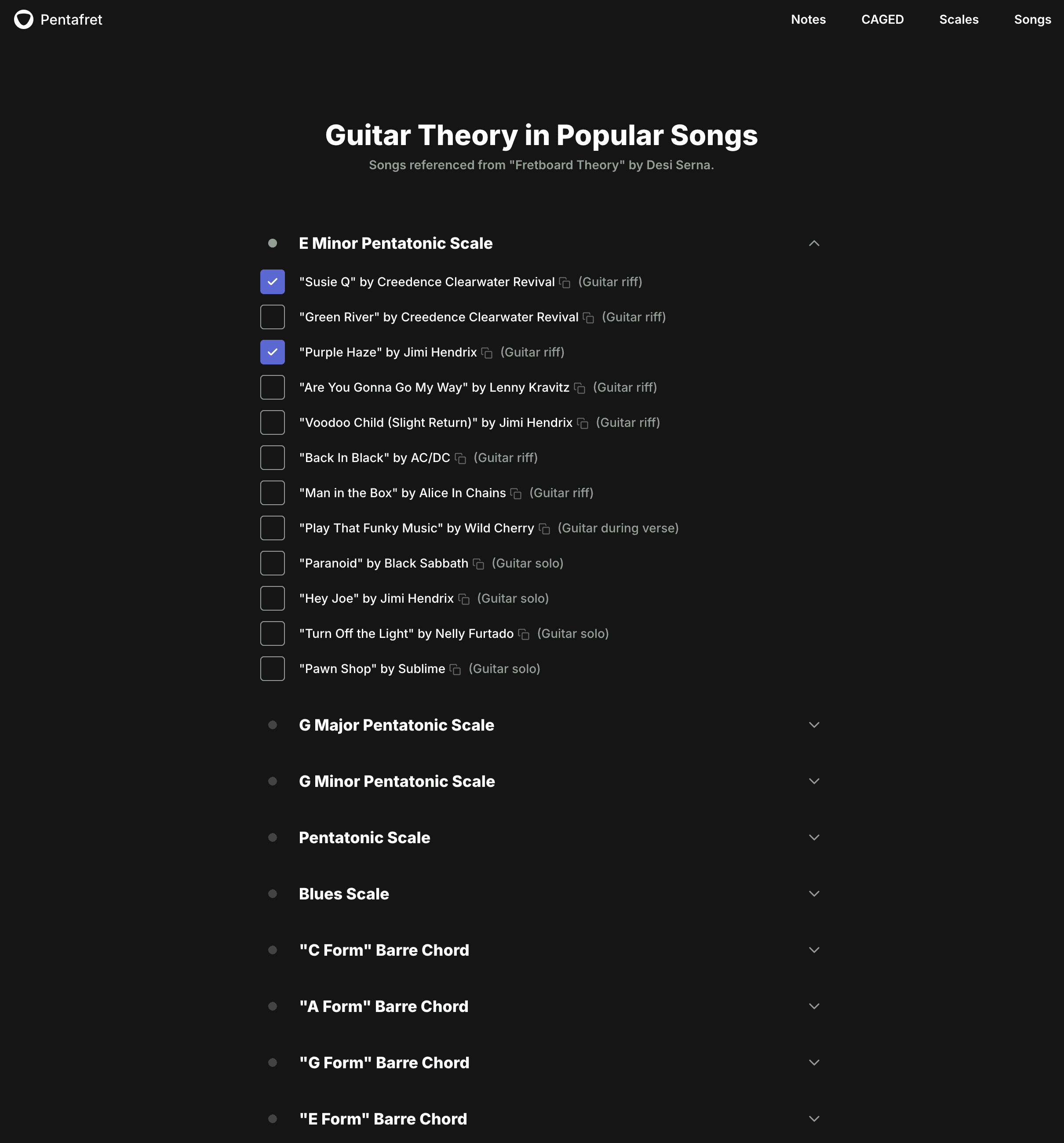
For the content of this page, we've curated a comprehensive collection of songs from Desi Serna's "Fretboard Theory" book. Each song serves as a practical example of specific guitar theory concepts, organized into 40 distinct sections.
import { ClientOnly } from "@lib/ui/base/ClientOnly"

export const guitarTheoryTopics = [
  "e-minor-pentatonic",
  "g-major-pentatonic",
  "g-minor-pentatonic",
  "pentatonic",
  "blues-scale",
  "c-form",
  "a-form",
  "g-form",
  "e-form",
  "d-form",
  "minor-forms",
  "chromatic-riffs",
  "major-scale",
  "major-scale-not-all-seven-degrees",
  "major-scale-chromatic-passing-tones",
  "triads",
  "major-chords-1-4-5",
  "minor-chords-2-3-6",
  "major-chords-1-4-5-string-5",
  "minor-chords-2-3-6-string-5",
  "e-major-root",
  "a-minor-root",
  "changing-pentatonic-scales",
  "blues",
  "ionian-mode",
  "dorian-mode",
  "lydian-mode",
  "mixolydian-mode",
  "aeolian-mode",
  "inverted-power-chords",
  "thirds",
  "sixths",
  "sixth-and-flat-seventh",
  "octaves",
  "minor-seven",
  "major-seven",
  "dominant-seven",
  "minor-seven-am-form",
  "e-form-major-seven",
  "c-form-add-9",
] as const

export type GuitarTheoryTopic = (typeof guitarTheoryTopics)[number]
Creating the Song Data Structure
The Song type represents a musical piece with three key properties: name, artist, and an optional details field. The details field captures important contextual information such as the song's key or specific sections relevant to guitar theory practice. For example, when studying pentatonic scales, the details might highlight a particular guitar riff that demonstrates the scale's application, allowing focused practice on that specific section rather than the entire song.
import { withoutUndefined } from "@lib/utils/array/withoutUndefined"

import { GuitarTheoryTopic } from "./GuitarTheoryTopic"

export type Song = {
  name: string
  artist: string
  details?: string
}
Mapping Topics to Song Collections
To organize our song collection, we'll use a TypeScript Record where each guitar theory topic maps to its corresponding array of songs. For simplicity, we'll focus exclusively on guitar pieces in standard tuning, omitting bass guitar arrangements and alternate tunings that were present in the original Fretboard Theory material.
import { GuitarTheoryTopic } from "./GuitarTheoryTopic"
import { Song } from "./Song"

export const songs: Record<GuitarTheoryTopic, Song[]> = {
  "e-minor-pentatonic": [
    {
      name: "Susie Q",
      artist: "Creedence Clearwater Revival",
      details: "Guitar riff",
    },
    {
      name: "Green River",
      artist: "Creedence Clearwater Revival",
      details: "Guitar riff",
    },
    {
      name: "Purple Haze",
      artist: "Jimi Hendrix",
      details: "Guitar riff",
    },
    {
      name: "Are You Gonna Go My Way",
      artist: "Lenny Kravitz",
      details: "Guitar riff",
    },
    {
      name: "Voodoo Child (Slight Return)",
      artist: "Jimi Hendrix",
      details: "Guitar riff",
    },
    {
      name: "Back In Black",
      artist: "AC/DC",
      details: "Guitar riff",
    },
    {
      name: "Man in the Box",
      artist: "Alice In Chains",
      details: "Guitar riff",
    },
    {
      name: "Play That Funky Music",
      artist: "Wild Cherry",
      details: "Guitar during verse",
    },
    {
      name: "Paranoid",
      artist: "Black Sabbath",
      details: "Guitar solo",
    },
    {
      name: "Hey Joe",
      artist: "Jimi Hendrix",
      details: "Guitar solo",
    },
    {
      name: "Turn Off the Light",
      artist: "Nelly Furtado",
      details: "Guitar solo",
    },
    {
      name: "Pawn Shop",
      artist: "Sublime",
      details: "Guitar solo",
    },
  ],
  "g-major-pentatonic": [
    {
      name: "Honky Tonk Woman",
      artist: "The Rolling Stones",
      details: "Intro guitar lick",
    },
    {
      name: "Wish You Were Here",
      artist: "Pink Floyd",
      details: "Guitar intro",
    },
    {
      name: "Sweet Home Alabama",
      artist: "Lynyrd Skynyrd",
      details: "Guitar intro and solos",
    },
    {
      name: "Centerfold",
      artist: "The J. Geils Band",
      details: "Guitar riff",
    },
    {
      name: "Cannonball",
      artist: "Duane Eddy",
      details: "Guitar riff",
    },
  ],
  "g-minor-pentatonic": [
    {
      name: "Money for Nothing",
      artist: "Dire Straits",
      details: "Guitar riff",
    },
    {
      name: "I Shot the Sheriff",
      artist: "Bob Marley/Eric Clapton",
      details: "Guitar riff at chorus end",
    },
    {
      name: "Play That Funky Music",
      artist: "Wild Cherry",
      details: "Guitar riff during chorus",
    },
    {
      name: "Are You Gonna Go My Way",
      artist: "Lenny Kravitz",
      details: "Guitar riff",
    },
    {
      name: "Lady Marmalade",
      artist: "Patti Labelle",
    },
  ],
  // ...
}
Building the Songs Page Component
Now, let's implement the songs page component that will display this collection. The page structure is straightforward - we'll use a container with a title and a list of sections, where each section corresponds to a guitar theory topic and its associated songs.
import { VStack } from "@lib/ui/css/stack"
import { guitarTheoryTopics } from "@product/core/songs/GuitarTheoryTopic"

import { PageContainer } from "../layout/PageContainer"

import { SongsPageTitle } from "./SongsPageTitle"
import { SongsSection } from "./SongsSection"

export const SongsPage = () => {
  return (
    <PageContainer contentMaxWidth={640}>
      <VStack gap={60}>
        <SongsPageTitle />
        <VStack gap={20}>
          {guitarTheoryTopics.map((topic) => (
            <SongsSection key={topic} value={topic} />
          ))}
        </VStack>
      </VStack>
    </PageContainer>
  )
}
Handling Client-Side State with Next.js
Since our application is built with Next.js and uses static site generation (SSG), we need to handle components that depend on client-side state carefully. The ClientOnly component ensures that sections are only rendered in the browser, where we can access localStorage to maintain which theory topics a user has expanded. This prevents hydration mismatches that would occur if we tried to render these dynamic sections during static generation, as each user will have their own unique set of expanded sections stored locally.
import { ClientOnly } from "@lib/ui/base/ClientOnly"
import { vStack, VStack } from "@lib/ui/css/stack"
import { verticalPadding } from "@lib/ui/css/verticalPadding"
import { ValueProp } from "@lib/ui/props"
import { songs } from "@product/core/songs"
import { GuitarTheoryTopic } from "@product/core/songs/GuitarTheoryTopic"
import { getGuitarTheorySongId } from "@product/core/songs/Song"
import styled from "styled-components"

import { SongItem } from "./SongItem"
import { SongsSectionHeader } from "./SongSectionHeader"
import { useExpandedSongTopics } from "./state/expandedSongTopics"

const Content = styled.div`
  ${vStack({ gap: 12 })}
  ${verticalPadding(8)}
`

export const SongsSection = ({ value }: ValueProp<GuitarTheoryTopic>) => {
  const items = songs[value]

  const [expandedTopics] = useExpandedSongTopics()

  const isExpanded = expandedTopics.includes(value)

  return (
    <VStack>
      <SongsSectionHeader value={value} />
      <ClientOnly>
        {isExpanded && (
          <Content>
            {items.map((song) => (
              <SongItem
                key={getGuitarTheorySongId(value, song)}
                song={song}
                topic={value}
              />
            ))}
          </Content>
        )}
      </ClientOnly>
    </VStack>
  )
}
Persisting User Preferences with Local Storage
To maintain a consistent user experience across sessions, we store which sections are expanded in the browser's local storage. This allows users to return to their previous view state without having to re-expand all the sections they were interested in. For a deeper dive into our storage implementation, check out the dedicated blog post.
import { guitarTheoryTopics } from "@product/core/songs/GuitarTheoryTopic"

import { PersistentStateKey } from "../../state/persistentState"
import { usePersistentState } from "../../state/persistentState"

const defaultValue = guitarTheoryTopics.slice(0, 1)

export const useExpandedSongTopics = () => {
  return usePersistentState<string[]>(
    PersistentStateKey.ExpandedSongTopics,
    defaultValue,
  )
}
Creating Interactive Section Headers
Each section header serves as both a navigation element and a progress indicator. The SongsSectionHeader component displays the theory topic name and manages the expanded/collapsed state of its song list. It also includes a visual indicator that shows whether any songs in that section have been marked as learned. This interactive element helps users quickly identify which concepts they've practiced.
import { ClientOnly } from "@lib/ui/base/ClientOnly"
import { UnstyledButton } from "@lib/ui/buttons/UnstyledButton"
import { round } from "@lib/ui/css/round"
import { sameDimensions } from "@lib/ui/css/sameDimensions"
import { hStack } from "@lib/ui/css/stack"
import { verticalPadding } from "@lib/ui/css/verticalPadding"
import { Center } from "@lib/ui/layout/Center"
import { CollapsableStateIndicator } from "@lib/ui/layout/CollapsableStateIndicator"
import { IsActiveProp, ValueProp } from "@lib/ui/props"
import { Text } from "@lib/ui/text"
import { getColor, matchColor } from "@lib/ui/theme/getters"
import { without } from "@lib/utils/array/without"
import { songs } from "@product/core/songs"
import {
  GuitarTheoryTopic,
  guitarTheoryTopicNames,
} from "@product/core/songs/GuitarTheoryTopic"
import { getGuitarTheorySongId } from "@product/core/songs/Song"
import styled from "styled-components"

import { SongItemFrame } from "./SongItemFrame"
import { useCheckedSongs } from "./state/checkedSongs"
import { useExpandedSongTopics } from "./state/expandedSongTopics"

const CompletionIndicator = styled.div<IsActiveProp>`
  ${round}
  ${sameDimensions(10)}
  background: ${matchColor("isActive", {
    true: "success",
    false: "mistExtra",
  })};
`

const CollapseIndicator = styled(CollapsableStateIndicator)`
  font-size: 20px;
  color: ${getColor("textSupporting")};
`

const Container = styled(UnstyledButton)`
  ${hStack({
    fullWidth: true,
    alignItems: "center",
    justifyContent: "space-between",
    gap: 8,
  })}
  ${verticalPadding(8)}

  &:hover ${CollapseIndicator} {
    color: ${getColor("contrast")};
  }
`

export const SongsSectionHeader = ({ value }: ValueProp<GuitarTheoryTopic>) => {
  const items = songs[value]
  const [checkedSongs] = useCheckedSongs()

  const hasCheckedSong = checkedSongs.some((songId) =>
    items.some((song) => getGuitarTheorySongId(value, song) === songId),
  )

  const [expandedTopics, setExpandedTopics] = useExpandedSongTopics()

  const isExpanded = expandedTopics.includes(value)

  return (
    <Container
      onClick={() =>
        setExpandedTopics(
          isExpanded
            ? without(expandedTopics, value)
            : [...expandedTopics, value],
        )
      }
    >
      <SongItemFrame>
        <Center>
          <ClientOnly>
            <CompletionIndicator isActive={hasCheckedSong} />
          </ClientOnly>
        </Center>
        <Text color="contrast" as="h3" weight={700} size={18}>
          {guitarTheoryTopicNames[value]}
        </Text>
      </SongItemFrame>
      <ClientOnly>
        <CollapseIndicator isOpen={isExpanded} />
      </ClientOnly>
    </Container>
  )
}
Maintaining Visual Consistency with Grid Layout
To have header and song item content aligned, we implement a consistent grid layout with the SongItemFrame component. This ensures that both section headers and individual song items maintain visual uniformity throughout the interface.
import { toSizeUnit } from "@lib/ui/css/toSizeUnit"
import styled from "styled-components"

const boxSize = 28

export const SongItemFrame = styled.div`
  display: grid;
  gap: 16px;
  grid-template-columns: ${toSizeUnit(boxSize)} 1fr;
  line-height: ${toSizeUnit(boxSize)};
`
Building the Song Item Component
The SongItem component displays individual songs within each theory topic. It includes a checkbox for tracking learned songs and shows both the song name and artist. We utilize the CopyText component from RadzionKit to enhance usability—when clicked, it copies the full song information to the clipboard, allowing users to easily search for these songs on YouTube or elsewhere.
import { CheckStatus } from "@lib/ui/checklist/CheckStatus"
import { InvisibleHTMLCheckbox } from "@lib/ui/inputs/InvisibleHTMLCheckbox"
import { Text } from "@lib/ui/text"
import { CopyText } from "@lib/ui/text/CopyText"
import { without } from "@lib/utils/array/without"
import { capitalizeFirstLetter } from "@lib/utils/capitalizeFirstLetter"
import { GuitarTheoryTopic } from "@product/core/songs/GuitarTheoryTopic"
import { getGuitarTheorySongId, Song } from "@product/core/songs/Song"

import { SongItemFrame } from "./SongItemFrame"
import { useCheckedSongs } from "./state/checkedSongs"

type SongItemProps = {
  song: Song
  topic: GuitarTheoryTopic
}

export const SongItem = ({ song, topic }: SongItemProps) => {
  const [checkedSongs, setCheckedSongs] = useCheckedSongs()

  const songId = getGuitarTheorySongId(topic, song)

  const isChecked = checkedSongs.includes(songId)

  const songText = `"${song.name}" by ${song.artist}`

  return (
    <SongItemFrame>
      <CheckStatus as="label" isInteractive value={isChecked}>
        <InvisibleHTMLCheckbox
          value={isChecked}
          onChange={(value) =>
            setCheckedSongs((prev) =>
              value ? [...prev, songId] : without(prev, songId),
            )
          }
        />
      </CheckStatus>
      <Text>
        <CopyText content={songText}>
          <Text as="span" color="contrast">
            {songText}
          </Text>
        </CopyText>
        {song.details && (
          <Text color="supporting" style={{ marginLeft: 8 }} as="span">
            ({capitalizeFirstLetter(song.details)})
          </Text>
        )}
      </Text>
    </SongItemFrame>
  )
}
Generating Unique Song Identifiers
To ensure each song has a unique identifier within our application, we need a function that creates IDs in the context of guitar theory topics. Since each song appears only once per theory topic (even though the same song might appear in multiple topics), we can generate unique IDs by combining the topic name with the song's artist and title.
import { withoutUndefined } from "@lib/utils/array/withoutUndefined"

import { GuitarTheoryTopic } from "./GuitarTheoryTopic"

export type Song = {
  name: string
  artist: string
  details?: string
}

export const getGuitarTheorySongId = (
  topic: GuitarTheoryTopic,
  { artist, name }: Pick<Song, "artist" | "name">,
) =>
  withoutUndefined([topic, artist, name])
    .map((s) => s.toLowerCase().replace(/ /g, "-"))
    .join("-")
With this songs page implementation, we've bridged the gap between abstract guitar theory and practical application, allowing guitarists to track their progress while discovering songs that reinforce specific concepts they're learning—transforming theoretical knowledge into musical fluency through deliberate practice.