How To Make Slider Component with React & Style Range Input


Let's make an excellent slider component on top of HTML range input with React and styled-components.
To support changing the slider value with keyboard arrow keys, we want to include HTML range input that would be completely invisible. We'll propagate props to the input element while converting value before calling the onChange handler.
import styled from "styled-components"

export interface InvisibleHTMLSliderProps {
  min: number
  max: number
  value: number
  step: number
  autoFocus?: boolean
  onChange: (value: number) => void
}

const SliderInput = styled.input`
  border: 0;
  clip: rect(0 0 0 0);
  margin: -1px;
  overflow: hidden;
  padding: 0;
  position: absolute;

  height: 100%;
  white-space: nowrap;
  width: 100%;
  direction: ltr;
`

export const InvisibleHTMLSlider = ({
  min,
  max,
  step,
  autoFocus,
  value,
  onChange,
}: InvisibleHTMLSliderProps) => (
  <SliderInput
    type="range"
    min={min}
    max={max}
    step={step}
    autoFocus={autoFocus}
    value={value}
    onChange={(event) => {
      onChange(Number(event.currentTarget.value))
    }}
  />
)
The Slider component will receive the same props as InvisibleHTMLSlider together with styling parameters: size, color, and height. First, we render a relatively positioned Container and place InvisibleHTMLSlider inside.
To handle changes, we'll listen for the user's press on the container setting the isActive flag to true and calling the handleMove function. We'll do the same in the onMouseMove handler to change the value according to the pressed mouse location.
To calculate new values based on the new X coordinate of the mouse, we take the container's width and start position from the useBoudingBox hook. To stop tracking mouse moves after the user has lifted the mouse, we have an event listed in the window.
import { handleWithStopPropagation } from "lib/shared/events"
import { useBoundingBox } from "lib/shared/hooks/useBoundingBox"
import { toPercents } from "lib/shared/utils/toPercents"
import { defaultTransition } from "lib/ui/animations/transitions"
import { HSLA } from "lib/ui/colors/HSLA"
import { centerContentCSS } from "lib/ui/utils/centerContentCSS"
import { getCSSUnit } from "lib/ui/utils/getCSSUnit"
import { getSameDimensionsCSS } from "lib/ui/utils/getSameDimensionsCSS"
import { useEffect, useRef, useState } from "react"
import styled, { useTheme } from "styled-components"

import {
  InvisibleHTMLSlider,
  InvisibleHTMLSliderProps,
} from "./InvisibleHtmlSlider"

type SliderSize = "m" | "l"

export interface SliderProps extends InvisibleHTMLSliderProps {
  size?: SliderSize
  color?: HSLA
  height?: React.CSSProperties["height"]
}

const Control = styled.div<{ value: number; size: number; $color: HSLA }>`
  position: absolute;
  left: ${({ value, size }) =>
    `calc(${toPercents(value)} - ${getCSSUnit(size / 2)})`};
  ${({ size }) => getSameDimensionsCSS(size)};
  border-radius: 1000px;
  background: ${({ $color }) => $color.getVariant({ a: () => 1 }).toCssValue()};
  transition: outline ${defaultTransition};
  outline: 6px solid transparent;
`

const Container = styled.div<{ $color: HSLA }>`
  width: 100%;
  cursor: pointer;
  ${centerContentCSS};
  position: relative;

  --active-outline-color: ${({ $color }) =>
    $color.getVariant({ a: (a) => a * 0.2 }).toCssValue()};

  :focus-within ${Control} {
    outline: 12px solid var(--active-outline-color);
  }

  &:hover ${Control} {
    outline-color: var(--active-outline-color);
  }
`

const Line = styled.div`
  width: 100%;

  overflow: hidden;
  background-color: ${({ theme }) => theme.colors.backgroundGlass.toCssValue()};
  border-radius: 1000px;
`

const Filler = styled.div<{ value: number; $color: HSLA }>`
  height: 100%;
  width: ${({ value }) => value * 100}%;
  background: ${({ $color }) => $color.toCssValue()};
`

const controlSize: Record<SliderSize, number> = {
  m: 12,
  l: 20,
}

const lineHeight: Record<SliderSize, number> = {
  m: 4,
  l: 8,
}

export const Slider = ({
  value,
  onChange,
  min,
  max,
  step,
  autoFocus,
  size = "m",
  color: optionalColor,
  height = 40,
}: SliderProps) => {
  const theme = useTheme()
  const color = optionalColor ?? theme.colors.text
  const [container, setContainer] = useState<HTMLDivElement | null>(null)
  const box = useBoundingBox(container)
  const isActive = useRef(false)

  const handleMove = (clientX: number) => {
    if (!box || !isActive.current) return

    if (clientX < box.left || clientX > box.right) return

    const ratio = (clientX - box.x) / box.width

    const steps = Math.round((ratio * max) / step)
    const newValue = Math.max(min, steps * step)
    onChange(newValue)
  }

  useEffect(() => {
    const handleMouseUp = () => {
      isActive.current = false
    }
    window.addEventListener("mouseup", handleMouseUp)
    return () => {
      window.removeEventListener("mouseup", handleMouseUp)
    }
  })

  const ratio = value / max

  return (
    <Container
      style={{ height }}
      $color={color}
      ref={setContainer}
      onClick={handleWithStopPropagation()}
      onMouseDown={handleWithStopPropagation((event) => {
        isActive.current = true
        if (event) {
          handleMove(event.clientX)
        }
      })}
      onMouseMove={({ clientX }) => handleMove(clientX)}
    >
      <InvisibleHTMLSlider
        step={step}
        value={value}
        onChange={onChange}
        min={min}
        max={max}
        autoFocus={autoFocus}
      />
      <Line style={{ height: lineHeight[size] }}>
        <Filler $color={color} value={ratio} />
      </Line>
      <Control $color={color} size={controlSize[size]} value={ratio} />
    </Container>
  )
}
To show the slider's track, we have the Line component filling container's width and having an almost transparent color for the background. To highlight the progress, we have the Filler component that uses the color property for the background attribute. Finally, we have a round control with diameter based on size prop changing outline on the focus/hover state of the container.
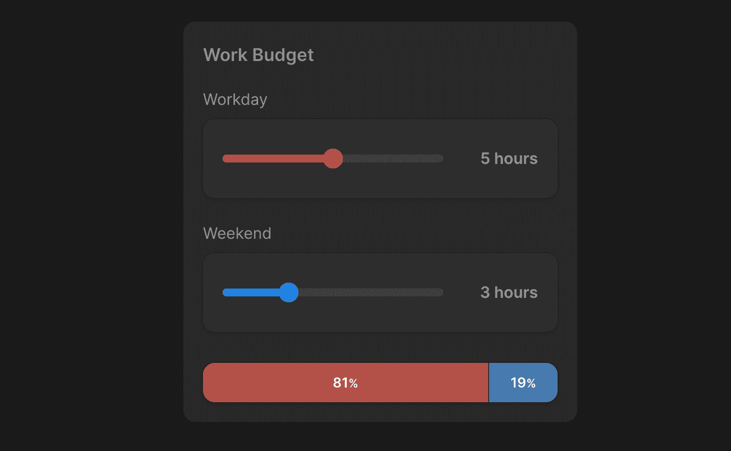
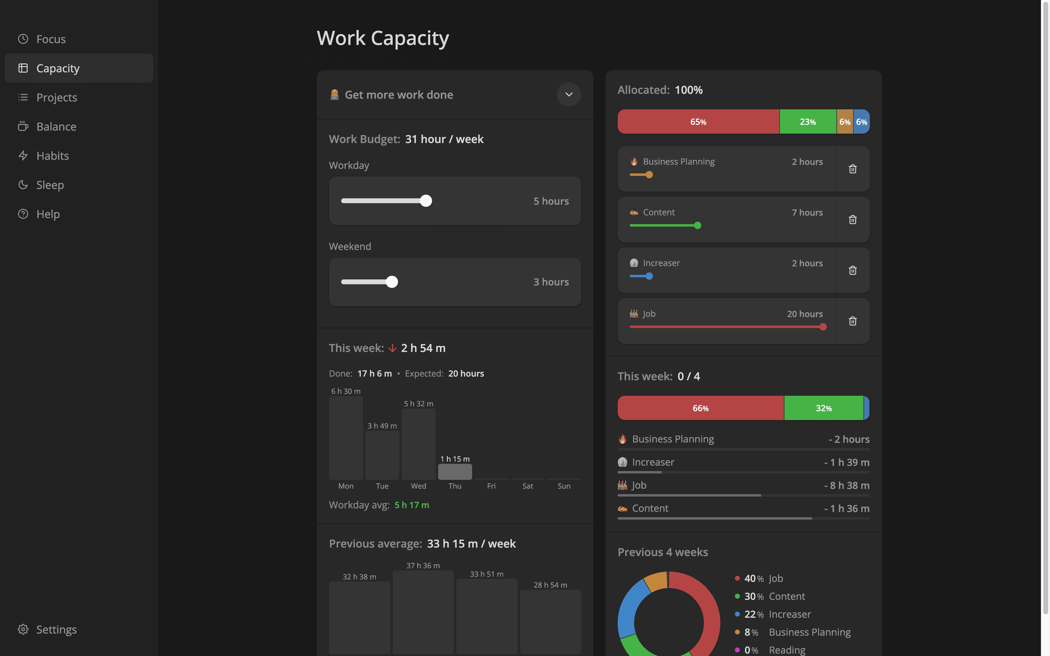
Then we can use the component in differently styled inputs, as in this example from Increaser.
To enter duration with the slider, we have the AmountInput component. And the important note is that we should wrap the Slider component with the label element to make arrow keys work for the invisible range input.
import { Panel } from "lib/ui/Panel/Panel"
import { Text } from "lib/ui/Text"
import { ReactNode } from "react"
import styled from "styled-components"
import { Slider, SliderProps } from "."

import { InputWrapperWithErrorMessage } from "../InputWrapper"

interface Props extends SliderProps {
  label: ReactNode
  formatValue: (value: number) => string
  alignValue?: "start" | "end"
}

const Content = styled.div`
  display: grid;
  width: 100%;
  display: grid;
  grid-template-columns: 1fr 80px;
  align-items: center;
  gap: 16px;
`

export const AmountInput = ({
  value,
  step,
  min = 0,
  max,
  onChange,
  label,
  formatValue,
  color,
  size = "l",
  alignValue = "end",
}: Props) => {
  return (
    <InputWrapperWithErrorMessage label={label}>
      <Panel>
        <Content>
          <Slider
            step={step}
            size={size}
            min={min}
            max={max}
            onChange={onChange}
            value={value}
            color={color}
          />
          <Text style={{ textAlign: alignValue }} weight="bold">
            {formatValue(value)}
          </Text>
        </Content>
      </Panel>
    </InputWrapperWithErrorMessage>
  )
}