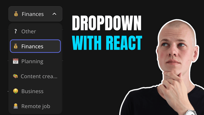
Implementing a Custom Dropdown Component in React with TypeScript and Floating-UI
Implementing a Dropdown Component with React, TypeScript, and Floating-UI
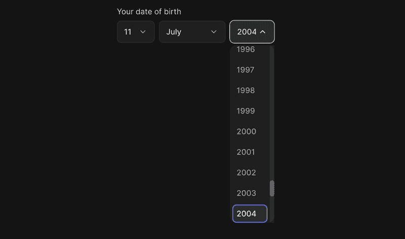
In this article, we'll walk through the implementation of a dropdown component using React, TypeScript, and Floating-UI. You can find both the demo and the source code in the RadzionKit repository.
Component Overview: ExpandableSelector
Let's call the component ExpandableSelector, as it expands when clicked and allows you to select an option. It will receive the following props:
style,className- Optional props for customizing the component's appearance. Both will be passed to the root element.value- The currently selected value. We usenullto represent a situation where no option is selected. Generics are used to define the type of the value, making the component more flexible.onChange- A callback function triggered when the value changes.isDisabled- A flag to disable the component.options- An array of options to choose from.getOptionKey- A function that returns a unique key for each option.renderOption- A function that renders an option.openerContent- Optional content to display in the opener. If not provided, therenderOptionfunction will be used.floatingOptionsWidthSameAsOpener- A flag to set the floating options width the same as the opener.showToggle- A flag to display the toggle button.returnFocus- A flag that returns focus to the opener after selecting an option, useful when used in a form.
import { FloatingOptionsContainer } from "../floating/FloatingOptionsContainer"
import { useFloatingOptions } from "../floating/useFloatingOptions"
import { UIComponentProps } from "../props"
import { OptionItem } from "./OptionItem"
import { ExpandableSelectorToggle } from "./ExpandableSelectorToggle"
import { FloatingFocusManager } from "@floating-ui/react"
import { OptionContent } from "./OptionContent"
import { OptionOutline } from "./OptionOutline"
import { ExpandableSelectorContainer } from "./ExpandableSelectorContainer"

export type ExpandableSelectorProp<T> = UIComponentProps & {
  value: T | null
  onChange: (value: T) => void
  isDisabled?: boolean
  options: readonly T[]
  getOptionKey: (option: T) => string
  renderOption: (option: T) => React.ReactNode
  openerContent?: React.ReactNode
  floatingOptionsWidthSameAsOpener?: boolean
  showToggle?: boolean
  returnFocus?: boolean
}

export function ExpandableSelector<T>({
  value,
  onChange,
  options,
  isDisabled,
  renderOption,
  getOptionKey,
  openerContent,
  floatingOptionsWidthSameAsOpener,
  showToggle = true,
  returnFocus = false,
  ...rest
}: ExpandableSelectorProp<T>) {
  const {
    getReferenceProps,
    getFloatingProps,
    getOptionProps,
    isOpen,
    setIsOpen,
    activeIndex,
    context,
  } = useFloatingOptions({
    floatingOptionsWidthSameAsOpener,
    selectedIndex: value === null ? null : options.indexOf(value),
  })

  const referenceProps = isDisabled ? {} : getReferenceProps()

  return (
    <>
      <ExpandableSelectorContainer
        isDisabled={isDisabled}
        isActive={isOpen}
        {...referenceProps}
        {...rest}
      >
        <OptionContent>
          {openerContent ?? renderOption(value as T)}
        </OptionContent>
        {showToggle && <ExpandableSelectorToggle isOpen={isOpen} />}
      </ExpandableSelectorContainer>
      {isOpen && !isDisabled && (
        <FloatingFocusManager context={context} modal returnFocus={returnFocus}>
          <FloatingOptionsContainer {...getFloatingProps()}>
            {options.map((option, index) => (
              <OptionItem
                key={getOptionKey(option)}
                isActive={activeIndex === index}
                {...getOptionProps({
                  index,
                  onSelect: () => {
                    onChange(option)
                    setIsOpen(false)
                  },
                })}
              >
                <OptionContent>{renderOption(option)}</OptionContent>
                {option === value && <OptionOutline />}
              </OptionItem>
            ))}
          </FloatingOptionsContainer>
        </FloatingFocusManager>
      )}
    </>
  )
}
Core Functionality with useFloatingOptions
The useFloatingOptions hook provides the core functionality for managing the dropdown's state and interactions. It uses the useFloating hook from the Floating-UI library to handle the positioning logic. This includes determining the placement of the floating options container, applying offsets, and ensuring the dropdown stays within the available viewport space by flipping its position if necessary.
The hook integrates various interactions such as clicking to open or close the dropdown, handling keyboard navigation, and dismissing the dropdown when clicking outside of it. By using useInteractions, the hook combines these behaviors seamlessly. Additionally, it manages focus and active states, ensuring a smooth and accessible user experience.
import {
  useFloating,
  useInteractions,
  useListNavigation,
  useRole,
  useClick,
  useDismiss,
  flip,
} from "@floating-ui/react"
import { autoUpdate, offset, size } from "@floating-ui/dom"

import { useRef, useState } from "react"
import { toSizeUnit } from "../css/toSizeUnit"

interface FloatingOptionsParams {
  selectedIndex: number | null
  floatingOptionsWidthSameAsOpener?: boolean
}

interface GetOptionsPropsParams {
  index: number
  onSelect: () => void
}

export const useFloatingOptions = ({
  selectedIndex,
  floatingOptionsWidthSameAsOpener = true,
}: FloatingOptionsParams) => {
  const [isOpen, setIsOpen] = useState(false)

  const { refs, context, floatingStyles } = useFloating({
    placement: "bottom-end",
    open: isOpen,
    onOpenChange: setIsOpen,
    whileElementsMounted: autoUpdate,
    middleware: [
      offset(4),
      flip(),
      size({
        apply({ elements, availableHeight, rects }) {
          Object.assign(elements.floating.style, {
            maxHeight: `${toSizeUnit(Math.min(availableHeight, 320))}`,
            width: floatingOptionsWidthSameAsOpener
              ? toSizeUnit(rects.reference.width)
              : undefined,
          })
        },
      }),
    ],
  })

  const optionsRef = useRef<Array<HTMLElement | null>>([])
  const [activeIndex, setActiveIndex] = useState<number | null>(null)

  const { getReferenceProps, getFloatingProps, getItemProps } = useInteractions(
    [
      useClick(context, { event: "mousedown" }),
      useRole(context, { role: "listbox" }),
      useDismiss(context),
      useListNavigation(context, {
        listRef: optionsRef,
        activeIndex,
        selectedIndex,
        onNavigate: setActiveIndex,
        loop: true,
      }),
    ]
  )

  const getReferencePropsEnhanced = () => {
    return getReferenceProps({
      ref: refs.setReference,
      tabIndex: 0,
      "aria-autocomplete": "none",
      "aria-labelledby": "select-label",
    })
  }

  const getFloatingPropsEnhanced = () => {
    return getFloatingProps({
      ref: refs.setFloating,
      style: floatingStyles,
    })
  }

  const getOptionPropsEnhanced = ({
    index,
    onSelect,
  }: GetOptionsPropsParams) => {
    return getItemProps({
      role: "option",
      tabIndex: activeIndex === index ? 0 : -1,
      "aria-selected": index === selectedIndex && index === activeIndex,
      onClick: onSelect,
      ref: (element) => {
        optionsRef.current[index] = element
      },
      onKeyDown: (event) => {
        if (event.key === "Enter") {
          event.preventDefault()
          onSelect()
        }
      },
    })
  }

  return {
    isOpen,
    setIsOpen,
    getReferenceProps: getReferencePropsEnhanced,
    getFloatingProps: getFloatingPropsEnhanced,
    getOptionProps: getOptionPropsEnhanced,
    activeIndex,
    floatingStyles,
    refs,
    context,
  } as const
}
Styling with ExpandableSelectorContainer
The ExpandableSelectorContainer component is a styled container for our dropdown, leveraging styled-components for dynamic styling based on props such as isDisabled and isActive. It ensures that the dropdown is interactive, visually responsive to hover and active states, and provides accessibility features like focus outlines. By applying different styles conditionally, the container offers a seamless user experience that aligns with the overall theme of the application.
import styled, { css } from "styled-components"
import { interactive } from "../css/interactive"
import { getColor } from "../theme/getters"
import { getHoverVariant } from "../theme/getHoverVariant"
import { SelectContainer } from "./SelectContainer"
import { ExpandableSelectorToggle } from "./ExpandableSelectorToggle"
import { ComponentWithActiveState, ComponentWithDisabledState } from "../props"

type ExpandableSelectorContainerProps = ComponentWithActiveState &
  ComponentWithDisabledState

export const ExpandableSelectorContainer = styled(
  SelectContainer
)<ExpandableSelectorContainerProps>`
  ${({ isDisabled }) =>
    isDisabled
      ? css`
          pointer-events: none;
          opacity: 0.4;
        `
      : css`
          ${interactive};

          &:hover {
            background: ${getHoverVariant("foreground")};
            ${ExpandableSelectorToggle} {
              color: ${getColor("contrast")};
            }
          }
        `}

  outline: 1px solid transparent;

  ${({ isActive }) =>
    isActive &&
    css`
      background: ${getHoverVariant("foreground")};
      ${ExpandableSelectorToggle} {
        color: ${getColor("contrast")};
      }
      outline: 1px solid ${getColor("text")};
    `}

  &:active, &:focus {
    outline: 1px solid ${getColor("text")};
  }
`
To ensure our component APIs are consistent, we leverage existing types ComponentWithActiveState and ComponentWithDisabledState from RadzionKit.
export type ComponentWithActiveState = {
  isActive: boolean
}

export type ComponentWithDisabledState = {
  isDisabled?: boolean | string
}
We use the OptionContent component for both the dropdown options and the currently selected option in the opener to maintain a consistent UI. To prevent layout issues, we apply the cropText CSS utility to each child element, ensuring long text is truncated and does not overflow.
import styled from "styled-components"
import { cropText } from "../css/cropText"
import { HStack } from "../layout/Stack"

export const OptionContent = styled(HStack)`
  overflow: hidden;
  align-items: center;
  gap: 8px;
  font-size: 14px;
  font-weight: 500;
  > * {
    ${cropText};
  }
`
Indicating Dropdown State with ExpandableSelectorToggle
To indicate the state of the dropdown (open or closed), we use the ExpandableSelectorToggle component. This component is built on top of the CollapsableStateIndicator, but includes custom styles and transitions for a smooth animation effect.
import styled from "styled-components"
import { CollapsableStateIndicator } from "../layout/CollapsableStateIndicator"
import { transition } from "../css/transition"
import { getColor } from "../theme/getters"

export const ExpandableSelectorToggle = styled(CollapsableStateIndicator)`
  font-size: 16px;
  ${transition};
  color: ${getColor("textSupporting")};
`
Since it's a common pattern to display a chevron icon to indicate whether a component is expanded or not, we use a generic CollapsableStateIndicator component. This component renders a chevron icon and rotates it based on the isOpen prop using a rotation transformation.
import styled from "styled-components"
import { UIComponentProps } from "../props"
import { IconWrapper } from "../icons/IconWrapper"
import { ChevronDownIcon } from "../icons/ChevronDownIcon"

type CollapsableStateIndicatorProps = UIComponentProps & {
  isOpen: boolean
}

const Container = styled(IconWrapper)<{ isOpen: boolean }>`
  transform: rotateZ(${({ isOpen }) => (isOpen ? "-180deg" : "0deg")});
`

export const CollapsableStateIndicator = (
  props: CollapsableStateIndicatorProps
) => (
  <Container {...props}>
    <ChevronDownIcon />
  </Container>
)
Managing Options in an Open State
When the component is in an open state and not disabled, we display the options within the FloatingOptionsContainer. Additionally, we use the FloatingFocusManager to trap focus within the dropdown, so users can navigate through the options using the keyboard.
import styled from "styled-components"
import { borderRadius } from "../css/borderRadius"
import { getColor } from "../theme/getters"

export const FloatingOptionsContainer = styled.div`
  ${borderRadius.m};
  overflow-y: auto;
  outline: none;

  display: flex;
  flex-direction: column;
  gap: 4px;

  padding: 4px;
  background: ${getColor("foreground")};
  z-index: 1;
`
Styling Options with OptionItem
We use the OptionItem to style each option and apply active state styles. This is particularly useful when the user navigates through the options using the keyboard. The active option is not necessarily the selected one, but the one that is currently focused, and if the user presses Enter, it will become the selected option.
import styled, { css } from "styled-components"
import { ComponentWithActiveState } from "../props"
import { borderRadius } from "../css/borderRadius"
import { interactive } from "../css/interactive"
import { getColor } from "../theme/getters"

export const OptionItem = styled.div<ComponentWithActiveState>`
  outline: none;
  ${interactive};
  color: ${getColor("textSupporting")};
  position: relative;
  padding: 8px;
  ${borderRadius.s}

  ${({ isActive }) =>
    isActive &&
    css`
      background: ${getColor("mist")};
      color: ${getColor("contrast")};
    `}
`
By using the OptionOutline component, we can highlight the selected option with a colored border. We utilize the absoluteOutline CSS utility from RadzionKit to position the element absolutely, providing more control over how the outline is displayed relative to the parent boundaries.
import styled from "styled-components"
import { absoluteOutline } from "../css/absoluteOutline"
import { borderRadius } from "../css/borderRadius"
import { getColor } from "../theme/getters"

export const OptionOutline = styled.div`
  ${absoluteOutline(0, 0)};
  background: transparent;
  ${borderRadius.s};
  border: 2px solid ${getColor("primary")};
`
