

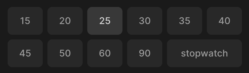
Here we can see a grid of options, where we can choose one by clicking on it or using arrows on the keyboard.
To display an option, we are using the SelectOption component. It receives the same props as InvisibleHtmlRadio component plus children, and optional className. To make it accessible and support the keyboard, we use HTML radio input hidden from the user. It receives a group name that should be the same across a group of options, value, isSelected flag, onSelect callback, and optional autoFocus. To make it invisible we reset a bunch of attributes and position it absolutely.
import React from "react"
import { ReactNode } from "react"
import styled, { css } from "styled-components"
import { defaultTransitionCSS } from "lib/ui/animations/transitions"
import { centerContentCSS } from "lib/ui/utils/centerContentCSS"

import { defaultInputShapeCSS } from "../config"
import {
  InvisibleHTMLRadio,
  Props as InvisibleHTMLRadioProps,
} from "../InvisibleHTMLRadio"

const Container = styled.label<{ isSelected: boolean }>`
  position: relative;
  cursor: pointer;

  ${centerContentCSS}
  background: ${({ theme }) => theme.colors.backgroundGlass.toCssValue()};

  ${defaultInputShapeCSS};
  ${defaultTransitionCSS};

  font-weight: 500;

  color: ${({ theme }) => theme.colors.textSupporting.toCssValue()};
  &:hover {
    background: ${({ theme }) => theme.colors.backgroundGlass2.toCssValue()};
  }

  ${({ isSelected }) =>
    isSelected &&
    css`
      background: ${({ theme }) => theme.colors.backgroundGlass2.toCssValue()};
      color: ${({ theme }) => theme.colors.text.toCssValue()};
    `};
`

interface Props extends InvisibleHTMLRadioProps {
  children: ReactNode
  className?: string
}

export const SelectOption = ({
  isSelected,
  children,
  className,
  ...rest
}: Props) => {
  return (
    <Container className={className} tabIndex={-1} isSelected={isSelected}>
      {children}
      <InvisibleHTMLRadio isSelected={isSelected} {...rest} />
    </Container>
  )
}
For the container styles, we set position, cursor, center content, background, the same shape as an input element, transition, font-weight, color, and hover effect. To highlight the selected option we rely on the isSelected flag and set a different color for the background and text. Then we place children and invisible radio inside of the container, and we are good to go.
We can also use a different approach where we use one Select component instead of mapping over options and rendering SelectOption, but then we might lose some flexibility. For example, here, I want to display options in two rows and make the last one take two columns, and using a custom container makes it easy.