React Masterclass: Building a Schedule Page for a Productivity App


Mastering React: Building a Schedule Page for a Productivity App
In this post, we delve into a React masterclass to build a visually appealing schedule page for a productivity app. We'll leverage actual data to craft interesting visualizations, all without depending on external component libraries. You'll discover that, by decomposing the complex UIs into smaller components, the task becomes way easier. While the code for this specific application is in a private repository, all the reusable components can be found in the RadzionKit repository.
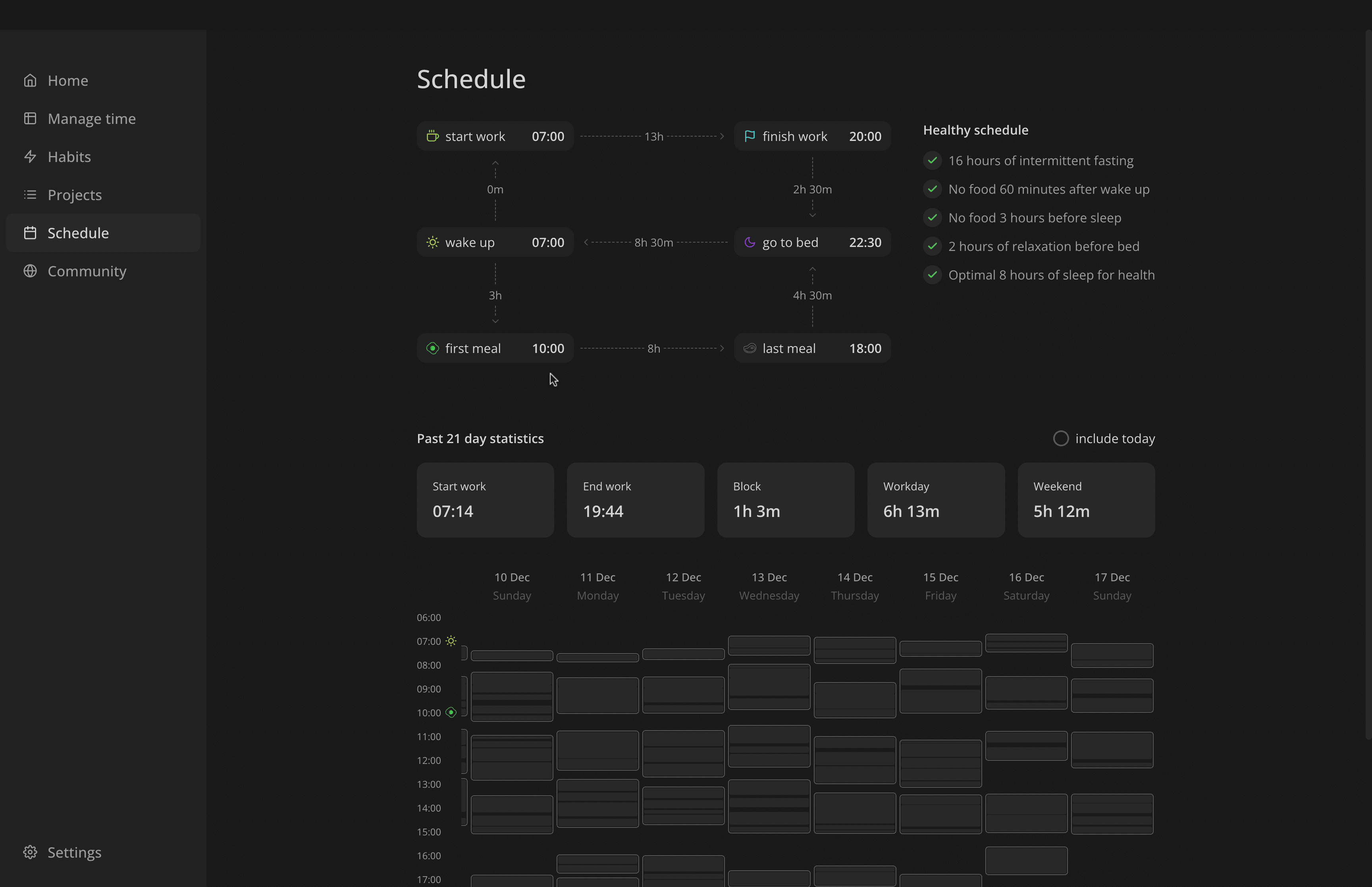
Enhancing Remote Work: The Dual-Feature Schedule Page at Increaser
The Schedule Page at Increaser aims to assist remote workers in optimizing their daily routine for enhanced health and productivity. It comprises two main sections:
- Scheduler: This section includes essential events every user should plan, such as wake-up time, first meal, and end of the workday.
- Statistics: Here, we provide an analysis of the user's previous workdays, including average work blocks, total work hours on weekdays and weekends, and the start and end times of the workday. This feature enables users to compare their intended schedule with their actual work patterns.
By integrating these sections, the Schedule Page serves as a valuable tool for remote workers striving for a balanced and efficient daily routine.
Optimizing Data Structure for Scheduling in React: A DynamoDB and Day Moment Integration
Our code models the schedule as a record, where each key is a DayMoment type, representing various daily events like wakeUpAt, startWorkAt, firstMealAt, etc. The value of each key indicates the minutes elapsed since midnight. For instance, a wake-up time at 7 am is denoted by a wakeUpAt field with a value of 420 minutes. Additionally, we use a dayMomentShortName record to map DayMoment types to concise names suitable for UI display. The dayMomentStep variable sets the time increment for scheduling, allowing users to adjust events in 30-minute steps. Lastly, the dayMomentsDefaultValues record establishes default times for each scheduled event when creating a new user's profile.
import { convertDuration } from "@increaser/utils/time/convertDuration"
import { Minutes } from "@increaser/utils/time/types"

export const dayMoments = [
  "wakeUpAt",
  "firstMealAt",
  "startWorkAt",
  "lastMealAt",
  "finishWorkAt",
  "goToBedAt",
] as const

export type DayMoment = (typeof dayMoments)[number]

export type DayMoments = Record<DayMoment, Minutes>

export const dayMomentShortName: Record<DayMoment, string> = {
  wakeUpAt: "wake up",
  startWorkAt: "start work",
  finishWorkAt: "finish work",
  goToBedAt: "go to bed",
  firstMealAt: "first meal",
  lastMealAt: "last meal",
}

export const dayMomentStep: Minutes = 30

export const dayMomentsDefaultValues: Record<DayMoment, Minutes> = {
  wakeUpAt: convertDuration(7, "h", "min"),
  startWorkAt: convertDuration(7, "h", "min") + dayMomentStep,
  firstMealAt: convertDuration(10, "h", "min"),
  finishWorkAt: convertDuration(17, "h", "min") + dayMomentStep,
  lastMealAt: convertDuration(18, "h", "min"),
  goToBedAt: convertDuration(22, "h", "min"),
}
Given our use of DynamoDB as the database, it's advantageous to maintain a flat data structure. Consequently, the User type extends the DayMoments type. This approach simplifies updates, as modifying a day moment entails a standard update operation on a user, eliminating the need for an additional endpoint in our API.
export type User = DayMoments & {
  id: string
  email: string
  country?: CountryCode
  name?: string
  /// ...
}
Designing the ManageSchedule Component: Responsive Visualization for Varied Screen Sizes
Let's begin with the ManageSchedule component. This component aims to offer users a clear visualization of their events and enables them to manage their schedule effectively. We employ the ElementSizeAware component to accommodate both small and medium-sized screens. It provides the dimensions of the Wrapper element, guiding us in choosing the appropriate layout. For small screens, a flexbox with column direction is utilized, minimizing the spacing between events for optimal display. On medium-sized screens, we implement a CSS Grid for a more structured presentation.
import { useAssertUserState } from "user/state/UserStateContext"
import { convertDuration } from "@increaser/utils/time/convertDuration"
import styled from "styled-components"
import { ElementSizeAware } from "@increaser/ui/base/ElementSizeAware"
import { VStack } from "@increaser/ui/layout/Stack"
import { ManageDayMoment } from "./ManageDayMoment"
import { TimeDistance } from "@increaser/ui/time/TimeDistance"

const Wrapper = styled.div`
  flex: 1;
`

const gridMinWidth = 520

const Grid = styled.div`
  display: grid;
  gap: 8px;
  grid-template-rows: min-content 80px min-content 80px min-content;
  grid-template-columns: min-content 1fr min-content;
  width: 100%;
`

export const ManageSchedule = () => {
  const {
    wakeUpAt,
    startWorkAt,
    finishWorkAt,
    goToBedAt,
    firstMealAt,
    lastMealAt,
  } = useAssertUserState()

  const manageWakeUp = (
    <ManageDayMoment
      dayMoment="wakeUpAt"
      min={convertDuration(4, "h", "min")}
      max={startWorkAt}
    />
  )

  const manageStartWork = (
    <ManageDayMoment
      dayMoment="startWorkAt"
      min={wakeUpAt}
      max={finishWorkAt}
    />
  )

  const manageFirstMeal = (
    <ManageDayMoment dayMoment="firstMealAt" min={wakeUpAt} max={lastMealAt} />
  )

  const manageFinishWork = (
    <ManageDayMoment
      dayMoment="finishWorkAt"
      min={startWorkAt}
      max={goToBedAt}
    />
  )

  const manageLastMeal = (
    <ManageDayMoment dayMoment="lastMealAt" min={firstMealAt} max={goToBedAt} />
  )

  const manageBedTime = (
    <ManageDayMoment dayMoment="goToBedAt" min={finishWorkAt} max={goToBedAt} />
  )

  return (
    <ElementSizeAware
      render={({ setElement, size }) => (
        <Wrapper ref={setElement}>
          {size && size.width < gridMinWidth ? (
            <VStack gap={16}>
              {manageWakeUp}
              {manageStartWork}
              {manageFirstMeal}
              {manageFinishWork}
              {manageLastMeal}
              {manageBedTime}
            </VStack>
          ) : (
            <VStack fullWidth gap={40}>
              <Grid>
                {manageStartWork}
                <TimeDistance
                  direction="right"
                  value={finishWorkAt - startWorkAt}
                />
                {manageFinishWork}
                <TimeDistance direction="up" value={startWorkAt - wakeUpAt} />
                <div />
                <TimeDistance
                  direction="down"
                  value={goToBedAt - finishWorkAt}
                />
                {manageWakeUp}
                <TimeDistance
                  direction="left"
                  value={
                    convertDuration(1, "d", "min") - (goToBedAt - wakeUpAt)
                  }
                />
                {manageBedTime}
                <TimeDistance direction="down" value={firstMealAt - wakeUpAt} />
                <div />
                <TimeDistance direction="up" value={goToBedAt - lastMealAt} />
                {manageFirstMeal}
                <TimeDistance
                  direction="right"
                  value={lastMealAt - firstMealAt}
                />
                {manageLastMeal}
              </Grid>
            </VStack>
          )}
        </Wrapper>
      )}
    />
  )
}
Implementing the ManageDayMoment Component: Interactive Scheduling with Floating-UI in React
The ManageDayMoment component adeptly handles the dayMoment prop, which includes the event's name and accompanying minimum and maximum parameters. These parameters are instrumental in defining a specific time range for an event. For example, in a "start of work" event, the minimum will be set to the wake-up time and the maximum to the work finishing time. The container of this component smartly showcases an icon associated with the event, the event's abbreviated name, and the time in a formatted manner. Upon user interaction, such as clicking on the event, a dropdown appears, presenting various time options. Selecting a new time from this dropdown will promptly update the schedule to reflect this change.
import { borderRadius } from "@increaser/ui/css/borderRadius"
import { transition } from "@increaser/ui/css/transition"
import { HStack } from "@increaser/ui/layout/Stack"
import { Text } from "@increaser/ui/text"
import { getColor } from "@increaser/ui/theme/getters"
import styled, { useTheme } from "styled-components"
import { css } from "styled-components"
import { absoluteOutline } from "@increaser/ui/css/absoluteOutline"
import { interactive } from "@increaser/ui/css/interactive"
import { TimeOption } from "./TimeOption"
import { getDayMomentColor } from "sets/utils/getDayMomentColor"
import { IconWrapper } from "@increaser/ui/icons/IconWrapper"
import { dayMomentIcon } from "../../dayMomentIcon"
import {
  DayMoment,
  dayMomentShortName,
  dayMomentStep,
} from "@increaser/entities/DayMoments"
import { range } from "@increaser/utils/array/range"
import { useUpdateUserMutation } from "user/mutations/useUpdateUserMutation"
import { useAssertUserState } from "user/state/UserStateContext"
import { useFloatingOptions } from "@increaser/ui/floating/useFloatingOptions"
import { formatDailyEventTime } from "@increaser/utils/time/formatDailyEventTime"
import { FloatingOptionsContainer } from "@increaser/ui/floating/FloatingOptionsContainer"

interface ManageDayMomentProps {
  min: number
  max: number
  dayMoment: DayMoment
}

const Container = styled.div<{ isActive: boolean }>`
  ${borderRadius.m};
  ${interactive};
  outline: none;

  display: flex;
  justify-content: space-between;
  flex-direction: row;
  gap: 1px;
  overflow: hidden;
  padding: 8px 12px;
  background: ${getColor("foreground")};
  ${transition};

  ${({ isActive }) =>
    isActive &&
    css`
      background: ${getColor("mist")};
    `}

  &:hover {
    background: ${getColor("mist")};
    color: ${getColor("contrast")};
  }
`

const Outline = styled.div`
  ${absoluteOutline(0, 0)};
  background: transparent;
  border-radius: 8px;
  border: 2px solid ${getColor("primary")};
`

export const ManageDayMoment = ({
  min,
  max,
  dayMoment,
}: ManageDayMomentProps) => {
  const user = useAssertUserState()
  const value = user[dayMoment]

  const { mutate: updateUser } = useUpdateUserMutation()

  const options = range(Math.round((max - min) / dayMomentStep) + 1).map(
    (step) => min + dayMomentStep * step
  )

  const {
    getReferenceProps,
    getFloatingProps,
    getOptionProps,
    isOpen,
    setIsOpen,
    activeIndex,
  } = useFloatingOptions({
    selectedIndex: options.indexOf(value),
  })

  const theme = useTheme()
  const color = getDayMomentColor(dayMoment, theme)

  return (
    <>
      <Container isActive={isOpen} {...getReferenceProps()}>
        <HStack style={{ minWidth: 132 }} alignItems="center" gap={8}>
          <IconWrapper style={{ color: color.toCssValue() }}>
            {dayMomentIcon[dayMoment]}
          </IconWrapper>
          <Text as="div">{dayMomentShortName[dayMoment]}</Text>
        </HStack>
        <Text weight="bold">{formatDailyEventTime(value)}</Text>
      </Container>
      {isOpen && (
        <FloatingOptionsContainer {...getFloatingProps()}>
          {options.map((option, index) => (
            <TimeOption
              isActive={activeIndex === index}
              key={option}
              {...getOptionProps({
                index,
                onSelect: () => {
                  updateUser({ [dayMoment]: option })
                  setIsOpen(false)
                },
              })}
            >
              {formatDailyEventTime(option)}
              {option === value && <Outline />}
            </TimeOption>
          ))}
        </FloatingOptionsContainer>
      )}
    </>
  )
}
For positioning time options and facilitating keyboard selection, we leverage the floating-ui library within the useFloatingOptions hook. This hook sets the dropdown's appearance via useFloating and orchestrates navigation between the options with useListNavigation. The useDismiss hook enables closing options using the Escape key, while useClick allows for toggling options on a click event. The seamless integration of these functionalities is achieved through the useInteractions hook. To further enhance convenience for useFloatingOptions consumers, we provide upgraded versions of the getReferenceProps, getFloatingProps, and getOptionProps functions. For example getOptionPropsEnhanced accepts an onSelect callback and incorporates both click and enter key handlers. Although initially challenging to navigate, getting a hang of the floating-ui library unlocks its potential for creating complex user interfaces.
import {
  useFloating,
  useInteractions,
  useListNavigation,
  useRole,
  useClick,
  useDismiss,
} from "@floating-ui/react"
import { autoUpdate, offset, size } from "@floating-ui/dom"

import { useRef, useState } from "react"
import { toSizeUnit } from "../css/toSizeUnit"

interface FloatingOptionsParams {
  selectedIndex: number
}

interface GetOptionsPropsParams {
  index: number
  onSelect: () => void
}

export const useFloatingOptions = ({
  selectedIndex,
}: FloatingOptionsParams) => {
  const [isOpen, setIsOpen] = useState(false)

  const { refs, context, floatingStyles } = useFloating({
    placement: "bottom-end",
    open: isOpen,
    onOpenChange: setIsOpen,
    whileElementsMounted: autoUpdate,
    middleware: [
      offset(4),
      size({
        apply({ elements, availableHeight, rects }) {
          Object.assign(elements.floating.style, {
            maxHeight: `${toSizeUnit(Math.min(availableHeight, 320))}`,
            width: toSizeUnit(rects.reference.width),
          })
        },
      }),
    ],
  })

  const optionsRef = useRef<Array<HTMLElement | null>>([])
  const [activeIndex, setActiveIndex] = useState<number | null>(null)

  const { getReferenceProps, getFloatingProps, getItemProps } = useInteractions(
    [
      useClick(context, { event: "mousedown" }),
      useRole(context, { role: "listbox" }),
      useDismiss(context),
      useListNavigation(context, {
        listRef: optionsRef,
        activeIndex,
        selectedIndex,
        onNavigate: setActiveIndex,
        loop: true,
      }),
    ]
  )

  const getReferencePropsEnhanced = () => {
    return getReferenceProps({
      ref: refs.setReference,
      tabIndex: 0,
      "aria-autocomplete": "none",
      "aria-labelledby": "select-label",
    })
  }

  const getFloatingPropsEnhanced = () => {
    return getFloatingProps({
      ref: refs.setFloating,
      style: floatingStyles,
    })
  }

  const getOptionPropsEnhanced = ({
    index,
    onSelect,
  }: GetOptionsPropsParams) => {
    return getItemProps({
      role: "option",
      tabIndex: activeIndex === index ? 0 : -1,
      "aria-selected": index === selectedIndex && index === activeIndex,
      onClick: onSelect,
      ref: (element) => {
        optionsRef.current[index] = element
      },
      onKeyDown: (event) => {
        if (event.key === "Enter") {
          event.preventDefault()
          onSelect()
        }
      },
    })
  }

  return {
    isOpen,
    setIsOpen,
    getReferenceProps: getReferencePropsEnhanced,
    getFloatingProps: getFloatingPropsEnhanced,
    getOptionProps: getOptionPropsEnhanced,
    activeIndex,
    floatingStyles,
  } as const
}
When options are presented, they are encapsulated within the OptionsContainer component. This component is designed to mirror the reference element in both color and width, ensuring a cohesive visual experience. Within OptionsContainer, we render the time options. We alter options background and text color when in an active state, enhancing user interaction feedback.
import styled from "styled-components"
import { borderRadius } from "../css/borderRadius"
import { getColor } from "../theme/getters"

export const FloatingOptionsContainer = styled.div`
  ${borderRadius.m};
  overflow-y: auto;
  outline: none;

  display: flex;
  flex-direction: column;
  gap: 4px;

  padding: 4px;
  background: ${getColor("foreground")};
  z-index: 1;
`
To emphasize the currently selected option, we employ the Outline component, positioned absolutely. This component is frequently used due to its effectiveness in delineating the boundaries of an element. The absoluteOutline function is pivotal in positioning the outline relative to the parent element while also allowing for offset adjustments to the outline itself.
import { css } from "styled-components"
import { toSizeUnit } from "./toSizeUnit"

export const absoluteOutline = (
  horizontalOffset: number | string,
  verticalOffset: number | string
) => {
  return css`
    pointer-events: none;
    position: absolute;
    left: -${toSizeUnit(horizontalOffset)};
    top: -${toSizeUnit(verticalOffset)};
    width: calc(100% + ${toSizeUnit(horizontalOffset)} * 2);
    height: calc(100% + ${toSizeUnit(verticalOffset)} * 2);
  `
}
Upon user selection of a new time, the useUpdateUserMutation hook is utilized. It performs an optimistic update, creating the illusion of real-time changes, and concurrently calls an API endpoint to update the user's schedule in the database. For more insights into streamlining back-end development in a monorepo setup, refer to this post.
import { User } from "@increaser/entities/User"
import { useApi } from "api/hooks/useApi"
import { useMutation } from "react-query"
import { useUserState } from "user/state/UserStateContext"

export const useUpdateUserMutation = () => {
  const api = useApi()
  const { updateState } = useUserState()

  return useMutation(async (input: Partial<User>) => {
    updateState(input)

    return api.call("updateUser", input)
  })
}
Creating the TimeDistance Component: Flexbox and Chevron Icons for Event Duration Display in React
The TimeDistance component is used to display the time duration between two events. It accepts a time value in minutes and a direction as props. This component is housed in a flexbox container, which expands to occupy the full available space and centers its children. The flexbox's direction is determined by the direction prop: up and down set a column layout, while left and right create a row layout. Additionally, the DashedLine component, a simple div with dashed borders, is used. Chevron icons are utilized to create arrows pointing in the specified direction.
import { ChevronDownIcon } from "@increaser/ui/icons/ChevronDownIcon"
import { ChevronRightIcon } from "@increaser/ui/icons/ChevronRightIcon"
import { ChevronUpIcon } from "@increaser/ui/icons/ChevronUpIcon"
import { ChevronLeftIcon } from "@increaser/ui/icons/ChevronLeftIcon"
import { Text } from "@increaser/ui/text"
import { getColor } from "@increaser/ui/theme/getters"
import { formatDuration } from "@increaser/utils/time/formatDuration"
import styled from "styled-components"
import { Direction } from "@increaser/utils/Direction"
import { Stack } from "@increaser/ui/layout/Stack"
import { Minutes } from "@increaser/utils/time/types"

interface TimeDistanceProps {
  value: Minutes
  direction: Direction
}

const DashedLine = styled.div`
  border-top: 1px dashed;
  border-left: 1px dashed;
  height: 0px;
  flex: 1;
`

const Container = styled(Stack)`
  flex: 1;
  color: ${getColor("textShy")};
  align-items: center;
  font-size: 14px;
`

const Content = styled(Text)`
  padding: 4px;
`

const Connector = styled(Stack)`
  flex: 1;
  align-items: center;
`

export const TimeDistance = ({ value, direction }: TimeDistanceProps) => {
  const content = (
    <Content color="supporting">{formatDuration(value, "min")}</Content>
  )
  const contentDirection = ["up", "down"].includes(direction) ? "column" : "row"
  return (
    <Container direction={contentDirection}>
      <Connector direction={contentDirection}>
        {direction === "up" && <ChevronUpIcon />}
        {direction === "left" && <ChevronLeftIcon />}
        <DashedLine />
      </Connector>
      {content}
      <Connector direction={contentDirection}>
        <DashedLine />
        {direction === "down" && <ChevronDownIcon />}
        {direction === "right" && <ChevronRightIcon />}
      </Connector>
    </Container>
  )
}
Integrating Science-Backed Habits into Your Daily Routine with the ScheduleReview Component
To enhance user engagement and practicality, the page includes a ScheduleReview component adjacent to the scheduler. This component functions as a checklist for maintaining a healthy schedule. Each item on the list is backed by scientific evidence for its health benefits. Key examples include practicing 16 hours of intermittent fasting and ensuring 8 hours of sleep.
import { useAssertUserState } from "user/state/UserStateContext"
import { ScheduleCheckItem } from "./ScheduleCheckItem"
import { convertDuration } from "@increaser/utils/time/convertDuration"
import { VStack } from "@increaser/ui/layout/Stack"
import { Text } from "@increaser/ui/text"

const sleepHoursTarget = 8
const intermittentFastingHoursTarget = 16
const wakeUpFirstMealMinutesTarget = 60
const lastMealBedTimeHoursTarget = 3

export const ScheduleReview = () => {
  const { finishWorkAt, goToBedAt, wakeUpAt, firstMealAt, lastMealAt } =
    useAssertUserState()

  return (
    <VStack style={{ maxWidth: 320, minWidth: 240 }} gap={16}>
      <Text weight="bold">Healthy schedule</Text>
      <VStack gap={12}>
        <ScheduleCheckItem
          value={
            convertDuration(1, "d", "min") - (lastMealAt - firstMealAt) >=
            convertDuration(intermittentFastingHoursTarget, "h", "min")
          }
          label={`${intermittentFastingHoursTarget} hours of intermittent fasting`}
        />
        <ScheduleCheckItem
          value={firstMealAt - wakeUpAt >= wakeUpFirstMealMinutesTarget}
          label={`No food ${wakeUpFirstMealMinutesTarget} minutes after wake up`}
        />
        <ScheduleCheckItem
          value={
            goToBedAt - lastMealAt >=
            convertDuration(lastMealBedTimeHoursTarget, "h", "min")
          }
          label={`No food ${lastMealBedTimeHoursTarget} hours before sleep`}
        />
        <ScheduleCheckItem
          value={goToBedAt - finishWorkAt >= convertDuration(2, "h", "min")}
          label="2 hours of relaxation before bed"
        />
        <ScheduleCheckItem
          value={
            convertDuration(1, "d", "min") - goToBedAt + wakeUpAt >=
            convertDuration(sleepHoursTarget, "h", "min")
          }
          label={`Optimal ${sleepHoursTarget} hours of sleep for health`}
        />
      </VStack>
    </VStack>
  )
}
The ScheduleCheckItem component presents the name of a habit and displays a check icon when its value is set to true. For styling, we employ CSS helpers such as round and sameDimensions to create a circular element, and centerContent for converting it into a flexbox element with centered content. The color of the element is determined using the getColor function, which retrieves the appropriate color from the theme.
import { centerContent } from "@increaser/ui/css/centerContent"
import { round } from "@increaser/ui/css/round"
import { sameDimensions } from "@increaser/ui/css/sameDimensions"
import { CheckIcon } from "@increaser/ui/icons/CheckIcon"
import { HStack } from "@increaser/ui/layout/Stack"
import { Text } from "@increaser/ui/text"
import { getColor } from "@increaser/ui/theme/getters"
import { ReactNode } from "react"
import styled from "styled-components"

interface ScheduleCheckItemProps {
  value: boolean
  label: ReactNode
}

const CheckContainer = styled.div`
  background: ${getColor("mist")};
  ${round};
  ${sameDimensions(24)};
  ${centerContent};
  font-size: 14px;
  color: ${getColor("success")};
`

export const ScheduleCheckItem = ({ value, label }: ScheduleCheckItemProps) => {
  return (
    <HStack alignItems="start" gap={8}>
      <CheckContainer>{value && <CheckIcon />}</CheckContainer>
      <Text height="large" color={value ? "supporting" : "shy"} as="div">
        {label}
      </Text>
    </HStack>
  )
}
As Increaser primarily functions as a time tracker, numerous time conversions are essential. The convertDuration function is particularly useful in this context. It takes three parameters: a value, the unit to convert from, and the unit to convert to. Utilizing a record of each time unit in milliseconds, the function facilitates seamless conversion between different time units.
import { MS_IN_DAY, MS_IN_HOUR, MS_IN_MIN, MS_IN_SEC, MS_IN_WEEK } from "."

export type DurationUnit = "ms" | "s" | "min" | "h" | "d" | "w"

const msInUnit: Record<DurationUnit, number> = {
  ms: 1,
  s: MS_IN_SEC,
  min: MS_IN_MIN,
  h: MS_IN_HOUR,
  d: MS_IN_DAY,
  w: MS_IN_WEEK,
}

export const convertDuration = (
  value: number,
  from: DurationUnit,
  to: DurationUnit
) => {
  const result = value * (msInUnit[from] / msInUnit[to])

  return result
}
Analyzing Work Sessions Over Time with the SetsExplorer Component
In the second section of the page, the SetsExplorer component is featured. This component showcases numeric statistics at the top, followed by a visualization of work sessions below. For this report, the SetsExplorerYAxis is used to display time labels, while SetsExplorerDays presents work sessions grouped by days.
import { HStack, VStack } from "@increaser/ui/layout/Stack"
import { SetsExplorerProvider } from "./SetsExplorerProvider"
import { SetsExplorerYAxis } from "./SetsExplorerYAxis"
import { SetsExplorerDays } from "./SetsExplorerDays"
import { SetsExplorerStats } from "./SetsExplorerStats"

export const SetsExplorer = () => {
  return (
    <SetsExplorerProvider>
      <VStack gap={40}>
        <SetsExplorerStats />
        <HStack fullWidth gap={8}>
          <SetsExplorerYAxis />
          <SetsExplorerDays />
        </HStack>
      </VStack>
    </SetsExplorerProvider>
  )
}
We wrap everything within a SetsExplorerProvider that will provide sets organized in days, a start and end hour for the visualization and a boolean indicating whether today should be included in the report. To respect user's preference for today's inclusion in the report, we store the value in local storage. To learn more about a bulletproof implementation behind usePersistentState hook, refer to this post.
import { Set } from "@increaser/entities/User"
import { ComponentWithChildrenProps } from "@increaser/ui/props"
import { createContext, useMemo } from "react"
import { useAssertUserState } from "user/state/UserStateContext"
import { startOfDay } from "date-fns"
import { convertDuration } from "@increaser/utils/time/convertDuration"
import { range } from "@increaser/utils/array/range"
import { getLastItem } from "@increaser/utils/array/getLastItem"
import { createContextHook } from "@increaser/ui/state/createContextHook"
import { PersistentStateKey, usePersistentState } from "state/persistentState"

export interface SetsExplorerDay {
  startedAt: number
  sets: Set[]
}

interface SetsExplorerState {
  days: SetsExplorerDay[]
  startHour: number
  endHour: number

  includesToday: boolean
  setIncludesToday: (value: boolean) => void
}

const SetsExplorerContext = createContext<SetsExplorerState | undefined>(
  undefined
)

export const SetsExplorerProvider = ({
  children,
}: ComponentWithChildrenProps) => {
  const { sets, startWorkAt, finishWorkAt } = useAssertUserState()
  const [includesToday, setIncludesToday] = usePersistentState(
    PersistentStateKey.IncludeTodayInSetsExplorer,
    false
  )

  const days = useMemo(() => {
    const todayStartedAt = startOfDay(Date.now()).getTime()
    const firstDayStartedAt = startOfDay(sets[0].start).getTime()
    const daysCount =
      Math.round(
        convertDuration(todayStartedAt - firstDayStartedAt, "ms", "d")
      ) + 1

    const result: SetsExplorerDay[] = range(daysCount).map((dayIndex) => {
      const startedAt = firstDayStartedAt + convertDuration(dayIndex, "d", "ms")
      return {
        startedAt,
        sets: [],
      }
    })
    sets.forEach((set) => {
      const setDayStartedAt = startOfDay(set.start).getTime()
      const dayIndex = result.findIndex(
        ({ startedAt }) => startedAt >= setDayStartedAt
      )
      result[dayIndex].sets.push(set)
    })

    if (includesToday) return result

    return result.slice(0, -1)
  }, [includesToday, sets])

  const [startHour, endHour] = useMemo(() => {
    const daysWithSets = days.filter(({ sets }) => sets.length > 0)
    return [
      Math.min(
        Math.floor(convertDuration(startWorkAt, "min", "h")),
        ...daysWithSets.map(({ sets, startedAt }) => {
          return Math.floor(
            convertDuration(sets[0].start - startedAt, "ms", "h")
          )
        })
      ),
      Math.max(
        Math.ceil(convertDuration(finishWorkAt, "min", "h")),
        ...daysWithSets.map(({ sets, startedAt }) => {
          return Math.ceil(
            convertDuration(getLastItem(sets).end - startedAt, "ms", "h")
          )
        })
      ),
    ]
  }, [days, finishWorkAt, startWorkAt])

  return (
    <SetsExplorerContext.Provider
      value={{ days, startHour, endHour, includesToday, setIncludesToday }}
    >
      {children}
    </SetsExplorerContext.Provider>
  )
}

export const useSetsExplorer = createContextHook(
  SetsExplorerContext,
  "SetsExplorerContext"
)
The first set in the dataset is used to ascertain the start date of the report. By calculating the time difference between the start of today and the first day, we determine the report's duration in days. For the Y-axis of our report, it's crucial to identify the earliest start hour and the latest end hour of workdays. Additionally, to efficiently utilize our context within a React component, I employ a utility function named createContextHook. This function acts as a wrapper around the useContext hook, with added functionality to throw an error if the context is not provided.
import { Context as ReactContext, useContext } from "react"

export function createContextHook<T>(
  Context: ReactContext<T | undefined>,
  contextName: string
) {
  return () => {
    const context = useContext(Context)

    if (!context) {
      throw new Error(`${contextName} is not provided`)
    }

    return context
  }
}
Displaying Key Work Session Statistics with SetsExplorerStats and StatisticPanel
We begin by presenting the SetsExplorerStats component, which features a title indicating the number of days encompassed in the report, as well as a toggle option to include the current day.
import { HStack, VStack } from "@increaser/ui/layout/Stack"
import { SetsExplorerDay, useSetsExplorer } from "./SetsExplorerProvider"
import { Text } from "@increaser/ui/text"
import { pluralize } from "@increaser/utils/pluralize"
import { UniformColumnGrid } from "@increaser/ui/layout/UniformColumnGrid"
import { MinimalisticToggle } from "@increaser/ui/inputs/MinimalisticToggle"
import { useMemo } from "react"
import { isEmpty } from "@increaser/utils/array/isEmpty"
import { getAverage } from "@increaser/utils/math/getAverage"
import { formatDailyEventTime } from "@increaser/utils/time/formatDailyEventTime"
import { convertDuration } from "@increaser/utils/time/convertDuration"
import { StatisticPanel } from "@increaser/ui/panel/StatisticPanel"
import { formatDuration } from "@increaser/utils/time/formatDuration"
import { getSetsSum } from "sets/helpers/getSetsSum"
import { getBlocks } from "sets/Block"
import { isWorkday } from "@increaser/utils/time/isWorkday"

const getFormattedAvgWorkdayStart = (days: SetsExplorerDay[]) => {
  const ms = getAverage(days.map((day) => day.sets[0].start - day.startedAt))

  return formatDailyEventTime(convertDuration(ms, "ms", "min"))
}

const getFormattedAvgWorkdayEnd = (days: SetsExplorerDay[]) => {
  const ms = getAverage(
    days.map((day) => day.sets[day.sets.length - 1].end - day.startedAt)
  )

  return formatDailyEventTime(convertDuration(ms, "ms", "min"))
}

const getFormattedAvgBlock = (days: SetsExplorerDay[]) => {
  const sets = days.flatMap((day) => day.sets)
  const blocks = getBlocks(sets)
  const total = getSetsSum(sets)

  return formatDuration(total / blocks.length, "ms")
}

const getFormattedAvgWorkday = (days: SetsExplorerDay[]) => {
  const workdays = days.filter((day) => isWorkday(day.startedAt))
  if (!workdays.length) return

  const sets = workdays.flatMap((day) => day.sets)

  return formatDuration(getSetsSum(sets) / workdays.length, "ms")
}

const getFormattedAvgWeekend = (days: SetsExplorerDay[]) => {
  const weekends = days.filter((day) => !isWorkday(day.startedAt))
  if (!weekends.length) return

  const sets = weekends.flatMap((day) => day.sets)

  return formatDuration(getSetsSum(sets) / weekends.length, "ms")
}

export const SetsExplorerStats = () => {
  const { days, includesToday, setIncludesToday } = useSetsExplorer()

  const daysWithSets = useMemo(
    () => days.filter((day) => !isEmpty(day.sets)),
    [days]
  )

  return (
    <VStack gap={16}>
      <HStack fullWidth alignItems="center" justifyContent="space-between">
        <Text weight="bold">
          {includesToday ? "" : "Past "}
          {pluralize(days.length, "day")} statistics
        </Text>
        <MinimalisticToggle
          value={includesToday}
          onChange={setIncludesToday}
          label="include today"
        />
      </HStack>
      <UniformColumnGrid gap={16} maxColumns={5} minChildrenWidth={160}>
        <StatisticPanel
          title="Start work"
          value={
            isEmpty(daysWithSets)
              ? undefined
              : getFormattedAvgWorkdayStart(daysWithSets)
          }
        />
        <StatisticPanel
          title="End work"
          value={
            isEmpty(daysWithSets)
              ? undefined
              : getFormattedAvgWorkdayEnd(daysWithSets)
          }
        />
        <StatisticPanel
          title="Block"
          value={
            isEmpty(daysWithSets)
              ? undefined
              : getFormattedAvgBlock(daysWithSets)
          }
        />
        <StatisticPanel
          title="Workday"
          value={
            isEmpty(daysWithSets)
              ? undefined
              : getFormattedAvgWorkday(daysWithSets)
          }
        />
        <StatisticPanel
          title="Weekend"
          value={
            isEmpty(daysWithSets)
              ? undefined
              : getFormattedAvgWeekend(daysWithSets)
          }
        />
      </UniformColumnGrid>
    </VStack>
  )
}
We showcase the statistics using a CSS Grid layout, implemented with the UniformColumnGrid component. This component is designed to ensure uniform width for the content within. Given its frequent use, creating a component that simplifies interactions with CSS Grid is valuable.
import styled, { css } from "styled-components"
import { toSizeUnit } from "../css/toSizeUnit"

interface UniformColumnGridProps {
  gap: number
  minChildrenWidth?: number
  maxChildrenWidth?: number
  childrenWidth?: number
  rowHeight?: number
  fullWidth?: boolean
  maxColumns?: number
}

const getColumnMax = (maxColumns: number | undefined, gap: number) => {
  if (!maxColumns) return `0px`

  const gapCount = maxColumns - 1
  const totalGapWidth = `calc(${gapCount} * ${toSizeUnit(gap)})`

  return `calc((100% - ${totalGapWidth}) / ${maxColumns})`
}

const getColumnWidth = ({
  minChildrenWidth,
  maxChildrenWidth,
  maxColumns,
  gap,
  childrenWidth,
}: UniformColumnGridProps) => {
  if (childrenWidth !== undefined) {
    return toSizeUnit(childrenWidth)
  }

  return `
    minmax(
      max(
        ${toSizeUnit(minChildrenWidth || 0)},
        ${getColumnMax(maxColumns, gap)}
      ),
      ${maxChildrenWidth ? toSizeUnit(maxChildrenWidth) : "1fr"}
  )`
}

export const UniformColumnGrid = styled.div<UniformColumnGridProps>`
  display: grid;
  grid-template-columns: repeat(auto-fit, ${getColumnWidth});
  gap: ${({ gap }) => toSizeUnit(gap)};
  ${({ rowHeight }) =>
    rowHeight &&
    css`
      grid-auto-rows: ${toSizeUnit(rowHeight)};
    `}
  ${({ fullWidth }) =>
    fullWidth &&
    css`
      width: 100%;
    `}
`
To display a statistic, we utilize the StatisticPanel component, which presents a title in a smaller font while accentuating the value. If data is unavailable, it displays a dash in place of a formatted value. Given the availability of numerous helpers to manage work sessions and time, calculating data like the average start of a workday or the average amount of work on a weekend becomes quite straightforward.
import { VStack } from "@radzionkit/ui/layout/Stack"
import { Panel } from "@radzionkit/ui/panel/Panel"
import { Text } from "@radzionkit/ui/text"
import { ReactNode } from "react"

interface StatisticPanelProps {
  title: ReactNode
  value?: ReactNode
}
export const StatisticPanel = ({ title, value }: StatisticPanelProps) => (
  <Panel>
    <VStack gap={8}>
      <Text as="div" size={14}>
        {title}
      </Text>
      <Text as="div" size={20} weight="bold">
        {value ?? "-"}
      </Text>
    </VStack>
  </Panel>
)
Enhancing User Experience with Dynamic Visualization in SetsExplorerDays
The most challenging aspect is the visualization of sessions. Given the potential for numerous days in the report, fitting all content without a horizontal scroll becomes impractical. To address this, we ensure the Y axis remains fixed while enabling horizontal scrolling. This is achieved by employing a flexbox with row direction and setting overflow-x: auto on the container of the SetsExplorerDays.
import { Spacer } from "@increaser/ui/layout/Spacer"
import { VStack } from "@increaser/ui/layout/Stack"
import { setsExplorerConfig } from "./config"
import { useSetsExplorer } from "./SetsExplorerProvider"
import { DayTimeLabels } from "../DayTimeLabels"

export const SetsExplorerYAxis = () => {
  const { startHour, endHour } = useSetsExplorer()

  return (
    <VStack>
      <Spacer height={setsExplorerConfig.headerHeight} />
      <DayTimeLabels
        startHour={startHour}
        endHour={endHour}
        style={{
          height: (endHour - startHour) * setsExplorerConfig.hourHeight,
        }}
      />
    </VStack>
  )
}
To align the Y axis accurately with time labels and daily content, we use a set of predefined constants in a record named setsExplorerConfig. Specifically, we retrieve the hourHeight value from this configuration and multiply it by the total number of hours to determine the height of the time labels container.
export const setsExplorerConfig = {
  headerHeight: 60,
  hourHeight: 30,
  dayWith: 100,
  daysGap: 8,
}
The DayTimeLabels component plays a key role in displaying time labels alongside daily events, represented as small icons. This component is not limited to the schedule page; it is also utilized on the dashboard and focus pages to create a timeline. The component calculates the number of labels required based on the start and end hours, ensuring their even distribution along the Y-axis.
import styled, { useTheme } from "styled-components"
import { range } from "@increaser/utils/array/range"
import { PositionAbsolutelyCenterHorizontally } from "@increaser/ui/layout/PositionAbsolutelyCenterHorizontally"
import { convertDuration } from "@increaser/utils/time/convertDuration"
import { Text } from "@increaser/ui/text"
import { getColor } from "@increaser/ui/theme/getters"
import { useAssertUserState } from "user/state/UserStateContext"
import { IconWrapper } from "@increaser/ui/icons/IconWrapper"
import { getDayMomentColor } from "sets/utils/getDayMomentColor"
import { HStack } from "@increaser/ui/layout/Stack"
import { dayMomentIcon } from "./dayMomentIcon"
import { toSizeUnit } from "@increaser/ui/css/toSizeUnit"
import { toPercents } from "@increaser/utils/toPercents"
import { dayMomentStep, dayMoments } from "@increaser/entities/DayMoments"
import { formatDailyEventTime } from "@increaser/utils/time/formatDailyEventTime"
import { UIComponentProps } from "@increaser/ui/props"

export const dayTimeLabelsWidthInPx = 48
export const dayTimeLabelTimeWidthInPx = 32

const Container = styled.div`
  position: relative;
  width: ${toSizeUnit(dayTimeLabelsWidthInPx)};
  height: 100%;
`

const MarkContainer = styled(HStack)`
  display: grid;
  align-items: center;
  grid-template-columns: ${toSizeUnit(dayTimeLabelTimeWidthInPx)} ${toSizeUnit(
      dayTimeLabelsWidthInPx - dayTimeLabelTimeWidthInPx
    )};
  gap: 4px;
`

const Mark = styled.div`
  height: 1px;
  background: ${getColor("textShy")};
  justify-self: end;
`

interface DayTimeLabelsProps extends UIComponentProps {
  startHour: number
  endHour: number
}

export const DayTimeLabels = ({
  startHour,
  endHour,
  ...rest
}: DayTimeLabelsProps) => {
  const user = useAssertUserState()

  const marksCount =
    (endHour - startHour) / convertDuration(dayMomentStep, "min", "h") + 1

  const theme = useTheme()

  return (
    <Container {...rest}>
      {range(marksCount).map((markIndex) => {
        const minutesSinceStart = markIndex * dayMomentStep
        const minutes =
          minutesSinceStart + convertDuration(startHour, "h", "min")
        const top = toPercents(markIndex / (marksCount - 1))
        const isPrimaryMark = minutes % 60 === 0
        const moment = dayMoments.find((moment) => user[moment] === minutes)

        const color = moment
          ? getDayMomentColor(moment, theme).toCssValue()
          : undefined

        return (
          <PositionAbsolutelyCenterHorizontally
            key={markIndex}
            fullWidth
            top={top}
          >
            <MarkContainer>
              {isPrimaryMark ? (
                <Text size={12} color="supporting">
                  {formatDailyEventTime(minutes)}
                </Text>
              ) : moment ? (
                <Mark
                  style={{
                    width: isPrimaryMark ? "100%" : "32%",
                    background: color,
                  }}
                />
              ) : (
                <div />
              )}
              {moment && (
                <IconWrapper style={{ color, fontSize: 14 }}>
                  {dayMomentIcon[moment]}
                </IconWrapper>
              )}
            </MarkContainer>
          </PositionAbsolutelyCenterHorizontally>
        )
      })}
    </Container>
  )
}
When positioning an element absolutely, there are only top, left, right, and bottom properties. There's no center option for this purpose. To address this, we use the PositionAbsolutelyCenterHorizontally component. This component accepts a top property to set the vertical position and an optional fullWidth property to decide if the element should span the full width of its parent. We achieve the centering effect by strategically using nested divs with absolute positioning.
import styled from "styled-components"
import { ComponentWithChildrenProps } from "../props"

interface PositionAbsolutelyCenterHorizontallyProps
  extends ComponentWithChildrenProps {
  top: React.CSSProperties["top"]
  fullWidth?: boolean
}

const Wrapper = styled.div`
  position: absolute;
  left: 0;
`

const Container = styled.div`
  position: relative;
  display: flex;
  align-items: center;
`

const Content = styled.div`
  position: absolute;
  left: 0;
`

export const PositionAbsolutelyCenterHorizontally = ({
  top,
  children,
  fullWidth,
}: PositionAbsolutelyCenterHorizontallyProps) => {
  const width = fullWidth ? "100%" : undefined
  return (
    <Wrapper style={{ top, width }}>
      <Container style={{ width }}>
        <Content style={{ width }}>{children}</Content>
      </Container>
    </Wrapper>
  )
}
Streamlining Productivity Analysis with SetsExplorerDayView and Work Block Visualization
The SetsExplorerDays component presents days and their corresponding work blocks, along with a chart that highlights variations in work hours. Given the horizontal scrolling feature and the days being sorted in ascending order, the component is designed to automatically scroll to the chart's end. This functionality is accomplished using the useEffect hook, where the scrollLeft property of the container is set to match the container's scrollWidth.
import styled from "styled-components"
import { useSetsExplorer } from "./SetsExplorerProvider"
import { SetsExplorerDayView } from "./SetsExplorerDayView"
import { useEffect, useRef } from "react"
import { horizontalPadding } from "@increaser/ui/css/horizontalPadding"
import { toSizeUnit } from "@increaser/ui/css/toSizeUnit"
import { VStack } from "@increaser/ui/layout/Stack"
import { SetsExplorerDaysChart } from "./SetsExplorerDaysChart"
import { setsExplorerConfig } from "./config"

const Wrapper = styled(VStack)`
  ${horizontalPadding(4)};
  gap: ${toSizeUnit(setsExplorerConfig.daysGap)};
  overflow-x: auto;
  flex: 1;
  &::-webkit-scrollbar {
    height: 8px;
  }
`

const Container = styled.div`
  display: flex;
  flex-direction: row;
  gap: ${toSizeUnit(setsExplorerConfig.daysGap)};
`

export const SetsExplorerDays = () => {
  const { days } = useSetsExplorer()
  const container = useRef<HTMLDivElement>(null)

  useEffect(() => {
    const element = container.current
    if (element) {
      const scrollWidth = element.scrollWidth
      element.scrollLeft = scrollWidth
    }
  }, [days.length])

  return (
    <Wrapper ref={container}>
      <Container>
        {days.map((day) => (
          <SetsExplorerDayView key={day.startedAt} day={day} />
        ))}
      </Container>
      <SetsExplorerDaysChart />
    </Wrapper>
  )
}
The SetsExplorerDayView component features a header displaying the date and weekday, with work blocks forming the main content. Work sessions are organized into blocks, defined as collections of sessions separated by no more than 15 minutes. Targeting 90-minute blocks has proven effective in enhancing productivity.
import styled from "styled-components"
import { SetsExplorerDay, useSetsExplorer } from "./SetsExplorerProvider"
import { setsExplorerConfig } from "./config"
import { toSizeUnit } from "@increaser/ui/css/toSizeUnit"
import { VStack } from "@increaser/ui/layout/Stack"
import { Text } from "@increaser/ui/text"
import { format } from "date-fns"
import { useMemo } from "react"
import { getBlocks } from "sets/Block"
import { SetsExplorerWorkBlock } from "./SetsExplorerWorkBlock"

interface SetsExplorerDayViewProps {
  day: SetsExplorerDay
}

const Container = styled.div`
  min-width: ${toSizeUnit(setsExplorerConfig.dayWith)};
  width: ${toSizeUnit(setsExplorerConfig.dayWith)};
`

const Content = styled.div`
  position: relative;
`

export const SetsExplorerDayView = ({ day }: SetsExplorerDayViewProps) => {
  const { startHour, endHour } = useSetsExplorer()
  const height = (endHour - startHour) * setsExplorerConfig.hourHeight

  const blocks = useMemo(() => getBlocks(day.sets), [day.sets])

  return (
    <Container>
      <VStack
        alignItems="center"
        gap={4}
        style={{ height: setsExplorerConfig.headerHeight }}
      >
        <Text size={14} weight="semibold" color="supporting">
          {format(day.startedAt, "dd MMM")}
        </Text>
        <Text size={14} color="shy">
          {format(day.startedAt, "EEEE")}
        </Text>
      </VStack>
      <Content style={{ height }}>
        {blocks.map((block, index) => (
          <SetsExplorerWorkBlock
            key={index}
            block={block}
            dayStartedAt={day.startedAt}
          />
        ))}
      </Content>
    </Container>
  )
}
After organizing sessions into blocks, we iterate over them to display each SetsExplorerWorkBlock component. This component employs a familiar technique of absolute positioning to add an outline. It then iterates over each session within the block for rendering. Given the known start and end times of the timeline, calculating the height and top position of each block becomes straightforward.
import { Block } from "@increaser/entities/Block"
import styled from "styled-components"
import { getBlockBoundaries } from "@increaser/entities-utils/block"
import { toPercents } from "@increaser/utils/toPercents"
import { takeWholeSpace } from "@increaser/ui/css/takeWholeSpace"
import { getColor } from "@increaser/ui/theme/getters"

import { convertDuration } from "@increaser/utils/time/convertDuration"
import { getSetDuration } from "@increaser/entities-utils/set/getSetDuration"
import { transition } from "@increaser/ui/css/transition"
import { absoluteOutline } from "@increaser/ui/css/absoluteOutline"
import { useSetsExplorer } from "./SetsExplorerProvider"
import { WorkSession } from "../DayOverview/WorkBlocks/WorkSession"

interface SetsExplorerWorkBlockProps {
  block: Block
  dayStartedAt: number
}

const Container = styled.div`
  width: 100%;
  position: absolute;
  ${transition};
`

const Content = styled.div`
  position: relative;
  ${takeWholeSpace}
`

const Outline = styled.div`
  ${absoluteOutline(2, 2)};
  border-radius: 4px;
  border: 1px solid ${getColor("textShy")};
`

export const SetsExplorerWorkBlock = ({
  block,
  dayStartedAt,
}: SetsExplorerWorkBlockProps) => {
  const { startHour, endHour } = useSetsExplorer()
  const timelineStartsAt = dayStartedAt + convertDuration(startHour, "h", "ms")
  const timespan = convertDuration(endHour - startHour, "h", "ms")
  const { start, end } = getBlockBoundaries(block)
  const blockDuration = end - start

  return (
    <Container
      style={{
        top: toPercents((start - timelineStartsAt) / timespan),
        height: toPercents(blockDuration / timespan),
      }}
    >
      <Content>
        <Outline />
        {block.sets.map((set, index) => (
          <WorkSession
            key={index}
            set={set}
            showIdentifier={false}
            style={{
              top: toPercents((set.start - start) / blockDuration),
              height: toPercents(getSetDuration(set) / blockDuration),
            }}
          />
        ))}
      </Content>
    </Container>
  )
}
Visualizing Work Hours with SplineChart: Integrating SVG for Enhanced Data Representation
To illustrate the correlation between the structure of the blocks and total work hours, we incorporate a small chart. The width of this chart's container is determined based on our configuration settings. We then compute an array representing the total hours, which serves as the data for the chart. This data array is subsequently passed to the SplineChart component.
import { useSetsExplorer } from "./SetsExplorerProvider"
import { getSetsSum } from "sets/helpers/getSetsSum"
import { SplineChart } from "@increaser/ui/charts/SplineChart"
import { normalize } from "@increaser/utils/math/normalize"
import { VStack } from "@increaser/ui/layout/Stack"
import styled from "styled-components"
import { verticalPadding } from "@increaser/ui/css/verticalPadding"
import { setsExplorerConfig } from "./config"

const Container = styled(VStack)`
  ${verticalPadding(4)};
`

export const SetsExplorerDaysChart = () => {
  const { days } = useSetsExplorer()
  const data = days.map((day) => getSetsSum(day.sets))
  const width =
    (days.length - 1) *
    (setsExplorerConfig.dayWith + setsExplorerConfig.daysGap)

  return (
    <Container
      alignItems="center"
      style={{ width: width + setsExplorerConfig.dayWith }}
    >
      <SplineChart width={width} height={40} data={normalize(data)} />
    </Container>
  )
}
We use an SVG element comprising two paths: the first for drawing a curved line and the second for adding a background beneath it. This is where ChatGPT becomes valuable. Although it might not write the entire component flawlessly at first, understanding the building blocks of the problem is beneficial. Then, you can request specific functions like calculateControlPoints or createPath from the AI, which would be more tedious to deduce independently.
import { normalize } from "@radzionkit/utils/math/normalize"
import { useMemo } from "react"
import { Point } from "../../entities/Point"
import { useTheme } from "styled-components"

interface SplineChartProps {
  data: number[]
  height: number
  width: number
}

const calculateControlPoints = (dataPoints: Point[]) => {
  const controlPoints = []
  for (let i = 0; i < dataPoints.length - 1; i++) {
    const current = dataPoints[i]
    const next = dataPoints[i + 1]
    controlPoints.push({
      x: (current.x + next.x) / 2,
      y: (current.y + next.y) / 2,
    })
  }
  return controlPoints
}

const createPath = (
  points: Point[],
  controlPoints: Point[],
  width: number,
  height: number
) => {
  let path = `M${points[0].x * width} ${height - points[0].y * height}`
  for (let i = 0; i < points.length - 1; i++) {
    const current = points[i]
    const next = points[i + 1]
    const control = controlPoints[i]
    path +=
      ` C${control.x * width} ${height - current.y * height},` +
      `${control.x * width} ${height - next.y * height},` +
      `${next.x * width} ${height - next.y * height}`
  }
  return path
}

const createClosedPath = (
  points: Point[],
  controlPoints: Point[],
  width: number,
  height: number
) => {
  let path = `M${points[0].x * width} ${height}`
  path += ` L${points[0].x * width} ${height - points[0].y * height}`

  for (let i = 0; i < points.length - 1; i++) {
    const current = points[i]
    const next = points[i + 1]
    const control = controlPoints[i]
    path +=
      ` C${control.x * width} ${height - current.y * height},` +
      `${control.x * width} ${height - next.y * height},` +
      `${next.x * width} ${height - next.y * height}`
  }

  path += ` L${points[points.length - 1].x * width} ${height}`
  path += " Z"

  return path
}

export const SplineChart = ({ data, width, height }: SplineChartProps) => {
  const [path, closedPath] = useMemo(() => {
    if (data.length === 0) return ["", ""]

    const normalizedData = normalize(data)
    const points = normalizedData.map((value, index) => ({
      x: index / (normalizedData.length - 1),
      y: value,
    }))

    const controlPoints = calculateControlPoints(points)
    return [
      createPath(points, controlPoints, width, height),
      createClosedPath(points, controlPoints, width, height),
    ]
  }, [data, height, width])

  const theme = useTheme()

  return (
    <svg
      style={{ minWidth: width, overflow: "visible" }}
      width={width}
      height={height}
      viewBox={`0 0 ${width} ${height}`}
    >
      <path
        d={path}
        fill="none"
        stroke={theme.colors.primary.toCssValue()}
        strokeWidth="2"
      />
      <path
        d={closedPath}
        fill={theme.colors.primary.getVariant({ a: () => 0.1 }).toCssValue()}
        strokeWidth="0"
      />
    </svg>
  )
}