How To Make Interactive Promotion/Prompt with React


Let's make an interactive promotion that will prompt the user to try our product. I have it on my blog and book summary website promoting the productivity app - Increaser. I took inspiration from Josh's blog, where he uses a more crafted prompt to subscribe to his newsletter.
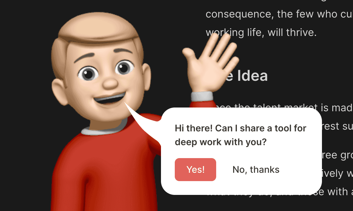
The component receives a text for the prompt, the URL of the promoted resource, a character that would most likely be an image, handlers for dismiss and accept, and instructions for placing the speech bubble. Both the character and message have fixed positions. To animate the character coming from the bottom of the screen, we are using the react-spring library.
import { ExternalLink } from "lib/navigation/Link/ExternalLink"
import { ReactNode, useState } from "react"
import { useSpring, animated, config } from "react-spring"
import styled from "styled-components"
import { GhostButton } from "../buttons/rect/GhostButton"
import { PrimaryButton } from "../buttons/rect/PrimaryButton"
import { HStack, VStack } from "../Stack"
import { Text } from "../Text"
import { ReversedTheme } from "../theme/ReversedTheme"

interface speechPlaecement {
  left: React.CSSProperties["left"]
  bottom: React.CSSProperties["bottom"]
}

interface InteractivePromotionProps {
  text: string
  url: string
  character: ReactNode
  speechPlacement: speechPlaecement
  onDismiss?: () => void
  onAccept?: () => void
}

const CharacterContainer = styled(animated.div)`
  position: fixed;
  z-index: 6;
  bottom: 0;
  left: 0;
`

const MessageContainer = styled(animated.div)`
  position: fixed;
  z-index: 7;
`

const Content = styled.div`
  position: relative;
  background: ${({ theme }) => theme.colors.background.toCssValue()};
  border-radius: 24px;
  padding: 24px;
  max-width: 280px;
  z-index: 2;
`

const Connector = styled.div`
  top: -10px;
  position: absolute;
  color: ${({ theme }) => theme.colors.background.toCssValue()};
  left: 1px;
  transform: translateX(-100%);
  pointer-events: none;
`

export const InteractivePromotion = ({
  text,
  url,
  character,
  onDismiss,
  onAccept,
  speechPlacement,
}: InteractivePromotionProps) => {
  const [isCharacterAnimationFinished, setIsCharacterAnimationFinished] =
    useState(false)

  const characterAnimationStyles = useSpring({
    config: {
      ...config.slow,
      friction: 40,
      clamp: true,
    },
    from: {
      bottom: -200,
    },
    to: {
      bottom: 0,
    },
    onRest: () => setIsCharacterAnimationFinished(true),
  })

  return (
    <>
      <CharacterContainer style={characterAnimationStyles}>
        {character}
      </CharacterContainer>
      {isCharacterAnimationFinished && (
        <ReversedTheme>
          <MessageContainer style={speechPlacement}>
            <Content>
              <Connector>
                <svg
                  width="65"
                  height="78"
                  viewBox="0 0 95 95"
                  fill="none"
                  preserveAspectRatio="none"
                >
                  <path
                    fill="currentColor"
                    d="M0 0C0 0 24.8936 38.9937 47 58C57.5966 67.1106 73.8292 77.0249 84.1762 83C90.03 86.3804 94 95 94 95L94.5 36C94.5 36 88.5727 43.1045 81 41.4825C70.8874 39.3165 56.9488 35.8549 47 31.5C26.7586 22.6397 0 0 0 0Z"
                  />
                </svg>
              </Connector>
              <VStack alignItems="start" gap={16}>
                <Text weight="bold" color="regular">
                  {text}
                </Text>
                <HStack gap={8} justifyContent="start">
                  <ExternalLink to={url}>
                    <PrimaryButton onClick={onAccept} kind="attention" as="div">
                      Yes!
                    </PrimaryButton>
                  </ExternalLink>
                  <GhostButton onClick={onDismiss}>No, thanks</GhostButton>
                </HStack>
              </VStack>
            </Content>
          </MessageContainer>
        </ReversedTheme>
      )}
    </>
  )
}
To make the message stand out, we wrap it with the ReversedTheme component so that in the dark mode, the bubble would be white, and in the light theme - black.
import { ComponentWithChildrenProps } from "lib/shared/props"
import { ThemeProvider, useTheme } from "styled-components"
import { darkTheme } from "./darkTheme"
import { lightTheme } from "./lightTheme"

export const ReversedTheme = ({ children }: ComponentWithChildrenProps) => {
  const theme = useTheme()

  return (
    <ThemeProvider theme={theme.name === "dark" ? lightTheme : darkTheme}>
      {children}
    </ThemeProvider>
  )
}
To make the cartoonish image of myself, I used iPhone Memoji exported as an image in the Notes app. We don't want to show the promo right after the visitor came to our website, so we wrap it with the ShowAfterDelay component. After the user interacted with it, we update the local storage to not show the prompt again.
import React, { useEffect, useState } from "react"

interface Props {
  children: React.ReactNode
  ms?: number
}

export const ShowAfterDelay = ({ children, ms = 2000 }: Props) => {
  const [shouldShow, setShouldShow] = useState(false)
  useEffect(() => {
    setTimeout(() => setShouldShow(true), ms)
  }, [ms])

  if (!shouldShow) {
    return null
  }

  return <>{children}</>
}