How To Make Popover Menu with React and Poppper.js

Let's make a bulletproof responsive popover menu component with React that we'll position with PopperJS on desktop and show as a slide-over on mobile devices.
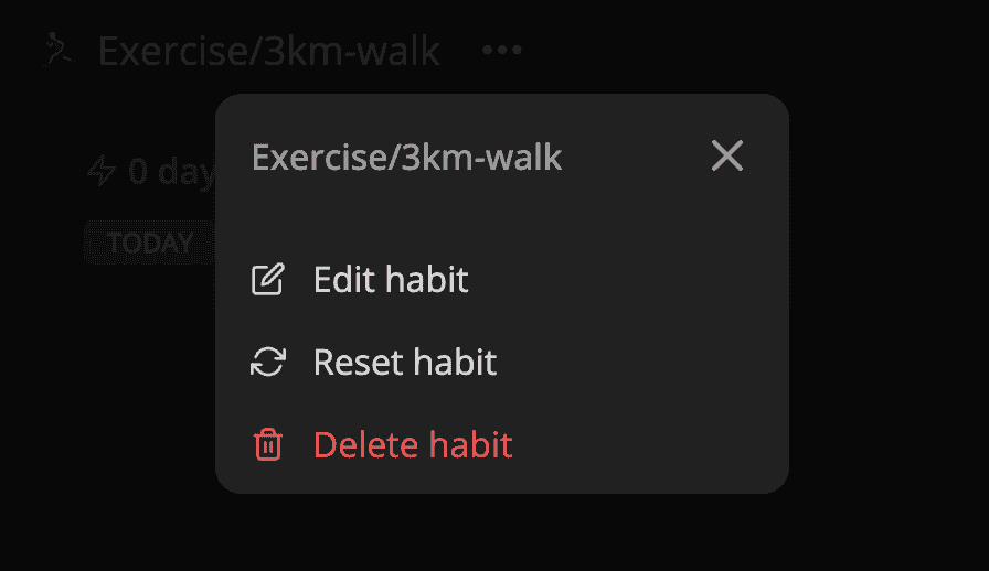
The component receives a title that we display at the top of the menu, a list of options, and a function to render the opener component, which most often would be a button. The menu option has icon, text, onSelect handler, and kind, so we can make destructive actions like delete stand out from the rest. For the opener element, we pass the ref and onClick handler. We'll need the ref to position the popover menu. Notice that we are using state for storing the anchor to force a rerender after we've received an element from the opener into the state.
import { useBoolean } from "lib/shared/hooks/useBoolean"
import { ReactNode, useState } from "react"
import { BottomSlideOver } from "lib/ui/BottomSlideOver"
import { ResponsiveView } from "lib/ui/ResponsiveView"
import { HStack, VStack } from "lib/ui/Stack"
import { Text } from "lib/ui/Text"

import { MenuOption, MenuOptionProps } from "./MenuOption"
import { PopoverMenu } from "./PopoverMenu"
import { PrimaryButton } from "../buttons/rect/PrimaryButton"
import { Popover } from "../popover/Popover"

interface OpenerParams {
  ref: (anchor: HTMLElement | null) => void
  onClick: () => void
}

interface OverlayMenuProps {
  title: ReactNode
  options: MenuOptionProps[]
  renderOpener: (params: OpenerParams) => ReactNode
}

export function OverlayMenu({
  options,
  renderOpener,
  title,
}: OverlayMenuProps) {
  const [anchor, setAnchor] = useState<HTMLElement | null>(null)

  const [isMenuOpen, { unset: closeMenu, toggle: toggleMenu }] =
    useBoolean(false)

  return (
    <>
      {renderOpener({ onClick: toggleMenu, ref: setAnchor })}
      {isMenuOpen && anchor && (
        <ResponsiveView
          small={() => (
            <BottomSlideOver onClose={closeMenu} title={title}>
              <VStack gap={12}>
                {options.map(({ text, icon, onSelect, kind }) => (
                  <PrimaryButton
                    style={{ justifyContent: "flex-start", height: 56 }}
                    kind={kind === "alert" ? "alert" : "secondary"}
                    size="l"
                    isRounded={true}
                    key={text}
                    onClick={() => {
                      onSelect()
                      closeMenu()
                    }}
                  >
                    <HStack alignItems="center" gap={8}>
                      {icon} <Text>{text}</Text>
                    </HStack>
                  </PrimaryButton>
                ))}
              </VStack>
            </BottomSlideOver>
          )}
          normal={() => (
            <Popover
              placement="bottom"
              onClickOutside={toggleMenu}
              anchor={anchor}
              enableScreenCover
            >
              <PopoverMenu onClose={closeMenu} title={title}>
                {options.map(({ text, icon, onSelect, kind }) => (
                  <MenuOption
                    text={text}
                    key={text}
                    icon={icon}
                    kind={kind}
                    onSelect={() => {
                      closeMenu()
                      onSelect()
                    }}
                  />
                ))}
              </PopoverMenu>
            </Popover>
          )}
        />
      )}
    </>
  )
}
Once the user has clicked on the opener, the isMenuOpen will be true, and we'll render the ResponsiveView. It's a primitive component that will use either the small or the normal function to render the content based on screen size.
import { ReactNode } from "react"

import { useIsScreenWidthLessThan } from "./hooks/useIsScreenWidthLessThan"

interface ResponsiveViewProps {
  small: () => ReactNode
  normal: () => ReactNode
}

const smallScreenWidth = 600

export const ResponsiveView = ({ small, normal }: ResponsiveViewProps) => {
  const isSmallScreen = useIsScreenWidthLessThan(smallScreenWidth)

  return <>{(isSmallScreen ? small : normal)()}</>
}
For a normal-screen size, we'll display the Popover component. It receives an anchor element relative to which we'll show the children, a placement that we drag from the PopperJS library, the distance between the anchor and children, a flag to enable screen cover, and a handler for clicking outside.
Here we set up the popover with PopperJS, add a handler for clicking outside, force update on size change, and render everything inside of a body portal.
import { Placement } from "@popperjs/core"
import { ReactNode, useEffect, useState } from "react"
import { usePopper } from "react-popper"
import { useClickAway } from "react-use"
import styled from "styled-components"
import { BodyPortal } from "lib/ui/BodyPortal"
import { useElementSize } from "lib/ui/hooks/useElementSize"
import { ScreenCover } from "lib/ui/ScreenCover"
import { zIndex } from "lib/ui/zIndex"
import { useValueRef } from "lib/shared/hooks/useValueRef"

export type PopoverPlacement = Placement

interface PopoverProps {
  anchor: HTMLElement
  children: ReactNode
  placement?: PopoverPlacement
  distance?: number
  enableScreenCover?: boolean
  onClickOutside?: () => void
}

export const Popover = styled(
  ({
    anchor,
    children,
    onClickOutside,
    placement = "auto",
    distance = 4,
    enableScreenCover = false,
  }: PopoverProps) => {
    const [popperElement, setPopperElement] = useState<HTMLElement | null>(null)

    const { styles, attributes, update } = usePopper(anchor, popperElement, {
      placement,
      strategy: "fixed",

      modifiers: [
        {
          name: "offset",
          options: {
            offset: [0, distance],
          },
        },
        {
          name: "preventOverflow",
          options: {
            padding: 8,
          },
        },
      ],
    })

    const poperRef = useValueRef(popperElement)
    useClickAway(poperRef, (event) => {
      if (anchor.contains(event.target as Node)) return
      onClickOutside?.()
    })

    const size = useElementSize(popperElement)
    useEffect(() => {
      if (!update) return

      update()
    }, [size, update])

    const popoverNode = (
      <Container
        ref={setPopperElement}
        style={styles.popper}
        {...attributes.popper}
      >
        {children}
      </Container>
    )

    return (
      <BodyPortal>
        {enableScreenCover && <ScreenCover />}
        {popoverNode}
      </BodyPortal>
    )
  }
)``

const Container = styled.div`
  position: relative;
  z-index: ${zIndex.menu};
`
The PopoverMenu serves as a container that receives children, a title, and an onClose handler. We build it on top of the existing panel component, with some style changes to make it look better as an overlay element. At the top, we show a header with a title and a close button.
import { ReactNode } from "react"
import { ClosableComponentProps } from "lib/shared/props"
import styled from "styled-components"
import { Panel } from "../Panel/Panel"
import { HStack, VStack } from "../Stack"
import { getVerticalPaddingCSS } from "../utils/getVerticalPaddingCSS"
import { getHorizontalMarginCSS } from "../utils/getHorizontalMarginCSS"
import { Text } from "../Text"
import { CloseIconButton } from "../buttons/square/CloseIconButton"

interface Props extends ClosableComponentProps {
  title: ReactNode
  children: ReactNode
}

const Container = styled(Panel)`
  box-shadow: ${({ theme }) => theme.shadows.medium};
  background: ${({ theme: { colors, name } }) =>
    (name === "dark" ? colors.foreground : colors.background).toCssValue()};
  overflow: hidden;
  min-width: 260px;
  max-width: 320px;
`

const Header = styled(HStack)`
  align-items: center;
  gap: 12px;
  justify-content: space-between;
  ${getHorizontalMarginCSS(12)};
  ${getVerticalPaddingCSS(12)};
  border-bottom: 1px solid ${({ theme }) =>
      theme.colors.backgroundGlass.toCssValue()};
`

export const PopoverMenu = ({ children, title, onClose }: Props) => {
  return (
    <Container padding={4}>
      <VStack gap={12}>
        <Header>
          <Text weight="semibold" color="supporting" cropped>
            {title}
          </Text>
          <CloseIconButton onClick={onClose} />
        </Header>
        <VStack fullWidth alignItems="start">
          {children}
        </VStack>
      </VStack>
    </Container>
  )
}
The popover menu won't be that comfortable on mobile, and here is where BottomSlideOver comes in. It receives children, a title, and an onClose handler. We display the content also in BodyPortal, inside of a screen cover.
import { ReactNode } from "react"
import { handleWithStopPropagation } from "lib/shared/events"
import {
  ClosableComponentProps,
  ComponentWithChildrenProps,
} from "lib/shared/props"
import styled from "styled-components"
import { BodyPortal } from "lib/ui/BodyPortal"
import { ScreenCover } from "lib/ui/ScreenCover"
import { HStack, VStack } from "lib/ui/Stack"
import { Text } from "lib/ui/Text"
import { getHorizontalPaddingCSS } from "lib/ui/utils/getHorizontalPaddingCSS"
import { getVerticalPaddingCSS } from "lib/ui/utils/getVerticalPaddingCSS"
import { PrimaryButton } from "./buttons/rect/PrimaryButton"

type BottomSlideOverProps = ComponentWithChildrenProps &
  ClosableComponentProps & {
    title: ReactNode
  }

const Cover = styled(ScreenCover)`
  align-items: flex-end;
  justify-content: flex-end;
`

const Container = styled(VStack)`
  width: 100%;
  border-radius: 20px 20px 0 0;
  ${getVerticalPaddingCSS(24)}

  background: ${({ theme }) => theme.colors.background.toCssValue()};
  max-height: 80%;

  gap: 32px;

  > * {
    ${getHorizontalPaddingCSS(16)}
  }
`

const Content = styled(VStack)`
  flex: 1;
  overflow-y: auto;
`

export const BottomSlideOver = ({
  children,
  onClose,
  title,
}: BottomSlideOverProps) => {
  return (
    <BodyPortal>
      <Cover onClick={onClose}>
        <Container onClick={handleWithStopPropagation()}>
          <HStack gap={8} alignItems="center" justifyContent="space-between">
            <Text cropped as="div" weight="bold" size={24}>
              {title}
            </Text>
            <PrimaryButton
              kind="secondary"
              size="l"
              onClick={onClose}
              isRounded
            >
              Close
            </PrimaryButton>
          </HStack>
          <Content gap={12}>{children}</Content>
        </Container>
      </Cover>
    </BodyPortal>
  )
}