

Let's make a donut-shaped pie-chart component with labels using React and SVG.
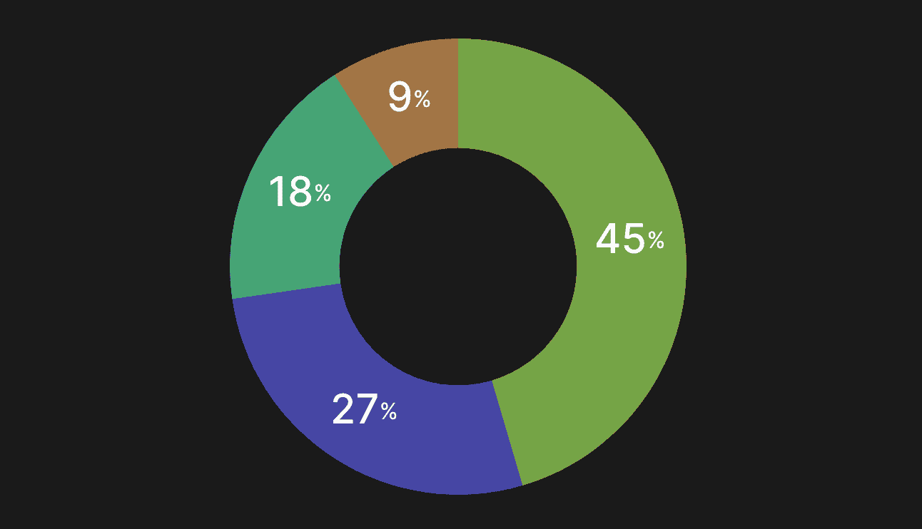
The component takes only one property, the list of items consisting of numeric value and color. We don't pass any parameters for size because the component will fit into its parent. First, we render an SVG element where the width and height of the view box could be any number. It doesn't relate to size in pixels and instead provides an aspect ratio for the SVG. The cutoutRadius will be the distance from the center to the inner border of the donut.
import { useMemo } from "react"
import { useTheme } from "styled-components"
import { HSLA } from "lib/ui/colors/HSLA"

import { SvgArc } from "./SvgArc"
import { SvgDisk } from "./SvgDisk"
import { sum } from "lib/shared/utils/sum"
import { PieChartLabel } from "./PieChartLabel"
import { degreesInCircle } from "lib/shared/utils/degreesToRadians"

export interface PieChartItem {
  value: number
  color: HSLA
}

interface Props {
  items: PieChartItem[]
}

const cutoutRadiusShare = 0.52

interface PieChartItemWithAngle extends PieChartItem {
  startAngle: number
  endAngle: number
}

const getItemsWithAngles = (items: PieChartItem[]): PieChartItemWithAngle[] => {
  const total = sum(items.map((item) => item.value))

  const itemsWithAngles: PieChartItemWithAngle[] = []

  items.forEach((item, index) => {
    const startAngle = index === 0 ? 0 : itemsWithAngles[index - 1].endAngle
    const endAngle = startAngle + (item.value / total) * degreesInCircle

    itemsWithAngles.push({
      ...item,
      startAngle,
      endAngle,
    })
  })

  return itemsWithAngles
}

const svgViewBoxSize = 100

export const PieChart = ({ items }: Props) => {
  const itemsWithAngles = useMemo(() => getItemsWithAngles(items), [items])

  const { colors } = useTheme()

  const radius = svgViewBoxSize / 2
  const cutoutRadius = radius * cutoutRadiusShare

  const total = sum(items.map((item) => item.value))

  return (
    <svg viewBox={`0 0 ${svgViewBoxSize} ${svgViewBoxSize}`}>
      {items.length < 2 ? (
        <SvgDisk
          color={items.length === 0 ? colors.backgroundGlass : items[0].color}
          radius={radius}
          cutoutRadius={cutoutRadius}
        />
      ) : (
        itemsWithAngles.map(({ color, startAngle, endAngle, value }, index) => {
          const percentage = Math.round((value * 100) / total)

          return (
            <>
              <SvgArc
                key={index}
                color={color.getVariant({ l: () => 46, s: () => 40 })}
                radius={radius}
                cutoutRadius={cutoutRadius}
                startAngle={startAngle}
                endAngle={endAngle}
              />
              {percentage > 5 && (
                <PieChartLabel
                  radius={radius}
                  cutoutRadius={cutoutRadius}
                  startAngle={startAngle}
                  endAngle={endAngle}
                />
              )}
            </>
          )
        })
      )}
    </svg>
  )
}
Inside we render a disc or a list of arcs based on the item's presence. We'll render the disc with the circle element and the arc with the path. To make instructions for rendering the arc, we have the getArcPath function. Here we want to get four points to display a part of the donut chart using the getPointOnCircle function and join each coordinate with an SVG path instruction. To get those start and end coordinates for every piece of the donut, we use the getItemsWithAngles function that will go over each item and calculate the next set of angles based on the previous one.
import { getPointOnCircle } from "lib/shared/utils/getPointOnCircle"
import { HSLA } from "lib/ui/colors/HSLA"

interface Props {
  color: HSLA
  startAngle: number
  endAngle: number
  radius: number
  cutoutRadius: number
}

const getArcPath = (
  radius: number,
  cutoutRadius: number,
  startAngle: number,
  endAngle: number
) => {
  const start = getPointOnCircle(radius, radius, endAngle)
  const end = getPointOnCircle(radius, radius, startAngle)
  const largeArcFlag = endAngle - startAngle <= 180 ? 0 : 1

  const start2 = getPointOnCircle(radius, cutoutRadius, endAngle)
  const end2 = getPointOnCircle(radius, cutoutRadius, startAngle)

  return [
    "M",
    start.x,
    start.y,
    "A",
    radius,
    radius,
    0,
    largeArcFlag,
    0,
    end.x,
    end.y,
    "L",
    radius,
    radius,
    "Z",

    "M",
    start2.x,
    start2.y,
    "A",
    cutoutRadius,
    cutoutRadius,
    0,
    largeArcFlag,
    0,
    end2.x,
    end2.y,
    "L",
    radius,
    radius,
    "Z",
  ].join(" ")
}

export const SvgArc = ({
  color,
  startAngle,
  endAngle,
  radius,
  cutoutRadius,
}: Props) => {
  const path = getArcPath(radius, cutoutRadius, startAngle, endAngle)

  return <path fillRule="evenodd" fill={color.toCssValue()} d={path} />
}
To render a label on top of the arc, we use the PieChartLabel component. Here we use the same getPointOnCircle function to get coordinates for the label's center. Since we can't make the text a fixed size, we center it inside of an invisible rect element.
import { degreesInCircle } from "lib/shared/utils/degreesToRadians"
import { getPointOnCircle } from "lib/shared/utils/getPointOnCircle"
import { toPercents } from "lib/shared/utils/toPercents"
import styled from "styled-components"

interface Props {
  startAngle: number
  endAngle: number
  radius: number
  cutoutRadius: number
}

const labelWrapperSize = 20

const Label = styled.text`
  fill: ${({ theme }) => theme.colors.white.toCssValue()};
  font-size: 9px;
  font-weight: 500;
`

export const PieChartLabel = ({
  startAngle,
  endAngle,
  radius,
  cutoutRadius,
}: Props) => {
  const labelAngle = startAngle + (endAngle - startAngle) / 2
  const labelPosition = getPointOnCircle(
    radius,
    cutoutRadius + (radius - cutoutRadius) / 2,
    labelAngle
  )
  labelPosition.x -= labelWrapperSize / 2
  labelPosition.y -= labelWrapperSize / 2

  return (
    <g>
      <rect
        fill="transparent"
        {...labelPosition}
        width={labelWrapperSize}
        height={labelWrapperSize}
      />
      <Label
        x={labelPosition.x + labelWrapperSize / 2}
        y={labelPosition.y + labelWrapperSize / 2}
        dominantBaseline="middle"
        textAnchor="middle"
      >
        {Math.round(((endAngle - startAngle) * 100) / degreesInCircle)}
        <tspan fontSize={5}>%</tspan>
      </Label>
    </g>
  )
}