How To Make Panel (Card) Component With React + Expandable Panel


Panels and cards are fundamental for most interfaces, so let me share a versatile React component that will speed up your front-end work.
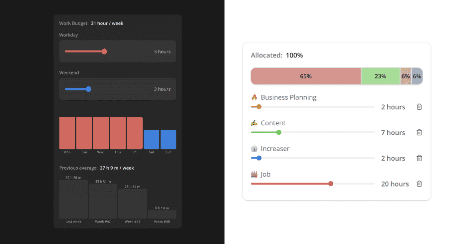
It works for both dark and light modes and covers a case for both a simple card and a panel with a few sections separated by lines.
It receives all the properties that a styled component does together with optional width and padding properties. To show lines between children we will pass the withSections parameter.
The panel has a box shadow in both color modes without changing the background in the light theme.
import styled, { css } from "styled-components"
import { defaultBorderRadiusCSS } from "../borderRadius"
import { getCSSUnit } from "../utils/getCSSUnit"

interface PanelProps {
  width?: React.CSSProperties["width"]
  padding?: React.CSSProperties["padding"]
  withSections?: boolean
}

const panelBackgroundCSS = css`
  background: ${({ theme: { name, colors } }) =>
    (name === "light"
      ? colors.background
      : colors.backgroundGlass
    ).toCssValue()};
`

const panelPaddingCSS = css<{
  padding?: React.CSSProperties["padding"]
}>`
  padding: ${({ padding }) => getCSSUnit(padding || 20)};
`

export const Panel = styled.div<PanelProps>`
  ${defaultBorderRadiusCSS};
  width: ${({ width }) => (width ? getCSSUnit(width) : undefined)};
  box-shadow: ${({ theme }) => theme.shadows.small};

  ${({ withSections }) =>
    withSections
      ? css`
          overflow: hidden;
          display: flex;
          flex-direction: column;
          gap: 1px;

          background: ${({ theme }) =>
            theme.name === "light"
              ? theme.colors.backgroundGlass2.toCssValue()
              : undefined};

          > * {
            ${panelPaddingCSS}

            ${panelBackgroundCSS}
          }
        `
      : css`
          ${panelPaddingCSS}
          ${panelBackgroundCSS}
        `}
`
For a panel with sections, we make the container a flexbox element with a gap property that will create a line. Then we'll add padding and background to every child. To make the line stand out in the light mode, we set the container's background to gray.
Then we can extend the panel for different use cases, for example, this ExpandablePanel.
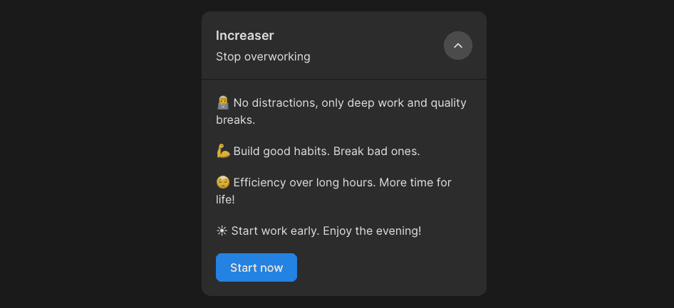
Here we have a clickable header with an icon button on the right side highlighted as we hover the header. Once the component is in an extended mode, we'll show another section with content separated by the line from the header.
import { useBoolean } from "lib/shared/hooks/useBoolean"
import { ReactNode } from "react"
import styled from "styled-components"
import { defaultTransitionCSS } from "../animations/transitions"
import { UnstyledButton } from "../buttons/UnstyledButton"
import { ChevronDownIcon } from "../icons/ChevronDownIcon"
import { HStack } from "../Stack"
import { centerContentCSS } from "../utils/centerContentCSS"
import { getSameDimensionsCSS } from "../utils/getSameDimensionsCSS"
import { roundedCSS } from "../utils/roundedCSS"
import { Panel, PanelProps } from "./Panel"

interface ExpandableProps extends PanelProps {
  header: ReactNode
  renderContent: () => ReactNode
}

const ExpandIconWrapper = styled.div<{ isExpanded: boolean }>`
  ${roundedCSS};
  ${getSameDimensionsCSS(40)};
  ${centerContentCSS};

  background: ${({ theme }) => theme.colors.backgroundGlass.toCssValue()};

  ${defaultTransitionCSS};

  font-size: 20px;

  transform: rotateZ(${({ isExpanded }) => (isExpanded ? "-180deg" : "0deg")});
`

const Header = styled(UnstyledButton)`
  ${defaultTransitionCSS};

  &:hover ${ExpandIconWrapper} {
    background: ${({ theme }) => theme.colors.backgroundGlass2.toCssValue()};
  }
`

export const ExpandablePanel = ({
  header,
  renderContent,
  ...panelProps
}: ExpandableProps) => {
  const [isExpanded, { toggle }] = useBoolean(false)

  return (
    <Panel withSections {...panelProps}>
      <Header onClick={toggle}>
        <HStack fullWidth justifyContent="space-between" alignItems="center">
          {header}
          <ExpandIconWrapper isExpanded={isExpanded}>
            <ChevronDownIcon />
          </ExpandIconWrapper>
        </HStack>
      </Header>
      {isExpanded && renderContent()}
    </Panel>
  )
}