How To Show A Button Inside Of a Parent Button/Link On Hover with React


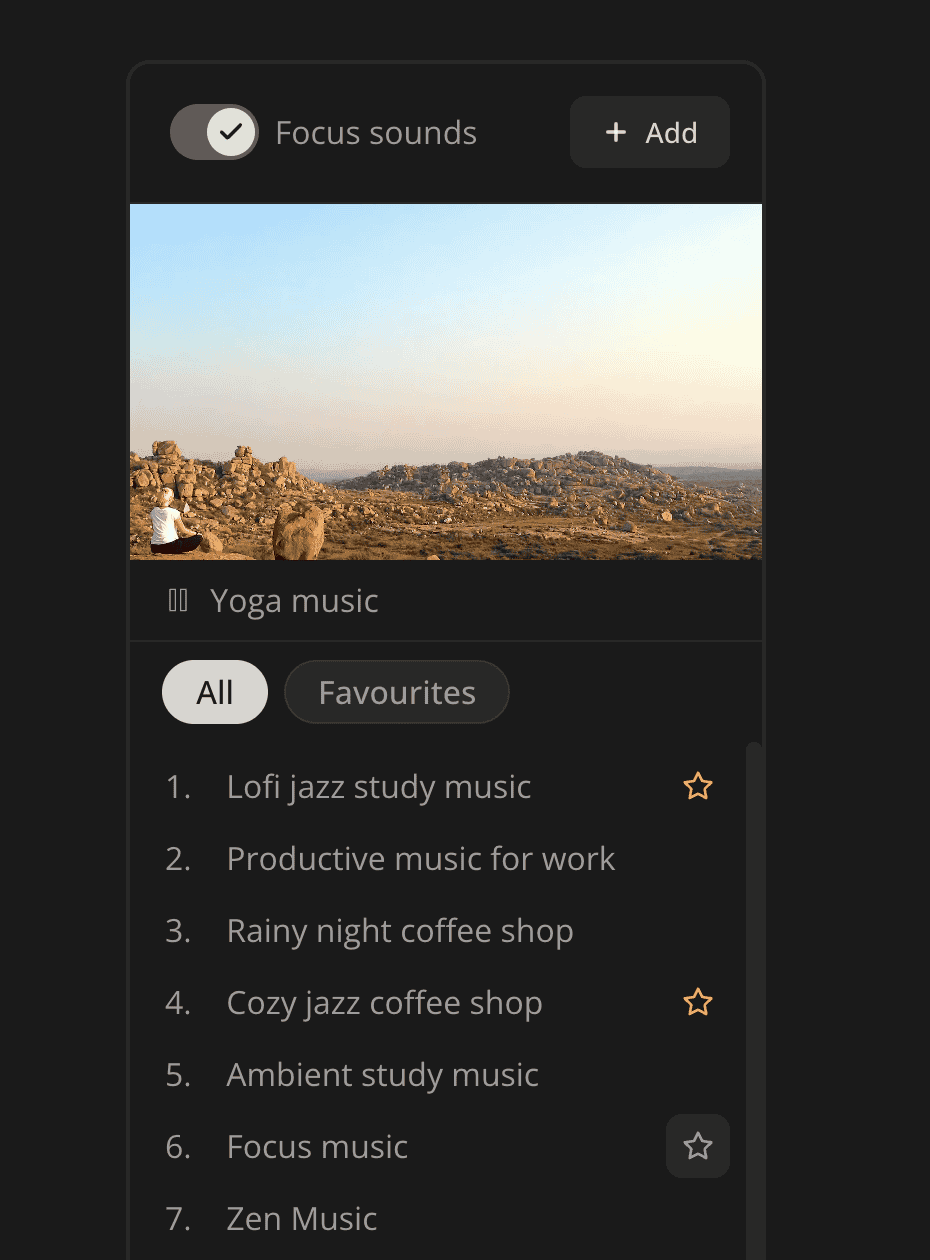
It's a popular UI pattern to show a button at the corner when hovering another interactive element, but the problem is that HTML doesn't allow putting an anchor or button inside an existing interactive element. That's why I want to share with you an ActionOnHover component. You can see it in action in this focus sounds player at Increaser, where you can add a sound to favorites category by clicking a button that appears on item hover.
The OnHoverAction component receives an action element to display on hover, actionPlacerStyles to adjust the absolute location of the action, and a render function to display the primary interactive element.
import { ReactNode } from "react"
import styled from "styled-components"

import { ElementSizeAware } from "./ElementSizeAware"
import { ElementSize } from "./hooks/useElementSize"

interface OnHoverActionRenderParams<T extends React.CSSProperties> {
  actionSize: ElementSize
  actionPlacerStyles: T
}

interface OnHoverActionProps<T extends React.CSSProperties> {
  render: (params: OnHoverActionRenderParams<T>) => ReactNode
  action: ReactNode
  actionPlacerStyles: T
}

const ActionPlacer = styled.div`
  position: absolute;
  opacity: 0;
`

const Container = styled.div`
  position: relative;
  display: flex;
  flex-direction: row;
  align-items: center;

  &:hover ${ActionPlacer} {
    opacity: 1;
  }
`

export function OnHoverAction<T extends React.CSSProperties>({
  render,
  action,
  actionPlacerStyles,
}: OnHoverActionProps<T>) {
  return (
    <Container>
      <ElementSizeAware
        render={({ setElement, size }) => (
          <>
            {size &&
              render({
                actionPlacerStyles,
                actionSize: size,
              })}
            <ActionPlacer ref={setElement} style={actionPlacerStyles}>
              {action}
            </ActionPlacer>
          </>
        )}
      />
    </Container>
  )
}
The Container has a relative position, and it aligns the content horizontally. On hover, we'll set the opacity for the action wrapper to one so that it will appear. To prevent the overflow, the primary element might preserve a space where the action element will appear on hover. To achieve that, we first measure the size of the action and provide its width and height as a parameter to the render function. You can learn about the implementation of the ElementSizeAware component here.
The component is a generic function because it's more convenient to know the exact styles for the ActionPlacer componenent when rendering the primary interactive element. In our player example we set the right property for an absolutely positioned placer and then use it as padding for the primary element to have a consistent UI.
<OnHoverAction
  actionPlacerStyles={{ right: 8 }}
  action={
    <IconButton
      icon={star}
      onClick={...}
    />
  }
  render={({ actionSize, actionPlacerStyles }) => (
    <Container
      style={{ padding: actionPlacerStyles.right }}
      onClick={...}
    >
      {content}
      <VStack style={actionSize} alignItems="center" justifyContent="center">
        {isFavourite && star}
      </VStack>
    </Container>
  )}
/>