Recently I’ve read the book “Obviously Awesome” by April Dunford. In this story, I would try to apply knowledge from this book to my app — Increaser.
Weak positioning leaves a trail — the signs are there if you know where to look.
- Only 1% of registered users buy a membership.
- The number of members doesn’t grow because of high churn.
- A lot of people point to a high price.
What is Increaser, is it a time tracker, or, is it a Pomodoro timer?
- If it’s Pomodoro timer, why I need to pay for it, there are tons of Pomodoros online that are free.
- Usually, time trackers are for enterprises. They are designed for managers to track what their employees do. Also, there are some time trackers for teams and freelancers. They all have a lot of features.
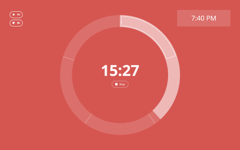
Increaser has a timer, but it doesn’t force Pomodoro ideology. You can set a timer for any period from 5 to 60 minutes, and then take a break for as long as you want.
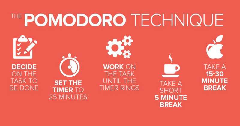
But if you want, you can use it as a Pomodoro timer by setting Timer for 25 minutes, then taking a break for 5 minutes(there is an interface for it) and repeat this cycle.
So we could say that it has something from the Pomodoro timer, but it is not a Pomodoro timer. Because I started it as a Pomodoro timer, I continue thinking of it as Pomodoro timer, while it is not quite a Pomodoro.
Is it a time tracking app then? After every set, Increaser asks the user — “What project you were working on?” There is already an element of time tracking. If the user registers in the app and uses it for some time, he would get productivity reports.
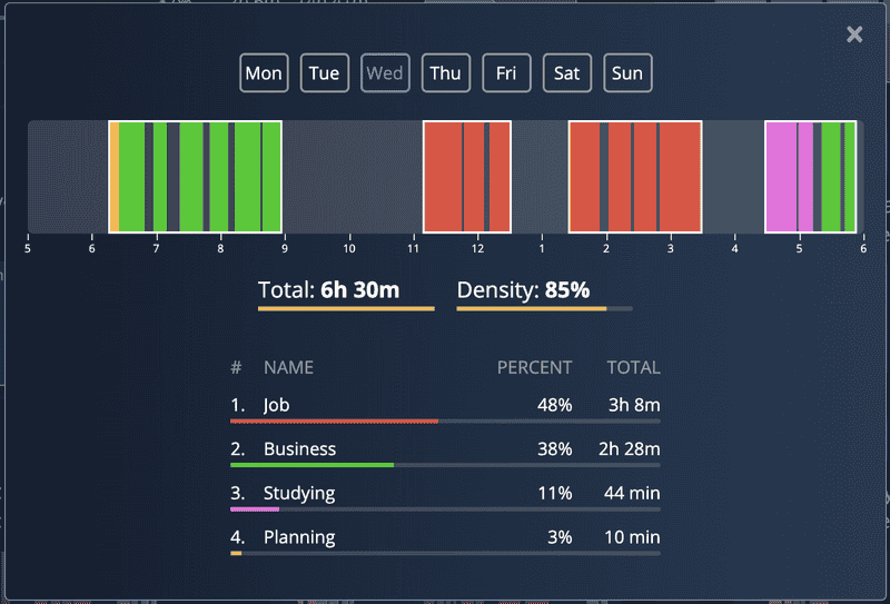
These reports are not for an employer. These charts and timelines designed for a user to help him understand what he could do to improve, organize days better, find time for things that matter, have more productive and less stressful days.
It is not a time tracker in the classic sense, but it is a PERSONAL time tracker. The problem is there is no such category.
THE FIVE (PLUS ONE) COMPONENTS OF EFFECTIVE POSITIONING
- Competitive alternatives. What customers would do if your solution didn’t exist.
- If a person used it as a Pomodoro timer, he could pick one of the free timers on the web.
- If a person used it as a time tracker, he would try Toggl or Clockify.
- If a person used it both as a Pomodoro timer and a time tracker, he may switch to the Toggl browser extension or Pomofocus that has a little bit of reporting, or Focus Booster that doesn’t look that good, but has some charts. Also, there is a Focus To-Do with historical statistics.
As we could see, there are alternatives for each situation. Plus, it is a good habit, not a pain killer, a person could continue without any app. Why I researched this only after two and a half years of working on it. Damn!
- Unique attributes. The features and capabilities that you have and the alternatives lack.
Hold on, maybe there is a hope, is Increaser worse that these Focus Booster and Focus To-Do?
After looking at alternatives, I can say that Increaser's timer is superior. The whole user experience of the app is on point. Everything is nice and smooth. So we could say that the app is easy to use and has a beautiful design.
Most competitors have charts. This representation of the data quite useful — you could take action from knowing the time ratio of your projects, like putting more time in one project and less into another. Knowing that in the last week you had 6 hours of work on average will motivate you to do a little bit more this week.
No competitors have timelines that represent how you were working during the day. This representation is very actionable and useful. By reflecting on how you’ve spent your days, you could improve your time-awareness, organize days better, and in the long term, it will lead you to have a better life in general. It is not just about making more shit done but have a healthier, happier life.
For now, we could say there are two unique attributes — easy to use and timelines.
- Value (and proof). The benefit that those features enable for customers.
We could say that Increaser is a good habit, and a beautiful interface helps the user to stick to the practice of tracking time. There are small things in the interface that makes it feels rewarding every time user completes Pomodoro.
We already talked about the value of the timeline, but I feel like this feature not completely clear for the user. There definitely should be more prompts to use the feature and some content explaining the value of the feature.
- Target market characteristics. The characteristics of a group of buyers that lead them to really care a lot about the value you deliver.
I think most users are students and people with flexible work hours, like freelancers or remote work people. But I don’t know for sure. The action point here is to figure out who is using the app, maybe it could be done by categorizing projects people are creating.
- Market category. The market you describe yourself as being part of, to help customers understand your value.
The biggest category Increaser belongs to is the productivity tools category. Then we are going down to the time management apps category. The niche category is a Pomodoro timer with reports or a time-tracking app.
- (Bonus) Relevant trends. Trends that your target customers understand and/or are interested in that can help make your product more relevant right now.
Pomodoro timer is not a trend. Maybe remote work is a trendy thing right now?
THE 10-STEP POSITIONING PROCESS
STEP 1. UNDERSTAND THE CUSTOMERS WHO LOVE YOUR PRODUCT
I don’t have a list of best-fit customers. There are a few members who were using the app for a few months, the action point is to start talking with them, and with the time build up this list.
STEP 2. FORM A POSITIONING TEAM
STEP 3. ALIGN YOUR POSITIONING VOCABULARY AND LET GO OF YOUR POSITIONING BAGGAGE
There is no team, only me :)
STEP 4. LIST YOUR TRUE COMPETITIVE ALTERNATIVES
Here is also an action point for me, if the user hasn’t converted to a customer, I should ask him regarding what he’s using instead of Increaser, and why. The same applies to members, I should ask them why they subscribed, and what parts of the product are most valuable for them.
After gathering the information, the action point is to update the landing page, copy throughout the app, and possible text of emails.
STEP 5. ISOLATE YOUR UNIQUE ATTRIBUTES OR FEATURES
I can’t take any action points here, because everything I would do on the 4th step applies here too.
STEP 6. MAP THE ATTRIBUTES TO VALUE “THEMES”
The action point here is to convert the most important features from the previous step and convert them into text that highlight what user gets from this features, like make work done faster, or not being tired at the end of the day.
STEP 7. DETERMINE WHO CARES A LOT
The action point here is to reflect on who’s using the app and target a specific segment.
STEP 8. FIND A MARKET FRAME OF REFERENCE THAT PUTS YOUR STRENGTHS AT THE CENTER AND DETERMINE HOW TO POSITION IN IT
The action point here is to position the app as a niche inside the Pomodoro Technique market for specific types of customers. I think it would be more clear once I gather enough information from the previous steps.
STEP 9. LAYER ON A TREND (BUT BE CAREFUL)
The action point here is to consider exercise remote work trends and research if there are any time management trends.
STEP 10. CAPTURE YOUR POSITIONING SO IT CAN BE SHARED
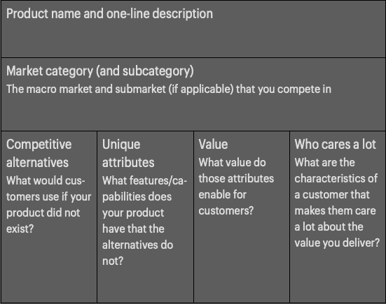
The action point is to fill the table below.
TO-DO
- Update landing page copy and title to reflect a new positioning — Pomodoro timer with reports.
- Make more prompts for a user to open a timeline.
- Educate users on the value of the day timeline.
- If possible, extract data about what categories of people use the app from project names. Otherwise, add the question, like “What are you using Increaser for” to the email.
- Build up the list of best-fit customers, ask them why they are using the app, what they would use if Increaser disappeared, what attributes are most important to them, and who are they👽.
- Send emails to not converted users asking, what they are using instead and why.
- Update the landing page, copy throughout the app, and possible text of emails with unique attributes and value users could get.
- After knowing what categories of people use the app, find a way to target them.
- Research time management and remote work trends.
- Fill positioning canvas.
