Building an Accessible and Responsive App Modal Component: A Developer's Guide


Introduction to Custom Modal Component
Every app needs a popup dialog that is accessible, responsive, and aesthetically pleasing. However, we also want it to be convenient to use for us developers. In this post, I will share with you a minimalistic Modal component which I utilize in my projects, and which does not require any component libraries. You can find all of the source code in the RadzionKit repository.
Component Requirements and Props
Before starting the implementation, we need to consider the requirements and use cases of the component, as well as what props it should accept. First, every Modal requires a title, and often a subtitle as well. These would typically be strings, but for further customization, we'll designate them as a ReactNode type. The component obviously needs to contain some content, so it should accept a children prop. The user must be able to close the modal, thus necessitating an onClose callback. For title, children, and onClose props I have reusable types because these props are used in various components in my projects. Though modals are typically centered on the screen, there are times when a series of modals are utilized or the height of the content inside of the modal may change, and to prevent a "jumpy" feel as users navigate between them, it may be preferable to position them at the top of the screen. The width prop allows customization of the modal width for content that needs more space than the default width. The final prop is the footer, which is kept as an extra property rather than just incorporating it as children on account of the footer often containing buttons that should be positioned at the bottom of the screen, particularly when on a mobile device where the modal occupies the whole screen.
export type TitledComponentProps = {
  title: ReactNode
}

export type ComponentWithChildrenProps = {
  children: ReactNode
}

export type ClosableComponentProps = {
  onClose: () => void
}

export type ModalPlacement = "top" | "center"

export type ModalProps = TitledComponentProps &
  ComponentWithChildrenProps &
  ClosableComponentProps & {
    subTitle?: ReactNode
    placement?: ModalPlacement
    width?: number
    footer?: ReactNode
  }
How to Use the Component
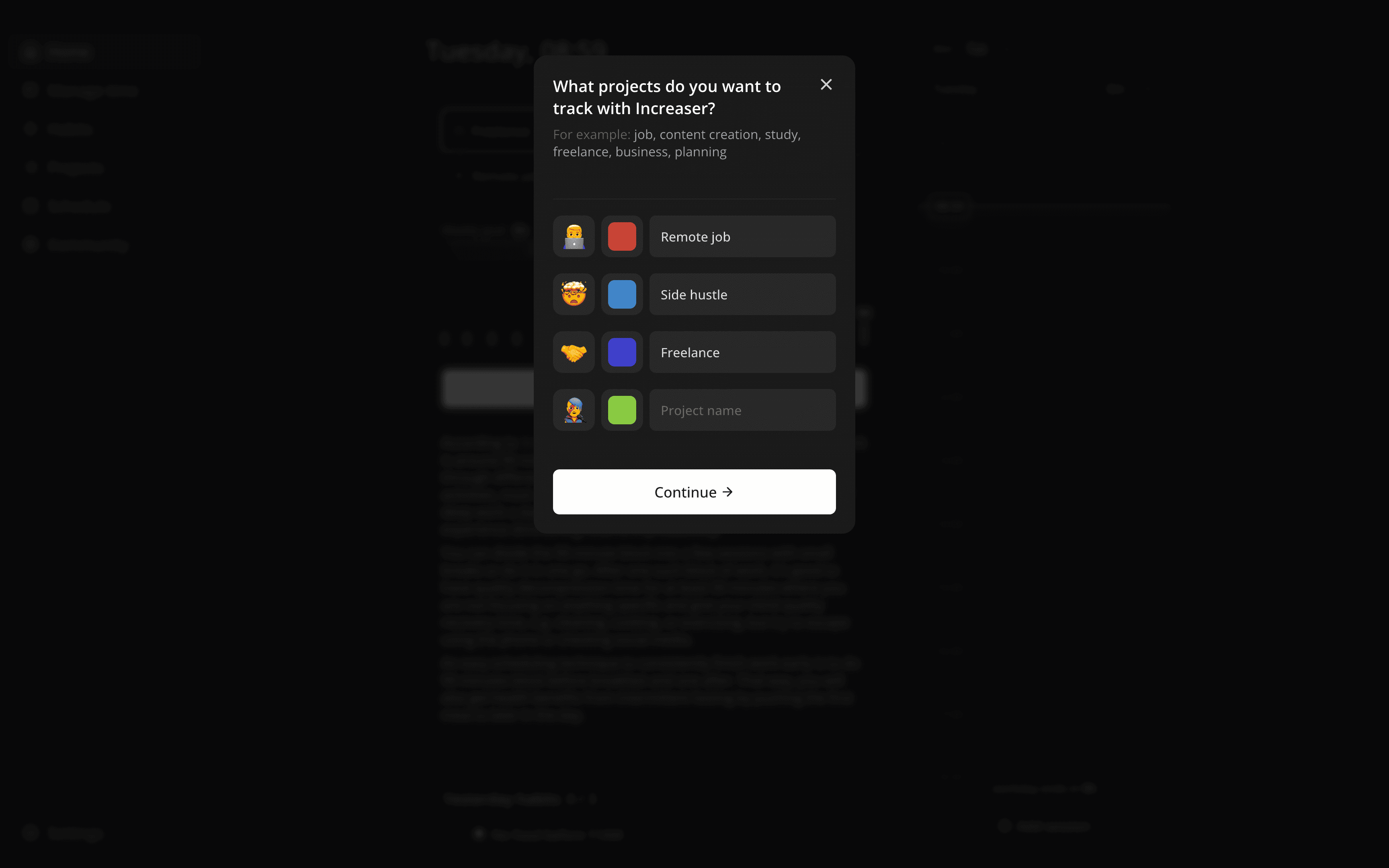
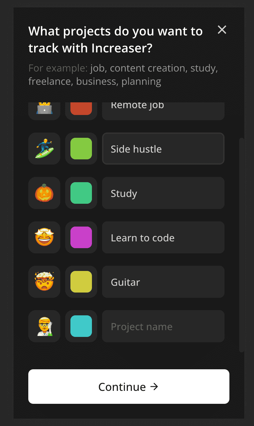
Here is an example of how one might use the component to display a step in a series of onboarding modals. We'll position it at the top, provide a title, a subtitle as a React node for customization of part of the text, a footer with the continue button, and children with the content.
<Modal
  onClose={onClose}
  placement="top"
  title="What projects do you want to track with Increaser?"
  subTitle={
    <>
      <Text as="span" color="shy">
        For example:
      </Text>{" "}
      job, content creation, study, freelance, business, planning
    </>
  }
  footer={
    <ContinueButton
      isDisabled={validProjects.length < 1}
      onClick={() => {
        createProjects({ projects: validProjects })
        onNext()
      }}
    />
  }
>
  {content}
</Modal>
Screem Management: Full or Part Width
You can notice that on a mobile screen, the modal occupies the whole space. The header with title, subtitle, and close button remains at the top, the footer with the continue button at the bottom, and in case of overflow, the content can scroll without disrupting the layout, keeping both header and footer consistently visible.
Implementing Modal Opening and Closing
To manage the opened/closed state of the Modal, I habitually rely on the abstract Opener component:
<Opener
  renderOpener={({ onOpen }) => (
    <Container title="Change focus duration" onClick={onOpen}>
      <TargetIcon />
      <Value nowrap>{focusDuration} min</Value>
    </Container>
  )}
  renderContent={({ onClose }) => (
    <UpdateFocusDurationOverlay onClose={onClose} />
  )}
/>
Building the Modal Component
This is basically a wrapper around the useBoolean hook. This may be a matter of preference, but I find it more readable and comfortable than using the useState hook at the top of the component, followed by having the modal as a conditional render.
import { ReactNode } from "react"
import { ClosableComponentProps } from "../props"
import { useBoolean } from "../hooks/useBoolean"

interface RenderOpenerParams {
  isOpen: boolean
  onOpen: () => void
}

interface Props {
  renderOpener: (params: RenderOpenerParams) => ReactNode
  renderContent: (params: ClosableComponentProps) => ReactNode
}

export const Opener = ({ renderOpener, renderContent }: Props) => {
  const [isOpen, { set: onOpen, unset: onClose }] = useBoolean(false)

  return (
    <>
      {isOpen && renderContent({ onClose })}
      {renderOpener({ onOpen, isOpen })}
    </>
  )
}
Adjusting Modal's Content Display According its Width
Now, let's delve into the Modal implementation!
import { ReactNode } from "react"
import {
  ClosableComponentProps,
  ComponentWithChildrenProps,
  TitledComponentProps,
} from "../props"
import { BodyPortal } from "../ui/BodyPortal"
import { CompleteMist } from "./CompleteMist"
import { useIsScreenWidthLessThan } from "../hooks/useIsScreenWidthLessThan"
import { useKey } from "react-use"
import { FocusTrap } from "./FocusTrap"
import { ModalContainer, ModalPlacement } from "./ModalContainer"
import { HStack, VStack } from "../ui/Stack"
import { ModalTitleText } from "./ModalTitleText"
import { ModalContent } from "./ModalContent"
import { ModalCloseButton } from "./ModalCloseButton"
import { stopPropagation } from "../utils/stopPropagation"
import { ModalSubTitleText } from "./ModalSubTitleText"

export type ModalProps = TitledComponentProps &
  ComponentWithChildrenProps &
  ClosableComponentProps & {
    subTitle?: ReactNode
    placement?: ModalPlacement
    footer?: ReactNode
    width?: number
  }

const minHorizontalFreeSpaceForMist = 120

export const Modal = ({
  title,
  children,
  onClose,
  placement = "center",
  footer,
  width = 400,
  subTitle,
}: ModalProps) => {
  const isFullScreen = useIsScreenWidthLessThan(
    width + minHorizontalFreeSpaceForMist
  )

  useKey("Escape", onClose)

  return (
    <BodyPortal>
      <CompleteMist onClick={onClose}>
        <FocusTrap>
          <ModalContainer
            onClick={stopPropagation()}
            placement={placement}
            width={isFullScreen ? undefined : width}
          >
            <VStack gap={8}>
              <HStack
                alignItems="start"
                justifyContent="space-between"
                gap={16}
              >
                <ModalTitleText>{title}</ModalTitleText>
                <ModalCloseButton onClick={onClose} />
              </HStack>
              {subTitle && <ModalSubTitleText>{subTitle}</ModalSubTitleText>}
            </VStack>
            <ModalContent>{children}</ModalContent>
            <VStack>{footer}</VStack>
          </ModalContainer>
        </FocusTrap>
      </CompleteMist>
    </BodyPortal>
  )
}
Adding Ability to Close Modal On 'Escape' Key Press
First, we need to determine whether to display the modal as a popup or a full-screen view. This is why we have a useIsScreenWidthLessThan hook. In the scenario where the modal width is 400px and the screen width is 1000px, we display the modal as a popup. However, if the screen width is 500px, then the 50px free space on either side of the modal would make it look strange, so we opt to display it as a full-screen view. The useIsScreenWidthLessThan hook is a simple wrapper around the useMedia hook from the react-use library, which returns true or false depending on the media query.
import { useMedia } from "react-use"
import { toSizeUnit } from "../css/toSizeUnit"

export const useIsScreenWidthLessThan = (width: number | string) => {
  return useMedia(`(max-width: ${toSizeUnit(width)})`, false)
}
Modal Rendering Inside Body Element
The toSizeUnit function is a helper function that converts any given number to a px string if the provided value is a number.
export const toSizeUnit = (value: number | string) =>
  typeof value === "number" ? `${value}px` : value
Blurring Screen Content Around the Modal
To close the modal on an Escape key press, we use the useKey hook from the react-use library.
Ensuring Modal's Accessibility through Focus Management
We render the modal in the body element instead of being a child of the component that opens it to avoid UI bugs due to parent positioning. The BodyPortal is a wrapper around the useBody hook.
import { createPortal } from "react-dom"
import { useBody } from "../hooks/useBody"
import { ComponentWithChildrenProps } from "../props"

export function BodyPortal({ children }: ComponentWithChildrenProps) {
  const body = useBody()

  if (!body) return null

  return createPortal(children, body)
}
Defining the Modal Container's Properties
In the useBody hook, we maintain a state for the body element and use the useIsomorphicLayoutEffect hook to set the body value on the first render.
import { useState } from "react"
import { useIsomorphicLayoutEffect } from "react-use"

export function useBody() {
  const [body, setBody] = useState<HTMLBodyElement | null>(null)

  useIsomorphicLayoutEffect(() => {
    setBody(document.body as HTMLBodyElement)
  }, [])

  return body
}
Preventing Modal from Closing When Clicking Inside It
To blur the rest of the screen when the modal is open, we utilize the CompleteMist component. It is a fixed element that occupies the entire space and centers content inside it. We also use backdrop-filter to blur the content behind the modal. We pass onClose to the CompleteMist onClick to close the modal when the user clicks outside of it.
import styled from "styled-components"
import { takeWholeSpace } from "../css/takeWholeSpace"
import { centerContent } from "../css/centerContent"
import { getColor } from "../ui/theme/getters"

export const CompleteMist = styled.div`
  z-index: 1;

  position: fixed;
  left: 0;
  top: 0;

  ${takeWholeSpace};

  ${centerContent};

  background: ${getColor("overlay")};

  backdrop-filter: blur(4px);
`
Modal Header Details
In order to make the modal accessible and keep tab focus within it, we use the FocusTrap component. It employs the focus-trap-react library, and while we could've used it directly in the Modal without creating a dedicated component, I prefer to create a wrapper around it with a limited API considering I might replace it in the future.
import { ComponentWithChildrenProps } from "../props"
import FocusTrapReact from "focus-trap-react"

export const FocusTrap = ({ children }: ComponentWithChildrenProps) => {
  return (
    <FocusTrapReact
      focusTrapOptions={{
        allowOutsideClick: true,
        escapeDeactivates: false,
      }}
    >
      {children}
    </FocusTrapReact>
  )
}
Modal Close Button Details
Next, we have the ModalContainer component. It is a styled-component that accepts an optional width parameter and placement. We make the container a flexbox element, and based on the presence of width, we either make it occupy the whole space or set a specific width. If the modal should be placed at the top, we set the top margin and align-self: start to make it stick to the top of the screen. The component does not have padding, but all of its children will have 24px padding. This ensures that if the content is scrollable, the scrollbar will appear at the edge of the modal and not 24px from the edge.
import styled, { css } from "styled-components"
import { getColor } from "../ui/theme/getters"
import { takeWholeSpace } from "../css/takeWholeSpace"
import { toSizeUnit } from "../css/toSizeUnit"

export type ModalPlacement = "top" | "center"

interface ModalContainerProps {
  width?: number
  placement: ModalPlacement
}

export const ModalContainer = styled.div<ModalContainerProps>`
  display: flex;
  flex-direction: column;

  max-height: 100%;
  background: ${getColor("background")};

  ${({ width, placement }) =>
    width
      ? css`
          width: ${toSizeUnit(width)};
          border-radius: 16px;
          max-height: 92%;
          ${placement === "top" &&
          css`
            align-self: start;
            margin-top: 4%;
          `}
        `
      : takeWholeSpace};

  > * {
    padding: 24px;
  }
`
Modal Content Configuration
We also pass to the ModalContainer an onClick handler that prevents the execution of the onClick event of the CompleteMist component, thereby preventing the modal from closing when the user clicks inside of it. The stopPropagation function is a helper function that accepts an optional handler and returns another handler which stops the propagation of the event and calls the handler if provided.
interface Event {
  stopPropagation: () => void
}

export const stopPropagation =
  <E extends Event>(handler?: (event?: E) => void) =>
  (event: E) => {
    event.stopPropagation()

    handler?.(event)
  }
The first child inside of the container is the header, which displays the title and the close button in the first row, and the subtitle in the second row, if provided. Both the ModalTitleText and the ModalSubTitleText are Text wrappers with style customization. We render them as div elements so that any content can be passed to them.
import { ComponentProps } from "react"
import { Text } from "../ui/Text"

export const ModalTitleText = (props: ComponentProps<typeof Text>) => (
  <Text color="contrast" as="div" weight="bold" size={20} {...props} />
)

export const ModalSubTitleText = (props: ComponentProps<typeof Text>) => (
  <Text color="supporting" as="div" {...props} />
)
The ModalCloseButton is built upon the Hoverable component to add a hover effect that goes beyond the borders of the element, ensuring the close icon aligns with the content.
import styled from "styled-components"
import { ClickableComponentProps } from "../props"
import { Hoverable } from "../ui/Hoverable"
import { CloseIcon } from "../ui/icons/CloseIcon"
import { centerContent } from "../css/centerContent"
import { getColor } from "../ui/theme/getters"
import { transition } from "../css/transition"
import { sameDimensions } from "../css/sameDimensions"

const IconWrapper = styled.div`
  font-size: 24px;
  ${sameDimensions(24)};
  ${centerContent};
  ${transition};
`

const Container = styled(Hoverable)`
  &:hover ${IconWrapper} {
    color: ${getColor("contrast")};
  }
`

export const ModalCloseButton = ({ onClick }: ClickableComponentProps) => {
  return (
    <Container onClick={onClick}>
      <IconWrapper>
        <CloseIcon />
      </IconWrapper>
    </Container>
  )
}
We achieve this effect in the Hoverable component by making the Highlight component absolute.
import styled from "styled-components"

import { getColor } from "./theme/getters"
import { UnstyledButton } from "./buttons/UnstyledButton"
import { ComponentProps } from "react"
import { absoluteOutline } from "../css/absoluteOutline"
import { transition } from "../css/transition"

interface HighlightProps {
  horizontalOffset: number | string
  verticalOffset: number | string
}

const Highlight = styled.div<HighlightProps>`
  position: absolute;
  ${transition};
  border-radius: 8px;
  ${(props) => absoluteOutline(props.horizontalOffset, props.verticalOffset)}
`

const Container = styled(UnstyledButton)`
  position: relative;

  &:hover ${Highlight} {
    background: ${getColor("mist")};
  }
`

const Content = styled.div`
  z-index: 1;
`

type HoverableProps = ComponentProps<typeof Container> & Partial<HighlightProps>

export const Hoverable = ({
  children,
  horizontalOffset = 8,
  verticalOffset = 8,
  ...rest
}: HoverableProps) => {
  return (
    <Container {...rest}>
      <Highlight
        verticalOffset={verticalOffset}
        horizontalOffset={horizontalOffset}
      />
      <Content>{children}</Content>
    </Container>
  )
}
We make the ModalContent component occupy all available space and set overflow-y: auto to make it scrollable in case of overflow.
import styled from "styled-components"
import { takeWholeSpace } from "../css/takeWholeSpace"

export const ModalContent = styled.div`
  ${takeWholeSpace};
  overflow-y: auto;
`