Building a React Landing Page in a TypeScript Monorepo: A Developer's Insight


Building an Effective Landing Page in TypeScript: A Developer-First Approach
In this article, we adopt a developer-first perspective to build a landing page, emphasizing key sections essential for its effectiveness. Our work will be within a TypeScript monorepo, the foundation of our product's web application. The primary aim is to strategically utilize the existing components and utilities within this monorepo. This approach facilitates the creation of a React-based website that seamlessly integrates with our current app, thereby significantly enhancing the development process. Such a strategy expedites the construction of the landing page and simplifies its maintenance. The final version of our landing page can be seen at Increaser. Furthermore, we are sharing all the reusable code from this project in the RadzionKit repository, a meticulously designed template suited for building robust full-stack TypeScript applications.
Understanding the Monorepo Structure: Key Directories and Code Placement Strategies
To grasp the logic behind the code placement, we'll dissect the structure of the monorepo. At its root, it encompasses two key directories: lib and increaser. The lib directory is home to packages that are generic, not tailored to any specific product. These packages are highly adaptable, suitable for a range of projects such as web3 apps, B2B SaaS, or content websites. While they might contain domain-specific packages, product-specific code is absent. For example, the subscription-ui package is designed for varied applications with a subscription business model. However, if your application doesn't use subscriptions, it can be seamlessly deleted without impacting fundamental packages like ui or utils, which are independent of domain-specific elements. In my projects, I use the @lib prefix for packages in the lib directory, such as @lib/ui or @lib/utils. This naming convention helps distinguish them from product-specific packages and simplifies the code transfer between monorepos, as it eliminates the need for renaming imports.
In contrast to the lib directory, the increaser folder focuses exclusively on packages for the Increaser product, encompassing two front-end projects: app and website. For a SaaS like Increaser, it is advantageous to separate the landing page (website) from the core application (app). The website operates from increaser.org, whereas the application is accessible at app.increaser.org. Given that the app presents only sign-in and sign-up pages to unauthorized users, SEO optimization is not a priority for it. Instead, the spotlight shifts to the website, which hosts all the public-facing content. Being less dependency-intensive than the main app, the website also benefits from quicker load times.
The website package primarily utilizes components from @lib/ui, but for the demo section, there's a requirement for Increaser-specific components such as a focus timer, a list of today's habits, or a statistics panel displaying time allocation across projects. To circumvent a dependency between the website and app packages, the @increaser/ui package is employed. This package serves the purpose of developing shared components, but with flexibility in implementation for React providers. In the app, these providers interact directly with the API, while in the website, they are confined to updating the React state.
Simplifying Deployment: Why We Chose NextJS SSG for Both App and Website Projects
Both our app and website projects utilize NextJS, but they don't fully rely on its extensive framework capabilities. As these are statically generated sites, there's no need for a server, allowing us to host them on CDNs to reduce costs. It's common to achieve a satisfactory user experience in apps without needing the more advanced, server-dependent features of NextJS. Deploying a NextJS app that requires server-side functionalities can be complex, especially without using their proprietary product, Vercel. My preference leans towards a simple and minimalistic setup, with an easy deployment process that isn't tied to a specific hosting provider. For future projects, I'm considering experimenting with a more minimalistic framework like Remix. However, for the sake of consistency, since the app is already developed in NextJS, I've chosen to use NextJS for the website as well.
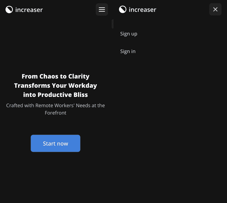
Implementing Consistent Navigation with makeWebsitePage in NextJS
Our website comprises just three pages: Terms of Service, Privacy Policy, and the Landing Page. The first two are straightforward, essentially consisting of text paragraphs, and thus don't warrant detailed discussion. Therefore, our primary focus will be on the Landing Page. However, before delving into that, it's crucial to establish a shared navigation across all the website's pages. This is achieved by wrapping each page with the makeWebsitePage function, ensuring consistent navigation throughout the site.
import { LandingPage } from "../landing/LandingPage"
import { makeWebsitePage } from "../layout/makeWebsitePage"

export default makeWebsitePage(LandingPage)
The makeWebsitePage function takes a component and enhances it with a getLayout function. This getLayout function is utilized by the root app component to wrap the current page, providing a consistent layout across the website. For those unfamiliar with the NextJS Layout pattern, I recommend exploring a dedicated article on this topic here.
import type { AppProps } from "next/app"
import { Page } from "@lib/next-ui/Page"

interface MyAppProps extends AppProps {
  Component: Page
}

function MyApp({ Component, pageProps }: MyAppProps) {
  const getLayout = Component.getLayout || ((page: ReactNode) => page)
  const component = getLayout(<Component {...pageProps} />)
  // ...
}
To construct the topbar navigation, we're utilizing the WebsiteNavigation component from RadzionKit. Shortly, we'll delve into its implementation, but first, let's review its props. Initially, we need to pass the logo, which is positioned in the top left corner. Encased in a link, this logo redirects users to the homepage upon being clicked. The logo's design employs a flexbox layout, featuring an SVG on the left and the product name on the right.
import { IconWrapper } from "@lib/ui/icons/IconWrapper"
import { HStack } from "@lib/ui/layout/Stack"
import { Text } from "@lib/ui/text"
import { productName } from "@increaser/config"
import { ProductIcon } from "./icon/ProductIcon"

export const ProductLogo = () => (
  <HStack alignItems="center" gap={8}>
    <IconWrapper style={{ fontSize: `1.2em` }}>
      <ProductIcon />
    </IconWrapper>
    <Text color="contrast" weight="bold">
      {productName.toLowerCase()}
    </Text>
  </HStack>
)
The app icon is maintained as a standard React component. Given its black and white design, I utilize the theme's color variables, enabling the logo to automatically adapt to both dark and light modes.
import { useTheme } from "styled-components"

export const ProductIcon = () => {
  const { colors } = useTheme()

  return (
    <svg
      width="1em"
      height="1em"
      viewBox="0 0 400 400"
      fill="none"
      xmlns="http://www.w3.org/2000/svg"
    >
      <path
        d="M200 400C310.457 400 400 310.457 400 200C400 89.5431 310.457 0 200 0C89.5431 0 0 89.5431 0 200C0 310.457 89.5431 400 200 400Z"
        fill={colors.contrast.toCssValue()}
      />
      <path
        d="M313.411 313.411C343.417 283.405 360.274 242.709 360.274 200.274C360.274 157.84 343.417 117.143 313.412 87.137C283.406 57.1313 242.709 40.2742 200.274 40.2742C157.84 40.2742 117.143 57.1313 87.1372 87.137L200.274 200.274L313.411 313.411Z"
        fill={colors.background.toCssValue()}
      />
    </svg>
  )
}
To facilitate navigation between the app and the website, we maintain two enums in our @increaser/ui package: AppPath and WebsitePath. When navigating within the website, we use the standard NextJS Link component. Conversely, for navigating to the website from the app, we employ a regular HTML anchor tag.
export enum WebsitePath {
  Home = "/",
  TermsOfService = "/terms-of-service",
  PrivacyPolicy = "/privacy-policy",
}
To streamline our development process, we'll introduce an AppLink component to the website. This component will take a specified path and append it to the app's URL. Importantly, we will avoid adding a rel="noreferrer" attribute to these links. This decision is made to ensure the app's analytics can accurately track user visits originating from the website. Additionally, by default, these links will open in the same tab, offering a seamless user experience.
import {
  ExternalLinkProps,
  ExternalLink,
} from "@lib/ui/navigation/Link/ExternalLink"
import { joinPaths } from "@lib/utils/query/joinPaths"
import { appUrl } from "../config"

export const AppLink = ({
  to,
  openInSameTab = true,
  isReferring = true,
  ...rest
}: ExternalLinkProps) => (
  <ExternalLink
    to={joinPaths(appUrl, to)}
    openInSameTab={openInSameTab}
    isReferring={isReferring}
    {...rest}
  />
)
The app URL will be supplied as an environment variable. When constructing URLs, I prefer utilizing the joinPaths utility. This utility guarantees the formation of a valid URL, irrespective of whether the base path concludes with a slash or the provided path begins with one.
import { shouldBePresent } from "@lib/utils/assert/shouldBePresent"

export const appUrl = shouldBePresent(process.env.NEXT_PUBLIC_APP_URL)
export const joinPaths = (base: string, path: string): string => {
if (base.endsWith("/")) {
base = base.slice(0, -1)
}
if (path.startsWith("/")) {
path = path.substring(1)
}
return `${base}/${path}`
}Returning to our WebsiteNavigation, we need to define two functions: one for rendering topbar items in the desktop version, and another for overlay items in the mobile version. Both functions render the same navigation items. However, while the desktop version utilizes standard buttons, the mobile version employs the OverlayNavigationItem component. This component ensures that the items are styled appropriately for mobile viewing.
import { GetLayout, Page } from "@lib/next-ui/Page"
import { WebsiteNavigation } from "@lib/ui/website/navigation/WebsiteNavigation"
import { ProductLogo } from "@increaser/ui/ProductLogo"
import styled from "styled-components"
import { interactive } from "@lib/ui/css/interactive"
import Link from "next/link"
import { HStack } from "@lib/ui/layout/Stack"
import { Button } from "@lib/ui/buttons/Button"
import { OverlayNavigationItem } from "@lib/ui/website/navigation/OverlayNavigationItem"
import { Footer } from "@lib/ui/website/navigation/Footer"
import { Text } from "@lib/ui/text"
import { legalEntity, supportEmail, youTubeChannel } from "@increaser/config"
import { InteractiveText } from "@lib/ui/text/InteractiveText"
import { AppLink } from "../navigation/AppLink"
import { AppPath } from "@increaser/ui/navigation/AppPath"
import { WebsitePath } from "@increaser/ui/navigation/WebsitePath"
import { ExternalLink } from "@lib/ui/navigation/Link/ExternalLink"

const LogoWrapper = styled(Link)`
  ${interactive};
  font-size: 20px;
`

export const getWebsitePageLayout: GetLayout = (page) => (
  <WebsiteNavigation
    logo={
      <LogoWrapper href={WebsitePath.Home}>
        <ProductLogo />
      </LogoWrapper>
    }
    renderTopbarItems={() => (
      <>
        <div />
        <HStack alignItems="center" gap={8}>
          <AppLink to={AppPath.SignIn}>
            <Button kind="ghost" as="div">
              Sign in
            </Button>
          </AppLink>
          <AppLink to={AppPath.SignUp}>
            <Button kind="reversed" as="div">
              Sign up
            </Button>
          </AppLink>
        </HStack>
      </>
    )}
    renderOverlayItems={({ onClose }) => (
      <>
        <AppLink onClick={onClose} to={AppPath.SignUp}>
          <OverlayNavigationItem as="div">Sign up</OverlayNavigationItem>
        </AppLink>
        <AppLink onClick={onClose} to={AppPath.SignIn}>
          <OverlayNavigationItem as="div">Sign in</OverlayNavigationItem>
        </AppLink>
      </>
    )}
    footer={
      <Footer>
        <HStack
          alignItems="center"
          justifyContent="center"
          gap={16}
          fullWidth
          wrap="wrap"
        >
          <Text>
            © {new Date().getFullYear()} {legalEntity}
          </Text>
          <AppLink to={AppPath.Home}>
            <InteractiveText>App</InteractiveText>
          </AppLink>
          <Link href={WebsitePath.PrivacyPolicy}>
            <InteractiveText>Privacy</InteractiveText>
          </Link>
          <Link href={WebsitePath.TermsOfService}>
            <InteractiveText>Terms</InteractiveText>
          </Link>
          <ExternalLink to={`mailto:${supportEmail}`}>
            <InteractiveText>Get in touch</InteractiveText>
          </ExternalLink>
          <ExternalLink to={youTubeChannel}>
            <InteractiveText>YouTube</InteractiveText>
          </ExternalLink>
        </HStack>
      </Footer>
    }
  >
    {page}
  </WebsiteNavigation>
)

export const makeWebsitePage = (page: Page) => {
  page.getLayout = getWebsitePageLayout

  return page
}
Lastly, we incorporate a footer prop into our website design. This prop displays a horizontal stack featuring a copyright notice alongside the most important links. The Footer component acts as a wrapper, ensuring that the content adheres to a maximum width constraint. Additionally, it establishes the basic styling for the text.
import styled from "styled-components"
import { centeredContentColumn } from "../../css/slice"
import { websiteConfig } from "../config"
import { verticalPadding } from "../../css/verticalPadding"
import { getColor } from "../../theme/getters"

export const Footer = styled.div`
  ${centeredContentColumn({
    contentMaxWidth: websiteConfig.contentMaxWidth,
  })};
  ${verticalPadding(12)};
  color: ${getColor("textSupporting")};
  font-size: 14px;
`
The centeredContentColumn is a foundational CSS helper crucial to our website's design. It allows us to define a maximum width for the content while offering the flexibility to let certain child elements occupy the full width of the page by adjusting the grid-column property of the child elements, which we default to the second column. Utilizing the min CSS function, the content adapts to take the entire page width if the contentMaxWidth is less than the available space. This approach is instrumental in ensuring that the content is neither too wide on large screens nor too narrow on smaller ones.
import { css } from "styled-components"
import { toSizeUnit } from "./toSizeUnit"

interface CenteredContentColumnParams {
  contentMaxWidth: number | string
  horizontalMinPadding?: number | string
}

export const centeredContentColumn = ({
  contentMaxWidth,
  horizontalMinPadding = 20,
}: CenteredContentColumnParams) => css`
  display: grid;
  grid-template-columns:
    1fr min(
      ${toSizeUnit(contentMaxWidth)},
      100% - calc(${toSizeUnit(horizontalMinPadding)} * 2)
    )
    1fr;
  grid-column-gap: ${toSizeUnit(horizontalMinPadding)};

  > * {
    grid-column: 2;
  }
`
Building Responsive Navigation with the WebsiteNavigation Component in React
Now, diving into the WebsiteNavigation component's implementation: The layout of the navigation is determined using the useIsScreenWidthLessThan hook. In our case, this hook returns true when the screen width is under 800px. For managing the open state of the mobile overlay navigation, we utilize the useState hook. The Overlay component is styled with a fixed position. As we store the header's height in the configuration, we leverage this value to compute the overlay's height and set its top attribute. This ensures the overlay doesn't cover the header and user can always access the toggle button.
import styled from "styled-components"
import { ClosableComponentProps, ComponentWithChildrenProps } from "../../props"
import { takeWholeSpace } from "../../css/takeWholeSpace"
import { HStack, VStack } from "../../layout/Stack"
import { ReactNode, useEffect, useState } from "react"
import { useIsScreenWidthLessThan } from "../../hooks/useIsScreenWidthLessThan"
import { centeredContentColumn } from "../../css/centeredContentColumn"
import { websiteConfig } from "../config"
import { getColor } from "../../theme/getters"
import { IconButton } from "../../buttons/IconButton"
import { CloseIcon } from "../../icons/CloseIcon"
import { MenuIcon } from "../../icons/MenuIcon"
import { toSizeUnit } from "../../css/toSizeUnit"
import { verticalPadding } from "../../css/verticalPadding"

type WebsiteNavigationProps = ComponentWithChildrenProps & {
  logo: ReactNode
  renderTopbarItems: () => ReactNode
  renderOverlayItems: (props: ClosableComponentProps) => ReactNode
  footer?: ReactNode
}

const Wrapper = styled(VStack)`
  ${takeWholeSpace};
`

const Container = styled(VStack)`
  max-height: 100%;
  overflow: auto;
  ${takeWholeSpace};
`

const Header = styled.div`
  ${centeredContentColumn({
    contentMaxWidth: websiteConfig.contentMaxWidth,
  })}
  height: ${toSizeUnit(websiteConfig.headerHeight)};
  min-height: ${toSizeUnit(websiteConfig.headerHeight)};
`

const TobbarContent = styled(HStack)`
  flex: 1;
  justify-content: space-between;
`

const Overlay = styled(VStack)`
  position: fixed;
  width: 100%;
  height: calc(100% - ${toSizeUnit(websiteConfig.headerHeight)});
  top: ${toSizeUnit(websiteConfig.headerHeight)};
  background: ${getColor("background")};
  ${verticalPadding(20)};
  gap: 4px;
  z-index: 1;
`

const Content = styled.div`
  flex: 1;
`

export const WebsiteNavigation = ({
  children,
  logo,
  renderOverlayItems,
  renderTopbarItems,
  footer,
}: WebsiteNavigationProps) => {
  const isSmallScreen = useIsScreenWidthLessThan(800)
  const [isOverlayOpen, setIsOverlayOpen] = useState(false)

  useEffect(() => {
    if (!isSmallScreen && isOverlayOpen) {
      setIsOverlayOpen(false)
    }
  }, [isOverlayOpen, isSmallScreen])

  return (
    <>
      <Wrapper>
        <Header>
          <HStack fullWidth alignItems="center" gap={20}>
            {logo}
            <TobbarContent>
              {isSmallScreen ? (
                <>
                  <div />
                  <IconButton
                    size="l"
                    onClick={() => setIsOverlayOpen(!isOverlayOpen)}
                    title={
                      isOverlayOpen ? "Close navigation" : "Open navigation"
                    }
                    icon={isOverlayOpen ? <CloseIcon /> : <MenuIcon />}
                  />
                </>
              ) : (
                <TobbarContent>{renderTopbarItems()}</TobbarContent>
              )}
            </TobbarContent>
          </HStack>
        </Header>
        <Container>
          <Content>{children}</Content>
          {footer}
        </Container>
      </Wrapper>
      {isOverlayOpen && (
        <Overlay>
          {renderOverlayItems({
            onClose: () => setIsOverlayOpen(false),
          })}
        </Overlay>
      )}
    </>
  )
}
To ensure that the topbar navigation remains consistently at the top, the root component is designed as a flexbox element with a column direction, occupying the full width and height of the page. We then position the header, which has a predetermined fixed height. Following the header is a container that occupies the remaining space. This container is set with an overflow: auto property, enabling a scrollbar to appear when the content exceeds the available space. Finally, the footer is placed at the bottom of the page.
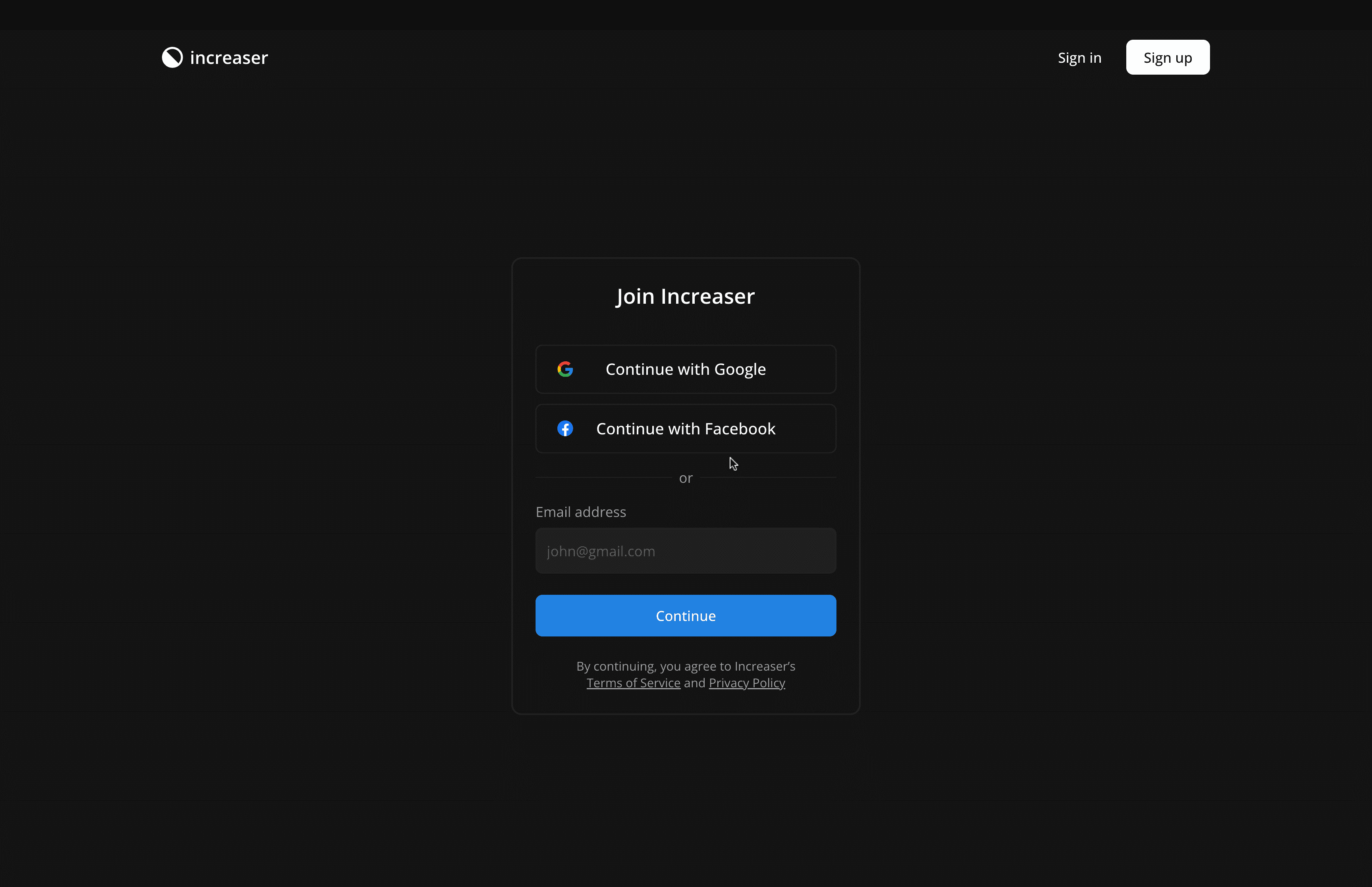
When users click on the sign-in or sign-up buttons, they are redirected to the Increaser app. To maintain a consistent user experience, we use the WebsiteNavigation component on the authorization pages. This component closely resembles the one on the website but omits the footer and utilizes different link components. This approach helps in creating a seamless transition between the website and the app.
export const AuthPageLayout = ({ children }: ComponentWithChildrenProps) => {
  return (
    <UnauthenticatedOnly>
      <WebsiteNavigation
        logo={
          <LogoWrapper to={WebsitePath.Home}>
            <ProductLogo />
          </LogoWrapper>
        }
        renderTopbarItems={() => (
          <>
            <div />
            <HStack alignItems="center" gap={8}>
              <Link href={AppPath.SignIn}>
                <Button kind="ghost" as="div">
                  Sign in
                </Button>
              </Link>
              <Link href={AppPath.SignUp}>
                <Button kind="reversed" as="div">
                  Sign up
                </Button>
              </Link>
            </HStack>
          </>
        )}
        renderOverlayItems={({ onClose }) => (
          <>
            <Link onClick={onClose} href={AppPath.SignUp}>
              <OverlayNavigationItem as="div">Sign up</OverlayNavigationItem>
            </Link>
            <Link onClick={onClose} href={AppPath.SignIn}>
              <OverlayNavigationItem as="div">Sign in</OverlayNavigationItem>
            </Link>
          </>
        )}
      >
        {/* content */}
      </WebsiteNavigation>
    </UnauthenticatedOnly>
  )
}
Optimizing SEO with PageMetaTags in NextJS Landing Pages
With the navigation established, our attention shifts to the landing page. This component is crafted using a sequence of 'slices', each slice representing a distinct section of the page. Additionally, we emphasize incorporating title and description metadata for enhancing the page's search engine optimization (SEO) effectiveness.
import { PageMetaTags } from "@lib/next-ui/metadata/PageMetaTags"
import { PricingSlice } from "./PricingSlice"
import { PrimarySlice } from "./PrimarySlice"
import { VideoSlice } from "./VideoSlice"
import { FaqSlice } from "./FaqSlice"
import { ClosingArgumentSlice } from "./ClosingArgumentSlice"
import { FoundersNoteSlice } from "./FoundersNoteSlice"
import { ScoreboardSlice } from "./ScoreboardSlice"
import { HabitsSlice } from "./demo/HabitsSlice"
import { DemoUserStateProvider } from "./demo/DemoUserStateProvider"
import { FocusSlice } from "./demo/FocusSlice"
import { ProjectsProvider } from "@increaser/ui/projects/ProjectsProvider"
import { TimeTrackingSlice } from "./demo/TimeTrackingSlice"
import { ScheduleSlice } from "./demo/ScheduleSlice"
import { TestimonialsSlice } from "./testimonials/TestimonialsSlice"

export const LandingPage = () => (
  <>
    <PageMetaTags
      title="Master Remote Work with Increaser – Enhance Focus and Time Management"
      description="Increaser offers a unique solution for remote workers seeking to boost efficiency, track time, and develop positive habits for better career and health outcomes."
    />
    <PrimarySlice />
    <DemoUserStateProvider>
      <ProjectsProvider>
        <FocusSlice />
        <TimeTrackingSlice />
        <HabitsSlice />
        <ScheduleSlice />
      </ProjectsProvider>
    </DemoUserStateProvider>
    <TestimonialsSlice />
    <VideoSlice />
    <ScoreboardSlice />
    <PricingSlice />
    <FoundersNoteSlice />
    <FaqSlice />
    <ClosingArgumentSlice />
  </>
)
The integration of SEO metadata is efficiently handled by the PageMetaTags component from RadzionKit, which is specifically designed to set page-specific metadata. For a deeper understanding of all the necessary meta tags in NextJS, I recommend referring to a detailed post on this topic, available here.
import Head from "next/head"

interface PageMetaTags {
  title?: string
  description?: string
  image?: string
  language?: string
}

export const PageMetaTags = ({
  title,
  description,
  image,
  language,
}: PageMetaTags) => (
  <Head>
    {title && (
      <>
        <title>{title}</title>
        <meta name="application-name" content={title} />
        <meta name="apple-mobile-web-app-title" content={title} />
        <meta property="og:title" content={title} />
        <meta name="twitter:title" content={title} />
      </>
    )}

    {description && (
      <>
        <meta name="description" content={description} />
        <meta property="og:description" content={description} />
        <meta name="twitter:description" content={description} />
        <meta property="og:image:alt" content={description} />
        <meta name="twitter:image:alt" content={description} />
      </>
    )}

    {image && (
      <>
        <meta property="og:image" content={image} />
        <meta name="twitter:image:src" content={image} />
      </>
    )}

    {language && <meta httpEquiv="Content-Language" content={language} />}
  </Head>
)
Designing the Minimalistic PrimarySlice for the Increaser Landing Page
import styled from "styled-components"
import { websiteConfig } from "@lib/ui/website/config"
import { toSizeUnit } from "@lib/ui/css/toSizeUnit"
import { WebsiteSectionHeader } from "@lib/ui/website/WebsiteSectionHeader"
import { WebsiteSlice } from "@lib/ui/website/WebsiteSlice"
import { WebsiteSliceContent } from "@lib/ui/website/WebsiteSliceContent"
import { PrimaryCallToAction } from "./PrimaryCallToAction"
const Container = styled(WebsiteSlice)`
min-height: calc(100vh - ${toSizeUnit(websiteConfig.headerHeight)});
`
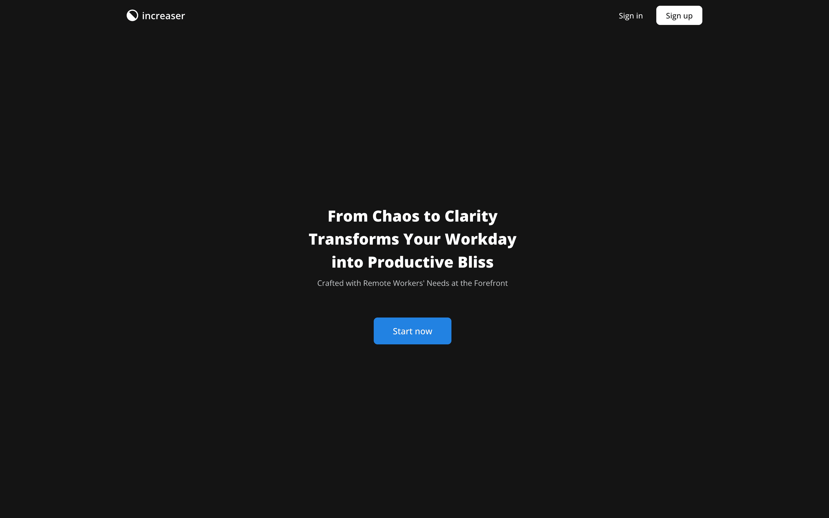
export const PrimarySlice = () => (
<Container>
<WebsiteSliceContent>
<WebsiteSectionHeader
titleAs="h1"
title={
<>
From Chaos to Clarity
<br /> Transforms Your Workday
<br /> into Productive Bliss
</>
}
subtitle="Crafted with Remote Workers' Needs at the Forefront"
/>
<PrimaryCallToAction />
</WebsiteSliceContent>
</Container>
)The first slice of the Increaser landing page is intentionally straightforward. While other projects might benefit from more dynamic visuals to convey their message, here the focus is on simplicity and minimalism. The container for this PrimarySlice is built using the WebsiteSlice component. This component makes use of the previously discussed centeredContentColumn, ensuring consistent content alignment. Additionally, it applies a vertical padding of 80px, which is instrumental in maintaining a clean and well-organized spacing between the different sections of the website.
import styled from "styled-components"
import { centeredContentColumn } from "../css/centeredContentColumn"
import { websiteConfig } from "./config"
import { verticalPadding } from "../css/verticalPadding"

export const WebsiteSlice = styled.div`
  ${centeredContentColumn({
    contentMaxWidth: websiteConfig.contentMaxWidth,
  })}

  ${verticalPadding(80)}
`
To make the PrimarySlice span the entire page width, its min-height property is set to 100vh, minus the height of the header. Meanwhile, the WebsiteSliceContent centers the content and creates a 60px gap between elements, usually consisting of the section's header and the main content.
import styled from "styled-components"
import { VStack } from "../layout/Stack"

export const WebsiteSliceContent = styled(VStack)`
  width: 100%;
  justify-content: center;
  align-items: center;
  gap: 60px;
`
Following this, the WebsiteSectionHeader component is utilized to display a title and subtitle across every slice of our landing page. Typically, titles are formatted as "h2", except in the primary slice where we use "h1" for improved SEO, as it's advisable to have only one "h1" tag per page. For better mobile readability, the font size is reduced to 20px on smaller screens to prevent the text from occupying the entire screen.
import { ReactNode } from "react"
import { TitledComponentProps } from "../props"
import { VStack } from "../layout/Stack"
import styled from "styled-components"
import { Text } from "../text"

type WebsiteSectionHeaderProps = TitledComponentProps & {
  subtitle?: ReactNode
  titleAs?: React.ElementType
}

const Title = styled(Text)`
  font-size: 32px;
  @media (max-width: 600px) {
    font-size: 20px;
  }
`

const Container = styled(VStack)`
  gap: 8px;
  align-items: center;
  text-align: center;
  line-height: 1.5;
  max-width: 600px;
`

export const WebsiteSectionHeader = ({
  title,
  subtitle,
  titleAs = "h2",
}: WebsiteSectionHeaderProps) => (
  <Container>
    <Title color="contrast" as={titleAs}>
      {title}
    </Title>
    {subtitle && <Text>{subtitle}</Text>}
  </Container>
)
The primary slice prominently features a call-to-action for app sign-up. To maintain consistency across the landing page, this button is encapsulated in a dedicated component named PrimaryCallToAction. This component combines a Button from RadzionKit with the previously discussed AppLink component. Although it's typically displayed uniformly, we enable customization by allowing prop propagation to the Button component.
import { AppPath } from "@increaser/ui/navigation/AppPath"
import { AppLink } from "../navigation/AppLink"
import { Button, ButtonProps } from "@lib/ui/buttons/Button"

type PrimaryCallToActionProps = Partial<ButtonProps>

export const PrimaryCallToAction = ({
  children = "Start now",
  size = "xl",
  kind = "primary",
  ...rest
}: PrimaryCallToActionProps) => (
  <AppLink to={AppPath.SignUp}>
    <Button as="div" kind={kind} size={size} {...rest}>
      {children}
    </Button>
  </AppLink>
)
It's generally effective to showcase social proof as the second slice of a landing page. This approach is common in many websites, typically featuring "as seen on" or "trusted by" sections, or displaying ratings from the App Store for mobile apps. However, for Increaser, extensive social proof has not yet been developed. While it had a moderately successful campaign on AppSumo, garnering four 5-star reviews, this is insufficient for prominent display on the landing page. Additionally, as Increaser is a progressive web app without a mobile app counterpart, we skip directly to highlighting the product features.
Integrating Interactive Demo Features on the Increaser Landing Page
In the product features sections of our landing page, we aim to use the same interactive components found in the app. However, these components should not trigger API calls when interacted with on the landing page. Moreover, they need mock data to ensure engagement. To facilitate this, we will implement custom React providers specifically for the landing page. The primary provider in this setup will be the DemoUserStateProvider.
import { useCallback, useState } from "react"
import { UserStateContext } from "@increaser/ui/user/UserStateContext"

import { User } from "@increaser/entities/User"
import { ComponentWithChildrenProps } from "@lib/ui/props"
import { getDemoUser } from "@increaser/demo/getDemoUser"

export const DemoUserStateProvider = ({
  children,
}: ComponentWithChildrenProps) => {
  const [state, setState] = useState<User>(getDemoUser)

  const updateState = useCallback(
    (pieceOfState: Partial<User>) => {
      setState((state) => ({
        ...(state || {}),
        ...pieceOfState,
      }))
    },
    [setState]
  )

  return (
    <UserStateContext.Provider
      value={{
        state: state,
        updateState,
        pullRemoteState: () => {},
        isLoading: false,
        lastUpdatedAt: Date.now(),
      }}
    >
      {children}
    </UserStateContext.Provider>
  )
}
Increaser initially loads all crucial user data from the API upon the first page load and stores this information in the UserStateContext. This context is then leveraged by the useAssertUserState hook, which verifies that the user is logged in and possesses all required data to effectively use the app. Thanks to caching the data in local storage, this process typically feels seamless to the user, who is unlikely to notice any delay caused by the "user state" query.
import { createContext } from "react"
import { createContextHook } from "@lib/ui/state/createContextHook"
import { User } from "@increaser/entities/User"

interface UserStateContextValue {
  state: User | null
  updateState: (state: Partial<User>) => void
  pullRemoteState: () => void
  isLoading: boolean
  lastUpdatedAt: number
}

export const UserStateContext = createContext<
  UserStateContextValue | undefined
>(undefined)

export const useUserState = createContextHook(
  UserStateContext,
  "UserStateContext"
)

export const useAssertUserState = () => {
  const { state } = useUserState()

  if (state === null) {
    throw new Error("UserState is not provided")
  }

  return state
}
In our DemoUserStateProvider, we maintain the state using the useState hook and provide a means for consumers to partially update it via the updateState function. The getDemoUser function, housed in @increaser/demo package, has a historical context: there was a time when the Increaser app utilized a demo user to showcase app features for new users without any data. This function populates the User entity, used across the app, with mock data designed to appear realistic on the landing page.
import { User, userDefaultFields } from "@increaser/entities/User"
import { convertDuration } from "@lib/utils/time/convertDuration"
import { getCurrentTimezoneOffset } from "@lib/utils/time/getCurrentTimezoneOffset"
import { getDemoHabits } from "./habits"
import { getDemoProjects } from "./projects"
import { getDemoSets } from "./sets"
import { getDemoTasks } from "./tasks"

export const getDemoUser = (): User => {
  return {
    ...userDefaultFields,
    id: "demo",
    email: "john@mail.com",
    name: "John",
    registrationDate: Date.now(),
    freeTrialEnd: Date.now() + convertDuration(100, "d", "ms"),
    updatedAt: Date.now(),
    timeZone: getCurrentTimezoneOffset(),
    habits: getDemoHabits(),
    projects: getDemoProjects(),
    sets: getDemoSets(),
    tasks: getDemoTasks(),
  }
}
The ProjectsProvider is specifically designed to enhance the dev experience of working with projects in the app. It effectively organizes projects and augments them with extra information, including the total minutes devoted to a project during the current week and the project's color represented in HSLA format. Owing to its independence from API interactions, the ProjectsProvider operates consistently across both the app and the landing page.
import { createContext, useMemo } from "react"
import { useStartOfWeek } from "@lib/ui/hooks/useStartOfWeek"
import { ComponentWithChildrenProps } from "@lib/ui/props"
import { areSameWeek } from "@lib/utils/time/areSameWeek"
import { getRecord } from "@lib/utils/record/getRecord"
import { range } from "@lib/utils/array/range"
import { splitBy } from "@lib/utils/array/splitBy"
import { toWeek } from "@lib/utils/time/toWeek"
import { useTheme } from "styled-components"
import { useAssertUserState } from "@increaser/ui/user/UserStateContext"
import { MS_IN_WEEK } from "@lib/utils/time"
import { createContextHook } from "@lib/ui/state/createContextHook"
import { EnhancedProject } from "./EnhancedProject"
import { useCurrentWeekSets } from "../sets/hooks/useCurrentWeekSets"
import { enhanceProject } from "./utils/enhanceProject"
export const weeksToDisplay = 4
export interface WeekSummaryProject {
seconds: number
id: string
}
export interface WeekSummary {
year: number
week: number
projects: WeekSummaryProject[]
}
interface ProjectsState {
projects: EnhancedProject[]
activeProjects: EnhancedProject[]
inactiveProjects: EnhancedProject[]
allocatedProjects: EnhancedProject[]
projectsRecord: Record<string, EnhancedProject>
weeks: WeekSummary[]
}
const getProjectSortingNumber = ({
allocatedMinutesPerWeek,
doneMinutesThisWeek,
status,
}: EnhancedProject) => {
if (status !== "ACTIVE") return 100000000000
if (!allocatedMinutesPerWeek && !doneMinutesThisWeek) return 1000000000
if (!allocatedMinutesPerWeek) return doneMinutesThisWeek
return doneMinutesThisWeek / allocatedMinutesPerWeek
}
export const ProjectsContext = createContext<ProjectsState | undefined>(
undefined
)
export const ProjectsProvider = ({ children }: ComponentWithChildrenProps) => {
const state = useAssertUserState()
const sets = useCurrentWeekSets()
const theme = useTheme()
const projects = useMemo(
() =>
state.projects
.map((project) => enhanceProject(project, sets, theme))
.sort(
(one, another) =>
getProjectSortingNumber(one) - getProjectSortingNumber(another)
),
[sets, state.projects, theme]
)
console.log(projects)
const [activeProjects, inactiveProjects] = useMemo(
() => splitBy(projects, ({ status }) => (status === "ACTIVE" ? 0 : 1)),
[projects]
)
const allocatedProjects = useMemo(
() =>
projects.filter(
({ allocatedMinutesPerWeek }) => allocatedMinutesPerWeek > 0
),
[projects]
)
const projectsRecord = useMemo(
() => getRecord(projects, (project) => project.id),
[projects]
)
const startOfWeek = useStartOfWeek()
const weeks: WeekSummary[] = useMemo(() => {
return range(weeksToDisplay).map((index) => {
const week = toWeek(startOfWeek - (weeksToDisplay - index) * MS_IN_WEEK)
const projectsWithWeek = [] as WeekSummaryProject[]
projects.forEach((project) => {
const projectWeek = project.weeks.find((partialWeek) =>
areSameWeek(partialWeek, week)
)
if (projectWeek) {
projectsWithWeek.push({
seconds: projectWeek.seconds,
id: project.id,
})
}
})
return {
...week,
projects: projectsWithWeek.sort((a, b) => a.seconds - b.seconds),
}
})
}, [projects, startOfWeek])
return (
<ProjectsContext.Provider
value={{
projects,
activeProjects,
inactiveProjects,
allocatedProjects,
projectsRecord,
weeks,
}}
>
{children}
</ProjectsContext.Provider>
)
}
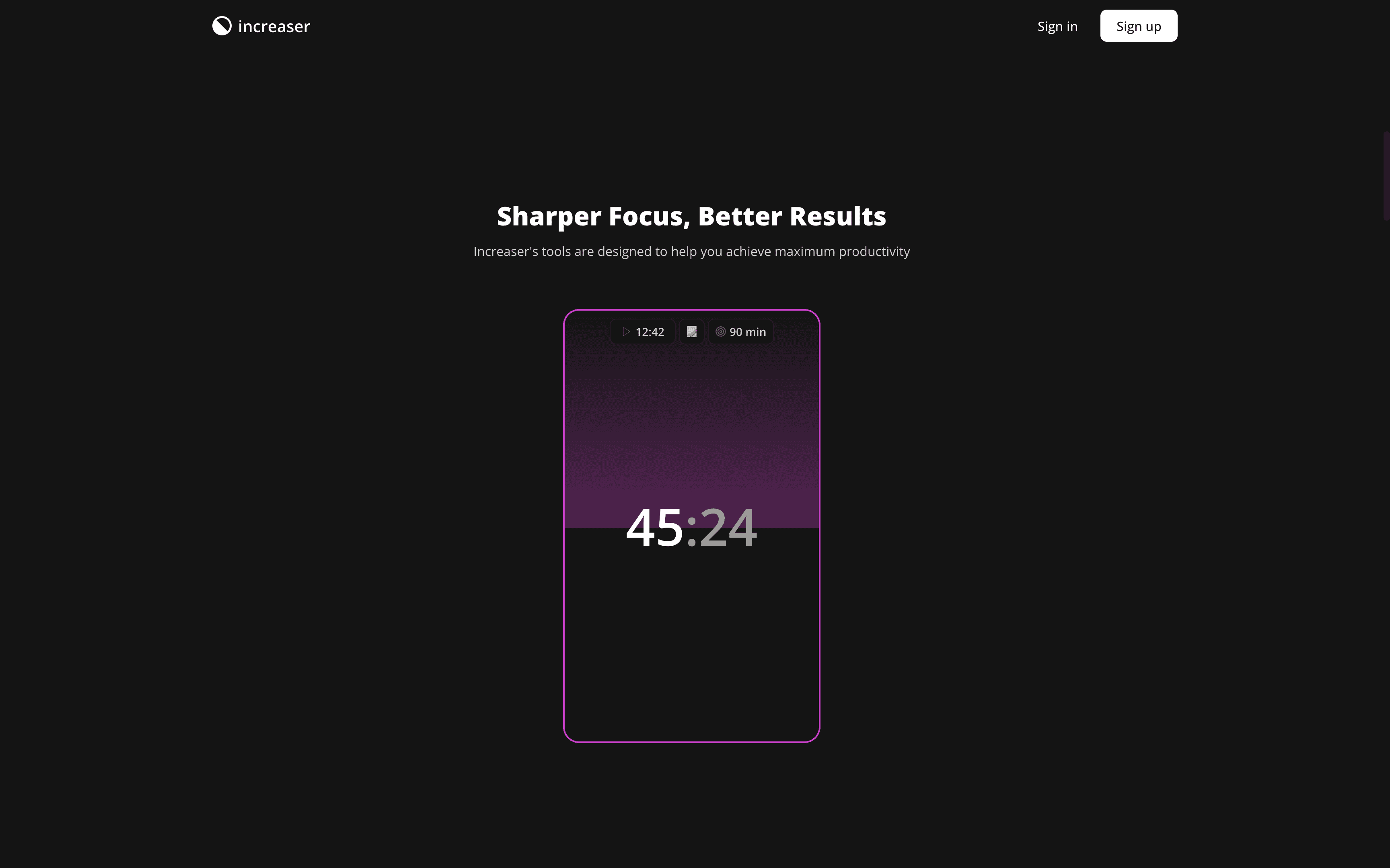
export const useProjects = createContextHook(ProjectsContext, "ProjectsContext")Our first demo slice highlights the focus timer. This slice utilizes components we've previously discussed: WebsiteSlice, WebsiteSliceContent, and WebsiteSectionHeader. Given the lack of practical benefit in prerendering the interactive feature during HTML generation, we will encapsulate the component within ClientOnly. This ensures that it is rendered exclusively on the client side.
import { WebsiteSectionHeader } from "@lib/ui/website/WebsiteSectionHeader"
import { WebsiteSlice } from "@lib/ui/website/WebsiteSlice"
import { WebsiteSliceContent } from "@lib/ui/website/WebsiteSliceContent"
import { productName } from "@increaser/config"
import { ClientOnly } from "@lib/ui/base/ClientOnly"
import styled from "styled-components"
import { centerContent } from "@lib/ui/css/centerContent"
import { SessionProgress } from "@increaser/ui/focus/SessionProgress"
import { DemoFocusProvider } from "./DemoFocusProvider"
import { Text } from "@lib/ui/text"
import { FocusPassedTime } from "@increaser/ui/focus/FocusPassedTime"
import { FocusSessionInfo } from "@increaser/ui/focus/FocusSessionInfo"

const BlockWrapper = styled.div`
  height: 540px;
  width: 320px;
  position: relative;
  ${centerContent};

  @media (max-width: 800px) {
    height: 400px;
    width: 280px;
  }
`

const PositionSessionInfo = styled.div`
  position: absolute;
  top: 12px;
`

export const FocusSlice = () => {
  return (
    <WebsiteSlice>
      <WebsiteSliceContent>
        <WebsiteSectionHeader
          title="Sharper Focus, Better Results"
          subtitle={`${productName}'s tools are designed to help you achieve maximum productivity`}
        />
        <ClientOnly>
          <DemoFocusProvider>
            <BlockWrapper>
              <SessionProgress />
              <PositionSessionInfo>
                <FocusSessionInfo />
              </PositionSessionInfo>
              <Text
                style={{ position: "absolute" }}
                as="div"
                weight="bold"
                size={64}
                height="small"
              >
                <FocusPassedTime />
              </Text>
            </BlockWrapper>
          </DemoFocusProvider>
        </ClientOnly>
      </WebsiteSliceContent>
    </WebsiteSlice>
  )
}
The DemoFocusProvider mirrors the approach of the DemoUserStateProvider. However, in addition to eliminating API calls, it also suppresses notifications, which we want to avoid triggering during user interactions on the landing page. The focus timer presented on the landing page closely resembles its app counterpart, yet we aim to avoid cluttering the UI with buttons for setting, finishing, or canceling sessions. This streamlined interface is achieved using the reusable components involved in the focus timer, simply by excluding unnecessary elements. Additionally, for mobile views, the timer size will be reduced to ensure it fits comfortably on smaller screens.
import { ReactNode, useCallback, useState } from "react"

import { FocusDuration } from "@increaser/entities/FocusDuration"
import { CurrentSet, FocusContext } from "@increaser/ui/focus/FocusContext"
import { convertDuration } from "@lib/utils/time/convertDuration"
import { DemoProject } from "@increaser/demo/projects"
import { CurrentFocusGuard } from "@increaser/ui/focus/CurrentFocusProvider"

interface Props {
  children: ReactNode
}

export const DemoFocusProvider = ({ children }: Props) => {
  const [focusDuration, setFocusDuration] = useState<FocusDuration>(90)

  const [currentSet, setCurrentSet] = useState<CurrentSet>({
    startedAt: Date.now() - convertDuration(45, "min", "ms"),
    projectId: DemoProject.Content,
  })

  const updateStartTime = useCallback((startedAt: number) => {
    setCurrentSet((set) => (set ? { ...set, startedAt } : set))
  }, [])

  const updateProject = useCallback((projectId: string) => {
    setCurrentSet((set) => (set ? { ...set, projectId } : set))
  }, [])

  return (
    <FocusContext.Provider
      value={{
        start: () => {},
        updateStartTime,
        updateProject,
        stop,
        cancel: () => {},
        currentSet,
        focusDuration,
        setFocusDuration,
        setHasTimerSoundNotification: () => {},
        hasTimerBrowserNotification: false,
        setHasTimerBrowserNotification: () => {},
        hasTimerSoundNotification: false,
      }}
    >
      <CurrentFocusGuard>{children}</CurrentFocusGuard>
    </FocusContext.Provider>
  )
}
Leveraging AI to Enhance Web Copy and Feature Presentation on Increaser's Landing Page
We feature three more demo slices on our website, each spotlighting a unique feature of the app. While we won't go into extensive detail about them, it's important to note that they follow a consistent pattern: using reusable elements from the @increaser/ui package and integrating custom providers specifically for the website. The website's copy is notably effective, a result of my utilization of ChatGPT, despite not being a copywriter myself. I keep a text file in the repository that provides a basic, albeit not comprehensive, description of the product and its features. This document is instrumental in giving ChatGPT a foundational understanding of our product. I use this file to prompt ChatGPT, asking it to confirm understanding with a "Yes" before moving on to more creative tasks, such as generating multiple title and subtitle options for various landing page sections.
This usage of AI is particularly fascinating to me as a developer. While I'm proficient with my tech stack and seldom need AI assistance for React component development, AI proves invaluable in areas outside my expertise. It enhances my capabilities as a developer, enabling me to be a more well-rounded professional, adept at tackling a wider array of challenges and functioning more autonomously.
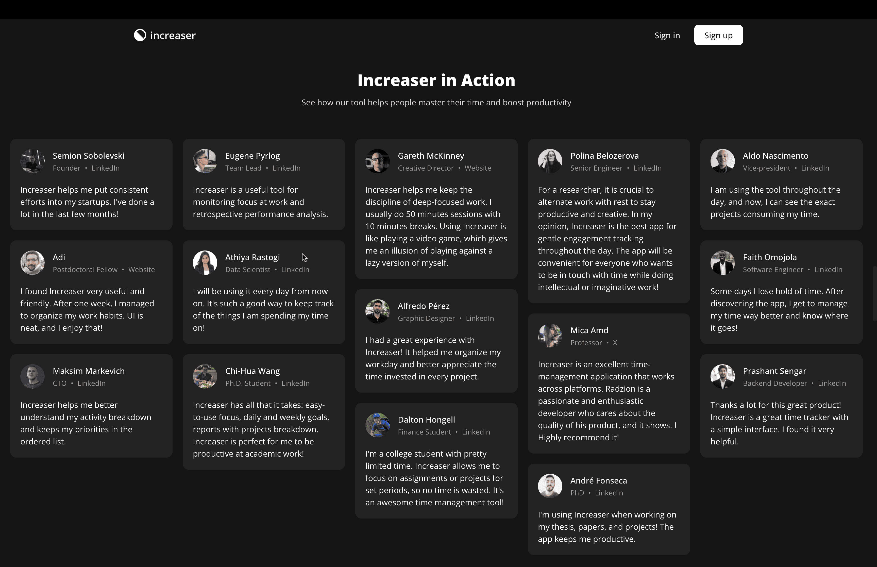
Showcasing Social Proof with a Testimonials Section on Increaser's Website
import { WebsiteSectionHeader } from "@lib/ui/website/WebsiteSectionHeader"
import { WebsiteSlice } from "@lib/ui/website/WebsiteSlice"
import { WebsiteSliceContent } from "@lib/ui/website/WebsiteSliceContent"
import { productName } from "@increaser/config"
import styled from "styled-components"
import { testimonials } from "./testimonials"
import { TestimonialItem } from "@lib/ui/website/testimonials/TestimonialItem"
import { TestimonialsContainer } from "@lib/ui/website/testimonials/TestimonialsContainer"
import { centeredContentColumn } from "@lib/ui/css/centeredContentColumn"
import { useIsScreenWidthLessThan } from "@lib/ui/hooks/useIsScreenWidthLessThan"

const Slice = styled(WebsiteSlice)`
  ${centeredContentColumn({
    contentMaxWidth: "100%",
  })}
`

export const TestimonialsSlice = () => {
  const isSmallScreen = useIsScreenWidthLessThan(600)
  const items = isSmallScreen ? testimonials.slice(0, 6) : testimonials

  return (
    <Slice>
      <WebsiteSliceContent>
        <WebsiteSectionHeader
          title={`${productName} in Action`}
          subtitle={`See how our tool helps people master their time and boost productivity`}
        />
        <TestimonialsContainer>
          {items.map((testimonial, index) => (
            <TestimonialItem key={index} testimonial={testimonial} />
          ))}
        </TestimonialsContainer>
      </WebsiteSliceContent>
    </Slice>
  )
}
After showcasing the features, we transition to a section showcasing testimonials. For this, we repurpose the WebsiteSlice component, configuring it to span the entire page width by setting contentMaxWidth to 100%. To arrange the testimonials in a columnar layout, we employ a multicolumn setup. This simply involves specifying the column width, the gap between columns, and ensuring each item's margin-bottom is equal to the gap value. To not make the user scroll through lots of testimonials, we limit the number of testimonials displayed on smaller screens.
import styled from "styled-components"

const testimonialsGap = "20px"

export const TestimonialsContainer = styled.div`
  column-gap: ${testimonialsGap};
  column-width: 320px;

  > * {
    margin-bottom: ${testimonialsGap};
  }
`
The testimonials are stored as a list of objects in a separate file. Admittedly, I haven't updated this list for the last two years due to a lapse in following up with individuals who provided positive feedback. However, I'll try to regularly update the testimonials with current social proof. Each testimonial object includes the content, the person's name, profile type, and a link, verifying the authenticity of the person behind the testimonial. Additionally, we incorporate an image URL and their position. For efficiency, small avatar images are stored in .webp format in the public folder.
export type ProfileType = "linkedin" | "website" | "x"

export const profileTypeName: Record<string, string> = {
  linkedin: "LinkedIn",
  website: "Website",
  x: "X",
}

export type Testimonial = {
  content: string
  name: string
  profileUrl: string
  profileType: ProfileType
  imageUrl: string
  position: string
}
The TestimonialItem component encases the content within a Panel, distinguishing the header from the content with a 20px gap. The header comprises the individual's avatar, name, position, and a link to their profile (e.g., LinkedIn or other platforms). For avatar display, we utilize two helper components: SafeImage, which prevents the display of a broken image if it fails to load, and CoverImage, which ensures the image stretches to fill the container.
import { ReactNode } from "react"
import { useBoolean } from "../hooks/useBoolean"

interface RenderParams {
  src: string
  onError: () => void
}

interface Props {
  src?: string
  fallback?: ReactNode
  render: (params: RenderParams) => void
}

export const SafeImage = ({ fallback = null, src, render }: Props) => {
  const [isFailedToLoad, { set: failedToLoad }] = useBoolean(false)

  return (
    <>
      {isFailedToLoad || !src
        ? fallback
        : render({ onError: failedToLoad, src })}
    </>
  )
}
import styled from "styled-components"
import { takeWholeSpace } from "../css/takeWholeSpace"
export const CoverImage = styled.img`
${takeWholeSpace};
object-fit: cover;
`import { HStack, VStack } from "../../layout/Stack"
import { Testimonial, profileTypeName } from "./Testimonial"
import { Panel } from "../../panel/Panel"
import styled from "styled-components"
import { CoverImage } from "../../images/CoverImage"
import { sameDimensions } from "../../css/sameDimensions"
import { round } from "../../css/round"
import { SafeImage } from "../../images/SafeImage"
import { Text } from "../../text"
import { HStackSeparatedBy, dotSeparator } from "../../layout/StackSeparatedBy"
import { InteractiveText } from "../../text/InteractiveText"
import { ExternalLink } from "../../navigation/Link/ExternalLink"
type TestimonialItemProps = {
testimonial: Testimonial
}
const Avatar = styled(CoverImage)`
${sameDimensions(48)};
${round};
`
export const TestimonialItem = ({ testimonial }: TestimonialItemProps) => {
const { content, name, profileType, profileUrl, imageUrl, position } =
testimonial
return (
<Panel>
<VStack gap={20}>
<HStack alignItems="center" gap={16}>
<SafeImage
src={imageUrl}
render={(props) => <Avatar alt={name} {...props} />}
/>
<VStack gap={4}>
<Text color="contrast" weight="semibold">
{name}
</Text>
<Text as="div" color="supporting" size={14}>
<HStackSeparatedBy separator={dotSeparator}>
<Text>{position}</Text>
<ExternalLink to={profileUrl}>
<InteractiveText>
{profileTypeName[profileType]}
</InteractiveText>
</ExternalLink>
</HStackSeparatedBy>
</Text>
</VStack>
</HStack>
<Text color="contrast" height="large">
{content}
</Text>
</VStack>
</Panel>
)
}Enhancing User Engagement with the VideoSlice Feature on Increaser's Landing Page
Following the testimonials, there's a VideoSlice section showcasing a product overview video. In this video, I guide viewers through the onboarding process and highlight key features of the app. Ideally, this video should align with the website's UI for consistency. We embed the YouTube video using the react-player package, which activates as the user scrolls to this section. This approach optimizes the website's performance by avoiding unnecessary network requests. To further enhance site efficiency, we might consider using IntersectionObserver for rendering content only when it becomes visible to the user, or combining React.lazy with Suspense to delay loading the component until necessary.
import YouTubePlayer from "react-player/lazy"
import styled, { css } from "styled-components"
import { demoVideoUrl, productName } from "@increaser/config"
import { borderRadius } from "@lib/ui/css/borderRadius"
import { VStack } from "@lib/ui/layout/Stack"
import { IntersectionAware } from "@lib/ui/base/IntersectionAware"
import { useBoolean } from "@lib/ui/hooks/useBoolean"
import { ElementSizeAware } from "@lib/ui/base/ElementSizeAware"
import { WebsiteSectionHeader } from "@lib/ui/website/WebsiteSectionHeader"
import { WebsiteSliceContent } from "@lib/ui/website/WebsiteSliceContent"
import { getColor } from "@lib/ui/theme/getters"
import { transition } from "@lib/ui/css/transition"
import { WebsiteSlice } from "@lib/ui/website/WebsiteSlice"

const youTubeVideoRatio = 9 / 16

const PlayerWrapper = styled.div<{ isActive: boolean }>`
  ${borderRadius.m};
  overflow: hidden;
  ${transition}
  border: 1px solid transparent;
  ${({ isActive, theme }) =>
    !isActive &&
    css`
      border-color: ${getColor("primary")};
      box-shadow: 0 0 20px 5px ${theme.colors.primary
          .getVariant({ a: () => 0.8 })
          .toCssValue()};
    `}
`

export const VideoSlice = () => {
  const [isPlaying, { set: play, unset: pause }] = useBoolean(false)

  return (
    <WebsiteSlice>
      <WebsiteSliceContent>
        <WebsiteSectionHeader
          title={`Unveiling the Power of ${productName}`}
          subtitle="Dive into an insightful demonstration and see how our app transforms your workday efficiency"
        />
        <IntersectionAware<HTMLDivElement>
          render={({ ref, wasIntersected }) => {
            return (
              <VStack fullWidth ref={ref}>
                {wasIntersected && (
                  <ElementSizeAware
                    render={({ setElement, size }) => {
                      return (
                        <PlayerWrapper isActive={isPlaying} ref={setElement}>
                          {size && (
                            <YouTubePlayer
                              isActive
                              width={size.width}
                              height={size.width * youTubeVideoRatio}
                              url={demoVideoUrl}
                              playing={isPlaying}
                              onPause={pause}
                              onPlay={play}
                              config={{
                                youtube: {
                                  playerVars: { autoplay: 0, controls: 1 },
                                },
                              }}
                            />
                          )}
                        </PlayerWrapper>
                      )
                    }}
                  />
                )}
              </VStack>
            )
          }}
        />
      </WebsiteSliceContent>
    </WebsiteSlice>
  )
}
The video's playing state is managed using the useState hook. This state is utilized to toggle the visibility of the video's highlight, ensuring it doesn't distract the user during playback. The highlight effect is achieved by adding a border and a box-shadow, the latter manipulating the color's alpha channel for a semi-transparent look. For those interested in exploring the HSLA color format in React, further details are available here.
import styled, { css } from "styled-components"
import { borderRadius } from "@lib/ui/css/borderRadius"
import { getColor } from "@lib/ui/theme/getters"
import { transition } from "@lib/ui/css/transition"

export const VideoHighlight = styled.div<{ isActive: boolean }>`
  ${borderRadius.m};
  overflow: hidden;
  ${transition}
  border: 1px solid transparent;
  ${({ isActive, theme }) =>
    !isActive &&
    css`
      border-color: ${getColor("primary")};
      box-shadow: 0 0 20px 5px ${theme.colors.primary
          .getVariant({ a: () => 0.8 })
          .toCssValue()};
    `}
`
Showcasing Real-Time Productivity with the ScoreboardSlice on Increaser's Landing Page
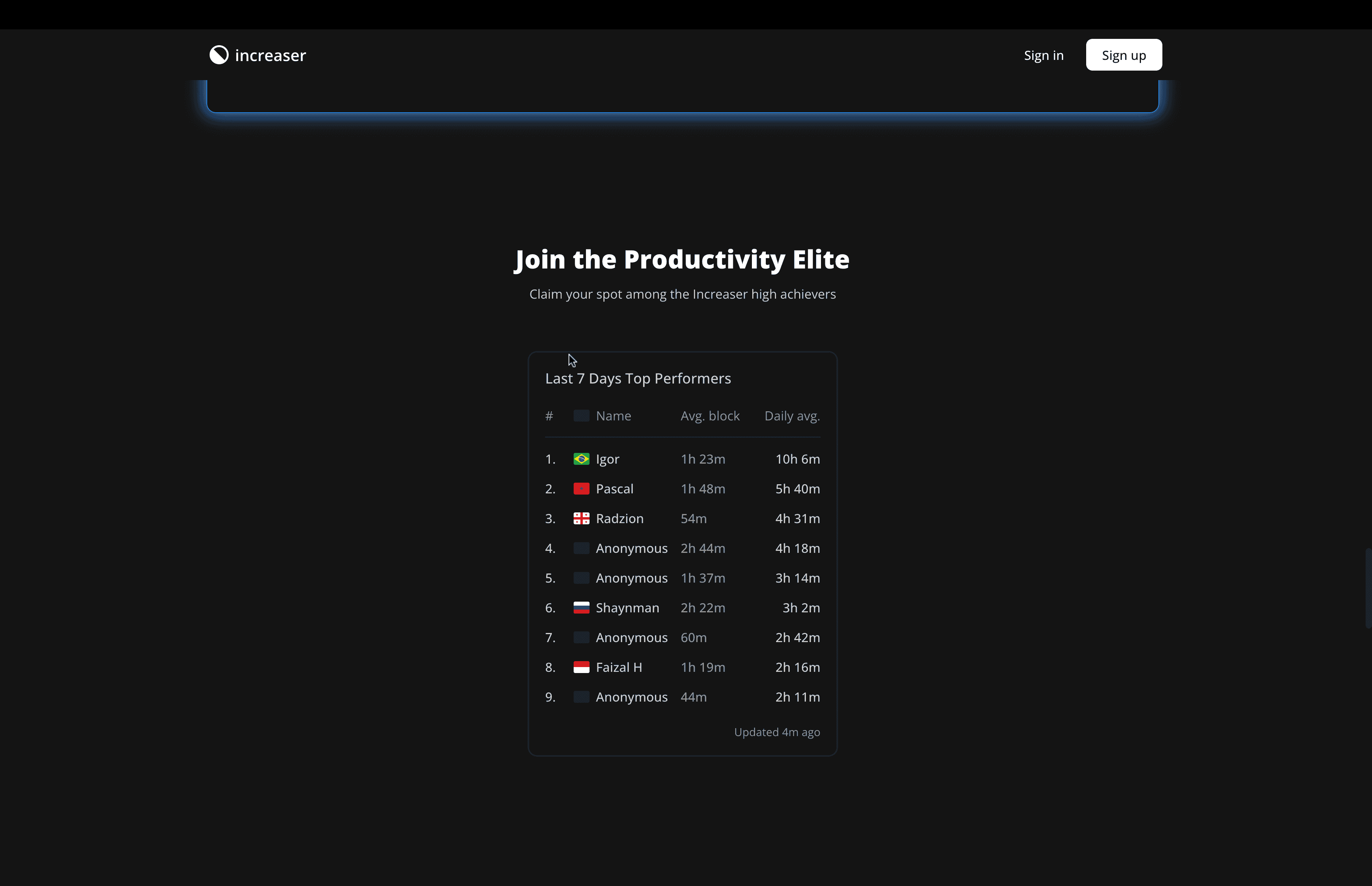
Following that, we have the ScoreboardSlice section. This unique feature of Increaser serves as a form of social proof, displaying the most productive users in real-time. While measuring productivity in terms of hours worked may not be the most accurate metric, it provides a tangible benchmark. For those interested, further insights into this feature's implementation are available in a blog post. In this case, we bypass the need for custom providers as the data is directly queried from the API. The current user won't be highlighted, due to the absence of a JWT token in the request for user identification.
import { WebsiteSectionHeader } from "@lib/ui/website/WebsiteSectionHeader"
import { WebsiteSlice } from "@lib/ui/website/WebsiteSlice"
import { WebsiteSliceContent } from "@lib/ui/website/WebsiteSliceContent"
import { Scoreboard } from "@increaser/ui/scoreboard/Scoreboard"
import { productName } from "@increaser/config"

export const ScoreboardSlice = () => {
  return (
    <WebsiteSlice>
      <WebsiteSliceContent>
        <WebsiteSectionHeader
          title="Join the Productivity Elite"
          subtitle={`Claim your spot among the ${productName} high achievers`}
        />
        <Scoreboard />
      </WebsiteSliceContent>
    </WebsiteSlice>
  )
}
Introducing the PricingSlice: Effectively Displaying Subscription Options on Increaser
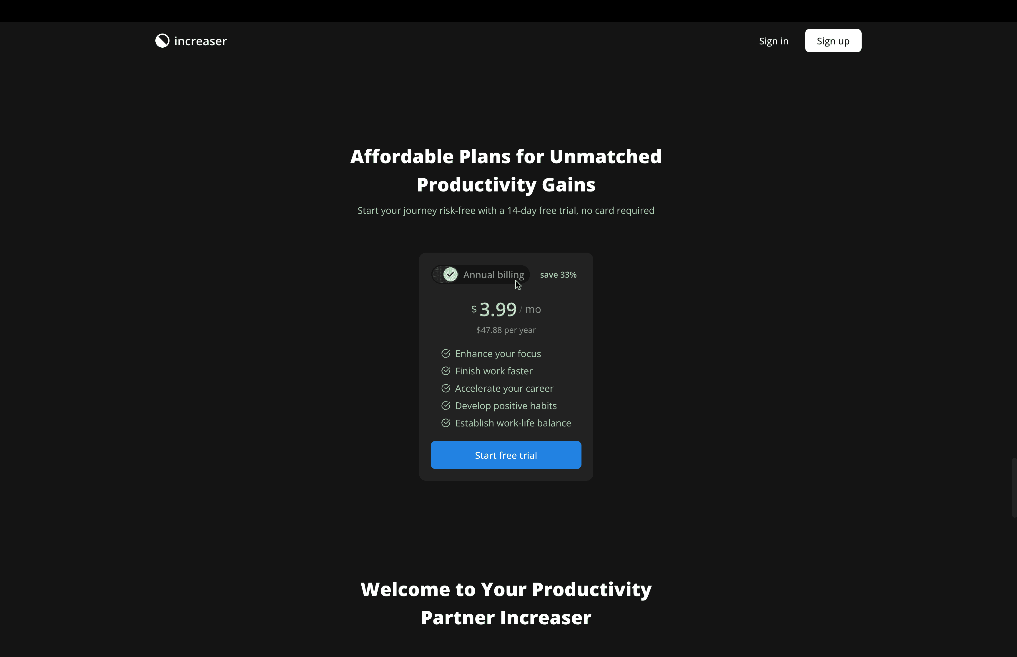
The inclusion of a pricing section, termed the PricingSlice, is essential given that the app isn't free. For managing subscriptions, I use Paddle, yet the underlying principles of subscription management are universally applicable, regardless of the provider. To delve deeper into this topic, you can refer to a blog post dedicated to it. Within this section, the SubscriptionBillingCycleProvider holds the user's chosen billing cycle—either month or year. We then present a Panel that encapsulates both the SubscriptionOffer and the PrimaryCallToAction components. Here, the PrimaryCallToAction button is slightly reduced in size and relabeled as "Start free trial" to better suit the context.
import { freeTrialDays } from "@increaser/config"
import { VStack } from "@lib/ui/layout/Stack"
import { Panel } from "@lib/ui/panel/Panel"
import { SubscriptionOffer } from "@increaser/ui/subscription/SubscriptionOffer"
import { SubscriptionBillingCycleProvider } from "@lib/subscription-ui/SubscriptionBillingCycleProvider"
import { WebsiteSectionHeader } from "@lib/ui/website/WebsiteSectionHeader"
import { WebsiteSlice } from "@lib/ui/website/WebsiteSlice"
import { WebsiteSliceContent } from "@lib/ui/website/WebsiteSliceContent"
import { PrimaryCallToAction } from "./PrimaryCallToAction"

export const PricingSlice = () => {
  return (
    <WebsiteSlice>
      <WebsiteSliceContent>
        <WebsiteSectionHeader
          title="Affordable Plans for Unmatched Productivity Gains"
          subtitle={`Start your journey risk-free with a ${freeTrialDays}-day free trial,
          no card required`}
        />
        <SubscriptionBillingCycleProvider>
          <Panel>
            <VStack gap={20}>
              <SubscriptionOffer />
              <PrimaryCallToAction size="l">
                Start free trial
              </PrimaryCallToAction>
            </VStack>
          </Panel>
        </SubscriptionBillingCycleProvider>
      </WebsiteSliceContent>
    </WebsiteSlice>
  )
}
Adding a Personal Touch with the Founder's Note Section on Increaser's Website
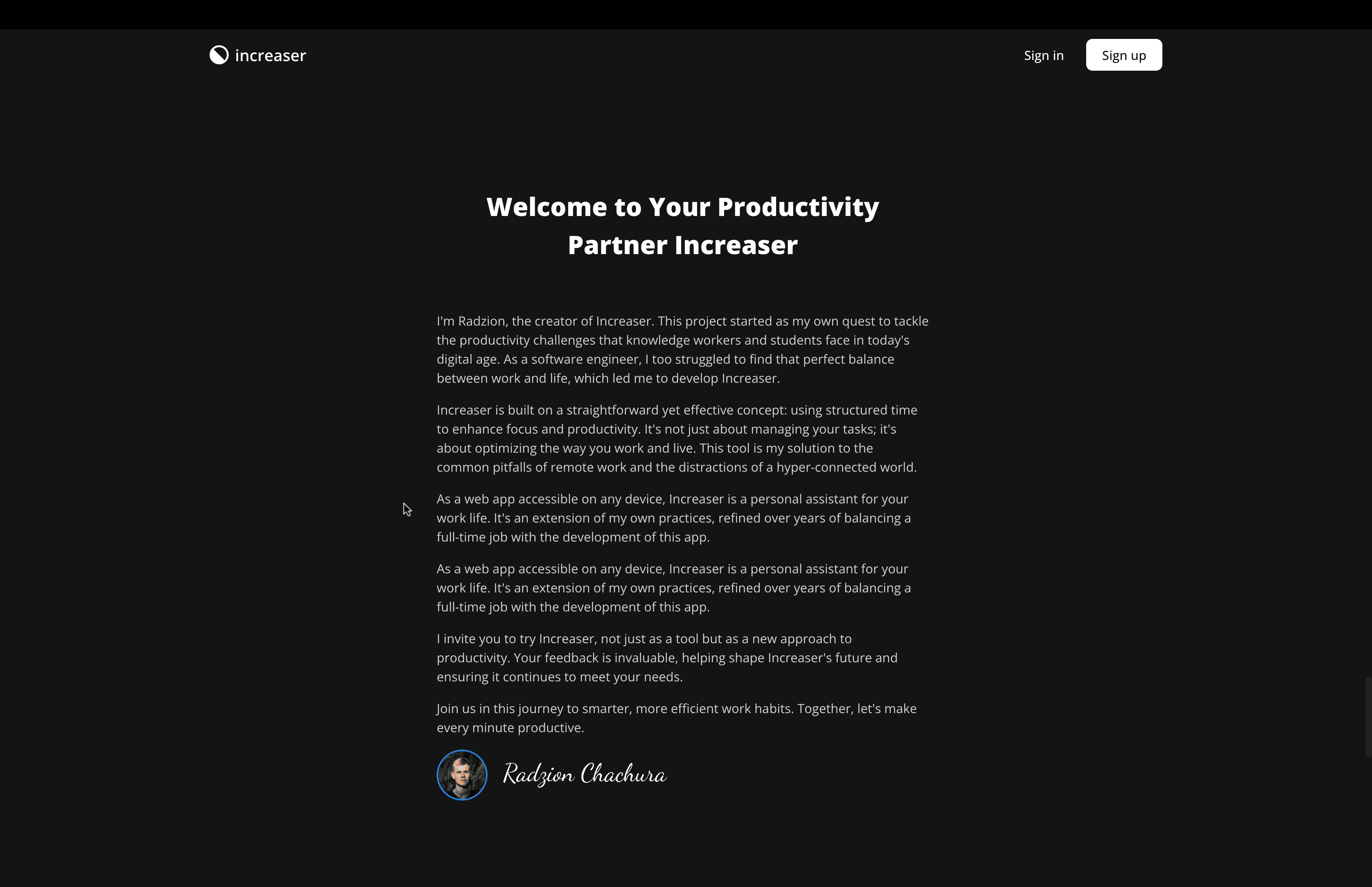
While not all landing pages include a "Founder's Note," I find it particularly beneficial in early versions of a website, where content or social proof may be limited. This section adds a personal touch and helps fill out an otherwise underdeveloped page. There are several ways to present the founder's note, ranging from text to videos. In this case, I've chosen a simple text format, enhanced with my photo and signature.
import { WebsiteSectionHeader } from "@lib/ui/website/WebsiteSectionHeader"
import { WebsiteSlice } from "@lib/ui/website/WebsiteSlice"
import { WebsiteSliceContent } from "@lib/ui/website/WebsiteSliceContent"
import { Text } from "@lib/ui/text"
import { FounderSignature } from "./FounderSignature"
import { FoundersNote } from "@lib/ui/website/FoundersNote"

export const FoundersNoteSlice = () => {
  return (
    <WebsiteSlice>
      <WebsiteSliceContent>
        <WebsiteSectionHeader title="Welcome to Your Productivity Partner Increaser" />
        <FoundersNote
          avatarUrl="/images/founder-avatar.webp"
          signature={<FounderSignature />}
        >
          <Text>
            I'm Radzion, the creator of Increaser. This project started as my
            own quest to tackle the productivity challenges that knowledge
            workers and students face in today's digital age. As a software
            engineer, I too struggled to find that perfect balance between work
            and life, which led me to develop Increaser.
          </Text>
          <Text>
            Increaser is built on a straightforward yet effective concept: using
            structured time to enhance focus and productivity. It's not just
            about managing your tasks; it's about optimizing the way you work
            and live. This tool is my solution to the common pitfalls of remote
            work and the distractions of a hyper-connected world.
          </Text>
          <Text>
            As a web app accessible on any device, Increaser is a personal
            assistant for your work life. It's an extension of my own practices,
            refined over years of balancing a full-time job with the development
            of this app.
          </Text>
          <Text>
            As a web app accessible on any device, Increaser is a personal
            assistant for your work life. It's an extension of my own practices,
            refined over years of balancing a full-time job with the development
            of this app.
          </Text>
          <Text>
            I invite you to try Increaser, not just as a tool but as a new
            approach to productivity. Your feedback is invaluable, helping shape
            Increaser's future and ensuring it continues to meet your needs.
          </Text>
          <Text>
            Join us in this journey to smarter, more efficient work habits.
            Together, let's make every minute productive.
          </Text>
        </FoundersNote>
      </WebsiteSliceContent>
    </WebsiteSlice>
  )
}
There's a dedicated component in RadzionKit for display the founder's note which receives children, avatar url, and signature. To make a signature I just opened up Figma, choose a nice handwritten font, put my name and surname and exported it as an SVG. Since the width and height of the signature SVG is in ems unit we can control it's size with the font-size attribute on its container. To display an image we use the same SafeImage component, and we use the similar pattern with media queries to reduce size of some elements on mobile screens to make it look better.
import { HStack, VStack } from "@lib/ui/layout/Stack"
import styled from "styled-components"
import { getColor } from "@lib/ui/theme/getters"
import { CoverImage } from "@lib/ui/images/CoverImage"
import { sameDimensions } from "@lib/ui/css/sameDimensions"
import { SafeImage } from "@lib/ui/images/SafeImage"
import { round } from "@lib/ui/css/round"
import { IconWrapper } from "@lib/ui/icons/IconWrapper"
import { ComponentWithChildrenProps } from "../props"
import { ReactNode } from "react"

const Container = styled(VStack)`
  gap: 16px;
  max-width: 620px;
  line-height: 1.5;
`

const Image = styled(CoverImage)`
  ${sameDimensions(64)}
  ${round};
  border: 2px solid ${getColor("primary")};
  @media (max-width: 600px) {
    ${sameDimensions(36)}
  }
`

const SignutureWrapper = styled(IconWrapper)`
  color: ${getColor("contrast")};
  font-size: 32px;
  @media (max-width: 600px) {
    font-size: 24px;
  }
`

type FoundersNoteProps = ComponentWithChildrenProps & {
  avatarUrl: string
  signature: ReactNode
}

export const FoundersNote = ({
  children,
  avatarUrl,
  signature,
}: FoundersNoteProps) => {
  return (
    <Container>
      {children}
      <HStack gap={20} alignItems="center">
        <SafeImage
          fallback={null}
          src={avatarUrl}
          render={(props) => <Image alt="Founder" {...props} />}
        />
        <SignutureWrapper>{signature}</SignutureWrapper>
      </HStack>
    </Container>
  )
}
Creating an Engaging FAQ Section with the FaqContainer and FaqItem Components
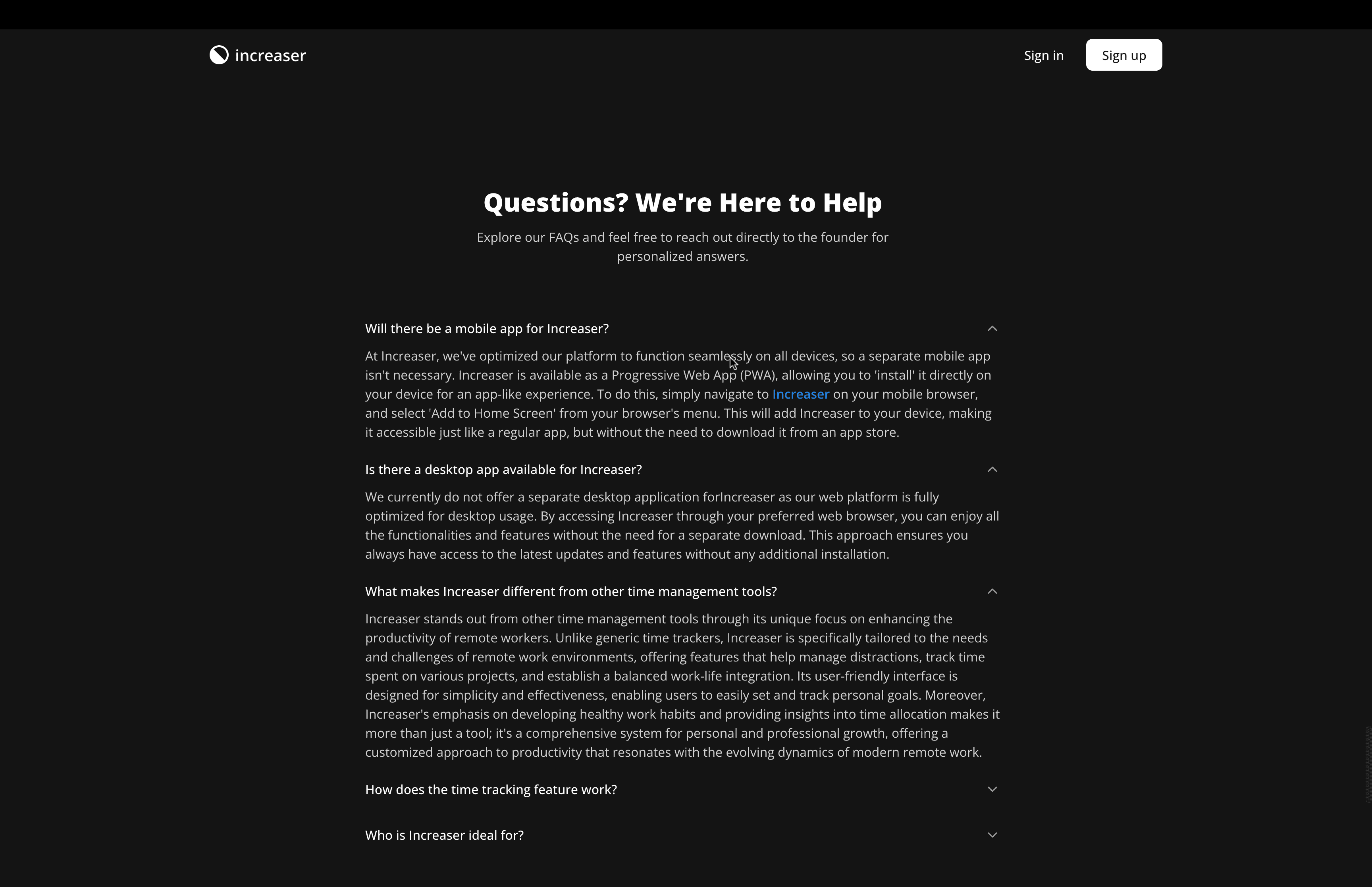
Following up, we delve into the "Find Answers to Your Questions" section, a common feature of every landing page. Initially, it might be challenging to populate this section, but over time, recurring questions become apparent, making it easier to enrich your FAQ. For this section, we also leverage reusables components from RadzionKit.
import { WebsiteSectionHeader } from "@lib/ui/website/WebsiteSectionHeader"
import { WebsiteSlice } from "@lib/ui/website/WebsiteSlice"
import { WebsiteSliceContent } from "@lib/ui/website/WebsiteSliceContent"
import { productName } from "@increaser/config"
import { TextButton } from "@lib/ui/buttons/TextButton"
import { FaqItem } from "@lib/ui/website/faq/FaqItem"
import { FaqContainer } from "@lib/ui/website/faq/FaqContainer"
import { AppLink } from "../navigation/AppLink"
import { AppPath } from "@increaser/ui/navigation/AppPath"

export const FaqSlice = () => {
  return (
    <WebsiteSlice>
      <WebsiteSliceContent>
        <WebsiteSectionHeader
          title="Questions? We're Here to Help"
          subtitle="Explore our FAQs and feel free to reach out directly to the founder for personalized answers."
        />
        <FaqContainer>
          <FaqItem title={`Will there be a mobile app for ${productName}?`}>
            At {productName}, we've optimized our platform to function
            seamlessly on all devices, so a separate mobile app isn't necessary.{" "}
            {productName} is available as a Progressive Web App (PWA), allowing
            you to 'install' it directly on your device for an app-like
            experience. To do this, simply navigate to{" "}
            <AppLink to={AppPath.Home}>
              <TextButton text={productName} />
            </AppLink>{" "}
            on your mobile browser, and select 'Add to Home Screen' from your
            browser's menu. This will add {productName} to your device, making
            it accessible just like a regular app, but without the need to
            download it from an app store.
          </FaqItem>
          <FaqItem
            title={`Is there a desktop app available for ${productName}?`}
          >
            We currently do not offer a separate desktop application for
            {productName} as our web platform is fully optimized for desktop usage.
            By accessing {productName} through your preferred web browser, you can
            enjoy all the functionalities and features without the need for a separate
            download. This approach ensures you always have access to the latest
            updates and features without any additional installation.
          </FaqItem>
          <FaqItem
            title={`What makes ${productName} different from other time management tools?`}
          >
            {productName} stands out from other time management tools through
            its unique focus on enhancing the productivity of remote workers.
            Unlike generic time trackers, {productName} is specifically tailored
            to the needs and challenges of remote work environments, offering
            features that help manage distractions, track time spent on various
            projects, and establish a balanced work-life integration. Its
            user-friendly interface is designed for simplicity and
            effectiveness, enabling users to easily set and track personal
            goals. Moreover, {productName}'s emphasis on developing healthy work
            habits and providing insights into time allocation makes it more
            than just a tool; it's a comprehensive system for personal and
            professional growth, offering a customized approach to productivity
            that resonates with the evolving dynamics of modern remote work.
          </FaqItem>
          <FaqItem title="How does the time tracking feature work?">
            {productName}'s time tracking feature is centered around 'focus
            sessions' where you start a timer and select a project, seamlessly
            recording your work in the system. This method not only tracks your
            time but aligns it with specific project objectives. For times when
            you might forget to start a timer, {productName} allows the addition
            of sessions manually, ensuring all your efforts are accounted for.
            To provide comprehensive insights into your productivity,{" "}
            {productName} offers detailed session reports for the last 30 days
            and project-based reports for previous weeks and months, allowing
            you to analyze and optimize your time management effectively.
          </FaqItem>
          <FaqItem title={`Who is ${productName} ideal for?`}>
            {productName} is designed to cater to a wide range of knowledge
            workers, particularly those who spend a significant portion of their
            workday on a computer. It's an especially valuable tool for remote
            workers, who often have more flexibility and control over their
            time, allowing them to optimize their schedules more effectively.
            However, Increaser is not just for remote professionals;
            office-based employees will also find it beneficial for managing
            their time and tasks efficiently. Additionally, Increaser is an
            excellent resource for students who are looking to improve their
            time organization and focus. Whether you're working from home, the
            office, or studying, Increaser provides the tools and insights
            needed to enhance productivity and focus across various work
            environments
          </FaqItem>
        </FaqContainer>
      </WebsiteSliceContent>
    </WebsiteSlice>
  )
}
The FaqContainer component in our design is configured to have a maximum width of 800px. This width is intentionally chosen to prevent the content from becoming overly stretched, ensuring it remains comfortable for reading.
import styled from "styled-components"
import { VStack } from "../../layout/Stack"

export const FaqContainer = styled(VStack)`
  gap: 16px;
  max-width: 800px;
  width: 100%;
`
The FaqItem component functions as a straightforward wrapper around the expandable section component provided by RadzionKit. Our primary customization involves setting the Text component within it to have a large height. This specific adjustment is made to enhance the readability of the content.
import { ExpandableSection } from "../../layout/ExpandableSection"
import { ComponentWithChildrenProps, TitledComponentProps } from "../../props"
import { Text } from "../../text"

type FaqItemProps = ComponentWithChildrenProps & TitledComponentProps

export const FaqItem = ({ children, title }: FaqItemProps) => (
  <ExpandableSection title={title}>
    <Text height="large">{children}</Text>
  </ExpandableSection>
)
To create a visually appealing animation for the expandable sections, it's crucial to know the actual height of the content inside. This is where the ElementSizeAware component from RadzionKit comes into play. It accurately captures the size of an element by tracking its ref using the setElement callback. Once the element is rendered, the size object gets populated with its width and height.
For a smooth content appearance using pure CSS animations, the content needs to remain in the DOM at all times. To make it invisible when the section is collapsed, we employ visibility: hidden. Opacity also facilitate a graceful transition between the closed and opened states of the section. Additionally, the collapse icon's animation is handled using the rotateZ transform property, adding a dynamic visual effect.
import { ComponentWithChildrenProps, TitledComponentProps } from "../props"
import { HStack, VStack } from "./Stack"
import styled, { css } from "styled-components"
import { interactive } from "../css/interactive"
import { getColor } from "../theme/getters"
import { useBoolean } from "../hooks/useBoolean"
import { transition } from "../css/transition"
import { ChevronDownIcon } from "../icons/ChevronDownIcon"
import { verticalPadding } from "../css/verticalPadding"
import { IconWrapper } from "../icons/IconWrapper"
import { Text } from "../text"
import { ElementSizeAware } from "../base/ElementSizeAware"

type ExpandableSectionProps = TitledComponentProps & ComponentWithChildrenProps

const Container = styled(VStack)`
  gap: 4px;
`

const Icon = styled(IconWrapper)<{ isOpen: boolean }>`
  font-size: 20px;
  ${transition};
  transform: rotateZ(${({ isOpen }) => (isOpen ? "-180deg" : "0deg")});
  color: ${getColor("textSupporting")};
`

const Header = styled(HStack)`
  gap: 20px;
  width: 100%;
  align-items: center;
  justify-content: space-between;
  ${verticalPadding(8)};
  ${interactive};
  font-weight: 500;
  &:hover ${Icon} {
    color: ${getColor("contrast")};
  }
`

const Content = styled.div<{ isOpen: boolean }>`
  ${transition};
  ${({ isOpen }) =>
    isOpen
      ? css`
          opacity: 1;
        `
      : css`
          opacity: 0;
          overflow: hidden;
          transform: translateY(-8px);
          visibility: hidden;
        `}
`

export const ExpandableSection = ({
  title,
  children,
}: ExpandableSectionProps) => {
  const [isExpanded, { toggle }] = useBoolean(false)
  return (
    <Container>
      <Header onClick={toggle}>
        <Text weight="semibold" color="contrast">
          {title}
        </Text>
        <Icon isOpen={isExpanded}>
          <ChevronDownIcon />
        </Icon>
      </Header>
      <ElementSizeAware
        render={({ setElement, size }) => {
          return (
            <Content
              style={{ height: isExpanded ? size?.height : 0 }}
              isOpen={isExpanded}
              aria-hidden={!isExpanded}
            >
              <div ref={setElement}>{children}</div>
            </Content>
          )
        }}
      />
    </Container>
  )
}
Crafting a Persuasive Closing Argument on Increaser's Landing Page
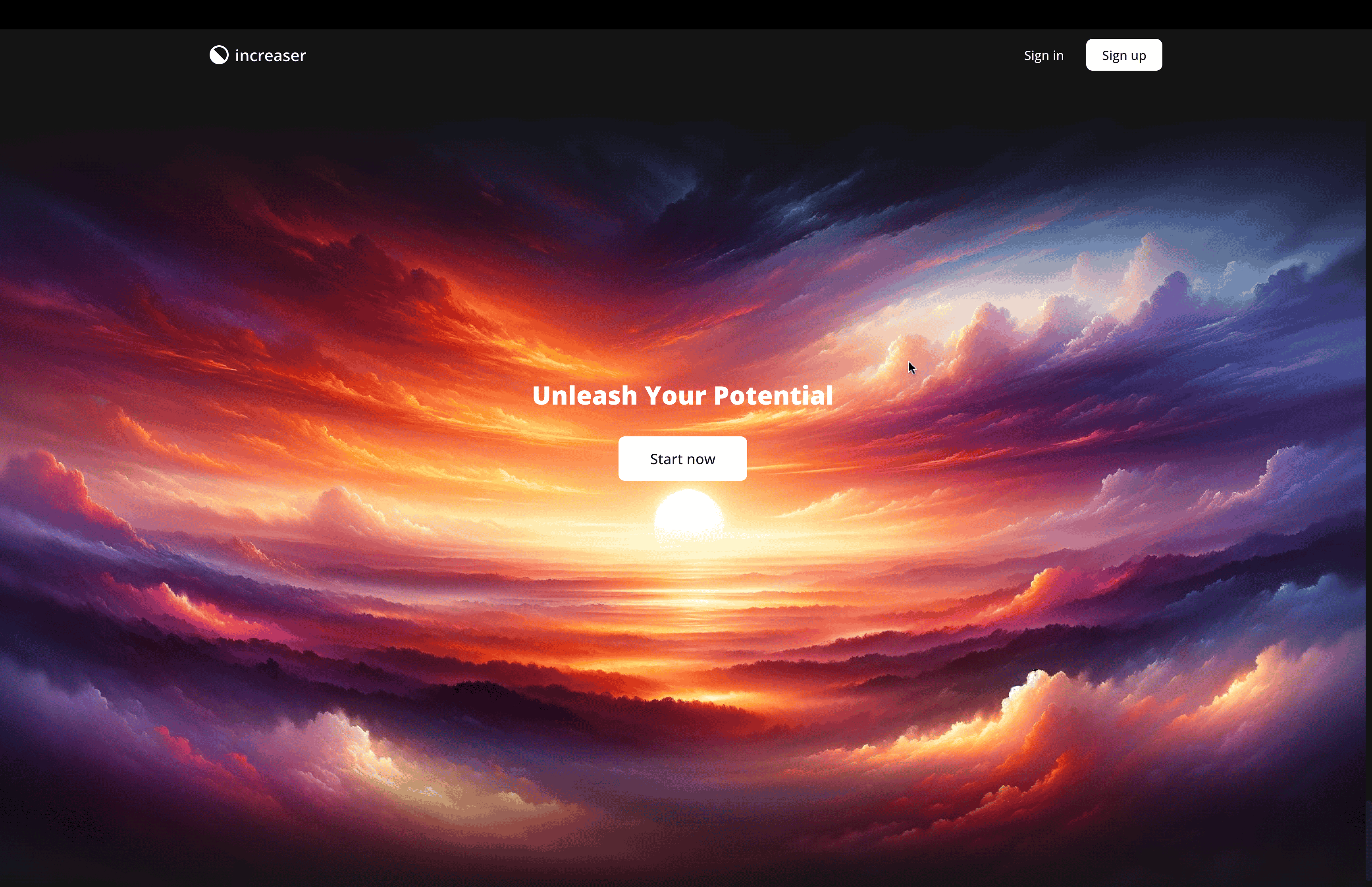
The final section of our landing page is what's commonly known as the "closing argument." This is a crucial element on many landing pages, where you present a compelling last persuasion for why users should choose your product, especially if they haven't clicked the call-to-action (CTA) button by the time they reach the end of the page.
import { darkTheme } from "@lib/ui/theme/darkTheme"
import { WebsiteSectionHeader } from "@lib/ui/website/WebsiteSectionHeader"
import { WebsiteSliceContent } from "@lib/ui/website/WebsiteSliceContent"
import { ThemeProvider } from "styled-components"
import { PrimaryCallToAction } from "./PrimaryCallToAction"
import { ClosingArgumentBackground } from "@lib/ui/website/ClosingArgumentBackground"

export const ClosingArgumentSlice = () => {
  return (
    <ThemeProvider theme={darkTheme}>
      <ClosingArgumentBackground imageUrl="images/closing-argument.webp">
        <WebsiteSliceContent style={{ gap: 28, paddingBottom: 200 }}>
          <WebsiteSectionHeader title="Unleash Your Potential" />
          <PrimaryCallToAction kind="reversed" />
        </WebsiteSliceContent>
      </ClosingArgumentBackground>
    </ThemeProvider>
  )
}
The closing section of our landing page is anchored by a clear and motivational message: "Unleash Your Potential." This is coupled with a prominent call-to-action (CTA) button, set against a peaceful sunrise background, generated using ChatGPT.
To effectively render this backdrop, we employ the ClosingArgumentBackground component. Its role is to precisely position and scale the background image to cover the entire container, ensuring it's centrally aligned and fully encompasses the space. Adding to the visual depth, we incorporate a pseudo-element adorned with a linear gradient background. This gradient, notable for its partial transparency, smoothly transitions into the surrounding background color.
import { centerContent } from "@lib/ui/css/centerContent"
import { toSizeUnit } from "@lib/ui/css/toSizeUnit"
import { websiteConfig } from "@lib/ui/website/config"
import styled from "styled-components"
import { getColor } from "@lib/ui/theme/getters"

export const ClosingArgumentBackground = styled.div<{ imageUrl: string }>`
  width: 100%;
  min-height: calc(100vh - ${toSizeUnit(websiteConfig.headerHeight)});
  ${centerContent}
  position: relative;
  overflow: hidden;
  background-image: url(${(props) => props.imageUrl});
  background-size: cover;
  background-position: center;

  &:before {
    content: "";
    position: absolute;
    top: 0;
    left: 0;
    right: 0;
    bottom: 0;
    background: linear-gradient(
      to bottom,
      ${getColor("background")} 0%,
      ${getColor("transparent")} 25%,
      ${getColor("transparent")} 80%,
      ${getColor("background")} 100%
    );
    pointer-events: none;
  }
`