How to Make Text Input Component with React and styled-components


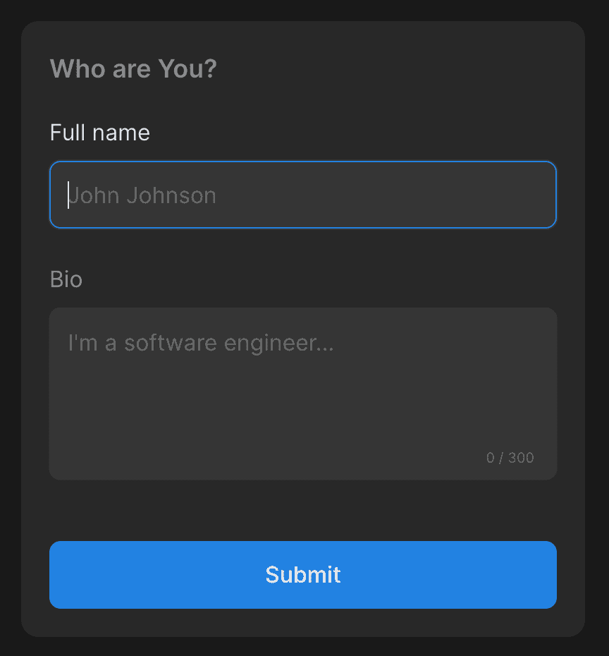
Here we have a form with a TextInput for a name and a text area for a bio. When we focus on the field, it changes styles, and when we try to submit an invalid form, the field becomes red and error messages appear below it.
Text input and text area have the same set of styles. First, we define the shape with height and border radius. Then we set up the background, padding, color, and transition. We don't want to bring much focus to the placeholder, so we set it to a supporting color. Based on the form state and focus status, we want a different border and outline colors.
import React from "react"
import { ChangeEvent, InputHTMLAttributes, Ref, forwardRef } from "react"
import styled, { css } from "styled-components"
import { defaultTransitionCSS } from "lib/ui/animations/transitions"
import { defaultInputShapeCSS } from "./config"

import {
  Props as InputWrapperProps,
  InputWrapperWithErrorMessage,
} from "./InputWrapper"

export type SharedTextInputProps = Pick<
  InputWrapperProps,
  "label" | "error"
> & {
  onValueChange?: (value: string) => void
}

type TextInputProps = InputHTMLAttributes<HTMLInputElement> &
  SharedTextInputProps

export const TextInput = forwardRef(function TextInputInner(
  { onValueChange, label, error, height, ...props }: TextInputProps,
  ref: Ref<HTMLInputElement> | null
) {
  return (
    <InputWrapperWithErrorMessage error={error} label={label}>
      <TextInputContainer
        {...props}
        isValid={!error}
        ref={ref}
        onChange={(event: ChangeEvent<HTMLInputElement>) => {
          props.onChange?.(event)
          onValueChange?.(event.currentTarget.value)
        }}
      />
    </InputWrapperWithErrorMessage>
  )
})

export const commonInputCSS = css<{
  isValid: boolean
}>`
  ${defaultInputShapeCSS};
  max-width: 100%;

  background: ${({ theme }) => theme.colors.backgroundGlass.toCssValue()};
  padding: 12px;
  color: ${({ theme }) => theme.colors.text.toCssValue()};

  ${defaultTransitionCSS};

  &::placeholder {
    color: ${({ theme }) => theme.colors.textSupporting3.toCssValue()};
  }

  outline: 1px solid transparent;
  ${({ isValid, theme }) => {
    const errorColor = theme.colors.alert.toCssValue()
    const regularColor = isValid
      ? theme.colors.backgroundGlass.toCssValue()
      : errorColor
    const activeColor = isValid ? theme.colors.primary.toCssValue() : errorColor

    return css`
      border: 1px solid ${regularColor};

      &:hover {
        outline-color: ${regularColor};
      }

      :focus,
      :active {
        border-color: ${activeColor};
      }
    `
  }}
`

export const TextInputContainer = styled.input`
  ${commonInputCSS};
`
For the TextInput container, we don't change anything and leveraging commonInputCSS. For the text area, we disable resize and reset the height because usually, we will use the rows property instead of the height CSS attribute.
To allow passing ref to the input, we wrap it with forwardRef to make it possible to build components on top of this one. We'll look more into it in the upcoming video about Combobox.
In props, we have everything that comes with input plus text for label, error message, and onValueChange callback.
To show the label and error message, we use InputWrapper. Its container sets color based on the isValid prop, and when the input is in focus, we change the color of the label. To not make the form jump, we make the error message have a minimum height, font size, and line height to the same value.
For the text area, we are leveraging an existing setup from the text input, but with an addition of a character counter that is an absolutely positioned element at the bottom right corner.
import React from "react"
import {
  ChangeEvent,
  Ref,
  TextareaHTMLAttributes,
  forwardRef,
  useState,
} from "react"
import styled from "styled-components"
import { getCSSUnit } from "lib/ui/utils/getCSSUnit"
import { Text } from "lib/ui/Text"

import { InputWrapperWithErrorMessage } from "./InputWrapper"
import { SharedTextInputProps, commonInputCSS } from "./TextInput"

const TextareaContainer = styled.textarea`
  ${commonInputCSS};
  resize: none;
  height: initial;
`

const characterCounterHeight = 10
const characterCounterMargin = 16

const CharacterCounterWrapper = styled.div`
  position: absolute;
  bottom: ${getCSSUnit(characterCounterMargin + characterCounterHeight)};
  right: ${getCSSUnit(characterCounterMargin)};
  user-select: none;
`

type Props = TextareaHTMLAttributes<HTMLTextAreaElement> &
  SharedTextInputProps & {
    value?: string
  }

export const TextArea = forwardRef(function TextAreaInner(
  { onValueChange, label, error, ...props }: Props,
  ref: Ref<HTMLTextAreaElement> | null
) {
  const [charactersCount, setCharactersCount] = useState(0)

  return (
    <InputWrapperWithErrorMessage error={error} label={label}>
      <TextareaContainer
        {...props}
        isValid={!error}
        ref={ref}
        onChange={(event: ChangeEvent<HTMLTextAreaElement>) => {
          setCharactersCount(event.currentTarget.value.length)
          props.onChange?.(event)
          onValueChange?.(event.currentTarget.value)
        }}
      />
      {props.maxLength && (
        <CharacterCounterWrapper>
          <Text color="supporting3" height="small" size={10}>
            {charactersCount} / {props.maxLength}
          </Text>
        </CharacterCounterWrapper>
      )}
    </InputWrapperWithErrorMessage>
  )
})