How To Make Distribution Bar Component with React (Pie Chart Replacement)
Let's make a distribution bar component that could replace the pie chart when we want to save place in our layout.
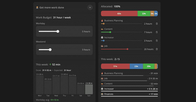
Here's an example from increaser.org, where we don't have enough space for a pie chart, and we are using DistributionBar to show how much time you spend on different projects.
import { sum } from "lib/shared/utils/sum"
import { toPercents } from "lib/shared/utils/toPercents"
import { useMemo } from "react"
import styled from "styled-components"

import { defaultTransitionCSS } from "./animations/transitions"
import { HSLA } from "./colors/HSLA"
import { ElementSizeAware } from "./ElementSizeAware"
import { Panel } from "./Panel/Panel"
import { VStack } from "./Stack"
import { Text } from "./Text"

export interface DistributionBarItem {
  value: number
  color: HSLA
}

interface DistributionBarProps {
  items: DistributionBarItem[]
  height?: React.CSSProperties["height"]
}

const Container = styled(Panel)`
  padding: 0;
  width: 100%;

  display: flex;
  gap: 1px;
`

const Segment = styled.div`
  height: 100%;
  ${defaultTransitionCSS};
`

export const DistributionBar = ({
  items,
  height = 40,
}: DistributionBarProps) => {
  const total = useMemo(() => sum(items.map((item) => item.value)), [items])

  return (
    <Container style={{ height }}>
      {items.map(({ value, color }, index) => (
        <ElementSizeAware
          key={index}
          render={({ size, setElement }) => {
            const background = color
              .getVariant({ l: () => 48, s: () => 42 })
              .toCssValue()

            return (
              <Segment
                style={{
                  width: toPercents(value / total),
                  background,
                }}
              >
                <VStack
                  fullHeight
                  fullWidth
                  alignItems="center"
                  justifyContent="center"
                  ref={setElement}
                >
                  {!size ||
                    (size.width > 20 && (
                      <Text color="white" weight="bold" size={14}>
                        {Math.round((value / total) * 100)}
                        <Text as="span" size={12}>
                          %
                        </Text>
                      </Text>
                    ))}
                </VStack>
              </Segment>
            )
          }}
        />
      ))}
    </Container>
  )
}
The component receives a list of items. The item has a numeric value and HSLA color. If you are curious, there is a video about the format. To have better contrast with percentage text, we set the same lightness and saturation for every segment background.
We go over every item and render segment components inside a flexbox container. We set the width to the item's value divided by the total, a sum of every item's value. The label with percentage takes up space, and it might not be enough area for a small segment's label. Therefore we wrap it with the ElementSizeAware component and hide the label when the container is less than 20 pixels.

