Top CSS Utils for React Projects: Practical Styling Snippets


In this post, I want to share with you some of the most useful CSS utils I use in my React projects. I believe you will find a good number of them not only time-saving but also useful for your projects. You can find all these functions and snippets in the css folder under the ui package in the RadzionKit repository.
centerContent - Centering Content Inside
One of the most practical snippets is centerContent. It makes the parent a flexbox element and centers the children inside it.
import { css } from "styled-components"

export const centerContent = css`
  display: flex;
  align-items: center;
  justify-content: center;
`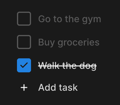
For instance, this checkbox has a defined width and height and positions the check icon inside using centerContent:
const Box = styled.div<{ isChecked: boolean }>`
  ${sameDimensions(28)}
  ${centerContent};
sameDimensions - Width and Height Set to the Same Value
We used the sameDimensions function to give the box the same width and height:
import { css } from "styled-components"
import { toSizeUnit } from "./toSizeUnit"

export const sameDimensions = (size: string | number) => {
  const value = toSizeUnit(size)

  return css`
    width: ${value};
    height: ${value};
    min-width: ${value};
    min-height: ${value};
  `
}
Both width and height, as well as min-width and min-height, are set to the same value by this function. We can pass a string or a number to this function. If we pass a number, it will be converted to pixels using the toSizeUnit function:
export const toSizeUnit = (value: number | string) =>
  typeof value === "number" ? `${value}px` : value
verticalPadding, horizontalPadding, verticalMargin, horizontalMargin - Padding and Margin Set to the Same Value
The verticalPadding, horizontalPadding, verticalMargin, and horizontalMargin functions are also quite handy. Often, we need to set padding or margin to the same value for top and bottom or left and right. To avoid repeating code, we can use these functions:
import { css } from "styled-components"

import { toSizeUnit } from "./toSizeUnit"

export const verticalPadding = (value: string | number) => css`
  padding-top: ${toSizeUnit(value)};
  padding-bottom: ${toSizeUnit(value)};
`

export const horizontalPadding = (value: string | number) => css`
  padding-left: ${toSizeUnit(value)};
  padding-right: ${toSizeUnit(value)};
`

export const verticalMargin = (value: string | number) => css`
  margin-top: ${toSizeUnit(value)};
  margin-bottom: ${toSizeUnit(value)};
`

export const horizontalMargin = (value: string | number) => css`
  margin-left: ${toSizeUnit(value)};
  margin-right: ${toSizeUnit(value)};
`
We don't have to look far for an example. Here we use them to define horizontal padding for a button. It saves us from redundancy when defining different padding for different size variants:
  ${({ size }) =>
    match(size, {
      xs: () => css`
        ${horizontalPadding(8)}
        height: 28px;
        font-size: 14px;
      `,
      s: () => css`
        ${horizontalPadding(16)}
        height: 36px;
        font-size: 14px;
      `,
      m: () => css`
        ${horizontalPadding(20)}
        height: 40px;
        font-size: 16px;
      `,
      l: () => css`
        ${horizontalPadding(20)}
        height: 48px;
        font-size: 16px;
      `,
      xl: () => css`
        ${horizontalPadding(40)}
        height: 56px;
        font-size: 18px;
      `,
    })}
cropText - Crop Text with Ellipsis
We don't want text to exceed its container boundaries. To prevent this, we can use the cropText function, which will add an ellipsis at the end of the text if it doesn't fit.
import { css } from "styled-components"

export const cropText = css`
  white-space: nowrap;
  overflow: hidden;
  text-overflow: ellipsis;
`
Here's an example where one of the options has a long name and is cropped with an ellipsis:
maxTextLines - Crop Text with Ellipsis After a Specified Number of Lines
The maxTextLines function solves a similar problem. We can pass 3 to the maxTextLines function, and it will ensure that the text is cropped with an ellipsis after 3 lines.
import { css } from "styled-components"

export const maxTextLines = (number: number) => css`
  display: -webkit-box;
  -webkit-line-clamp: ${number};
  -webkit-box-orient: vertical;
  overflow: hidden;
`
absoluteOutline - Outline Element with Absolute Position
The next function is one designed for more advanced use.
import { css } from "styled-components"
import { toSizeUnit } from "./toSizeUnit"
export const absoluteOutline = (
horizontalOffset: number | string,
verticalOffset: number | string,
) => {
return css`
pointer-events: none;
position: absolute;
left: -${toSizeUnit(horizontalOffset)};
top: -${toSizeUnit(verticalOffset)};
width: calc(100% + ${toSizeUnit(horizontalOffset)} * 2);
height: calc(100% + ${toSizeUnit(verticalOffset)} * 2);
`
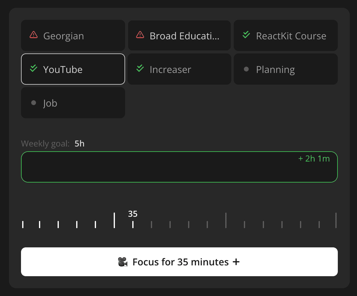
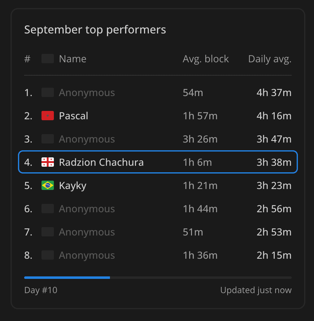
}I use it at Increaser in the scoreboard to outline the current user:
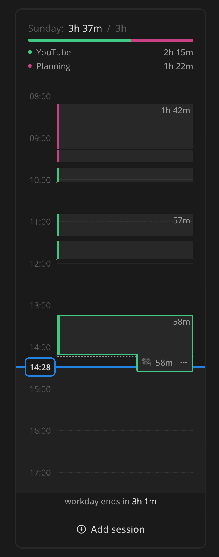
And on today's timeline to highlight the current time:
At RadzionKit, it is used for a reusable Hoverable component, creating a highlight effect on hover.
takeWholeSpace and takeWholeSpaceAbsolutely - Fill Entire Space of the Parent
The takeWholeSpace is a small helper function that sets the element to take up 100% of the parent's width and height.
import { css } from "styled-components"

export const takeWholeSpace = css`
  width: 100%;
  height: 100%;
`
The takeWholeSpaceAbsolutely performs the same task, but with absolute position.
import { css } from "styled-components"
import { takeWholeSpace } from "./takeWholeSpace"
export const takeWholeSpaceAbsolutely = css`
position: absolute;
left: 0;
top: 0;
${takeWholeSpace};
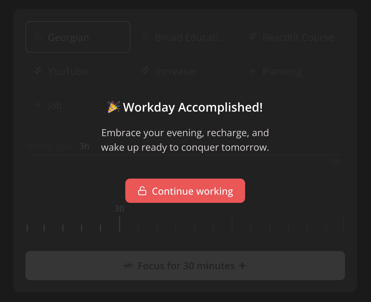
`A practical application of this from Increaser is to display an overlay over a focus session launcher when the workday is over.
hideScrollbars and themedScrollbars - Hide Scrollbars and Style Them
In situations like this horizontal navigation, we sometimes need to hide scrollbars, a task made easy with hideScrollbars:
import { css } from "styled-components"

export const hideScrollbars = css`
  &::-webkit-scrollbar {
    display: none;
  }

  -ms-overflow-style: none;
  scrollbar-width: none;
`
To customize the appearance of scrollbars to fit the theme of our app, we can use the themedScrollbars. They can be placed once in global styles.
import { css } from "styled-components"
import { round } from "./round"
import { getColor } from "../ui/theme/getters"

export const themedScrollbars = css`
  &::-webkit-scrollbar {
    width: 8px;
  }
  &::-webkit-scrollbar-track {
    background-color: transparent;
  }

  &::-webkit-scrollbar-thumb {
    ${round}
    cursor: pointer;
    background-color: ${getColor("mist")};
    &:hover {
      background-color: ${getColor("mistExtra")};
    }
  }
`
interactive, round - Make the Element Interactive and Rounded
The final two snippets I want to share are interactive, which adds a cursor pointer and removes user select so that users don't accidentally select part of a button's text:
import { css } from "styled-components"

export const interactive = css`
  cursor: pointer;
  user-select: none;
`
The round snippet rounds the element by setting the border-radius to an arbitrarily large number:
import { css } from "styled-components"

export const round = css`
  border-radius: 1000px;
`
That’s all for now! In upcoming posts, we will delve into useful abstract React components.