Building a Refined Combobox Component with React & TypeScript


Building a Custom Combobox in React and TypeScript: A Step-by-Step Guide
In this article, we will create a fully functional and visually appealing combobox component using React and TypeScript, without relying on external component libraries. Our goal is to make it flexible and reusable. To demonstrate its versatility, we'll construct two applications: a country selector and a cryptocurrency input. By the end of this article, you'll have the knowledge to implement your own input with a dropdown list tailored to your project's requirements. You can view a demo on this page, and the complete source code is accessible in the RadzionKit repository.
Implementing a Country Selector: Enhancing User Experience with Dynamic Search and Navigation
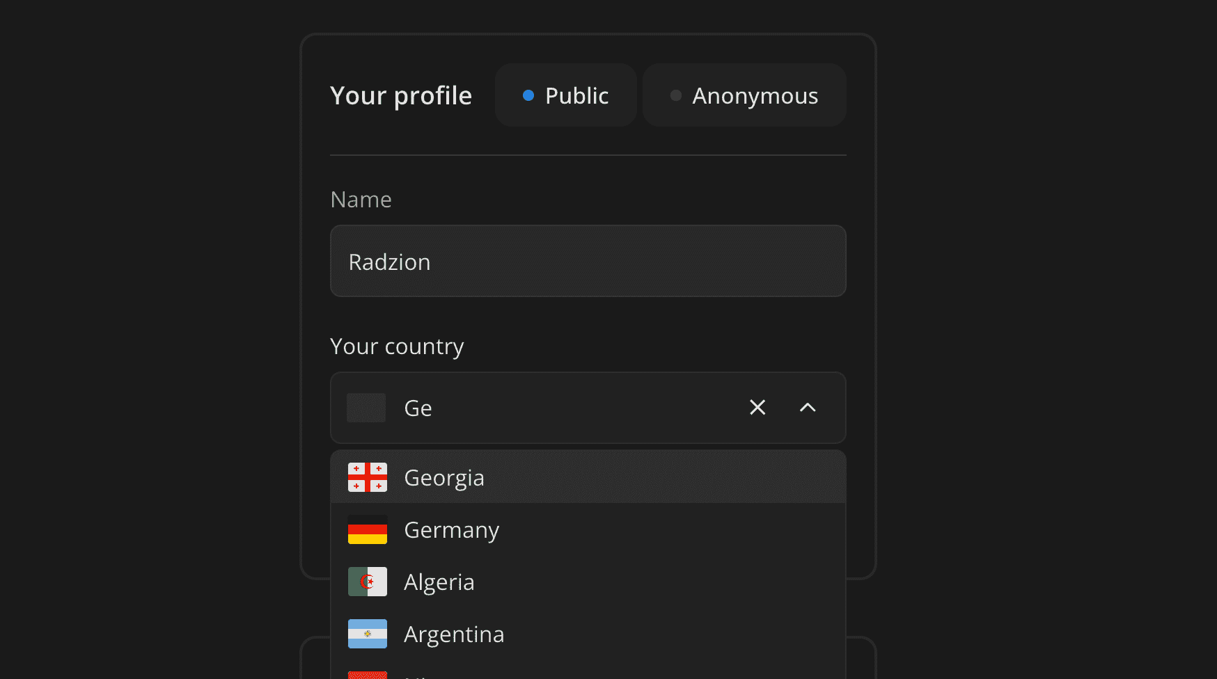
Instead of creating a generic reusable component right away, let's focus on a specific use case first. In my productivity app, Increaser, I needed to incorporate an input for users to select a country for their public profile. To simplify the search process, we will integrate a dropdown list with a search feature. Users can type their country's name, and the list will dynamically filter to match the input. Additionally, users can navigate through the list using arrow keys and select a country with the Enter key. We also plan to display each country's flag in the list and show the selected country's flag in the input field. Moreover, including a clear button to reset the input would enhance usability.
Defining Properties for the Country Input Component in React
Now, let's determine the properties that our country input component should accept. The value prop will represent the selected country and can be either a two-letter country code string or null if no country is selected. Additionally, an onChange callback is essential to update this value. We should also consider an optional label prop, which will be displayed above the input field.
export interface InputProps<T> {
  value: T
  onChange: (value: T) => void
}

interface CountryInputProps extends InputProps<CountryCode | null> {
  label?: React.ReactNode
}
Designing the Cryptocurrency Input: UI and Property Specifications
The user interface for the cryptocurrency input will closely resemble that of the country input, with a few key differences. Instead of displaying a country flag, we will showcase the logo of the cryptocurrency. Additionally, in the dropdown options, we will present both the cryptocurrency symbol and its name, providing a comprehensive and user-friendly selection experience.
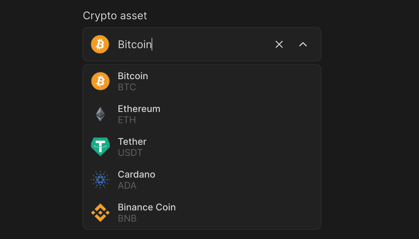
The properties for the cryptocurrency input mirror those of the country input in many ways. The value prop will indicate the chosen cryptocurrency, which can either be an Asset object or null. An Asset here is defined as an object with fields such as id, name, and icon. Unlike the country input, which inherently knows all available countries, the cryptocurrency input will require a list of assets, provided via the options prop. Similar to the previous component, the label prop remains optional.
export interface Asset {
  id: string
  name: string
  icon?: string
}

interface AssetInputProps extends InputProps<Asset | null> {
  label?: React.ReactNode
  options: Asset[]
}
Creating FixedOptionsInput: A Reusable Component for Selecting From Fixed Options
These components share several similarities, allowing us to abstract the common logic into a reusable component named FixedOptionsInput. This component will cater to selections from a predetermined set of options and will accommodate the following properties:
valueandonChange: These represent the selected option. We will use a generic typeT, making it adaptable to different data types – a string for the country input and anAssetobject for the cryptocurrency input.placeholderandlabel: Essential attributes for any text input.options: This prop supplies the list of selectable options.getOptionKey: A function to derive a unique key from each option, to be used in the Reactkeyattribute.renderOption: This allows for custom rendering of each option in the list.getOptionSearchStrings: A function to extract an array of strings from each option, enhancing the search functionality.getOptionName: This retrieves the name of the selected option for display in the input field.renderOptionIdentifier: A method for rendering an identifier for the selected option, such as a country flag for country input or a cryptocurrency icon for cryptocurrency input.optionIdentifierPlaceholder: A placeholder for the identifier when no option is selected. For instance, a gray rectangle for the country input and a gray circle for the cryptocurrency input.
interface FixedOptionsInputProps<T> extends InputProps<T | null> {
  placeholder?: string
  label?: ReactNode

  options: T[]
  getOptionKey: (option: T) => string
  renderOption: (option: T) => ReactNode
  getOptionSearchStrings: (option: T) => string[]
  getOptionName: (option: T) => string
  renderOptionIdentifier: (option: T) => ReactNode
  optionIdentifierPlaceholder: ReactNode
}
Implementing CountryInput and AssetInput Using FixedOptionsInput
Here is the implementation of the CountryInput component, which utilizes the FixedOptionsInput component. We forward the value, onChange, and label directly to FixedOptionsInput. The options are set to the list of countryCodes. For search functionality, we include only the country name as search strings, as users are more likely to search by name rather than code. To obtain the country names, we use a predefined record. The flag is used as a visual identifier for each country. If you're interested in how I generated all the SVG icons for the flags, you can find details in my previous article about TypeScript code generation. For rendering the options in the dropdown, we employ a helper component named OptionContent, which provides a visually appealing layout with the icon on the left and the name on the right.
import {
  CountryCode,
  countryCodes,
  countryNameRecord,
} from "@radzionkit/utils/countries"
import { InputProps } from "../props"
import { FixedOptionsInput } from "./FixedOptionsInput"
import CountryFlag from "../countries/flags/CountryFlag"
import { IconWrapper } from "../icons/IconWrapper"
import styled from "styled-components"
import { CountryFlagFrame } from "../countries/CountryFlagFrame"
import { OptionContent } from "./FixedOptionsInput/OptionContent"

interface CountryInputProps extends InputProps<CountryCode | null> {
  label?: React.ReactNode
}

const FlagWrapper = styled(IconWrapper)`
  border-radius: 2px;
`

export const CountryInput = ({ value, onChange, label }: CountryInputProps) => {
  return (
    <FixedOptionsInput
      value={value}
      label={label}
      onChange={onChange}
      placeholder="Search for a country"
      options={countryCodes}
      getOptionSearchStrings={(code) => [countryNameRecord[code]]}
      getOptionName={(code) => countryNameRecord[code]}
      getOptionKey={(code) => code}
      renderOptionIdentifier={(code) => (
        <FlagWrapper>
          <CountryFlag code={code} />
        </FlagWrapper>
      )}
      optionIdentifierPlaceholder={
        <FlagWrapper>
          <CountryFlagFrame />
        </FlagWrapper>
      }
      renderOption={(code) => (
        <OptionContent
          identifier={
            <FlagWrapper>
              <CountryFlag code={code} />
            </FlagWrapper>
          }
          name={countryNameRecord[code]}
        />
      )}
    />
  )
}
The implementation of the AssetInput closely mirrors that of the CountryInput, with a few distinctions. For displaying the identifier, we use the AssetIcon component. The search strings include both the name and id of the asset. Additionally, the renderOption function is slightly modified to display both the name and id in the dropdown list.
import { InputProps } from "../props"
import { FixedOptionsInput } from "../inputs/FixedOptionsInput"
import styled from "styled-components"
import { OptionContent } from "../inputs/FixedOptionsInput/OptionContent"
import { Asset } from "@radzionkit/entities/Asset"
import { round } from "../css/round"
import { sameDimensions } from "../css/sameDimensions"
import { getColor } from "../theme/getters"
import { VStack } from "../layout/Stack"
import { Text } from "../text"
import { AssetIcon } from "./AssetIcon"

interface AssetInputProps extends InputProps<Asset | null> {
  label?: React.ReactNode
  options: Asset[]
}

const IdentifierPlaceholder = styled.div`
  ${round};
  ${sameDimensions("1em")};
  background: ${getColor("mist")};
`

export const AssetInput = ({
  value,
  onChange,
  label,
  options,
}: AssetInputProps) => {
  return (
    <FixedOptionsInput
      value={value}
      label={label}
      onChange={onChange}
      placeholder="Search for an asset"
      options={options}
      getOptionSearchStrings={(option) => [option.name, option.id]}
      getOptionName={(option) => option.name}
      getOptionKey={(option) => option.id}
      renderOptionIdentifier={({ name, icon }) => (
        <AssetIcon name={name} src={icon} />
      )}
      optionIdentifierPlaceholder={<IdentifierPlaceholder />}
      renderOption={({ name, id, icon }) => (
        <OptionContent
          identifier={<AssetIcon name={name} src={icon} />}
          name={
            <VStack>
              <Text size={14} weight="semibold">
                {name}
              </Text>
              <Text size={14} color="shy">
                {id}
              </Text>
            </VStack>
          }
        />
      )}
    />
  )
}
Deep Dive into the Combobox Component Implementation
Having outlined all the requirements for our combobox, let's dive into the implementation. Despite the efforts to modularize the code by splitting it into different files, this remains one of those rare components that spans about 200 lines.
import { ReactNode, useCallback, useMemo, useRef, useState } from "react"
import { InputProps } from "../../props"
import { useEffectOnDependencyChange } from "../../hooks/useEffectOnDependencyChange"
import { getSuggestions } from "./getSuggestions"
import { NoMatchesMessage } from "./NoMatchesMessage"
import { FixedOptionsInputItem } from "./OptionItem"
import { FixedOptionsInputOptionsContainer } from "./OptionsContainer"
import { FixedOptionsInputIdentifierWrapper } from "./IdentifierWrapper"
import { Text } from "../../text"
import { RelativeRow } from "../../layout/RelativeRow"
import { InputContainer } from "../InputContainer"
import { FixedOptionsInputTextInput } from "./TextInput"
import { useFloatingOptions } from "./useFloatingOptions"
import { FixedOptionsInputButtons } from "./Buttons"

interface FixedOptionsInputProps<T> extends InputProps<T | null> {
  placeholder?: string
  label?: ReactNode

  options: T[]
  getOptionKey: (option: T) => string
  renderOption: (option: T) => ReactNode
  getOptionSearchStrings: (option: T) => string[]
  getOptionName: (option: T) => string
  renderOptionIdentifier: (option: T) => ReactNode
  optionIdentifierPlaceholder: ReactNode
}

export function FixedOptionsInput<T>({
  value,
  label,
  onChange,
  placeholder,
  options,
  renderOption,
  getOptionSearchStrings,
  getOptionName,
  renderOptionIdentifier,
  optionIdentifierPlaceholder,
  getOptionKey,
}: FixedOptionsInputProps<T>) {
  const inputElement = useRef<HTMLInputElement>(null)

  const [textInputValue, setTextInputValue] = useState(() =>
    value ? getOptionName(value) : ""
  )

  const optionsToDisplay = useMemo(() => {
    if (value) {
      return options
    }

    return getSuggestions({
      inputValue: textInputValue,
      options,
      getOptionSearchStrings,
    })
  }, [getOptionSearchStrings, options, textInputValue, value])

  const {
    activeIndex,
    setActiveIndex,
    getReferenceProps,
    setReferenceRef,
    getFloatingProps,
    setFloatingRef,
    floatingStyles,
    getItemProps,
    optionsRef,
    areOptionsVisible,
    showOptions,
    hideOptions,
    toggleOptionsVisibility,
  } = useFloatingOptions()

  useEffectOnDependencyChange(() => {
    if (!value) return

    const valueName = getOptionName(value)
    if (textInputValue === valueName) return

    setTextInputValue(valueName)
  }, [value])

  const onTextInputChange = useCallback(
    (newValue: string) => {
      showOptions()

      if (value && newValue !== getOptionName(value)) {
        onChange(null)
      }

      setTextInputValue(newValue)
    },
    [getOptionName, onChange, showOptions, value]
  )

  useEffectOnDependencyChange(() => {
    if (!areOptionsVisible || optionsToDisplay.length === 0) return

    setActiveIndex(0)
  }, [textInputValue])

  return (
    <InputContainer
      onClick={() => {
        inputElement.current?.focus()
      }}
      onKeyDown={(event) => {
        if (event.key === "Enter" && activeIndex != null) {
          event.preventDefault()
          onChange(optionsToDisplay[activeIndex])
          setActiveIndex(null)
          hideOptions()
        }
      }}
    >
      {label && <Text as="div">{label}</Text>}
      <RelativeRow
        {...getReferenceProps({
          ref: setReferenceRef,
        })}
      >
        <FixedOptionsInputIdentifierWrapper>
          {value ? renderOptionIdentifier(value) : optionIdentifierPlaceholder}
        </FixedOptionsInputIdentifierWrapper>
        <FixedOptionsInputTextInput
          ref={inputElement}
          value={textInputValue}
          onChange={(event) => onTextInputChange(event.currentTarget.value)}
          placeholder={placeholder}
          aria-autocomplete="list"
        />
        {areOptionsVisible && (
          <FixedOptionsInputOptionsContainer
            {...getFloatingProps({
              ref: setFloatingRef,
              style: floatingStyles,
            })}
          >
            {optionsToDisplay.length > 0 ? (
              optionsToDisplay.map((option, index) => (
                <FixedOptionsInputItem
                  {...getItemProps({
                    ref: (element) => {
                      optionsRef.current[index] = element
                    },
                    key: getOptionKey(option),
                    onClick: () => {
                      onChange(option)
                      inputElement.current?.focus()
                      hideOptions()
                    },
                  })}
                  active={index === activeIndex}
                >
                  {renderOption(option)}
                </FixedOptionsInputItem>
              ))
            ) : (
              <NoMatchesMessage />
            )}
          </FixedOptionsInputOptionsContainer>
        )}
        <FixedOptionsInputButtons
          onClear={
            textInputValue
              ? () => {
                  onTextInputChange("")
                  inputElement.current?.focus()
                }
              : undefined
          }
          areOptionsVisible={areOptionsVisible}
          toggleOptionsVisibility={() => {
            toggleOptionsVisibility()
            inputElement.current?.focus()
          }}
        />
      </RelativeRow>
    </InputContainer>
  )
}
Let's delve into the structure of our component. We start by enclosing all elements within an InputContainer component. This component acts as a label element, thereby enhancing accessibility. We've crafted it using flexbox to ensure a neat gap between the label text and the input field. Moreover, we've added a transition effect on the color property, employed to change the text color when the input is focused.
import { css } from "styled-components"
import { transition } from "./transition"
import { getColor } from "../theme/getters"

export const inputContainer = css`
  display: flex;
  flex-direction: column;
  width: 100%;
  gap: 8px;

  ${transition};
  color: ${getColor("textSupporting")};

  :focus-within {
    color: ${getColor("text")};
  }
`

export const InputContainer = styled.label`
  ${inputContainer};
`
Inside the InputContainer, we begin with a label, if provided. Next, we utilize the RelativeRow component. Designed as a flexbox element with a relative position, its align-items property is set to center. This setup guarantees that any absolutely positioned children are horizontally aligned within it.
import styled from "styled-components"

export const RelativeRow = styled.div`
  width: 100%;
  position: relative;
  display: flex;
  align-items: center;
`
Within the RelativeRow, there are four elements. The first one is the FixedOptionsInputIdentifierWrapper. This wrapper is carefully designed to align the icon perfectly with the input field. We achieve this alignment by setting the wrapper's left property to match the input's padding. The font size inside this wrapper is consistently defined in the config.ts file located in the FixedOptionsInput folder. This arrangement ensures that when adding an identifier, there's no need for manual size adjustments; instead, we use 1em for both width and height. For country flags, which are rectangular, we set their largest dimension to 1em.
import styled from "styled-components"
import { toSizeUnit } from "../../css/toSizeUnit"
import { textInputPadding } from "../../css/textInput"
import { fixedOptionsInputConfig } from "./config"

export const FixedOptionsInputIdentifierWrapper = styled.div`
  position: absolute;
  font-size: ${toSizeUnit(fixedOptionsInputConfig.identifierSize)};
  left: ${toSizeUnit(textInputPadding)};
  pointer-events: none;
  display: flex;
`
After the identifier wrapper, we position the text input. This input adopts the textInput CSS, which includes all the crucial styling for text fields. Our primary focus here is to fine-tune the padding on both the left and right sides. This adjustment is vital to prevent the text from overlapping with the absolutely positioned icon on the left and the buttons on the right, thereby ensuring a neat and user-friendly interface.
import styled from "styled-components"
import { textInput, textInputPadding } from "../../css/textInput"
import { toSizeUnit } from "../../css/toSizeUnit"
import { fixedOptionsInputConfig } from "./config"
import { iconButtonSizeRecord } from "../../buttons/IconButton"

export const FixedOptionsInputTextInput = styled.input`
  ${textInput};
  padding-left: ${toSizeUnit(
    fixedOptionsInputConfig.identifierSize + textInputPadding * 2
  )};
  padding-right: ${toSizeUnit(
    iconButtonSizeRecord[fixedOptionsInputConfig.iconButtonSize] * 2 +
      textInputPadding +
      fixedOptionsInputConfig.buttonsSpacing
  )};
`
When the options become visible, we display the options container. Its placement is managed by the floating-ui library, which we will examine shortly. To guarantee that the container appears above other elements on the page, we assign it a z-index. The container is essentially a straightforward div with a defined border and border radius, creating a distinct and elegant appearance. Additionally, we set the max-height and overflow-y properties. These settings ensure that if the list of options exceeds the maximum height, it becomes scrollable, thereby maintaining a user-friendly and accessible interface.
import styled from "styled-components"
import { getColor } from "../../theme/getters"
import { toSizeUnit } from "../../css/toSizeUnit"
import { textInputBorderRadius } from "../../css/textInput"

export const FixedOptionsInputOptionsContainer = styled.div`
  background: ${getColor("foreground")};
  border: 1px solid ${getColor("mist")};

  border-radius: ${toSizeUnit(textInputBorderRadius)};
  overflow: hidden;
  max-height: 280px;
  overflow-y: auto;

  z-index: 1;
`
In the dropdown list, if there are options that match the input value, we display them accordingly. However, if no matches are found, a message is shown to indicate this. Each option in the list is wrapped with the FixedOptionsInputItem, a component that essentially styles a div element. We visually distinguish the currently selected item by changing its background color to a color named mist. For better accessibility, we have defined both role and aria-selected attributes for each item. To ensure the floating-ui library handles these options correctly, each element must have a unique identifier. This is accomplished using the useId hook from React, which generates these unique IDs.
import styled from "styled-components"
import { transition } from "../../css/transition"
import { horizontalPadding } from "../../css/horizontalPadding"
import { textInputPadding } from "../../css/textInput"
import { verticalPadding } from "../../css/verticalPadding"
import { getColor } from "../../theme/getters"
import { ComponentProps, forwardRef, useId } from "react"
import { interactive } from "../../css/interactive"

export const Container = styled.div`
  width: 100%;
  ${transition};
  ${interactive};

  ${horizontalPadding(textInputPadding)};
  ${verticalPadding(8)}
  &[aria-selected='true'] {
    background: ${getColor("mist")};
  }
`

export const FixedOptionsInputItem = forwardRef<
  HTMLDivElement,
  ComponentProps<typeof Container>
>(({ children, active, ...rest }, ref) => {
  const id = useId()

  return (
    <Container ref={ref} role="option" id={id} aria-selected={active} {...rest}>
      {children}
    </Container>
  )
})
The last component is the FixedOptionsInputButtons, which is displayed as an absolutely positioned flexbox element containing "Clear" and collapse buttons. In a manner akin to the identifier wrapper, we set its right attribute to textInputPadding for proper alignment. The "Clear" button is only displayed when the input is not empty. The collapse button, on the other hand, is always visible, but its icon changes based on the visibility of the options. Rather than using onClick for the toggle button, we opt for onMouseDown and onTouchStart. This is because if we used onClick, when the options are hidden and the user clicks on the button, the options would briefly show and then hide again. This occurs since we also listen for focus within the label to display the options, and by the time the onClick event is triggered, the focus has already shifted to the label.
import styled from "styled-components"
import { HStack } from "../../layout/Stack"
import { toSizeUnit } from "../../css/toSizeUnit"
import { textInputPadding } from "../../css/textInput"
import { IconButton } from "../../buttons/IconButton"
import { fixedOptionsInputConfig } from "./config"
import { CloseIcon } from "../../icons/CloseIcon"
import { CollapseToggleButton } from "../../buttons/CollapseToggleButton"

const Container = styled(HStack)`
  position: absolute;
  gap: 4px;
  right: ${toSizeUnit(textInputPadding)};
`

interface FixedOptionsInputButtonsProps {
  onClear?: () => void
  areOptionsVisible: boolean
  toggleOptionsVisibility: () => void
}

export const FixedOptionsInputButtons = ({
  onClear,
  areOptionsVisible,
  toggleOptionsVisibility,
}: FixedOptionsInputButtonsProps) => (
  <Container>
    {onClear && (
      <IconButton
        size={fixedOptionsInputConfig.iconButtonSize}
        icon={<CloseIcon />}
        title="Clear"
        kind="secondary"
        onClick={onClear}
      />
    )}
    <CollapseToggleButton
      size={fixedOptionsInputConfig.iconButtonSize}
      kind="secondary"
      isOpen={areOptionsVisible}
      onMouseDown={toggleOptionsVisibility}
      onTouchStart={toggleOptionsVisibility}
    />
  </Container>
)
For animating the chevron icon on the collapse button, we encase it in a wrapper and introduce a transition to the internal SVG. This transition is paired with a rotateZ transform, effectively creating a smooth animation effect for the icon.
import styled from "styled-components"
import { ComponentProps, Ref, forwardRef } from "react"

import { IconButton } from "./IconButton"
import { transition } from "../css/transition"
import { ChevronDownIcon } from "../icons/ChevronDownIcon"

type CollapseToggleButtonProps = Omit<
  ComponentProps<typeof IconButton>,
  "icon" | "title"
> & {
  isOpen: boolean
}

const IconWrapper = styled.div<{ isOpen: boolean }>`
  display: flex;
  svg {
    ${transition};
    transform: rotateZ(${({ isOpen }) => (isOpen ? "-180deg" : "0deg")});
  }
`

export const CollapseToggleButton = forwardRef(
  function CollapsableToggleIconButton(
    { isOpen, ...props }: CollapseToggleButtonProps,
    ref: Ref<HTMLButtonElement> | null
  ) {
    return (
      <IconButton
        ref={ref}
        {...props}
        title={isOpen ? "Collapse" : "Expand"}
        icon={
          <IconWrapper isOpen={isOpen}>
            <ChevronDownIcon />
          </IconWrapper>
        }
      />
    )
  }
)
Implementing Dropdown Positioning and Keyboard Navigation with useFloatingOptions
The positioning and keyboard navigation for the dropdown are efficiently encapsulated within the useFloatingOptions hook. We initiate by establishing a state for the visibility of options. To enhance ease of use, we rely on the useBoolean hook.
import { useCallback, useState } from "react"

export function useBoolean(initial: boolean) {
  const [value, setValue] = useState(initial)

  const set = useCallback(() => setValue(true), [])
  const unset = useCallback(() => setValue(false), [])

  const toggle = useCallback(() => setValue((old) => !old), [])

  const update = useCallback((value: boolean) => setValue(value), [])

  return [value, { set, unset, toggle, update }] as const
}
Next, we set up the positioning of the floating dropdown container using the useFloating hook. Our goal is to align the options right below the input field, so we choose bottom-start as our placement. We use a fixed positioning strategy to ensure visibility of the dropdown even if the input is inside a container with overflow: hidden. Although we inform the floating-ui about the dropdown's open state, we refrain from allowing it to alter the options state. This is because I've found managing the open state more straightforward without depending on the library. To create a slight gap between the input and the dropdown, we add an offset of 4 pixels. We also employ the size middleware to dynamically adjust the dropdown's width to match the input field’s width.
import { autoUpdate, offset, shift, size } from "@floating-ui/dom"
import {
  useFloating,
  useInteractions,
  useListNavigation,
  useRole,
} from "@floating-ui/react"
import { toSizeUnit } from "../../css/toSizeUnit"
import { useRef, useState } from "react"
import { useBoolean } from "../../hooks/useBoolean"
import { useHasFocusWithin } from "../../hooks/useHasFocusWithin"
import { useEffectOnDependencyChange } from "../../hooks/useEffectOnDependencyChange"
import { useKey } from "react-use"

export const useFloatingOptions = () => {
  const [
    areOptionsVisible,
    { set: showOptions, unset: hideOptions, toggle: toggleOptionsVisibility },
  ] = useBoolean(false)

  const { refs, context, floatingStyles } = useFloating<HTMLDivElement>({
    placement: "bottom-start",
    strategy: "fixed",
    open: areOptionsVisible,
    whileElementsMounted: autoUpdate,
    middleware: [
      offset(4),
      shift(),
      size({
        apply({ rects, elements }) {
          Object.assign(elements.floating.style, {
            width: toSizeUnit(rects.reference.width),
          })
        },
      }),
    ],
  })

  const labelHasFocusWithin = useHasFocusWithin(refs.domReference)
  useEffectOnDependencyChange(() => {
    if (labelHasFocusWithin) {
      showOptions()
    } else {
      hideOptions()
    }
  }, [labelHasFocusWithin])

  useKey("Escape", hideOptions)

  const optionsRef = useRef<Array<HTMLElement | null>>([])

  const [activeIndex, setActiveIndex] = useState<number | null>(null)

  const { getReferenceProps, getFloatingProps, getItemProps } = useInteractions(
    [
      useRole(context, { role: "listbox" }),
      useListNavigation(context, {
        listRef: optionsRef,
        activeIndex,
        onNavigate: setActiveIndex,
        virtual: true,
        loop: true,
      }),
    ]
  )

  return {
    referenceRef: refs.domReference,
    setReferenceRef: refs.setReference,
    setFloatingRef: refs.setFloating,
    floatingStyles,
    optionsRef,
    activeIndex,
    getReferenceProps,
    getFloatingProps,
    getItemProps,
    setActiveIndex,
    areOptionsVisible,
    showOptions,
    hideOptions,
    toggleOptionsVisibility,
  } as const
}
To display the dropdown, we require that the label container has focus within it. While the focus-within CSS selector is an option, our component's code benefits from having a variable for this state. Therefore, we utilize the useHasFocusWithin hook. This hook takes a ref of the element and implements focusin and focusout event listeners. When the element receives focus (focusin), we set the isFocused state to true. Conversely, when focus is lost (focusout), we verify if the newly focused element is outside the ref element. If so, we update the isFocused state to false.
import { useEffect, RefObject } from "react"
import { useBoolean } from "./useBoolean"

const containsRelatedTarget = ({
  currentTarget,
  relatedTarget,
}: FocusEvent) => {
  if (
    currentTarget instanceof HTMLElement &&
    relatedTarget instanceof HTMLElement
  ) {
    return currentTarget.contains(relatedTarget)
  }

  return false
}

export function useHasFocusWithin(ref: RefObject<HTMLElement>): boolean {
  const [isFocused, { set: focus, unset: blur }] = useBoolean(false)

  useEffect(() => {
    const element = ref.current
    if (!element) return

    const handleFocusOut = (event: FocusEvent) => {
      if (!containsRelatedTarget(event)) {
        blur()
      }
    }

    element.addEventListener("focusin", focus)
    element.addEventListener("focusout", handleFocusOut)

    return () => {
      element.removeEventListener("focusin", focus)
      element.removeEventListener("focusout", handleFocusOut)
    }
  }, [blur, focus, ref])

  return isFocused
}
We then employ the useEffectOnDependencyChange hook to control the visibility of the options, showing them when the label gains focus and hiding them when it loses focus. To guarantee that this behavior is triggered exclusively in response to changes in labelHasFocusWithin, we make use of the useEffectOnDependencyChange hook from RadzionKit. This hook operates in a manner akin to the useEffect hook, but it's specifically tailored to activate only when its dependencies change. To hide the options when the Escape key is pressed, we use the useKey hook from react-use.
import { DependencyList, useEffect, useRef } from "react"

export const useEffectOnDependencyChange = (
  effect: () => void,
  deps: DependencyList
) => {
  const prevDeps = useRef(deps)
  useEffect(() => {
    const hasDepsChanged = !prevDeps.current.every((dep, i) => dep === deps[i])
    if (hasDepsChanged) {
      effect()
      prevDeps.current = deps
    }
  }, [deps, effect])
}
The useListNavigation hook is instrumental in enabling keyboard navigation among the items in the dropdown. Notably, floating-ui takes care of auto-scrolling, ensuring that the currently selected item is always visible within the dropdown. To supply the useListNavigation hook with the list of items, we utilize the optionsRef array. For improved accessibility, the useRole hook is employed to set the role attribute on the dropdown container. Furthermore, the useInteractions hook amalgamates these functionalities, providing getReferenceProps, getFloatingProps, and getItemProps functions. These functions are crucial for attaching the necessary event handlers and attributes to the corresponding elements.
Implementing Intelligent Search: The getSuggestions Function for Dropdown Options
When the value is already selected and the dropdown is open we show all the options, otherwise we rely on the getSuggestions helper. It will lower case the input value and search through the options. If the option's name starts with the input value, it will be added to the primaryMatches array. Otherwise, if the option's name includes the input value, it will be added to the secondaryMatches array. Finally, we concatenate the two arrays and return the result.
interface GetSuggestionsParams<T> {
  inputValue: string
  options: T[]
  getOptionSearchStrings: (option: T) => string[]
}

export const getSuggestions = <T,>({
  inputValue,
  options,
  getOptionSearchStrings,
}: GetSuggestionsParams<T>) => {
  const matchString = inputValue.toLowerCase()

  const primaryMatches: T[] = []
  const secondaryMatches: T[] = []

  options.forEach((option) => {
    const searchStrings = getOptionSearchStrings(option).map((s) =>
      s.toLowerCase()
    )
    if (searchStrings.find((s) => s.startsWith(matchString))) {
      primaryMatches.push(option)
    } else if (searchStrings.find((s) => s.includes(matchString))) {
      secondaryMatches.push(option)
    }
  })

  return [...primaryMatches, ...secondaryMatches]
}
Synchronizing Input and Value Changes in FixedOptionsInput with React Hooks
As the user types in the input, the onTextInputChange function is activated. This function performs several key actions: it ensures that the dropdown remains open, clears the current value if it does not correspond to the name of the selected option, and updates the textInputValue state.
const onTextInputChange = useCallback(
  (newValue: string) => {
    stopHidingOptions()

    if (value && newValue !== getOptionName(value)) {
      onChange(null)
    }

    setTextInputValue(newValue)
  },
  [getOptionName, onChange, stopHidingOptions, value]
)
Facilitating Option Selection with onKeyDown: Handling Enter Key in Dropdown
To enable users to select the highlighted item in the dropdown, we add an onKeyDown listener to the label container. When the Enter key is pressed, we first stop the event's propagation to prevent form submission if the input is within a form. If an item is highlighted and the Enter key is pressed, we execute the onChange callback with the selected option, reset the activeIndex state, and subsequently hide the dropdown. To improve the user experience we bring the focus back to the input field on a click within the label container.
<InputContainer
  onClick={() => {
    inputElement.current?.focus()
  }}
  onKeyDown={(event) => {
    if (event.key === 'Enter' && activeIndex != null) {
      event.preventDefault()
      onChange(optionsToDisplay[activeIndex])
      setActiveIndex(null)
      hideOptions()
    }
  }}
>