

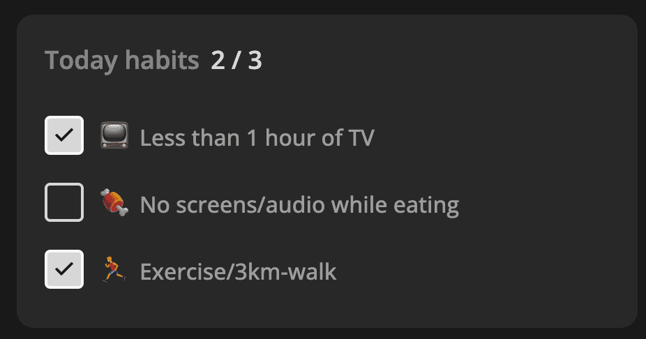
Let's turn a boring checkbox input into a pretty UI element with React. Here's an example of how I use it for a habit tracker at Increaser.
While we are still using the native input, the user won't see it because we apply styles that make it completely invisible. We won't display the element to make the checkbox accessible through the keyboard without trying to customize it directly.
import styled from "styled-components"

export interface InvisibleHTMLCheckboxProps {
  value: boolean
  onChange: (value: boolean) => void
}

const CheckboxInput = styled.input`
  border: 0;
  clip: rect(0 0 0 0);
  height: 1px;
  margin: -1px;
  overflow: hidden;
  padding: 0;
  position: absolute;
  width: 1px;
`

export const InvisibleHTMLCheckbox = ({
  value,
  onChange,
}: InvisibleHTMLCheckboxProps) => (
  <CheckboxInput
    type="checkbox"
    checked={value}
    onChange={(event) => {
      onChange(event.currentTarget.checked)
    }}
  />
)
The primary checkbox component will receive the same props as the invisible one together with the label and optional className for customizing the container.
import { ReactNode } from "react"
import styled, { css } from "styled-components"
import { defaultTransitionCSS } from "ui/animations/transitions"
import { CheckIcon } from "ui/icons/CheckIcon"
import { HStack } from "ui/Stack"
import { Text } from "ui/Text"
import { centerContentCSS } from "ui/utils/centerContentCSS"
import { getSameDimensionsCSS } from "ui/utils/getSameDimensionsCSS"

import {
  InvisibleHTMLCheckbox,
  InvisibleHTMLCheckboxProps,
} from "./InvisibleHTMLCheckbox"

interface CheckboxProps extends InvisibleHTMLCheckboxProps {
  label?: ReactNode
  className?: string
}

const Box = styled.div<{ isChecked: boolean }>`
  ${getSameDimensionsCSS(28)}
  ${centerContentCSS};
  border-radius: 4px;
  border: 2px solid ${({ theme }) => theme.colors.text.toCssValue()};
  color: ${({ theme }) => theme.colors.background.toCssValue()};

  ${defaultTransitionCSS}

  ${({ isChecked }) =>
    isChecked &&
    css`
      background: ${({ theme }) => theme.colors.text.toCssValue()};
    `};
`

const Container = styled(HStack)`
  color: ${({ theme }) => theme.colors.textSupporting.toCssValue()};

  cursor: pointer;

  ${defaultTransitionCSS}

  &:hover {
    color: ${({ theme }) => theme.colors.text.toCssValue()};
  }

  font-weight: 500;

  &:hover ${Box} {
    transform: scale(1.1);
  }
`

export const Checkbox = ({
  value,
  onChange,
  label,
  className,
}: CheckboxProps) => (
  <Container className={className} as="label" alignItems="center" gap={12}>
    <Box isChecked={value}>{value && <CheckIcon />}</Box>
    {label && (
      <Text style={{ transition: "none" }} as="div">
        {label}
      </Text>
    )}
    <InvisibleHTMLCheckbox value={value} onChange={onChange} />
  </Container>
)
We display everything inside of a flexbox element with the row direction. We apply interactive styles to the container, including an effect to make the checkbox slightly larger on hover. To make the whole area clickable, we render the container as a label so that the invisible checkbox will trigger the change callback even when the user clicks on the text.
In the unchecked state, the box will have a transparent background, and when in the checked state, we'll fill it with text color and place the icon inside.