Building a Custom Cryptocurrency Candlestick Chart from Scratch with React


Introduction
In this tutorial, we'll create a custom real-time candlestick chart for tracking cryptocurrency prices from scratch, without relying on external charting libraries. Follow along step-by-step or explore the complete implementation in the GitHub repository.
Building the Demo Component
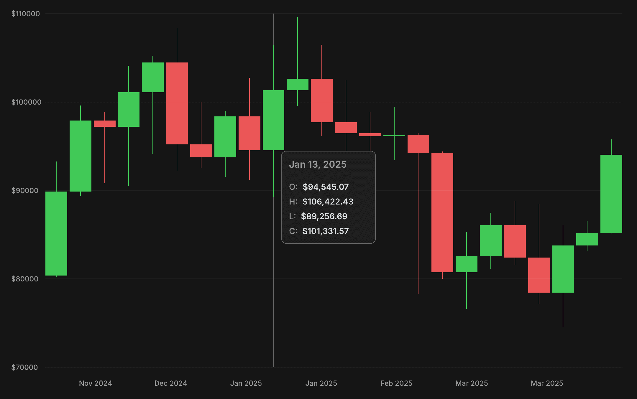
To demonstrate our solution, we'll create a CandlestickDemo component that fetches the last 24 weeks of BTC price data and renders it as a candlestick chart upon successful loading.
import { useAssetPriceCandlesQuery } from "@lib/chain-ui/queries/useAssetPriceCandlesQuery"
import { MatchQuery } from "@lib/ui/query/components/MatchQuery"
import { Text } from "@lib/ui/text"
import { getErrorMessage } from "@lib/utils/getErrorMessage"

import { CandlestickChart } from "./chart/CandlestickChart"

export const CandlestickDemo = () => {
  const query = useAssetPriceCandlesQuery({
    id: "BTC",
    limit: 24,
    candleDuration: { value: 1, unit: "w" },
  })

  return (
    <MatchQuery
      value={query}
      success={(value) => <CandlestickChart value={value} />}
      error={(error) => (
        <Text>Failed to fetch data: {getErrorMessage(error)}</Text>
      )}
      pending={() => <Text>Loading...</Text>}
    />
  )
}
Setting Up Data Fetching
The useAssetPriceCandlesQuery hook functions as a React Query wrapper for the price data fetching function. It accepts the same input parameters and leverages react-query to handle caching, loading states, and error management automatically.
import { useQuery } from "@tanstack/react-query"

import { getAssetPriceCandles } from "../../chain/trading/getAssetPriceCandles"
import { GetAssetPriceCandlesInput } from "../../chain/trading/getAssetPriceCandles"

export const useAssetPriceCandlesQuery = (input: GetAssetPriceCandlesInput) => {
  return useQuery({
    queryKey: ["asset-price-candles", input],
    queryFn: () => getAssetPriceCandles(input),
  })
}
Defining the Data Structure
Before implementing the chart, we need to define our price candle data structure. We'll create a constant array of price fields that will allow us to iterate over them efficiently when rendering chart elements or displaying price information.
import { Milliseconds } from "@lib/utils/time/types"

export const priceCandlePriceFields = ["open", "high", "low", "close"] as const
export type PriceCandlePriceField = (typeof priceCandlePriceFields)[number]
export type PriceCandlePriceFields = Record<PriceCandlePriceField, number>

export type PriceCandle = PriceCandlePriceFields & {
  startTime: Milliseconds
}
Implementing API Integration
Let's implement the core functionality for fetching cryptocurrency price data from the Binance API. Our getAssetPriceCandles function converts input parameters into the format Binance expects, manages the HTTP request, and transforms the raw kline data into structured candle objects. We use TypeScript's discriminated unions to ensure type safety throughout this process, especially with the CandleDuration type that restricts time intervals to only those supported by Binance's API.
import { PriceCandle } from "@lib/trading/PriceCandle"
import { order } from "@lib/utils/array/order"
import { addQueryParams } from "@lib/utils/query/addQueryParams"
import { queryUrl } from "@lib/utils/query/queryUrl"
import { withoutUndefinedFields } from "@lib/utils/record/withoutUndefinedFields"

const binanceUnitMap = {
  min: "m",
  h: "h",
  d: "d",
  w: "w",
}

export type CandleDuration =
  | { value: 1; unit: "min" }
  | { value: 3; unit: "min" }
  | { value: 5; unit: "min" }
  | { value: 15; unit: "min" }
  | { value: 30; unit: "min" }
  | { value: 1; unit: "h" }
  | { value: 2; unit: "h" }
  | { value: 4; unit: "h" }
  | { value: 6; unit: "h" }
  | { value: 8; unit: "h" }
  | { value: 12; unit: "h" }
  | { value: 1; unit: "d" }
  | { value: 3; unit: "d" }
  | { value: 1; unit: "w" }

const toBinanceInterval = (duration: CandleDuration): string => {
  const apiUnit = binanceUnitMap[duration.unit]
  if (!apiUnit) {
    throw new Error(`Unsupported duration unit: ${duration.unit}`)
  }

  return `${duration.value}${apiUnit}`
}

export type GetAssetPriceCandlesInput = {
  id: string
  startTime?: number
  endTime?: number
  candleDuration: CandleDuration
  limit?: number
}

type KlineData = [
  number, // Open time
  string, // Open price
  string, // High price
  string, // Low price
  string, // Close price
  string, // Volume
  number, // Close time
  string, // Quote asset volume
  number, // Number of trades
  string, // Taker buy base asset volume
  string, // Taker buy quote asset volume
  string, // Ignore
]

const baseUrl = "https://api.binance.com/api/v3/klines"

export const maxLimit = 1000

export const getAssetPriceCandles = async ({
  id,
  startTime,
  endTime,
  candleDuration,
  limit = maxLimit,
}: GetAssetPriceCandlesInput): Promise<PriceCandle[]> => {
  const symbol = `${id.toUpperCase()}USDT`

  const url = addQueryParams(
    baseUrl,
    withoutUndefinedFields({
      symbol,
      interval: toBinanceInterval(candleDuration),
      startTime,
      endTime,
      limit,
    }),
  )

  const klines = await queryUrl<KlineData[]>(url.toString())

  return order(
    klines.map((kline) => ({
      startTime: kline[0],
      open: parseFloat(kline[1]),
      high: parseFloat(kline[2]),
      low: parseFloat(kline[3]),
      close: parseFloat(kline[4]),
    })),
    (o) => o.startTime,
    "asc",
  )
}
Creating Chart Components
With our data pipeline established, we're ready to implement the chart's visual components. The chart consists of several key elements: X and Y axes with appropriate labels, candlestick representations of price movements, and an interactive hover tracker that highlights individual candles while displaying their detailed price information.
import { PriceCandle, priceCandlePriceFields } from "@lib/trading/PriceCandle"
import { ElementSizeAware } from "@lib/ui/base/ElementSizeAware"
import { HoverTracker } from "@lib/ui/base/HoverTracker"
import { ChartHorizontalGridLines } from "@lib/ui/charts/ChartHorizontalGridLines"
import { ChartLabel } from "@lib/ui/charts/ChartLabel"
import { ChartSlice } from "@lib/ui/charts/ChartSlice"
import { ChartXAxis } from "@lib/ui/charts/ChartXAxis"
import { ChartYAxis } from "@lib/ui/charts/ChartYAxis"
import { generateYLabels } from "@lib/ui/charts/utils/generateYLabels"
import { VStack } from "@lib/ui/css/stack"
import { TakeWholeSpaceAbsolutely } from "@lib/ui/css/takeWholeSpaceAbsolutely"
import { UniformColumnGrid } from "@lib/ui/css/uniformColumnGrid"
import { BodyPortal } from "@lib/ui/dom/BodyPortal"
import { ValueProp } from "@lib/utils/entities/props"
import { getSegmentIndex } from "@lib/utils/math/getSegmentIndex"
import { normalizeDataArrays } from "@lib/utils/math/normalizeDataArrays"
import { recordFromKeys } from "@lib/utils/record/recordFromKeys"
import { format } from "date-fns"
import { useMemo, useState } from "react"

import { Candlestick } from "./Candlestick"
import { CandlestickInfo } from "./CandlestickInfo"
import { chartConfig } from "./config"

export function CandlestickChart({ value }: ValueProp<PriceCandle[]>) {
  const yLabels = useMemo(() => {
    return generateYLabels({
      data: value.flatMap((candle) => [candle.low, candle.high]),
    })
  }, [value])

  const normalized = normalizeDataArrays({
    yLabels,
    ...recordFromKeys(priceCandlePriceFields, (field) =>
      value.map((candle) => candle[field]),
    ),
  })

  const [selectedIndex, setSelectedIndex] = useState<number | null>(null)

  return (
    <VStack fullWidth gap={20}>
      <ChartSlice yLabelsWidth={chartConfig.yLabelsWidth}>
        <ChartYAxis
          renderLabel={(index) => (
            <ChartLabel key={index}>${yLabels[index]}</ChartLabel>
          )}
          data={normalized.yLabels}
        />
        <VStack
          style={{
            position: "relative",
          }}
          fullWidth
        >
          <UniformColumnGrid
            gap={4}
            style={{
              height: chartConfig.chartHeight,
              position: "relative",
            }}
          >
            {value.map((_, index) => (
              <Candlestick
                key={index}
                value={recordFromKeys(
                  priceCandlePriceFields,
                  (field) => normalized[field][index],
                )}
                isActive={selectedIndex === index}
              />
            ))}
            <HoverTracker
              onChange={({ position }) => {
                setSelectedIndex(
                  position ? getSegmentIndex(value.length, position.x) : null,
                )
              }}
              render={({ props, clientPosition }) => (
                <TakeWholeSpaceAbsolutely {...props}>
                  <BodyPortal>
                    {clientPosition && selectedIndex !== null && (
                      <CandlestickInfo
                        position={clientPosition}
                        value={value[selectedIndex]}
                      />
                    )}
                  </BodyPortal>
                </TakeWholeSpaceAbsolutely>
              )}
            />
          </UniformColumnGrid>
          <ChartHorizontalGridLines data={normalized.yLabels} />
        </VStack>
      </ChartSlice>
      <ElementSizeAware
        render={({ setElement, size }) => (
          <ChartSlice yLabelsWidth={chartConfig.yLabelsWidth} ref={setElement}>
            <div />
            {size?.width !== undefined && (
              <ChartXAxis
                dataSize={value.length}
                containerWidth={size.width}
                expectedLabelHeight={chartConfig.xLabelsHeight}
                expectedLabelWidth={chartConfig.xLabelsWidth}
                labelsMinDistance={chartConfig.xLabelsMinDistance}
                renderLabel={(index) => (
                  <ChartLabel key={index}>
                    {format(value[index].startTime, "MMM yyyy")}
                  </ChartLabel>
                )}
              />
            )}
          </ChartSlice>
        )}
      />
    </VStack>
  )
}
Generating Y-Axis Labels
With our chart's structure in place, we need a system for generating meaningful Y-axis labels that work across any price range. The following algorithm intelligently determines the optimal step size between labels based on the data's range, creating visually balanced axis labels that use familiar increments (1, 2, 2.5, 5, 10) scaled to match the data's magnitude.
import { range } from "@lib/utils/array/range"

type Input = {
  data: number[]
  minLabels?: number
  maxLabels?: number
}

const PREFERRED_STEPS = [1, 2, 2.5, 5, 10] as const

const getMagnitude = (value: number): number => {
  if (value === 0) return 1
  return Math.pow(10, Math.floor(Math.log10(Math.abs(value))))
}

const getBoundaryValue = (
  value: number,
  step: number,
  roundUp: boolean,
): number => {
  return (roundUp ? Math.ceil(value / step) : Math.floor(value / step)) * step
}

const getStepSizes = (approximateStep: number): number[] => {
  const magnitude = getMagnitude(approximateStep)
  return PREFERRED_STEPS.map((step) => step * magnitude)
}

const findBestStep = (
  dataRange: number,
  stepSizes: number[],
  minLabels: number,
  maxLabels: number,
): number => {
  if (dataRange === 0) {
    return stepSizes[0]
  }

  for (const step of stepSizes) {
    const labelCount = Math.floor(dataRange / step) + 1
    if (labelCount >= minLabels && labelCount <= maxLabels) {
      return step
    }
  }
  return stepSizes[0]
}

export const generateYLabels = ({
  data,
  minLabels = 4,
  maxLabels = 6,
}: Input): number[] => {
  if (data.length === 0) {
    return []
  }

  const maxValue = Math.max(...data)
  const minValue = Math.min(...data)
  const dataRange = maxValue - minValue

  if (dataRange === 0) {
    const magnitude = getMagnitude(Math.abs(maxValue))
    const step = magnitude / 2
    const base = getBoundaryValue(maxValue, step, false)
    return range(5).map((i) => Number((base + (i - 2) * step).toFixed(2)))
  }

  const approximateStep = dataRange / (maxLabels - 1)
  const stepSizes = getStepSizes(approximateStep)
  const bestStep = findBestStep(dataRange, stepSizes, minLabels, maxLabels)

  const lowerBound = getBoundaryValue(minValue, bestStep, false)
  const upperBound = getBoundaryValue(maxValue, bestStep, true)
  const labelCount = Math.floor((upperBound - lowerBound) / bestStep) + 1

  return range(labelCount).map((i) =>
    Number((lowerBound + i * bestStep).toFixed(2)),
  )
}
Normalizing Data for Responsive Rendering
The key to rendering our chart components at any size is normalizing the data to a consistent scale. The following utility function transforms multiple arrays of numerical data to the 0-1 range, making it easy to position elements using percentage-based measurements instead of absolute pixel values. This approach provides flexibility when working with dynamic container sizes and eliminates the need for manual recalculation when the chart dimensions change.
export const normalizeDataArrays = <T extends Record<string, number[]>>(
  input: T,
): T => {
  const values = Object.values(input).flat()
  const max = Math.max(...values)
  const min = Math.min(...values)
  const range = max - min
  return Object.fromEntries(
    Object.entries(input).map(([key, value]) => [
      key,
      value.map((v) => (v - min) / range),
    ]),
  ) as T
}
Centralizing Chart Configuration
To ensure consistent sizing and spacing throughout our chart, we define a configuration object that centralizes all dimensional parameters. This approach makes it easy to fine-tune the chart's appearance and maintain proper proportions between its components without scattered magic numbers.
export const chartConfig = {
  chartHeight: 600,
  yLabelsWidth: 58,
  xLabelsHeight: 18,
  xLabelsWidth: 80,
  xLabelsMinDistance: 20,
  tailWidth: 1,
}
Creating the Chart Layout Structure
Now let's create a ChartSlice component to handle the layout structure of our chart. This component provides a two-column grid where the first column contains y-axis labels and the second contains the chart's main content area.
import { toSizeUnit } from "@lib/ui/css/toSizeUnit"
import styled from "styled-components"

type ChartSliceProps = {
  yLabelsWidth: number | string
}

export const ChartSlice = styled.div<ChartSliceProps>`
  position: relative;
  display: grid;
  grid-template-columns: ${({ yLabelsWidth }) => toSizeUnit(yLabelsWidth)} 1fr;
`
Building the Y-Axis Component
The ChartYAxis component renders the vertical axis labels at positions determined by normalized data values. By using the toPercents utility to convert normalized values (0-1) to percentage-based CSS positions, we can place labels at their proper vertical positions regardless of the chart's physical height.
import { toPercents } from "@lib/utils/toPercents"
import { ReactNode } from "react"
import styled from "styled-components"

import { PositionAbsolutelyCenterHorizontally } from "../layout/PositionAbsolutelyCenterHorizontally"
import { UiProps } from "../props"

type ChartYAxisProps = UiProps & {
  data: number[]
  renderLabel: (index: number) => ReactNode
}

const Container = styled.div`
  position: relative;
`

export const ChartYAxis = ({ data, renderLabel, ...rest }: ChartYAxisProps) => {
  return (
    <Container {...rest}>
      {data.map((value, index) => {
        return (
          <PositionAbsolutelyCenterHorizontally
            top={toPercents(1 - value)}
            key={index}
          >
            {renderLabel(index)}
          </PositionAbsolutelyCenterHorizontally>
        )
      })}
    </Container>
  )
}
Implementing Positioning Utilities
The PositionAbsolutelyCenterHorizontally component serves as a positioning utility that places elements at specific vertical positions while centering them horizontally. This approach creates a clean, responsive layout where elements maintain their relative positions when the container dimensions change.
import styled from "styled-components"

import { ChildrenProp } from "../props"

interface PositionAbsolutelyCenterHorizontallyProps extends ChildrenProp {
  top: React.CSSProperties["top"]
  fullWidth?: boolean
}

const Wrapper = styled.div`
  position: absolute;
  left: 0;
`

const Container = styled.div`
  position: relative;
  display: flex;
  align-items: center;
`

const Content = styled.div`
  position: absolute;
  left: 0;
`

export const PositionAbsolutelyCenterHorizontally = ({
  top,
  children,
  fullWidth,
}: PositionAbsolutelyCenterHorizontallyProps) => {
  const width = fullWidth ? "100%" : undefined
  return (
    <Wrapper style={{ top, width }}>
      <Container style={{ width }}>
        <Content style={{ width }}>{children}</Content>
      </Container>
    </Wrapper>
  )
}
Creating a Flexible Grid Layout
The UniformColumnGrid component provides the flexible container layout for our candlesticks, ensuring they're evenly distributed across the chart width. This responsive grid automatically adjusts column widths based on available space while maintaining consistent gaps between elements. With configurable parameters for spacing and sizing constraints, it creates the perfect foundation for visualizing time-series data where each column represents a distinct time interval.
import styled, { css } from "styled-components"

import { toSizeUnit } from "../css/toSizeUnit"

export type UniformColumnGridParams = {
  gap: number
  minChildrenWidth?: number
  maxChildrenWidth?: number
  childrenWidth?: number
  rowHeight?: number
  fullWidth?: boolean
  maxColumns?: number
}

const getColumnMax = (maxColumns: number | undefined, gap: number) => {
  if (!maxColumns) return `0px`

  const gapCount = maxColumns - 1
  const totalGapWidth = `calc(${gapCount} * ${toSizeUnit(gap)})`

  return `calc((100% - ${totalGapWidth}) / ${maxColumns})`
}

const getColumnWidth = ({
  minChildrenWidth,
  maxChildrenWidth,
  maxColumns,
  gap,
  childrenWidth,
}: UniformColumnGridParams) => {
  if (childrenWidth !== undefined) {
    return toSizeUnit(childrenWidth)
  }

  return `
    minmax(
      max(
        ${toSizeUnit(minChildrenWidth || 0)},
        ${getColumnMax(maxColumns, gap)}
      ),
      ${maxChildrenWidth ? toSizeUnit(maxChildrenWidth) : "1fr"}
  )`
}

export const uniformColumnGrid = (params: UniformColumnGridParams) => css`
  display: grid;
  grid-template-columns: repeat(auto-fit, ${getColumnWidth(params)});
  gap: ${toSizeUnit(params.gap)};
  ${params.rowHeight &&
  css`
    grid-auto-rows: ${toSizeUnit(params.rowHeight)};
  `}
  ${params.fullWidth &&
  css`
    width: 100%;
  `}
`

export const UniformColumnGrid = styled.div<UniformColumnGridParams>`
  ${uniformColumnGrid}
`
Adding Interactive Hover Tracking
The chart's interactivity relies on the HoverTracker component, which elegantly handles mouse movements to create a responsive hover experience. This component captures mouse positions, converts them to normalized coordinates within the chart, and notifies parent components when users interact with specific data points. By separating this tracking logic into a reusable component, we maintain clean separation of concerns while providing a consistent hover experience throughout the visualization.
import { useIsomorphicLayoutEffect } from "@lib/ui/hooks/useIsomorphicLayoutEffect"
import { RenderProp } from "@lib/ui/props"
import { Point } from "@lib/utils/entities/Point"
import { MouseEvent, MouseEventHandler, useCallback, useState } from "react"

import { useBoundingBox } from "../hooks/useBoundingBox"
import { useRelativePosition } from "../hooks/useRelativePosition"

interface ContainerProps {
  onMouseEnter?: MouseEventHandler<HTMLElement>
  onMouseLeave?: MouseEventHandler<HTMLElement>
  onMouseMove?: MouseEventHandler<HTMLElement>
  ref: (node: HTMLElement | null) => void
}

interface ChangeParams {
  position: Point | null
  clientPosition: Point | null
}

interface RenderParams extends ChangeParams {
  props: ContainerProps
}

interface HoverTrackerProps extends RenderProp<RenderParams> {
  onChange?: (params: ChangeParams) => void
}

export const HoverTracker = ({ render, onChange }: HoverTrackerProps) => {
  const [container, setContainer] = useState<HTMLElement | null>(null)
  const box = useBoundingBox(container)

  const [clientPosition, setClientPosition] = useState<Point | null>(null)

  const position = useRelativePosition({ box, clientPosition })

  const handleMouse = useCallback((event: MouseEvent) => {
    setClientPosition({ x: event.clientX, y: event.clientY })
  }, [])

  useIsomorphicLayoutEffect(() => {
    if (onChange) {
      onChange({ position, clientPosition })
    }
  }, [onChange, position, clientPosition])

  return (
    <>
      {render({
        props: {
          ref: setContainer,
          onMouseEnter: handleMouse,
          onMouseLeave: position
            ? () => {
                setClientPosition(null)
              }
            : undefined,
          onMouseMove: position ? handleMouse : undefined,
        },
        position: position,
        clientPosition,
      })}
    </>
  )
}
Rendering Candlestick Elements
Now that we've established the core chart structure, we need to create the Candlestick component - the visual heart of our chart. This component renders each price candle with a thin "tail" representing the full price range (high to low) and a wider "body" showing the opening and closing prices. It uses color to instantly communicate price movement: green for bullish candles (price increased) and red for bearish ones (price decreased). When hovered, an indicator line appears to help users track the selected candle.
import { PriceCandlePriceFields } from "@lib/trading/PriceCandle"
import { vStack } from "@lib/ui/css/stack"
import { toSizeUnit } from "@lib/ui/css/toSizeUnit"
import { IsActiveProp } from "@lib/ui/props"
import { getColor } from "@lib/ui/theme/getters"
import { ValueProp } from "@lib/utils/entities/props"
import { toPercents } from "@lib/utils/toPercents"
import styled, { useTheme } from "styled-components"

import { chartConfig } from "./config"

type CandlestickProps = ValueProp<PriceCandlePriceFields> & IsActiveProp

const Container = styled.div`
  position: relative;
  ${vStack({ alignItems: "center", fullHeight: true })};

  > * {
    position: absolute;
  }
`

const Tail = styled.div`
  width: ${toSizeUnit(chartConfig.tailWidth)};
`

const Body = styled.div`
  width: 100%;
`

const Indicator = styled.div`
  width: ${toSizeUnit(chartConfig.tailWidth)};
  height: 100%;
  background: ${getColor("textShy")};
`

export const Candlestick = ({ value, isActive }: CandlestickProps) => {
  const { colors } = useTheme()
  const isBullish = value.close > value.open
  const background = (isBullish ? colors.success : colors.alert).toCssValue()

  return (
    <Container>
      {isActive && <Indicator />}
      <Tail
        style={{
          background,
          height: toPercents(value.high - value.low),
          bottom: toPercents(value.low),
        }}
      />
      <Body
        style={{
          background,
          height: toPercents(Math.abs(value.close - value.open)),
          bottom: toPercents(Math.min(value.close, value.open)),
        }}
      />
    </Container>
  )
}
Building the Interactive Tooltip
To complete our interactive chart, we need to create a tooltip component that displays detailed price information when users hover over a candle. The CandlestickInfo component uses Floating UI to position itself optimally near the cursor, providing a clean, non-intrusive way to show the date and OHLC (Open, High, Low, Close) values for the selected time period.
import {
  offset,
  shift,
  flip,
  useFloating,
  autoUpdate,
} from "@floating-ui/react"
import { PriceCandle, priceCandlePriceFields } from "@lib/trading/PriceCandle"
import { FixedReference } from "@lib/ui/base/FixedReference"
import { borderRadius } from "@lib/ui/css/borderRadius"
import { HStack, vStack, VStack } from "@lib/ui/css/stack"
import { Text } from "@lib/ui/text"
import { getColor } from "@lib/ui/theme/getters"
import { Point } from "@lib/utils/entities/Point"
import { ValueProp } from "@lib/utils/entities/props"
import { formatAmount } from "@lib/utils/formatAmount"
import { format } from "date-fns"
import { useEffect } from "react"
import styled from "styled-components"

type CandlestickInfoProps = {
  position: Point
} & ValueProp<PriceCandle>

const Container = styled.div`
  border: 1px solid ${getColor("textShy")};
  background: ${getColor("foregroundExtra")};
  ${borderRadius.s};
  overflow: hidden;

  min-width: 160px;

  ${vStack({
    gap: 20,
  })}

  padding: 12px;
  background: ${getColor("foreground")};
`

export const CandlestickInfo = ({ position, value }: CandlestickInfoProps) => {
  const {
    refs: { setReference, setFloating },
    floatingStyles,
    update,
  } = useFloating({
    open: true,
    placement: "right-start",
    strategy: "fixed",
    middleware: [offset(16), flip(), shift()],
    whileElementsMounted: autoUpdate,
  })

  useEffect(() => {
    update()
  }, [position, update])

  return (
    <>
      <FixedReference
        ref={setReference}
        style={{
          left: position.x,
          top: position.y,
        }}
      />
      <Container ref={setFloating} style={{ ...floatingStyles }}>
        <Text weight="600" size={16} color="supporting">
          {format(value.startTime, "MMM d, yyyy")}
        </Text>
        <VStack gap={8}>
          {priceCandlePriceFields.map((field) => (
            <HStack alignItems="center" gap={8} key={field}>
              <Text color="supporting">{field.slice(0, 1).toUpperCase()}:</Text>
              <Text weight="600">${formatAmount(value[field])}</Text>
            </HStack>
          ))}
        </VStack>
      </Container>
    </>
  )
}
Implementing the X-Axis with Smart Label Placement
To complete our chart, we need to implement the X-axis that displays time labels. The ChartXAxis component intelligently handles label placement to prevent overlapping text, making it suitable for any chart width or data density. It calculates optimal label positions based on container dimensions, expected label sizes, and minimum spacing requirements. For time series data, this ensures readable date markers that maintain consistent spacing whether the chart shows a few days or several months of data.
import { range } from "@lib/utils/array/range"
import { withoutUndefined } from "@lib/utils/array/withoutUndefined"
import { useMemo } from "react"
import styled from "styled-components"

import { PositionAbsolutelyCenterVertically } from "../layout/PositionAbsolutelyCenterVertically"

import { JustifyPoints, positionDataPoint } from "./utils/positionDataPoints"

type ChartXAxisProps = {
  dataSize: number
  containerWidth: number
  expectedLabelHeight: number
  expectedLabelWidth: number
  labelsMinDistance?: number
  renderLabel: (index: number) => React.ReactNode
  justifyPoints?: JustifyPoints
}

const Container = styled.div`
  width: 100%;
  position: relative;
`

export const ChartXAxis = ({
  dataSize,
  containerWidth,
  expectedLabelHeight,
  expectedLabelWidth,
  labelsMinDistance = 0,
  renderLabel,
  justifyPoints = "space-between",
}: ChartXAxisProps) => {
  const itemIndexes = useMemo(() => {
    if (justifyPoints === "space-between") {
      const stepInPx = containerWidth / (dataSize - 1)
      let lastItemEnd = 0
      return withoutUndefined(
        range(dataSize).map((index) => {
          const startsAt = index * stepInPx - expectedLabelWidth / 2
          const endsAt = startsAt + expectedLabelWidth
          if (startsAt < lastItemEnd + labelsMinDistance) return

          if (endsAt > containerWidth) return

          lastItemEnd = endsAt
          return index
        }),
      )
    }

    const itemSize = containerWidth / dataSize
    const step = Math.ceil(expectedLabelWidth / itemSize)

    return range(dataSize).filter((index) => index % step === 0)
  }, [
    containerWidth,
    dataSize,
    expectedLabelWidth,
    justifyPoints,
    labelsMinDistance,
  ])

  return (
    <Container
      style={{
        minHeight: expectedLabelHeight,
      }}
    >
      {itemIndexes.map((itemIndex) => {
        const center = positionDataPoint({
          dataSize,
          containerWidth,
          index: itemIndex,
          justifyPoints,
        })

        return (
          <PositionAbsolutelyCenterVertically key={itemIndex} left={center}>
            {renderLabel(itemIndex)}
          </PositionAbsolutelyCenterVertically>
        )
      })}
    </Container>
  )
}
Conclusion
By building this chart from scratch, we've created a flexible, customizable solution that gives us complete control over every aspect of the visualization while avoiding the bloat of large charting libraries. This approach not only results in better performance but also deepens our understanding of data visualization principles and responsive UI design.