How To Make An Ultimate Button Component with Variants using React


After six years of React development, I finally nailed a button component. It has enough style variants to cover most situations and looks great in dark and light modes. You can also easily modify those variants, add new ones, or build other UI components on top of it.
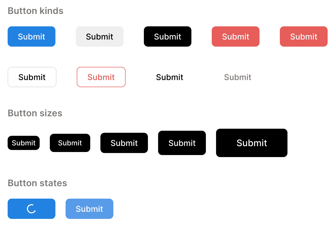
Buttom component
We use styled-components, so our Button receives the same properties as it's styled container plus a few optional ones. The first one is size, we have 5 size options starting from extra small and finishing with extra large. The second one is kind which defines Button variant, we have 9 sufficient options that we can easily modify. Then we have isDisabled, isLoading and isRounded properties that are self-explanatory. We make the onClick property optional since sometimes we'll render the button as a div element inside of a link so we won't need the onClick handler there.
import styled, { css } from "styled-components"
import { defaultTransitionCSS } from "lib/ui/animations/transitions"
import { centerContentCSS } from "lib/ui/utils/centerContentCSS"
import { getHorizontalPaddingCSS } from "lib/ui/utils/getHorizontalPaddingCSS"
import { Spinner } from "lib/ui/Spinner"

import { getCSSUnit } from "lib/ui/utils/getCSSUnit"

import { Tooltip } from "lib/ui/Tooltip"
import { UnstyledButton } from "./UnstyledButton"
import { match } from "lib/shared/utils/match"
import { getColor } from "../theme/getters"
import { CenterAbsolutely } from "../CenterAbsolutely"

export const buttonSizes = ["xs", "s", "m", "l", "xl"] as const

type ButtonSize = (typeof buttonSizes)[number]

export const buttonKinds = [
  "primary",
  "secondary",
  "reversed",
  "attention",
  "alert",
  "outlined",
  "outlinedAlert",
  "ghost",
  "ghostSecondary",
] as const

export type ButtonKind = (typeof buttonKinds)[number]

interface ContainerProps {
  size: ButtonSize
  isDisabled?: boolean
  isLoading?: boolean
  isRounded?: boolean
  kind: ButtonKind
}

const Container = styled(UnstyledButton)<ContainerProps>`
  ${defaultTransitionCSS};
  ${centerContentCSS};

  position: relative;

  white-space: nowrap;
  font-weight: 500;

  border-radius: ${({ isRounded }) => getCSSUnit(isRounded ? 100 : 8)};

  cursor: ${({ isDisabled, isLoading }) =>
    isDisabled ? "initial" : isLoading ? "wait" : "pointer"};

  ${({ isDisabled }) =>
    isDisabled &&
    css`
      opacity: 0.8;
    `};

  ${({ size }) =>
    match(size, {
      xs: () => css`
        ${getHorizontalPaddingCSS(8)}
        height: 28px;
        font-size: 14px;
      `,
      s: () => css`
        ${getHorizontalPaddingCSS(16)}
        height: 36px;
        font-size: 14px;
      `,
      m: () => css`
        ${getHorizontalPaddingCSS(20)}
        height: 40px;
        font-size: 16px;
      `,
      l: () => css`
        ${getHorizontalPaddingCSS(20)}
        height: 48px;
        font-size: 16px;
      `,
      xl: () => css`
        ${getHorizontalPaddingCSS(40)}
        height: 56px;
        font-size: 18px;
      `,
    })}

  ${({ kind }) =>
    match(kind, {
      primary: () => css`
        background: ${getColor("primary")};
        color: ${getColor("white")};
      `,
      secondary: () => css`
        background: ${getColor("mist")};
        color: ${getColor("contrast")};
      `,
      reversed: () => css`
        background: ${getColor("contrast")};
        color: ${getColor("background")};
      `,
      attention: () => css`
        background: ${getColor("attention")};
        color: ${getColor("white")};
      `,
      alert: () => css`
        background: ${getColor("alert")};
        color: ${getColor("white")};
      `,
      outlined: () => css`
        border: 1px solid ${getColor("mistExtra")};
        color: ${getColor("contrast")};
      `,
      outlinedAlert: () => css`
        border: 1px solid ${getColor("alert")};
        color: ${getColor("alert")};
      `,
      ghost: () => css`
        color: ${getColor("contrast")};
      `,
      ghostSecondary: () => css`
        color: ${getColor("textSupporting")};
      `,
    })}

  ${({ isDisabled, isLoading, kind }) =>
    !isDisabled &&
    !isLoading &&
    css`
      &:hover {
        ${match(kind, {
          primary: () => css`
            background: ${getColor("primaryHover")};
          `,
          secondary: () => css`
            background: ${getColor("mistExtra")};
          `,
          reversed: () => css`
            background: ${getColor("text")};
          `,
          attention: () => css`
            background: ${getColor("attentionHover")};
          `,
          alert: () => css`
            background: ${({ theme }) =>
              theme.colors.alert
                .getVariant({ l: (l) => l * 0.92 })
                .toCssValue()};
          `,
          outlined: () => css`
            background: ${getColor("mist")};
            color: ${getColor("contrast")};
          `,
          outlinedAlert: () => css`
            background: ${({ theme }) =>
              theme.colors.alert
                .getVariant({ a: (a) => a * 0.12 })
                .toCssValue()};
          `,
          ghost: () => css`
            background: ${getColor("mist")};
          `,
          ghostSecondary: () => css`
            background: ${getColor("mist")};
          `,
        })}
      }
    `};
`

export interface ButtonProps extends React.ComponentProps<typeof Container> {
  size?: ButtonSize
  kind?: ButtonKind
  isDisabled?: boolean | string
  isLoading?: boolean
  isRounded?: boolean
  onClick?: () => void
}

const Hide = styled.div`
  opacity: 0;
`

export const Button = ({
  children,
  size = "m",
  isDisabled = false,
  isLoading = false,
  onClick,
  kind = "primary",
  ...rest
}: ButtonProps) => {
  const content = isLoading ? (
    <>
      <Hide>{children}</Hide>
      <CenterAbsolutely>
        <Spinner size={18} />
      </CenterAbsolutely>
    </>
  ) : (
    children
  )

  const containerProps = {
    kind,
    size,
    isDisabled: !!isDisabled,
    isLoading,
    onClick: isDisabled || isLoading ? undefined : onClick,
    ...rest,
  }

  if (typeof isDisabled === "string") {
    return (
      <Tooltip
        content={isDisabled}
        renderOpener={(props) => (
          <Container {...props} {...containerProps}>
            {content}
          </Container>
        )}
      />
    )
  }

  return <Container {...containerProps}>{content}</Container>
}
How To Implement Button Component
The default values for size and kind are m and primary respectively. When the isLoading is true we still render the content of the button to keep its width the same, but we make it transparent while positioning the spinner in the center of the button absolutely. When the button is either disabled or loading we don't propagate the onClick handler to the container.
It's a good practice to show a tooltip explaining why the button is disabled when the user hovers over it. To achieve that we allow the isDisabled property to be a string and then render the button inside the Tooltip component, to learn about its implementation check out my other post about the tooltip.
The Container component built on top of UnstyledButton which resets all default button styles.
import styled from "styled-components"

export const UnstyledButton = styled.button`
  cursor: pointer;
  padding: 0;
  margin: 0;
  border: none;
  background: transparent;
  color: inherit;
  font-size: inherit;
  font-weight: inherit;
  font-family: inherit;
  line-height: inherit;
`
First, we add a default transition for a more pleasant hover effect, then we center content inside using flexbox. We add position relative for the spinner to be positioned absolutely inside the button. When the isRounded is true we make the button rounded, otherwise we keep border-radius to 8px. Based on isDisabled or isLoading flags we set cursor to either wait, initial or pointer. We also set opacity to 0.8 when the button is disabled.
Each size has a custom set of styles and to make the code more readable we use the match function that serves as a replacement for the switch-case statement. The only attributes that change based on the size are padding, height and font-size.
export function match<T extends string | number | symbol, V>(
  value: T,
  handlers: { [key in T]: () => V },
): V {
  const handler = handlers[value]

  return handler()
}
We apply the same approach for the kind property. The primary button has a blue background and white color for text. To access the color from theme we rely on a tiny helper getColor.
import { DefaultTheme } from "styled-components"
import { ThemeColors } from "./ThemeColors"

interface ThemeGetterParams {
  theme: DefaultTheme
}

export const getColor =
  (color: keyof Omit<ThemeColors, "getPaletteColor">) =>
  ({ theme }: ThemeGetterParams) =>
    theme.colors[color].toCssValue()
The secondary kind has the mist background which is same as the page background, but almost transparent. The contrast color would be absolute black in light theme and white in dark theme. The reversed button uses reverse colors to the rest of the UI and could often be a replacement for the primary button. The attention could be a nice option for a call-to-action like a sign-up button. The alert button is red and could be used for destructive actions. The outlined button has a transparent background and a light border. The outlinedAlert button is similar to the alert button, but doesn't have a background. The ghost and ghostSecondary buttons are transparent.
  mist: new HSLA(0, 0, 100, 0.06),
  mistExtra: new HSLA(0, 0, 100, 0.13),
When the button is interactive, e.g. not loading or disabled we apply a custom hover effect for every variant of a button.