

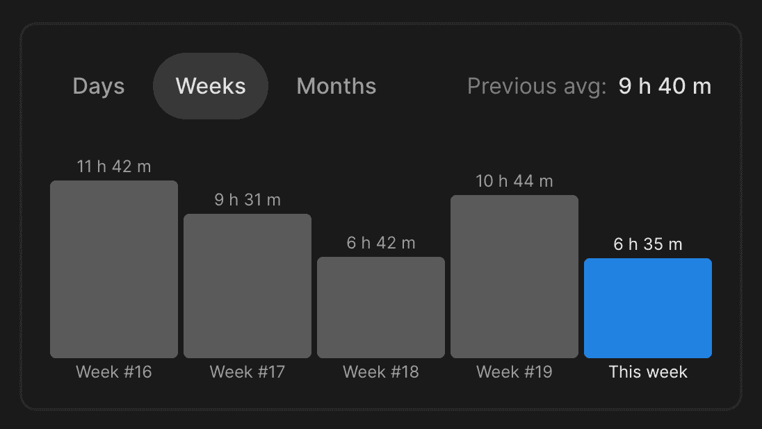
While there are plenty of libraries for data visualization, it often might be easier to implement a custom component that fits your exact needs and UI requirements. Let me share how I've implemented a simple Bar Chart so you can find some useful insights for your task.
The component receives a list of items or bars, the exact height of the BarChart, and two optional parameters for expected height for values we show under and above the bar. We are less likely to specify them, except if we want to make labels or values larger or smaller.
import { toPercents } from "lib/shared/utils/toPercents"
import { ReactNode } from "react"
import styled from "styled-components"
import { SameWidthChildrenRow } from "../Layout/SameWidthChildrenRow"
import { Spacer } from "../Spacer"
import { VStack } from "../Stack"
import { defaultTransitionCSS } from "../animations/transitions"
import { HSLA } from "../colors/HSLA"
import { centerContentCSS } from "../utils/centerContentCSS"
import { getCSSUnit } from "../utils/getCSSUnit"
import { Text } from "../Text"

export interface BarChartItem {
  label: ReactNode
  value: number
  color: HSLA
  renderValue?: (value: number) => ReactNode
}

interface BarChartProps {
  items: BarChartItem[]
  height: React.CSSProperties["height"]
  expectedValueHeight?: React.CSSProperties["height"]
  expectedLabelHeight?: React.CSSProperties["height"]
}

const barValueGap = "4px"
const barLabelGap = "4px"
const defaultLabelSize = 12

const Bar = styled.div`
  border-radius: 4px;
  ${defaultTransitionCSS};
`

const RelativeWrapper = styled.div`
  position: relative;
  ${centerContentCSS};
`

export const BarPlaceholder = styled(Bar)`
  height: 2px;
  background: ${({ theme }) => theme.colors.backgroundGlass.toCssValue()};
`

const Value = styled(Text)`
  position: absolute;
  white-space: nowrap;
  line-height: 1;
  bottom: ${barValueGap};
  color: ${({ theme }) => theme.colors.textSupporting.toCssValue()};
`

const Label = styled(Value)`
  top: ${barLabelGap};
`

const Content = styled(SameWidthChildrenRow)`
  flex: 1;
`

const Column = styled(VStack)`
  height: 100%;
  justify-content: end;
`

export const BarChart = ({
  items,
  height,
  expectedValueHeight = defaultLabelSize,
  expectedLabelHeight = defaultLabelSize,
}: BarChartProps) => {
  const maxValue = Math.max(...items.map((item) => item.value))

  return (
    <VStack style={{ height }}>
      <Spacer
        height={`calc(${getCSSUnit(expectedValueHeight)} + ${barValueGap})`}
      />
      <Content gap={4}>
        {items.map(({ value, color, renderValue, label }, index) => {
          return (
            <Column key={index}>
              {renderValue && (
                <RelativeWrapper>
                  <Value style={{ fontSize: defaultLabelSize }} as="div">
                    {renderValue(value)}
                  </Value>
                </RelativeWrapper>
              )}
              <Bar
                style={{
                  background: color.toCssValue(),
                  height: value ? toPercents(value / maxValue) : "2px",
                }}
              />
              <RelativeWrapper>
                <Label style={{ fontSize: defaultLabelSize }} as="div">
                  {label}
                </Label>
              </RelativeWrapper>
            </Column>
          )
        })}
      </Content>
      <Spacer
        height={`calc(${getCSSUnit(expectedLabelHeight)} + ${barLabelGap})`}
      />
    </VStack>
  )
}
Each item consists of a label, numeric value, color in HSLA format, and an optional function to render value on top of the bar.
To begin, we create a flexbox container with a predetermined height to accommodate the bar chart's elements. Within this container, we include two spacers and the content for the bar chart. The spacers are given fixed heights to prevent any potential overflow issues. This is crucial because we will be positioning the labels and values absolutely in relation to the bars. To make every bar the same width, we will place them inside a CSS grid component. You can learn more about SameWidthChildrenRow here.
Each column represents a flexbox component that contains a RelativeWrapper positioned both below and above the bar. The key aspect is that the RelativeWrapper is a relative element that centrally aligns absolute content within it, without occupying any space within its parent.
Values and labels will have the same font size that should match the expected value or label height, therefore spacers should reserve enough space to prevent labels from overflowing the total height of the component.
The bar itself is a regular div element with a transition property so that when we change items, they would have a nice animation for changing height and color.