Creating an Amount Input with Unit Adornment using React and TypeScript


Let's create an input for entering amounts or numbers using React and TypeScript. The UI element will have an adornment to show the unit, such as a dollar or percentage sign, and an optional suggested amount that could be useful when there is a maximum amount for a given field.
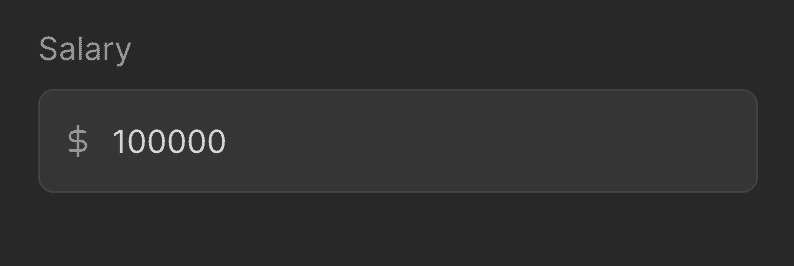
Here's an example of how we can use the input. It receives a value that could be either a number or undefined, a label, a callback for value changes, a unit (which would be an SVG icon), and an optional suggestion component (which would likely be a maximum amount).
const AmountInputPage: NextPage = () => {
  const [value, setValue] = useState<number | undefined>(80000)

  return (
    <AmountTextInput
      value={value}
      label="Salary"
      onValueChange={setValue}
      unit={<DollarIcon />}
      suggestion={
        <AmountSuggestion name="Max" value={100000} onSelect={setValue} />
      }
    />
  )
}
We build AmountTextInput on top of the TextInput component, and extend its props by changing the types of value and onValueChange to number, adding a unit to show before the input value, a shouldBePositive flag to force the input to be a positive value, and an optional suggestion element.
import { Ref, forwardRef, ReactNode, useRef } from "react"
import styled from "styled-components"
import { HStack } from "../Stack"
import { centerContentCSS } from "../utils/centerContentCSS"

import { TextInput, TextInputProps } from "./TextInput"

type AmountTextInputProps = Omit<TextInputProps, "value" | "onValueChange"> & {
  value: number | undefined
  onValueChange?: (value: number | undefined) => void
  unit: ReactNode
  shouldBePositive?: boolean
  suggestion?: ReactNode
}

const UnitContainer = styled.div`
  border-radius: 8px;
  position: absolute;
  left: 12px;
  ${centerContentCSS};
`

const Input = styled(TextInput)`
  padding-left: 36px;
`

export const AmountTextInput = forwardRef(function AmountInputInner(
  {
    onValueChange,
    onChange,
    max,
    inputOverlay,
    unit,
    value,
    shouldBePositive,
    suggestion,
    label,
    placeholder,
    type = "number",
    ...props
  }: AmountTextInputProps,
  ref: Ref<HTMLInputElement> | null
) {
  const valueAsString = value?.toString() ?? ""

  const inputValue = useRef<string>(valueAsString)

  return (
    <Input
      {...props}
      type={type}
      label={
        <HStack
          alignItems="center"
          justifyContent="space-between"
          gap={16}
          fullWidth
        >
          {label}
          {suggestion}
        </HStack>
      }
      placeholder={placeholder ?? "Enter amount"}
      value={valueAsString === inputValue.current ? inputValue.current : value}
      ref={ref}
      inputOverlay={unit ? <UnitContainer>{unit}</UnitContainer> : undefined}
      onValueChange={(value) => {
        const valueAsNumber = Number(value)
        if (Number.isNaN(valueAsNumber)) {
          return
        }

        if (shouldBePositive && valueAsNumber < 0) {
          return
        }

        inputValue.current = value
        onValueChange?.(value === "" ? undefined : valueAsNumber)
      }}
    />
  )
})
We store the value as a string with the useRef hook so that when the user types 0.0 or clears the input, we won't reset the value to 0. To handle the change, we use the onValueChange callback where we try to convert the input to a number and, if it's valid, we update the ref and propagate the value to the parent component. We show the suggestion on the same line as the label. To place the adornment at the beginning of the input, we pass the element to the inputOverlay prop, which in turn positions it absolutely above the input.
To learn more about the implementation of the TextInput component, check out this video.
The AmountSuggestion component receives a name, a value, a callback for accepting the suggestion, and an optional renderValue function to format the value. We use the ShyTextButton component to make the suggested amount look like a clickable element.
import { ReactNode } from "react"
import { ShyTextButton } from "../buttons/ShyTextButton"
import { HStack } from "../Stack"
import { Text } from "../Text"

interface AmountSuggestionProps {
  name: ReactNode
  value: number
  renderValue?: (value: number) => ReactNode
  onSelect: (value: number) => void
}

export const AmountSuggestion = ({
  name,
  value,
  onSelect,
  renderValue = (value) => value.toString(),
}: AmountSuggestionProps) => {
  return (
    <HStack alignItems="center" gap={4}>
      <Text size={14}>{name}:</Text>
      <ShyTextButton
        as="div"
        onClick={() => onSelect(value)}
        text={renderValue(value)}
      />
    </HStack>
  )
}